Showing posts with label leading indicators. Show all posts

Saturday, May 11, 2019

April 2019 Yield Curve Update

Sorry, I'm a little slow to this update.

The yield curve inversion remains in place.  The curve as of Thursday looked very similar to the levels at the end of March and April.  This seems to be a trading opportunity.  I consider a yield curve to be a signal rather than a cause.  During inversions, there is a bias in forward rates.  Something keeps forward rates from moving as far below short term rates as they should, which means that there appears to be potentially persistent profit available by shorting forward rates when the yield curve is inverted.

It seems like the trading position to take is to position for reversion while the Fed keeps the short term rate stable.  Forward rates will move up and down within a range.  Then, when the Fed moves the short term rate, forward rates will move out of the trading range.  If it lowers the rate proactively, forward rates will move up.  If it lowers the rate reactively, forward rates will move down.

It seems to me that the probable outcome here is that, on the first chart, 2019 will look like 2006 and 2007.  A brief vertical period eventually with a breakout to the left and down.

Keep in mind that I am actually a cocker spaniel and my master doesn't even know that I maintain this blogspot account, so I can't legally be responsible for your trading gains and losses, and you really shouldn't even be reading this nonsense.

Me


You taking actionable advice from this blog

Sunday, February 3, 2019

January 2019 Yield Curve Update

I have discussed how there is a sort of mental accounting problem with the yield curve model.  The zero-slope is treated as a constant, when, in fact, meaningful inversion happens at low yields when the 10 year yield is as much as 1% higher than the fed funds rate, and at higher yields, the inversion has to become fairly steep to become meaningful.

During the past two months, the curve has become meaningfully inverted.  Here, in the Eurodollar futures market, the upward bias of the longer term yields is clear.  What is important is that forward rates in the 2-3 year time frame are inverted.  I suspect those 2021 Eurodollar contracts will close at rates much closer to zero.

Here is the plot of the Fed Funds Rate against the 10 year Treasury, shown with the adjusted inversion levels.  From this point, a normalized yield curve is highly unlikely to develop without lowering the Fed Funds Rate.  Expect the 10 year yield to be below 2% by the time that process is finished.

Wednesday, January 16, 2019

Equity Values and Business Cycles

This chart is basically a "Financial Accounts of the US" version of the P/E ratio.  Also, here I show corporate debt as a ratio with corporate profit.
Source

These are as of the 3rd quarter of 2018.  After the recent pullback in equities, while earnings are strong, the P/E ratio (blue) is back to the teens.  And, corporate leverage is in a conservative range too.

Going forward it seems that there are two likely paths:

1) Stable NGDP growth leads to slightly lower profit growth, but higher wage growth and higher real total growth.

2) Unstable NGDP growth leads to lower profits and wages.

If (2) happens, equity losses will be widely blamed on valuations and debt even though they will more likely be caused by unstable NGDP growth.  In hindsight, it will always look like high valuations caused equity contractions and high debt levels, because equity prices will be lower and vulnerable firms will suddenly be too leveraged.  But cyclical contractions rarely have anything to do with valuations or corporate debt.

Monday, December 31, 2018

Yield Curve Watch

It looks like the market expectation is that this is the cyclical high point for the Fed Funds Rate.  It will be interesting to see if the FOMC insists on any more hikes.

In the meantime, the yield curve has become quite inverted.  Here is a chart of Eurodollar futures, which I like because it has a longer duration than Fed Funds futures.  The higher line is the yield curve on November 8, at the high point.  Even then, it was slightly inverted.  But, since then, even though near-term Fed Funds expectations have fallen, the yield curve in the 2-3 year range has fallen more.

Here, you can see how, at these low rates, there is a natural upward slope to the yield curve because the zero lower bound creates asymmetry in the expected yields on longer durations.  If you are using 10 year treasuries or some other longer term yield to estimate the yield curve, then you are getting a false signal.

I would say that, at this point, barring an unlikely additional bump in long term interest rates, the question is only how hard the landing will be, and that depends on how quickly the Fed reverses course.  It would be prudent if at the January meeting they pulled back 25 or 50 basis points, but that doesn't appear to even be in the set of potential options.  That would be the only chance at getting the "normalization" to 5%+ that I hear people talking about in long term interest rates.

It seems like the prudent position to take here is to maintain defensive positions until interest rates head back toward zero, and be ready to transition to equity at some point after the Fed starts to chase the natural rate down.  There could be a lot of noise between now and then, but it seems likely that in a year or so, equities will be available at prices near or below today's level and Treasury yields will be lower. (These are poorly informed opinions.  Do not use this blog for investment advice, etc. etc.)

Sunday, August 12, 2018

What counts as an inverted yield curve?

I have previously wondered about the actual measure we should use for yield curve inversion.  My impression is that generally, the absolute flat level is considered the inversion to watch for, and that, if anything, inversion at lower interest rate levels is considered less dangerous because low rates are stimulative.  To the extent that that is a common approach, I think it is an example of how looking at the capital asset pricing model upside down can be helpful.  Low rates aren't stimulative.  Low real long term rates are, themselves, a sign of risk aversion and contraction.
Source

And, I have noticed that when interest rates were high, inversions were a lot deeper while inversions at low rates have been shallow.  This makes sense, because the closer you get to the zero bound on nominal yields, the more option value there is in long term rates.  In addition, the inflation premium will tend to revert to long term norms, so when rates are high, it is easier for long term rates to decline with falling inflation expectations.

Here is a scatterplot of the fed funds rate over time compared to the 10 year rate.  I have also added a 45 degree line to show where inversion would happen (both rates being the same).  It seems like a pretty general rule that inversions are deeper at higher rates.

Note that at very low rates, the spread bottoms out at more than zero.  In fact, the curve never inverted before the 1957 and 1960 recessions.  Rates were very low then.

Anyway, I finally sat down and looked at the numbers.  I found the month with the lowest yield curve slope (10 year yield minus federal funds rate) before each of the last 9 recessions, and I noted the Fed Funds Rate and the 10 year rate at each of those months.

Then, I regressed the 10 year rates against the corresponding federal funds rates for each of those 9 months.  The relationship is so linear, I almost don't trust it.

Here, I have added the current rates, along with rates from 1 and 2 years ago.  We are basically right on the trendline that marks the deepest inversion point for the previous 9 recessions.  But, oddly, we were also on the trendline one and two years ago.

Source
Here is a graph of the monthly rates, showing June 2004 to the present.  Here, the line is the trendline of previous recessions rather than the 45 degree line.  When the Fed started raising rates in 2004, the yield curve was fairly steep, and since long term rates remained flat as the Fed raised the target rate, eventually, by 2005, the rates were pretty similar, and by 2006, true inversion happened.  I would argue that by late 2005, we were already tickling inversion territory, and that by late 2006 we were already into marginal recessionary territory, comparing nominal and real GDP growth at the time to previous recessions.  The boom had included a mass migration event away from prosperous cities, so the initial dip into economic contraction was moderated by a reversal of that flow.  You can see this in the collapsing employment growth in Contagion cities Miami and Phoenix in 2006.  This didn't lead to rising unemployment rates until late 2007 because the initial effect was just a downshift in population growth in the Contagion cities.

So, for a year or so, yields were moving up at the top end of the inversion zone, and eventually in 2006, the yield curve inverted more and in 2007 rates started to decline, but remained inverted until the Federal Reserve drastically cut rates in early 2008.  The Fed paused at 2% in 2008, where, in hindsight, there clearly wasn't enough accommodation.  If the trendline could be considered the bottom of inversion events, could that 2%-4% spot in 2008 still be in the range where the yield curve is flat enough to be considered inverted on this adjusted scale?  For any Fed Funds Rate above about 6%, on this adjusted scale, a yield curve slope 1% above the trendline would still be inverted in absolute terms.

But, if that was the case, then for the past two years, we would have been squarely in (adjusted) inverted territory.  It appears that we are in the 2005-2006 part of the process, where short and long term rates are both moving upward in a near inversion.  I have reasons for moving recessionary conditions back in time from 2007 to 2006.  But, I don't have a similar story for today.  If we really are in inversion territory, what has prevented there from being more of a contraction?

I don't know.  I am pretty confident in this general framework, but I am not confident in the precise specification of the trendline.  Maybe I have it set too high.  Maybe QE did create a permanent downshift in long term rates that affects the measured yield curve.  Maybe there is a market-based reason why the relationship isn't linear at this level or why there has been a shift over time to lower long term rates relative to short term rates.

But, it certainly seems reasonable to consider this dangerous territory at yield curve slopes well above zero when rates are this low.  And, as the fed funds rate is pushed up, a shift down in 10 year rates would be a bearish sign, even if it wasn't any lower than rates in recent memory.  It also means that when the Fed starts to lower rates, tepid moves that aren't matched by rising long term rates will probably not be stimulative enough.  If we end up back at the zero lower bound, with 10 year rates in the 1.5% to 2% range, that could be really bad news.

PS: Here are two additional charts.  The first one plots the spread against the Fed Funds Rate, to show that the high correlation in the chart above doesn't come from the co-movement of both rates.  There is a high correlation between the spread at the bottom of inversion and the rate level.

Also, when rates were high, rates were also more volatile.  In recent events, the spread has changed slowly and remained inverted or nearly inverted for an extended amount of time.  When rates were high, the deepest inversion usually only happened for a few months.  This added volatility probably causes my measure of the deepest inversion to be overstated when rates were high.  To reduce the noise, I have taken the 1 year average rates, centered on the most inverted month.  I have added a second series to the graph, which shows the relationship using the 1 year average, and it does flatten the relationship somewhat.  It also weakens the relationship, but it could be that the strength of the relationship for a single month is partly coming from relationship between rate levels and rate volatility.

I have also added a new version of the graph of recent rate movements.  The relationship from the annual average rates makes the recent rate behavior less mysterious.  According to this relationship, rates could follow a path similar to 2006.  In that scenario, the Fed would raise the target rate to something around 2.5% or so, and the 10 year rate might eventually fall to about 2.5%, which would be a signal similar to the 2007 signal, but with a yield slope almost 1% steeper than the 2007 curve because of the lower rate level.

Friday, September 22, 2017

The Housing Inventory Mystery

In real estate, and finance in general, I see a lot of standard analysis that seems backwards.  A lot of it would be something Scott Sumner would call "reasoning from a price change".  Analysis along the lines of predicting a decline in sales because prices have risen, making homes less affordable.  Prices are a signal of demand, not a cause of it.

This appears to be the case with inventory levels.  Inventory of homes for sale has been low during the recovery from the financial crisis.  Real estate analysts seem to commonly treat inventory as a signal of price shifts.  If inventory is low, that will lead to rising prices, because buyers have less supply to bid on.  If inventory is high, that will lead to declining prices.

This sort of analysis makes sense if we are looking at cyclical signals of a market with stable fundamentals that is constantly in a moderating process of finding an equilibrium of buyers and sellers.  In that context, rising inventory might signal an unexpected decline in demand, which would tend to lead to dropping prices.  That surely is what happened in 2006 and after.

Source
We can see that the first measure to peak was homes sold but not yet started.  Homes sold but not started is almost a sort of negative inventory, and it had been high during the boom.  After that began to decline, builders soon responded by reducing the number of spec homes they were building.  Demand was falling fast enough that spec homes finished but not sold rose until the beginning of 2008.  Considering that new home sales continued to decline to very low levels until 2011, this seems like pretty responsive inventory control to me.  The inventory of spec homes declined pretty sharply in 2008, even as sales continued to crater.  Inventory of existing homes (not shown), on the other hand, did remain elevated until 2011.

Since then, inventory has moved back down to the low levels previously seen during the boom.  If inventory is a leading indicator of seller power, then this is a bit of a mystery.  Low inventory should trigger rising prices and new home building.  But, home price appreciation has been moderate, even with strong rent inflation, and new supply continues to only develop slowly.

The reason is that the housing market isn't in the midst of normal cyclical shifts.  It is in the midst of a wholesale secular shift in mortgage access.  A significant portion of the population that once could count on having ownership as an option, cannot anymore.  Some families have negative or minimal home equity, which makes selling or moving difficult.  Some families wouldn't be able to qualify for a mortgage for the homes they already own.  There has been a large shift from ownership to renting, because of this.  That shift, itself, probably tends to tamp down low-tier and mid-tier housing demand, because there isn't as much value in renting vs. owning, due to the lack of control over the asset, and it also means that a significant conduit of new supply - sales to new homeowners - has been cut off, forcing other buyers of new units (new supply) to make up the difference.

The reason inventory is low is because there aren't many potential buyers, and families that do need to engage in real estate transactions might have to downsize or shift to renting if they can't manage to get funding.

So, as with interest rates, the signal here is probably flipped from the way it is normally thought of.  If interest rates rise, that will be a sign of expanding investment, which would likely be related to an increase in households able or willing to take an equity position in new homes.  Rising interest rates will probably be related to rising home prices and rising housing starts, even though that might seem counterintuitive.  (Actually, regarding interest rates, I'm not sure that this is that unusual.  On a secular time scale, long term real interest rates reflect broad trends regarding saving/consuming, etc., and do seem to have an inverse effect on home values.  But cyclical shifts in interest rates, especially short term rates, are more a reflection of short term shifts in demand and sentiment, so that housing activity tends to be strong when rates are rising during an expansionary period.)

Likewise, rising inventory will probably only come about when there is a new shift to more potential homebuying from those marginal buyers.  Rising interest rates, rising inventoary, rising prices, and rising starts will probably all either develop in unison, or not at all.

Reflecting on monetary policy, if the Fed was actually following natural rates higher, we would be seeing these developments.  Instead, the yield curve is flattening, credit growth is moderating, housing starts remain low, and non-rent inflation is dropping.  I suspect that the natural rate will remain very low either until we allow mortgage markets to adjust to their previous standards, or until the housing market fully adjusts to the new standard, where middle class households are generally renters and are consuming housing, in terms of rent, based on those new stable standards, instead of being grandfathered into the homes they were able to buy before the shift.

I think the barriers to supply in the Closed Access cities, which is an international problem, also lower rates by reducing potential investment, but comparing long term real rates since the crisis to before the crisis, the mortgage collapse seems like it could be a larger factor.

There are obviously many international factors that play into interest rates.  But, these real estate distortions are huge.  The Closed Access problem probably inflates real estate values in the US by $3 trillion or more.  Internationally, this must amount to something like $10 trillion of capital value that required no investment.  Up to 2007, this meant that Closed Access real estate owners earned excess profits for preventing new homes from being built.  When they sold those properties and realized those unearned gains, the new buyers had to transfer cash to those owners, using labor income to fund transfers to capital.  This led to rising mortgages outstanding from the buyers, but it also led to rising savings on the part of the sellers as they re-invested their realized capital gains (although these gains are not generally included in official measures of savings).

Since 2007, federal regulators have prevented new homes from being built through mortgage constraints.  This has caused profits on existing homes to rise, but kept home prices low.  So, the effect on mortgages is the opposite - mortgages outstanding declined instead of increasing.  But, otherwise, this is similar - capital captures high rental income, but this income cannot be easily reinvested into real estate markets, so there is an obstacle to the investment outlet that would utilize savings in a way that lowered capital incomes and lowered yields in real estate.  Savings must be invested in bond markets or equities.  So, yields in real estate are above long term ranges and yields in bonds are below long term ranges.  This also probably amounts to more than $3 trillion in distortions.  Here, it isn't an inflation of savings; it is a decrease in potential investment.  $3 trillion worth of homes have not been built, in spite of being economically useful, since the crisis.

All told, there are more than $10 trillion of distortions in the global real estate market either inflating the value of prior savings or decreasing available investments.  And, we should keep in mind that, in terms of yield, these distortions are somewhat targeted.  Yields aren't low in real estate earnings.  Total expected returns to equities are not particularly different than they normally are (somewhere around 7%, in real terms, in the aggregate).  These distortions get focused onto fixed income markets that don't have obstructions.  Developed market debt markets amount to about $90 trillion.  Some of that is not investment grade.  It seems reasonable that these distortions could affect yields in low risk markets.

Given this, complaints about foreign real estate buyers seem misguided.  First, if you impose a strict set of policies limiting borrowing among domestic buyers, of course there will be an uptick in buying from foreigners with access to foreign capital outside those controls.  But, secondly, that capital inflow might actually lead to some new supply.  It can't lead to much supply in the Closed Access cities, which is where the complaints are usually lodged.  But, it might lead to supply elsewhere.

Tuesday, August 29, 2017

More about leverage and the business cycle

What is the actual evidence for the Austrian business cycle/Minsky idea that businesses are induced to leverage up during expansions, which becomes unsustainable, and eventually must lead to a disciplining contraction?

The evidence seems to me to loudly proclaim the opposite.

Here is a chart of corporate leverage and changing profit margins.
Source


The red line is nonfinancial corporate debt as a proportion of operating profits, net of tax.  The grey line is the YOY percentage change in real operating profits.

It seems clear to me that firms tend to deleverage through expansions.  Where leverage rises, it is generally associated with falling profits that are usually a leading indicator of a coming recession.  The explanation for this seems obvious.  Firms confront negative profit shocks, which cause their balance sheets to shift out of equilibrium.  They cut back on investment in order to try to pull leverage back down to the comfortable level, which over time seems to have moved between about 4x to 6x operating income.  After the contraction, profits rebound, and firms use that expansion to finally allow their leverage to decline.

Here is a graph of these same two series.  Here I have converted the leverage measure so that it also is a measure of the YOY change.  Then, I created a scatterplot of these two series.  Could this be more clear?  Firms clearly deleverage when profits rise.

The change in profit is on the x-axis and the change in leverage is on the y-axis.
Source


Notice where zero is on the x-axis.  There are only a few quarters where leverage as a proportion of operating profit increased moderately during periods of moderate profit growth.  Overwhelmingly, during expansions, firms deleverage.

Wednesday, August 9, 2017

Unwinding the Fed's balance sheet

My retelling of the financial crisis and the recession requires some review of monetary policy, if for no other reason that the Fed frequently focused on housing during the crisis.  Generally, individual sectors are only very selectively mentioned in FOMC statements.  From May 2006 until recently, housing was mentioned in every FOMC statement except for October 2008:

May to August 2006:
Some version of:
Recent indicators suggest that economic growth is moderating from its quite strong pace earlier this year, partly reflecting a gradual cooling of the housing market and the lagged effects of increases in interest rates and energy prices. 
September to December 2006:
Some version of:
Economic growth has slowed over the course of the year, partly reflecting a cooling of the housing market. . 
January 2007
Recent indicators have suggested somewhat firmer economic growth, and some tentative signs of stabilization have appeared in the housing market. 
March to June 2007:
Some version of:
...the adjustment in the housing sector is ongoing.  
August to December 2007:
Some version of:
...the housing correction is ongoing
January to April 2008:
... deepening of the housing contraction...
June to September 2008:
...the ongoing housing contraction...

After that, housing was generally mentioned with regard to household wealth, housing starts, and the Fed's MBS purchases.  Clearly housing was important, as it should have been.

Anyway, it bothers me a bit, because every Tom, Dick, and Harry, including those with much better credentials than me, has a criticism of the Fed, and I find most of those criticisms to be horrendously wrong.  Why do I think I'm any different?

Yet, despite the fact that most everyone is wrong, the Fed is important.  Actually, because most everyone is wrong, the Fed becomes important.  What 'r ya gonna do?

I have recently been critical of rate hikes because of declining inflation and flatlined lending (although very recent bank real estate lending has turned up).  I fear the Fed Funds target is already pushing above a neutral level, and if that is the case, the Fed will certainly be too slow to reverse course.

And, I think this issue with the balance sheet will make it worse.

I really don't understand much of the academic treatment of Fed policy.  I certainly could be wrong.  I am not formally trained in these matters, so there is much I am certain to miss.  Please correct me in the comments if you feel that I am wrong and salvageable.

Much of the treatment of Fed policy seems to treat long term rates as if they are simply a product of the sum of the intervening forward rates (that much is somewhat defensible) and that those intervening rates are purely a product of future Fed policy stances in a ceteris paribus world.  It seems to me that more than even a few quarters forward, rates will be increasingly the product of factors out of the Fed's control or factors in the Fed's control that push rates in the opposite direction of short term Fed machinations.

Low long term rates were, famously, a "conundrum" for Fed officials in 2005-2006.  The fact that they see this as a mystery seems like part of the problem to me.  Policy rates during the time were basically neutral.  There was no reason for forward rates to rise because expectations were muted.  Far forward rates were actually declining during the time.  That's not because as the Fed was rapidly raising rates from 1% to 5.25% everyone was becoming convinced of their commitment to loose policy.  It's because there was a sharp shift in sentiment, a massive buildup of savings, and a lack of risk-taking investment.  Part of this is visible in sharply dropping housing starts and homeownership rates at the time.  Yet, the Fed generally seems to have viewed those low rates as stimulative.

The other thing I think is strange about reviews of monetary policy is that the liquidity effect seems to be treated as the overwhelming effect on interest rates.  This is especially weird because these are extremely liquid markets.  So, the idea generally seems to be that when the Fed loosens, it buys treasuries, which injects buying pressure into fixed income markets, pushing up prices.  When the scale of these effects is measured, it seems to usually be done as a sort of event study.  This is common in financial markets.  But, that is because financial markets are generally perceived to be extremely liquid, with little room for a liquidity effect.  Prices shift immediately because future buying pressure is presumed as part of the current price.  So, the effect of policy changes is measured by measuring the liquidity effect at the point of the shift.  But, if the liquidity effect can be anticipated and priced by markets, then how can there be any liquidity effect at all?

So, my mind boggles when I see so many analyses of Fed policy that claim the QEs were effective because at the point of the policy shift, forward interest rates declined.  This is a backwards interpretation of the signal forward rates are giving, based on a signal that shouldn't exist.

Now, I must admit that in the very short term there does appear to frequently be a shift in long term rates in the same direction as a short term policy shift that doesn't really make sense if, say, loose policy signaled by lower short term rates should cause long term sentiment, inflation expectations, and therefore rates, to rise.  I can't say forward rates confirm my complaints on a second-by-second basis.*

Source
But, over longer periods, I don't see how these conventional versions of Fed policy review hold water.  It seems clear to me that, as they were implemented, the QEs were associated with rising long term rates, which then fell each time as QEs were terminated.

One of the great failures of my trading life was that I was set up with a position that was highly sensitive to rising rates in the summer of 2013, and I managed to screw up the execution so badly that I ended up with nothing to show for it.

Anyway, what is odd to me is that conventional analysis of the QEs reverses this.  So, unwinding the balance sheet is expected to raise long term interest rates.  Here is Gavyn Davies in the Financial Times:
...the Fed will shed only around one third to one half of the assets it accumulated during the expansion phase, implying that the balance sheet will drop by $1.2-1.8 billion over several years. The total effect of this might be to increase 10 year bond yields by about 40-60 basis points...
The article later says:
Janet Yellen has suggested that the expectation of balance sheet normalisation has already increased the bond yield in 2017 by 15 basis points, which she says is equivalent to two 25 basis point increases in the fed funds rate. The market seems to think that the balance sheet run down will have an even larger effect on short rates than Yellen implies, which is perhaps why it is so reluctant to price in the full rise in rates implied by the FOMC’s “dot plot” for 2018-19.
So the liquidity effect, which must assume some sort of short term inefficiency in bond prices, has been anticipated.  Rates have already risen by 15 bp because spot prices reflect the inability of future spot prices to anticipate temporary shifts in Fed buying.  (Please tell me how I have this wrong!  I really would love to know that I am wrong.)

So, just because of institutional inertia, and the fact that rent inflation is wrongly attributed to monetary policy, I would expect the Fed to hold the Fed Funds Rate too high for too long, just like they did in 2007.  But, here, we have an added problem.  The expectation is that long term rates will rise as they unwind the balance sheet that was built up by the QEs.  But, I don't think they will.  As the program is implemented, long term rates will fall.  Maybe not by much.  But, I think they will fall a little bit.  And, instead of seeing that as a problem, FOMC members will say, "Well, we were worried, because we thought unwinding the balance sheet would raise rates, but rates are falling.  This will stimulate asset markets, which will allow us to continue raising rates."

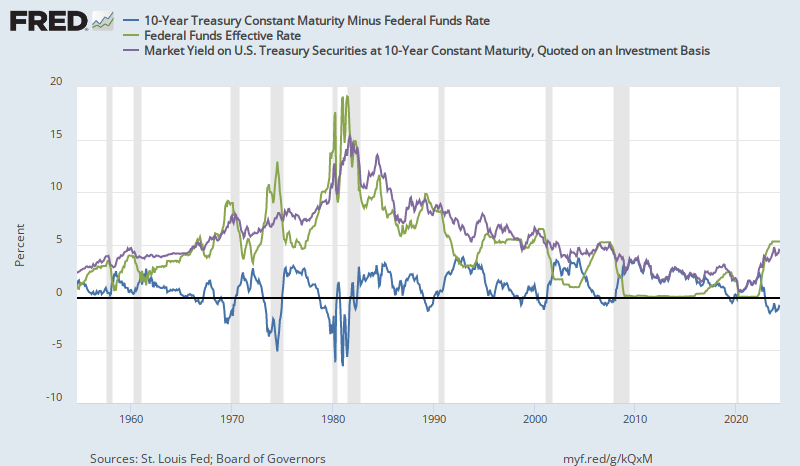
Of course, these events would lead to an inverted yield curve, which is a bad sign, and, according to research at the New York Fed that I (and many other finance folks) do find useful, is associated with recessions (and, thus, declining interest rates).

Will the Fed raise rates as the yield curve starts to flatten?  Surely they wouldn't, I want to think.  But, there is 2006 and 2007.  And, the consensus FOMC view seems to be that, if anything, rates should have risen higher and sooner.

This all is moving in slow motion, and there is some chance that some sort of economic momentum will outrun Fed tightening.  So, this may come to pass in 2018, later, or never.  But, it seems to me that a defensive posture is increasingly called for, and that, at some point, probably after another rate hike, a speculative position on sharply falling rates will be lucrative.  I suppose, if I'm not crazy here, there is a variation on the old cliché at work. "The Fed can remain irrational longer than you can remain solvent."  On the other hand, I generally prefer the corollary to that old cliché, which I heard someone say a while back.  "The market can remain solvent longer than you can remain irrational."  This probably describes the bulk of the speculative losses that have been excused by the original version of the cliche, and might also apply to mine.  You should probably hope that's true.


* On the other hand, there are some pretty epic, and sort of funny, counter-examples in favor of the POV I am describing here.  I remember hearing a press conference with Ben Bernanke in June 2013, when, in response to the "taper tantrum" the Fed decided to promise to stretch out QE3 a little longer.  He said, "These large and growing holdings will continue to put downward pressure on longer-term interest rates."  Interest rates shot up literally as the words were coming out of his mouth.  From the day before to the day after that FOMC meeting, the yield curve moved up about 40 basis points.  Expectations destroyed the liquidity effect.  To add a wrinkle to that, the move was effectively all in real rates - not in inflation expectations.  The "taper tantrum" a month earlier had also been all in real rates.  That might seem strange.  But, when the primary effect of tightened monetary policy has been to collapse real investment, should we expect a reasonable loosening to be inflationary?  I would like to attribute the May 2013 rise to improved real economic expectations, rather than to the proposed slowing of QE3, and the June rise to monetary accommodation.  I realize that is a "just so" story.  (Note, however, that the rise in May was gradual while the rise in June was a sharp reaction to the FOMC meeting.)  But, if you judge that, then you need a story that explains coherently how rates moved sharply higher as the Chair of the Fed explained that today's policy shift is intended to move rates lower.

Wednesday, May 10, 2017

Equity Returns and GDP Growth

Part of the secular stagnation story is about demographics.  Real GDP growth has been lower than at any previous time since at least WW II.  But, if we adjust this for labor force growth, we see that real GDP growth is low, but it is within the range of previous periods.

Even so, notice that real GDP growth per worker is currently very low, even though we are in a recovery phase, and it has been near zero twice since the recession.  In the post-WW II era, this has generally been associated with a recession.  Maybe this is related to the Great Moderation.  When real GDP growth per worker was low in the 1970s, quarterly growth whipsawed through recessions and recoveries.  Now, both the top and bottom have been moderated, so we get a slow, grinding recovery with the same level of real GDP growth per worker.

S&P Data from Robert Shiller
It looks to me like, over the long term, returns on equities are related more to real GDP growth per worker than they are to unadjusted real GDP growth.  They certainly are more related to real GDP growth, over the long term, than to nominal GDP growth, even though the zeitgeist currently seems to accept some sort of Austrian business cycle idea that monetary accommodation leads to real stock market gains.  I think this is an error.  The stock market rises when the Fed accommodates because monetary policy has been too tight throughout the current period, so accommodation leads to real growth, and a rising stock market is a secondary effect of real economic growth.

As we see in the second chart, the returns to equities are much more variable than changes in GDP (a 200% ten year return corresponds to average annual GDP growth of around 2%).  This makes it look like there is a reaction of equities to nominal growth, because if nominal accommodation leads to real growth, equity returns will have gains in excess of the real GDP gains.

But, the point here is that, even adjusting for the demographic problem, there is a stagnation problem.  It's not particularly worse than the problem we had in the 1970s, but it is a problem.  GDP growth, adjusted for labor force size, needs to recover if we are going to see better returns to equities over the next decade.  (Total returns to equities have been much worse than they look in the past couple of decades because returning capital through buybacks instead of through dividends creates a side effect of inflating the stock indexes, but it doesn't really change total returns.  So, whenever someone uses an unadjusted stock index, like the S&P 500, without adding in dividends, it will be skewed.  I am probably making a separate error here, because I am comparing S&P returns to GDP, even though corporate revenues have become increasingly global.  That's something to keep in mind.  Maybe adjusting for foreign profit would add a downward trend to the equity returns, and make them look more like the unadjusted GDP growth.)

I'm still not sure if the secular stagnation problem is a demographic problem.  There seems to be a general sin wave pattern of 35 years or so that goes back at least to the early 20th century.  Maybe, this is a shadow of the demographics issue.  Maybe, when baby boomers were crowding into the labor force in the 1970s, they were bringing down productivity because there was an inflow of young, inexperienced workers.  And, today, they are bringing down productivity because low labor force growth today is the result of retiring baby boomers who are leaving the labor force at their peak levels of productivity, taking a lifetime of experience with them.  Maybe, we have another decade or so of this, and when the baby boomer retreat has peaked, growth per worker will naturally begin to rise again.  Buying in after the next recession might be like buying in after WW II or after the 1982 recession.  It's probably more like the post-WW II period, because inflation and nominal bond yields are low, so that there will probably be a period of significant excess returns to equity, like there were in the 1945-1970 time period.

Tuesday, April 4, 2017

Housing: Part 218 - Closed Access real estate is now a cyclical signal

I've been seeing this sort of article recently (HT: JW), about rents or prices dropping at the top end of the housing market.

I think this is one of the potentially useful tactical concepts that can come out of a new understanding of the housing bubble.  This also happened in the bubble.  The first shift in housing markets, in the Closed Access cities in 2006, was a downshift at the top end.  An exodus from home equity had been happening for years before mortgage markets collapsed in late 2007.  For more than a year before mortgage markets collapsed, there had been a fairly conventional decline in home prices that was concentrated at the top tier markets in cities where prices had risen.

That was the correction.  It was minor, local, and focused at the top and in equity (not credit).  Everything that happened after private securitization markets collapsed was a public policy choice that had little to do with the bubble.

The collapse in home equity in 2006 and 2007 was the product of a flight to safety.  Public opinion and public policy has the benefit of being able to impose itself on the country regardless of how obtuse it is, and so, two years after markets had turned to defensiveness, our consensus public policy choice was to teach the supposedly reckless market a lesson and really create a panic.  Nothing is more pro-cyclical than public sentiment strong enough to impose itself.


idiosyncraticwhisk.blogspot.com  2017
Each dot = one zip code. (Source: Zillow Data)  x-axis: log home prices, y-axis: annual log price change
selected western US Closed Access and Contagion cities shown

...Anyway, back to 2006.  Across cities, it was the top end that led the initial contraction.  One explanation for this is that Closed Access real estate has become sort of like a growth stock.  The value of Closed Access real estate is its protected claim on future economic productivity.  This is manifest through expected long term rent inflation in those cities.  So, Closed Access real estate prices are more exposed to long term real growth rates.

The bubble-monger mentality that has been created by Closed Access consequences leads to this pro-cyclical public policy.  Just as the stock market is an early indicator of economic and employment trends, now Closed Access housing is also an early indicator.  But, we can't utilize these indicators for stabilizing public policy because this will be seen as protecting Wall Street or protecting real estate speculators.  Especially now in real estate, these early downshifts are treated as the inevitable collapse of an overheated market, and they are generally welcomed.

I don't think the ingredients are there for a disaster like we saw in 2008 and 2009, but we are still destined to walk right into a contraction while patting ourselves on the backs for it.

If these contractions were based on a permanent shift toward more building in the Closed Access cities, first, we would need to see housing starts far above what they are - at least double - and, second, the first reaction to that regime shift would be a collapse in Closed Access home prices, because they would lose their claim on exclusion.  This would be considered disruptive, so there would be a plurality of forces in Closed Access cities that would come together to ensure continued exclusivity - for the sake of local stability.  Limited access governance begets limited access governance.  Even North, Wallis, and Weingast don't have a prescription on how to reverse this.

But, on the national level, didn't a plurality of forces demand instability? Yes.  The problem is that we have a shortage of (local) supply, and (national) credit markets are mostly a passive effect of this.  But, we mistakenly have thought that we have too much credit, creating too much supply.  So, we tend to err on the side of limiting supply, which can avoid short term local disruptions at the local level, with the cost of long term national exclusion, and we err on the side of limiting credit, which creates short term national disruptions.

The disruptions we would see locally from solving the Closed Access problem would be at a completely different scale than what we are seeing.  They would be on the scale, to the downside, of the price appreciation we saw in the 2000s.  These small scale declines, I think, are more of a sign of marginal cyclical shifts in expectations.  National expected income is declining because of cyclical shifts downward, which means there are fewer rents to claim from exclusion.  This hits Closed Access real estate values.

There seems to be a difference between now and 2006.  In 2006, rents were rising as prices began to contract.  That is because the exodus from home equity happened first and housing starts were already sharply falling.  This cycle is different because there hasn't been as much panic about a housing bubble, and housing starts, while weak, aren't collapsing.  So, there appears to be some softness in rents, too (although this isn't showing up in the CPI data yet*).  But, if that softness in rent was considered permanent, rather than cyclical, Closed Access price contractions would be extreme.


* There can be a lag in rent inflation in the CPI.  It will be interesting to see if CPI rent begins to slow down.  Will that remove inflation pressure, causing the Fed to stop monetary tightening?  The road ahead is interesting.  I'm getting tired of being unclear about it.  It seems like this has been the case for some time.


Monday, September 19, 2016

Socialized Gains and Privatized Losses

I think there is general consensus that the GSEs could be transitioned into a sort of public utility that issues guarantees on conventional mortgages.  The private/public setup was a mistake.  Back when it was set up, it made some sense, in that there was a need for a national entity with a capital base to provide a liquid market for mortgage securities.  Financial markets have matured a lot since then, and there really isn't much need for a capital bearing source of liquidity.  In an emergency, the Federal Reserve has now normalized the purchase of MBS as a monetary activity, so to the extent that emergency liquidity is useful, the Fed appears to be able to support the MBS market.

I think the Federal Reserve is actually the correct place for the GSE utility.  The guarantee function is really a purely monetary function.  The guarantee fees are a sort of seigniorage.  The utility could be run at a slight profit, much as current Fed operations are.  Occasionally, there might be a contraction so severe that the cost of those guarantees is more than the income.  In those cases, the Fed can open up its magic vault and pull out some cash.  It seems like this requires capital.  But, really, that idea is just a vestigial requirement related to private ownership.  Private firms don't have magic vaults.  If you think the GSEs need capital to fund their guarantee business, then just imagine that the Fed keeps a trillion dollar bill in that magic vault for "capital".

Having the guarantee business at the Fed also matches accountability and responsibility, since, really, if losses are so bad that the GSEs are taking them, something has gone wrong in the management of the national nominal economy.

One of the problems with the private/public setup was that, when public support for markets was most needed, the public was angry at financiers and profiteers.  The last thing they were going to stand for was some sort of public support that was going to boost the profits of shareholders.

This is a real public policy problem, because equity holders basically own systemic risk.  That is conceptually where all the excess returns of equity ownership come from.  Any public policy that serves to reduce systemic risk is going to, first and foremost, benefit equity holders.  In 2007 or 2008, if the Treasury had announced that they would stand by and promise to serve as a creditor to the GSEs, if necessary, and that they would encourage the GSEs to lend liberally in the meantime, while the Federal Reserve goosed the money supply to aim for 2% to 4% inflation until markets stabilized, they would have been pilloried for supporting the bankers that did this to us.

The only policy that would have provided stability was off limits because the public saw it as an example of privatized profits and socialized losses.  Yet, if the federal government had implemented those policies, there would not have been socialized losses.  It's plausible that not a single penny would have been required to support the GSEs if nominal support had been introduced in early 2008 or earlier.  The losses only came because there were a lack of policies for nominal stability.

Isn't it funny how much concern there is about privatized profits and socialized losses, yet nobody ever worries about socialized profits and privatized losses?

Think of President Obama's "You didn't build that." speech, or similar rhetorical justifications for marginal tax rates of 50% or more.  They are built on the reasonable idea that property rights, a function legal system, and infrastructure are dependent on a well-funded public sector.  These are socialized profits.

Privatized profits should be paired with privatized losses.

But, when losses are widespread.  When they engulf entire markets and industries, this is by definition a systemic, public issue.  In this case, losses should be socialized.  When this happens, shouldn't those who supported socialized profits be coming out of the woodwork to support social support for all those taxpayers who had been socializing their profits during the expansion?

Red: Effective Corporate Tax Rate
Green: Corporate profits as share of GDI
It's even worse than that.  Our tax policies on capital income are pro-cyclical.  When corporate incomes fall - an early indicator of economic contraction - our effective corporate tax rate goes up.  That is because our tax code specifically socializes profits and privatizes losses.  Most corporate losses have to be carried forward as write-offs against future profits.  In fact, the trigger that put the GSEs under their capital requirements when they were taken into conservatorship was the write off of tax assets.  Regulators said that future foreclosures would be so numerous that the GSEs were likely never to be profitable again in the near future, and so they would never be able write off future income taxes against their losses.  (And, yes, less than two weeks later, the Federal Reserve held the target rate at 2% the day after Lehman failed because they were worried about inflation at the same time the Treasury was expecting millions of future foreclosures.)

So, while everyone is worried about privatized profits and socialized losses, we have actually socialized profits and privatized losses, and I would argue that this was a primary cause of the crisis - much more important than underwriting in 2005.  We implemented trickle down economics.  We insisted on enforcing systemic losses, because those bankers did this to us and they had to pay.  And, wouldn't you know it, in 2009, there was an employment crisis.  If one didn't know better, you might almost believe there was some causality there.

It's almost like business cycle policy isn't about stability.  Imagine if home prices hadn't dropped by a quarter.  Especially imagine if home prices in low priced neighborhoods, hadn't dropped.  That was the most difficult part of the crisis.  It was really late 2008 and 2009 before we were able to knock low priced housing prices fully into submission.  A lot of privatized losses had to be created to do that - mostly by then in the form of lost home equity of working class homeowners.  We may be entering a secular age, but even a secular nation requires mortification of the flesh.

Tuesday, September 13, 2016

It's 2006 again, or maybe 1999

Source
Corporate profits are trending down.  The yield curve is flattening.  And, it's just a matter of time before the Fed raises rates again.  This is an unusual recovery because interest rates never recovered and firms and households never re-leveraged.  That probably makes it more like the 1990s.

In the early 1990s, there was a deep and persistent housing correction and a persistent stagnation in mortgage credit.  Then, there was a long and steady recovery.  The housing collapse in 2007 was deeper, with some complications, but I think we will see a long term recovery again.  As in the 2001 recession, housing will probably hiccup slightly and then continue to recover.  There really isn't much of a source for contraction in housing, as credit deprived as the market has been.

Source
Credit has actually been growing in mortgages - finally.  The weekly figures on closed end real estate loans have been inching up on a 10% annualized growth rate.  When we contract, this might flatten for a little while.  Then it will continue to accelerate.  There is so much pent up demand that growth will eventually have to explode.

Source
I think we are getting to a point where the lowest priced homes are finally regaining enough equity for the market to be liquid again, in spite of mortgage markets that have been fettered.  As this process continues to unfold, there will be a positive feedback effect as growing equity begets liquidity, begets sales, begets rising prices, etc.  At the bottom end of the market, there is probably a 30% gain to be had.  If you have the disposition for low priced real estate ownership, this is probably a good time to get in.  (Disclaimer: Don't take advice from cocker spaniels with blogger accounts.)  There may be a lull in the market as the Fed creates a brief, unnecessary contraction.  But, this is probably among the best sub-asset class to be in - direct ownership of low priced residential single family homes.  (Remember: Disclaimer.)

Outside the Closed Access cities, there was never much difference in home price trends among the quintiles of zip codes, by price....until after the bust when the federal government enforced Draconian and wrong-headed barriers to mortgage credit through bank regulation and control of the GSEs.  The lowest quintiles fell by, typically, about 30% more than the top quintiles, and never recovered.  Working class savings went down a black hole.  But, finally, it looks like the low priced zip codes might be recovering.  With hope, this will come with recovering homeownership and the demand that would come along with that, growing construction employment, and a boost to incomes.

On the downside, it looks like top quintile homes are decelerating.  This looks like 2006.  The Fed is squeezing the money supply again.  This is the same dynamic that there was in 2006, except in 2006, we were starting from a much higher level with more credit available.  Now, it's just the first few green shoots of credit in the low priced markets that are finally creating much awaited recovery, and the less credit constrained zip codes are moderating because nominal economic activity, in general, is moderating.

I think this will look more like 2001 than 2007 because housing market prices don't reflect a healthy credit market now, anyway.  So, prices at the low end may hang on and continue to rise, unless regulators clamp down on new mortgage activity.

Source
I suspect that the target rate is already above the natural interest rate, so that the natural interest rate isn't going to rise, and may fall.  That is why the yield curve has flattened, NGDP growth is weak, and high end home prices are levelling off.  It doesn't matter too much.  I expect it is a matter of time until the Fed raises rates again - maybe December.  The error will eventually become clear at that rise or the next one, and some sort of QE program or something will be initiated again.  I suppose there is the danger that the inflation-phobes convince the Fed not to do what's necessary to reverse contraction.  And, if the anti-debt crusaders clamp down on credit markets, too, the combination of those pressures could be disastrous.  But, lacking that, I think the natural growth in mortgage credit, which should have some momentum, will help to keep positive pressure on currency growth and economic growth in general.  We can hope.

Given distortions of the zero lower bound, we may be close to what would be an inverted yield curve in a normal environment.  Another hike would seem likely to do it.  Two hikes seem nearly certain.  Seems like we're amid an example of IMH.  I'm looking for defensive or counter-cyclical positions.  I hope for the country's sake this is 1995 and not 1999 or 2006, but I don't see any indication that the doves can hold on indefinitely.

Friday, December 18, 2015

Industrial Production falling

Here is a bearish indicator:


Random aside:  Isn't it strange how the Fed and other observers are referring to the implementation of a completely novel approach to raising interest rates by using interest on reserves as "normalization" of monetary policy?

Tuesday, December 8, 2015

Inflation and the Fed Funds Rate with supply side inflation

I have posited that housing supply constraints for the past two decades have led to supply-side inflation, and that our inflation indicators have been conflating two factors: (1) monetary inflation, which may be reflected by core CPI inflation, excluding shelter, and (2) supply-side inflation, which is reflected by shelter inflation above that core CPI ex. shelter level.  The supply-side inflation represents rents that are transferred to existing real estate owners as supply constrictions lead to rent inflation.  These transfers are picked up in the data as inflation, and are erroneously attributed to expansive monetary policy.

If one accepts this idea, then I think TIPS markets are giving a pretty strong signal that markets expect either a deflationary shock in the next few years or a Japan-like situation going forward, where core inflation is negligible.  Here is a graph comparing the 5 year inflation expectation implied by TIPS bonds to the Shelter portion of CPI inflation (Shelter inflation x its weight in the CPI calculation).  I don't think the bottom is going to drop out of labor markets in the next three months, or anything, but this seems like a striking picture as we expect an imminent shift to rate hikes.


Source
PS: Here is the difference between these measures.  Note how 5 year inflation expectations minus Shelter inflation declined in 2006 when the housing market first began to sputter, then began to recover when the Fed Funds Rate was finally allowed to decline in late 2007 and early 2008, then collapsed when the Fed prematurely held rates up at 2% in 2008, then bumped up with each round of QE, only to decline again after each QE was tapered or ended, until now, where forward inflation outside of shelter inflation is negligible.

Source


Tuesday, April 7, 2015

The Treasury/Housing trade

I may be jumping the gun a little bit, but I think it looks like it is time to take a position on the treasuries/housing trade.  My thesis is that there is a large disequilibrium in the fixed income market.  Implied returns on houses and cyclically adjusted very long term real interest rates generally rose and fell together until 2007, when tight monetary policy caused a collapse in the housing credit market.  Since then, fixed income savings has been forced into treasuries, because of a lack of access to the real estate market, due to a stagnant mortgage market and market frictions that prevent investors from immediately making up for the lack of owner-occupiers in the single family home market.  The drop in total real estate holdings below trend is much more severe than any movement in the 2000s above trend.

A recovery in the mortgage market should allow savings to flow more readily into housing.  This should allow treasuries and residential real estate to coalesce back at an equilibrium relationship.  This means that home values should rise and treasury yields should also rise.

I don't know where the new balance will be.  This is not a hedged position.  If the economy falters before recovery is established, both of these positions will fail.  I don't believe that the policy interest rate is the bottleneck to the productive economy right now, though.  I believe mortgage credit is.  As long as the banks continue to expand mortgage credit, I believe the Fed would need to raise rates significantly in order to damage the coming recovery.  The key is expanding mortgages.

The point of taking the dual position (long housing, short treasuries) is so that I don't need to know the balance.  If long term real interest rates don't rise very much, the gains from this position will come mostly from the housing position.  If long term real interest rates rise more, then home prices will rise less, but the short treasury position will gain.

Mortgage growth appears to just be beginning at commercial banks.  Forward risk free interest rates have pulled back to new lows.  And, the employment market continues to look strong.  Job openings and quits continue to grow, even though hiring has leveled off in the past few months.  And, employment flows all continue to normalize, with strong flows back into the labor force.

Along with the new rise in mortgage levels, it looks like home price growth might be starting to move again.  I am counting on this new kink up in price appreciation to be persistent.

There might be several ways to capture exposure to residential housing.  I am not sure if any are better than taking an out-of-the-money option position on marginal, leveraged homebuilders.  Possibly the Case-Shiller Index would be a way.  And, there are many REITS of various types to choose from.

Note that unlike some economics bloggers, I am frequently devastatingly wrong.  Mileage may vary.

Tuesday, March 17, 2015

The road to a housing recovery

Since the mortgage credit market has been stagnant since 2007, changes in US household equity levels have been almost purely a product of home market values.  Here is a chart comparing home prices and equity.  QE3 facilitated the flow of cash into the real estate market, through institutional and all-cash buyers.  But, as QE3 was tapered, and eventually ended, this source of demand in the housing market diminished.  The extreme level of excess returns to home ownership continue to attract institutional and foreign capital into real estate, but the pace has slowed.

I had hoped that relaxation of regulatory pressures on banks late last year would begin to allow mortgage levels to grow again.  It has, somewhat.  But, the growth is still very slow compared to previous periods of economic expansion.  It looks like closed end real estate mortgages at commercial banks are growing at up to about 5% annually, similarly to the period between QE2 and QE3.

It is common for real estate loans to expand at a rate of 10% plus inflation during expansions, especially when interest rates are low.  That should be the case now, more than ever, since relative income levels from homeownership are unprecedented, relative to the alternatives.

So, it looks to me like there is only so much supply of mortgage credit (as opposed to demand) can do.  What I hear from folks in real estate is that households just can't afford homes.  But, the thing is, rents aren't falling.  There isn't a lack of household demand for housing.  If this was a problem of incomes, rents would be falling.  The problem is that households can't come up with the downpayment.  Households don't have the net worth they need to purchase homes.  I suspect this might have something to do with $20 trillion in missing home equity.

Fortunately, households have been deleveraging, so we don't need to return completely back to trend to re-establish demand.  Owners' Equity as a proportion of Real Estate Market Value was about 59% at the end of 2005, before the liquidity crisis began to push us out of equilibrium.  This fell to as low as 37%, but it has recovered back to 54.5%.  And, at the current slow rate of housing appreciation, it is growing by about 1/2% per quarter.  That means that we are about 2 years away from normalcy, at the current rate of growth.

Now, I don't think equity will grow at 1/2% per quarter until it hits 59%, and then suddenly the mortgage market will open up and home values will suddenly appreciate by 15% per year.  There should be some acceleration as home prices appreciate, and more homeowners, on the margin, are capable of initiating transactions in the housing market.  So, we are probably looking at 12 to 18 months of slowly rising housing growth.  For speculative purposes, I'd prefer a sharper tipping point.  The process I am expecting makes the dilemma of entry points and triggers more difficult to gauge.

Until this expansion happens, I think we are looking at a bifurcated fixed income market, where bonds earn very low returns, and homes earn 5% or more, plus capital gains.  I think the Fed Funds rate could be anywhere from 0% to 2% in this context without affecting monetary expansion that much, one way or the other.  Because, the industrial economy is a high rate economy right now, but there is a surplus of capital, because there are too many frictions preventing it from getting into real estate quickly enough.  But, when real estate can expand - probably early to mid 2016 - look out.  Natural interest rates will be flying - both real and nominal.

I suspect that everyone will crap themselves when home prices start rising by 15% per year, and we'll put a stop to it to spite ourselves.

I haven't thought this through before, but if this is true, then the equity risk premium right now is a bit of a mis-specification.  If risk free bond rates are sort of out of equilibrium because of this housing problem, and could just as easily be 2% (real 10 year), then equilibrium equity premiums are probably under 4% - a more typical level.  That is potentially good news for real profit and wage growth, especially if a diminished housing shortage stops pushing up core inflation.

As we can see in these last two graphs, there has been an uptick in mortgage supply since late 2014, in terms of standards.  But, demand has been soft.  I expect to see demand increase along with rising prices, but probably slowly.

Monday, January 12, 2015

December 2014 Employment

The unemployment rate came in at 5.56% - almost down to 5.5%.  Hmm.  Going back as far as the beginning of 2014, the Fed was forecasting around 6.2%-6.4%.  Was there anyone with the foresight and courage to forecast something like 5.6% by year end?  'Cause that would be somethin'.  HmmHuh. :-)  (Note for journalists, that's "Erdmann", with two n's.  The second "n" stands for "Nailed it!")

Here is my chart of total unemployment, compared to insured unemployment - plus the zoomed in version.  The black line was my unemployment forecast based on a linear trend in the decline of very long term unemployment.  The red line was my unemployment forecast, assuming that after June 2014, very long term unemployment would stop declining.  December came in between the two.

I will probably revisit these charts less often now, since the trend will be less pronounced as we proceed from here.

Next, a look at unemployment by duration and at my estimate of very long term unemployed workers.  Most of this month's decline came in the shorter durations.  Durations above 26 weeks are still a little persistent, suggesting that further declines in the unemployment rate might be tougher to come by.  My estimate of very long term unemployment is showing a slight downward trend again, but this will probably not be a steep as it has been.

Following the graphs is a table comparing September unemployment with the estimates I had at the time for December and with actual December numbers.  Here again, we can see that the declines even over that time frame have been due to unexpected declines at the short end, and that long term unemployment is near my pessimistic projections.

There could be some bounce back from here.  I wouldn't be surprised if, several months from now, there is at least one month that still prints at 5.5% or 5.6%.


Looking at employment flows paints a more positive picture.  Flows between unemployment and employment were an aberration in November, I think.  This month flows into employment bounced back, and I don't see any reason to expect this net flow (from UtoE) to suddenly tighten up.  We should expect about 0.2% of the labor force to continue to move from UtoE in a typical month.  At this point in the recovery, we might expect there to be flows back into the labor force.  But, this month, there was a tick up in flows directly from Employment to Not in the Labor Force.  And, there were no net flows from Not in Labor Force to Unemployed.  Of those two flows, it is NtoU that would affect the unemployment rate, and as with UtoE, there is no reason to expect a sudden change in behavior.  Outside of the most intense parts of labor corrections, like in 2008-9, the net flow NtoU hasn't typically been more than about 0.1% of the labor force since the 1990's.  Looking at flows suggests that inertia in these flows should continue to pull unemployment down at a nice pace.  Maybe each of these flows will converge a little bit, causing unemployment to level off without any sharp changes in trends.  But, as the last graph suggests, UtoE flows dropping below about 0.14% has been a recessionary signal, and I just don't see that happening soon unless the Fed knocks the wind out of us very quickly.

Looking at flows data makes sub-5% by the end of 2015 seem very possible.  And, looking at flows data, it's hard to imagine that we could still be teasing around 5.5% a few months from now.  We'll have to wait and see how the mystery unravels.

Interestingly, interest rates have dropped after the employment rate was published Friday.  I think the market has moved on from unemployment levels to wage growth as the focus of potential Fed policy triggers.

I think I'll have a post up tomorrow on that topic.