 |
| Source |
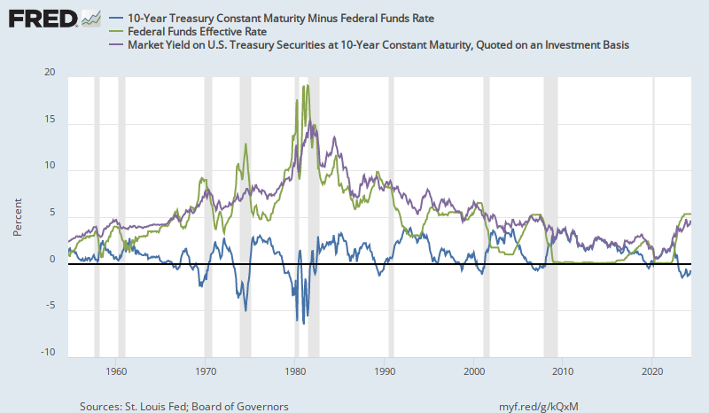
And, I have noticed that when interest rates were high, inversions were a lot deeper while inversions at low rates have been shallow. This makes sense, because the closer you get to the zero bound on nominal yields, the more option value there is in long term rates. In addition, the inflation premium will tend to revert to long term norms, so when rates are high, it is easier for long term rates to decline with falling inflation expectations.
 Here is a scatterplot of the fed funds rate over time compared to the 10 year rate. I have also added a 45 degree line to show where inversion would happen (both rates being the same). It seems like a pretty general rule that inversions are deeper at higher rates.
Note that at very low rates, the spread bottoms out at more than zero. In fact, the curve never inverted before the 1957 and 1960 recessions. Rates were very low then.
 Anyway, I finally sat down and looked at the numbers. I found the month with the lowest yield curve slope (10 year yield minus federal funds rate) before each of the last 9 recessions, and I noted the Fed Funds Rate and the 10 year rate at each of those months.
Then, I regressed the 10 year rates against the corresponding federal funds rates for each of those 9 months. The relationship is so linear, I almost don't trust it.
Here, I have added the current rates, along with rates from 1 and 2 years ago. We are basically right on the trendline that marks the deepest inversion point for the previous 9 recessions. But, oddly, we were also on the trendline one and two years ago.

 |
| Source |
So, for a year or so, yields were moving up at the top end of the inversion zone, and eventually in 2006, the yield curve inverted more and in 2007 rates started to decline, but remained inverted until the Federal Reserve drastically cut rates in early 2008. The Fed paused at 2% in 2008, where, in hindsight, there clearly wasn't enough accommodation. If the trendline could be considered the bottom of inversion events, could that 2%-4% spot in 2008 still be in the range where the yield curve is flat enough to be considered inverted on this adjusted scale? For any Fed Funds Rate above about 6%, on this adjusted scale, a yield curve slope 1% above the trendline would still be inverted in absolute terms.
But, if that was the case, then for the past two years, we would have been squarely in (adjusted) inverted territory. It appears that we are in the 2005-2006 part of the process, where short and long term rates are both moving upward in a near inversion. I have reasons for moving recessionary conditions back in time from 2007 to 2006. But, I don't have a similar story for today. If we really are in inversion territory, what has prevented there from being more of a contraction?
I don't know. I am pretty confident in this general framework, but I am not confident in the precise specification of the trendline. Maybe I have it set too high. Maybe QE did create a permanent downshift in long term rates that affects the measured yield curve. Maybe there is a market-based reason why the relationship isn't linear at this level or why there has been a shift over time to lower long term rates relative to short term rates.
But, it certainly seems reasonable to consider this dangerous territory at yield curve slopes well above zero when rates are this low. And, as the fed funds rate is pushed up, a shift down in 10 year rates would be a bearish sign, even if it wasn't any lower than rates in recent memory. It also means that when the Fed starts to lower rates, tepid moves that aren't matched by rising long term rates will probably not be stimulative enough. If we end up back at the zero lower bound, with 10 year rates in the 1.5% to 2% range, that could be really bad news.
 PS: Here are two additional charts. The first one plots the spread against the Fed Funds Rate, to show that the high correlation in the chart above doesn't come from the co-movement of both rates. There is a high correlation between the spread at the bottom of inversion and the rate level.
 Also, when rates were high, rates were also more volatile. In recent events, the spread has changed slowly and remained inverted or nearly inverted for an extended amount of time. When rates were high, the deepest inversion usually only happened for a few months. This added volatility probably causes my measure of the deepest inversion to be overstated when rates were high. To reduce the noise, I have taken the 1 year average rates, centered on the most inverted month. I have added a second series to the graph, which shows the relationship using the 1 year average, and it does flatten the relationship somewhat. It also weakens the relationship, but it could be that the strength of the relationship for a single month is partly coming from relationship between rate levels and rate volatility.
I have also added a new version of the graph of recent rate movements. The relationship from the annual average rates makes the recent rate behavior less mysterious. According to this relationship, rates could follow a path similar to 2006. In that scenario, the Fed would raise the target rate to something around 2.5% or so, and the 10 year rate might eventually fall to about 2.5%, which would be a signal similar to the 2007 signal, but with a yield slope almost 1% steeper than the 2007 curve because of the lower rate level.
Interesting post. IOER is "new," not sure if important.
ReplyDeletePerhaps the Fed is artificially propping up short-term rates, and the artificially inverted yield curve is no longer a telltale clue.
But I think you're right in your policy prescription. In the next recession the Fed will have to move quickly to lower rates quantitative easing and I would even say helicopter drops.
Okay stray thought:
ReplyDeleteSuppose in the past the inverted yield curve cut bank lending. Borrowing short to land long does not make sense when short rates are higher than long rates.
But today banks sit on top of a mountain of reserves. In the present day perhaps the important spread is that between mortgage rates and IOER.
As long as that stays around 150 basis points or more, perhaps the economy will continue to muddle through.
I'm not sure what it is that connects inversion to economic contraction, or whether it is more due to supply or demand.
DeleteGod is indeed a wonderful God,I want to share with you all that I was cared fully from my herpes infection after I got my herbal medicine from Dr Lucky..I will recommend who ever have herpes infection to contact or reach out to Dr lucky herbal medicine solution home because he have the strong herbal medicine for herpes infection. His Whats-app +2348154637647 . OR Email him via; drluckyherbalcure@gmail.com
ReplyDeleteThank you so much Dr Lucky for bringing my life back, i never thought i would ever be cured of HSV1 again due to the medical report i had from the hospital not until When God used Dr Lucky herbs and root in curing me of HSV1. Contact his on Email; drluckyherbalcure@gmail.com or WhatsApp him; +2348154637647
ReplyDelete