Showing posts with label asset allocation. Show all posts

Friday, June 25, 2021

The curious sine curve of equity returns

 Occasionally, I take a new look at how equities are doing compared to a long-term sine wave.  Over the course of the last century or so, real total returns on the S&P 500 follow a sine curve pattern in a surprisingly regular way.  I'm just fitting curves here, so I don't want to say too much about it, but it is interesting.

The positive performance of the stock market over the last few years is actually right in line with the long-term trends.

Here are charts comparing real total returns to the sine curve, fitted to 20th century results, with the last 21 years out of sample.


Monday, June 8, 2020

May 2020 Yield Curve Update

 The yield curve (using Eurodollar futures) has undergone a series of shifts with the coronavirus pandemic.  In the first graph, we can see that starting from the end of January, the whole curve shifted down by early March.  It shifted down more by March 10, as the extent of the pandemic became worse.  Then, it steepened over the next week as, across the US, cities, states, and citizens took action.

Then it shifted down again in late March as the pandemic worsened in the early weeks of the lockdown.  Then it steepened again over the course of April and May.

The result of these shifts is that short term rates are much lower than they were at the beginning of March but long term rates are about the same as they were.

I would say that we have encountered a pretty hairy real economic shock, but the Fed has done a decent job of countering that shock so that the nominal shock is lower than it could be.  (Five year inflation is still under 1%, so there is room for more, but obviously the Fed has been very active.)

The second chart here is an estimate of the first month when short term rates are expected to rise.  Before the pandemic, rates were not expected to bottom until September 2021, and that date was potentially moving out in time, just like it did after the GFC when the Fed would prematurely stop doing quantitative easing.

That was the main danger of the pre-COVID economy, that the Fed was pulling back on nominal growth just a little too much.  That, by itself, is unlikely to cause a crisis or an intense contraction, but it does put the economy in more danger of running into problems, especially, as the past 3 months have made clear, we never know what's around the corner.

The shock we did get was strong enough to kick the Fed into recovery mode, so I think the stock market has basically reacted to an exchange of risks.  We got a real shock, but now we are less likely to have whatever low-level monetary stagnation we were going to get otherwise.  If the expected future date of the first rate increase continues to push back to us in time (it's now at June 2021), then that might be evidence that the Fed has mitigated some of the real shock by moving into recovery mode.  Basically, this would create a deeper but shorter recession.

The next graph is my modified inversion measure.  Any spot below the trendlines is effectively yield curve inversion.  We are still technically inverted, but now the Fed has so many programs in place to provide liquidity there might be hope for recovery even if long-term yields remain low.  Understanding that is above my pay grade.  In either case, if 10 year yields can rise above, say, 1.5%, that would definitely be bullish.  Even moreso if the Fed misinterprets buoyant yields as some sort of headwind that calls for more stimulus.

In the meantime, it's a trader's market.  There are a lot of stocks still well below their previous highs and many stocks at all-time highs.  Their relative outcomes will depend on real developments.  A lot of people are talking about where the "stock market" is, but now really is a time where prices on individual stocks can present opportunities for acting on particular knowledge or simply for having the guts to take on potentially embarrassing positions that, nonetheless, have potential.

Monday, March 2, 2020

February 2020 Yield Curve Update

Well, this month appears to have presented the triggering event that will tip the Fed's hawkish bias over the tipping point.  It seems likely now that the Fed will chase the natural rate down to zero from here and there will be some sort of traditional contraction or recession related to the cycle.  In other words, in the second chart, we should have hoped for the dots to move up, but instead, they will likely move sharply to the left.  That chart uses monthly averages, so the 10-year yield is already well below the February point (in red).  The Fed is expected to announce an emergency rate cut.  Obviously, they should.  But, unless sub-1% short rates somehow leads to the 10 year moving up to 2% or 3%, there will likely be some period of economic contraction before rates increase again.

That means there probably still are some gains to be wrung out of a long bond position.  Regarding the other asset classes, however, housing looks increasingly bullish, and is relatively defensive in the current context, so I don't think there is much to fear in real estate.  And, equities certainly could decline, maybe even enough to become a legitimate bear market, but it is possible that they won't decline precipitously.  I think the jury is still out on that, though whatever the indexes do, this will likely be a trader's market for a while.  At some point, beaten down stocks will present long opportunities.

That relates to one bright spot in this month's update.  The yield curve has been inverted at the short end since early 2019.  The date of the expected rate low point had been September 2021 for a while.  As the last chart shows, we seem to have been moving toward that date, suggesting that there has been enough momentum in the economy to get back to a normal yield curve eventually.  But, the curve has been flattening lately, and it looked like it might tip back to December 2021 or even March 2022, which would suggest that we aren't really moving closer to a normal yield curve and that, as with the periods between QEs, more Fed loosening would be necessary to kick rates up over time.

But, with the corona virus dust up, even though yields have dropped down significantly, much of that has been at the short end.  In other words, markets expect the Fed to react.  So, even though most indicators in the past week have been negative, the yield curve has actually tilted up a little bit, and now the rate low point has moved to June 2021.  In other words, the negative thesis has probably been confirmed (We will proceed through a standard yield curve related contraction.) but as we proceed through the contraction, the market expects the Fed to be nimble enough to prevent it from being too deep or long-lasting.  I hope that's the case.


Disclosure: I have long positions in HOV, VNQ, and UBT.

Wednesday, February 5, 2020

January 2020 Yield Curve Update

Interest rates have declined back toward the August lows (though they have bounced back up a bit over the past couple of days).  Generally, this month has continued the trend that suggests the Fed will be a bit behind the curve, long term rates will remain low, and eventually they will have to lower their target overnight rate in an attempt to expand the money supply.

In the second graph, the bullish signal would be a 10 year yield pushing far above the regression lines.  Those lines are my estimation of a de facto yield curve inversion.  The pattern of recent recessions has been (as in 2006-2008) that the plots move to the left.  Where we have avoided recession, the plots move to the left for a relatively short time, then move up significantly as long-term rates reflect improved sentiment.  Either is still possible, but with each month below the inversion line, a move to the left is more likely.

The last graph is an indication of Fed posture measured as the expected low point in Eurodollar rates.  The further into the future the expected date of the last rate cut is, the more likely it is that the Fed has been too slow to react to poor sentiment.  It remains at September 2021, and looking back at the first graph, one can see that, if anything, it is more likely that the low point will move to a later date rather than to an earlier date, compared to the similarly low August yield curve.

Unless another Fed cut or a significant unexpected positive shock improves sentiment, it seems like there might still be some room for bonds to go higher before this turns.

Tuesday, January 14, 2020

December 2019 CPI Update

Not much to say.  More of the same.  Shelter inflation tracking over 3%, non-shelter core around 1.5%, and core CPI about 2.2%.  I don't think short-term inflation fluctuations are very informative at this point, unless they veer wildly in one direction or the other.  I still think the most likely event in the near term is a decline in interest rates, so I am still mostly holding on to bond exposure and keeping powder dry on some potential tactical equity positions, except for positions with some defensive elements.  For instance, Hovnanian, a homebuilder, (HOV) that is highly leveraged, financially and operationally, and poised to recover because of the both defensive and speculative potential of that sector.  I actually consider that position a sort of hedge against a bond position, in part, because I think a primary factor holding yields down is the lack of residential investment.

Disclosure: I own shares of Hovnanian (HOV)

Thursday, July 11, 2019

June 2019 CPI Inflation

Here is my monthly inflation update.  We continue along in the same pattern.  This month there was a bit of a bump in non-shelter inflation, but the trailing 12 month rate remains about 1.1% and shelter inflation remains about 3.4%.

Going forward, I think inflation may become a less important indicator.  The Fed has shifted to a more dovish posture and they are not insisting on holding the target rate at a plateau.  It would be a shock if they don't lower rates this month.  So, I am happy to say that my worst fears appear not to have come to pass.  Monetary policy is on the margin of neutral.  Unless the Fed reverses course, I suspect there will either be a slight contraction or a continuation of the expansion.  For now, I will call that a tentative prediction, but it seems to be where we have moved.

We are probably near the point in time where a tactical long position in fixed income should shift into more of a long position in equities and real estate, either now or over a few months as this plays out.

In terms of broader influences, I'm more worried about nominal growth rates in Australia and Canada than things like the tariff issue, but I'm no expert on those issues.  That's just my hunch.

Tuesday, April 2, 2019

March 2019 Yield Curve Update

Since the zero lower bound distorts the yield curve at very low rates, an inverted yield curve at low rates is worse than an inverted yield curve at higher rates.  This is a reason why the curve didn't invert in the 1950s.

The necessary adjustments here could be made either by just looking at the short end of the curve, recognizing that the long end of the curve will have a bias for a positive slope. Or, it could be estimated with a regression of the depth of the inversion in the various economic downturns that have happened since WW II.

Here are visualizations using each estimate.

In the Eurodollar market, the inversion of the short end is very deep.  Today rates bounced up a bit.  They will do that.  In the post-WW II era, though, even though rates seem to bounce around within the inversion, yield curve normalization has only happened when the short end rate has been lowered.  At this point, I have a fairly strong expectation that short term rates will be well below 2% before 2021.

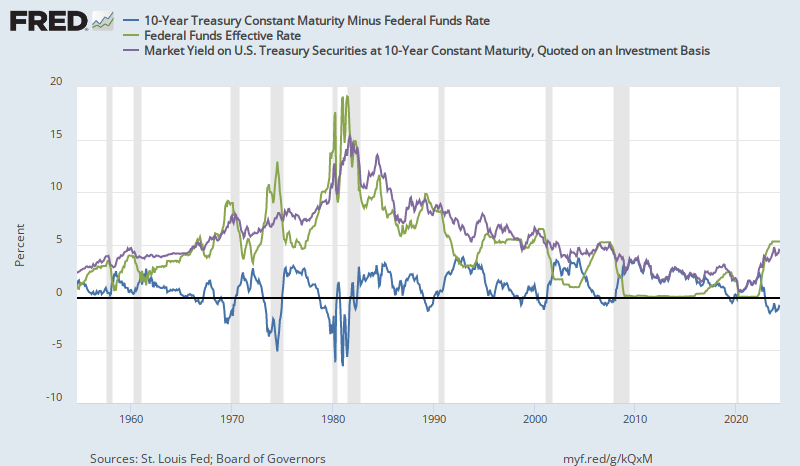
The estimate using the 10 year minus Fed Funds spread also has us well into inversion.  As this graph shows, in 2006 and 2007, the 10 year rate moved up and down without normalizing for some time, then, when the Fed finally lowered rates, the entire curve came down.

The inversion from early 2006 to summer of 2007 was especially extended.  I think the Fed was already sucking cash out of the economy far to aggressively for that whole period.  The housing boom is what delayed contraction, because many households could access their home equity for liquidity.  Lending was still growing at something close to double digits even into mid 2007.

Today, this source of liquidity is not significant.  Mortgages are growing at low single digits, if that.  Home equity is still declining.  General bank lending is at around 5% annual growth.  So, I expect falling rates to come sooner this time.  But, admittedly, I was surprised by a rising yield curve after the Fed raised rates in 2015, so my credibility on this point is worth the monthly subscription price to this blog.

Whatever else happens, this is definitely an inversion event at this point.

Sunday, February 3, 2019

January 2019 Yield Curve Update

I have discussed how there is a sort of mental accounting problem with the yield curve model.  The zero-slope is treated as a constant, when, in fact, meaningful inversion happens at low yields when the 10 year yield is as much as 1% higher than the fed funds rate, and at higher yields, the inversion has to become fairly steep to become meaningful.

During the past two months, the curve has become meaningfully inverted.  Here, in the Eurodollar futures market, the upward bias of the longer term yields is clear.  What is important is that forward rates in the 2-3 year time frame are inverted.  I suspect those 2021 Eurodollar contracts will close at rates much closer to zero.

Here is the plot of the Fed Funds Rate against the 10 year Treasury, shown with the adjusted inversion levels.  From this point, a normalized yield curve is highly unlikely to develop without lowering the Fed Funds Rate.  Expect the 10 year yield to be below 2% by the time that process is finished.

Monday, December 3, 2018

Yield Curve Update

I have written previously about the yield curve.  It appears to me that as interest rates get lower, there is an option value embedded in long term rates because of the zero lower bound.  That means that it is harder for the curve to invert at lower rates.

I suspect this comes from my "Upside down CAPM" way of thinking.  There is a relatively stable expected return on at-risk assets like corporate equity, and fixed income is a way to trade off some of those expected returns in exchange for cash flow certainty.  So, a real 10 year yield of 1% is really a payment of about 6% subtracted from the expected real yield on corporate equities of 7%.  Low real rates are a sign of risk aversion.  They are not stimulative.  It seems that others view them as stimulative.  They are wrong.  And, this gives them a false signal about the yield curve.  It makes it look like an inverted yield curve is less dangerous at lower interest rates, because the low rates are seen as stimulative.  But, an inverted curve at low rates is actually more dangerous, not less dangerous.

Here is a graph of the yield curve slope, my adjusted slope, and forward changes in the unemployment rate.

We have been treading right along the edge of "adjusted" inversion since 2016.  It seems to me that at this point in the recovery, the long term interest rate is a simple and important signal.  If the Fed can keep the yield curve spread between 0% and 1% (or, if my claim that an adjustment is necessary is accurate, then the spread now should be between about 0.75% and 1.75%), then that seems like a great first step in thinking about monetary policy through an interest rate lens.

My main concern is that if my adjustment is accurate, a positive yield curve of 0.5% or so is actually equivalent to an inversion, and even people on the lookout for an inversion won't notice it until it is too late.  The expected December rate hike puts us into inversion territory, in that case.  I have been early to this worry, and was surprised by rising long term interest rates, so you may want to take this with a grain of salt.  But, it seems like something worth watching.  If the unadjusted yield curve inverts, it seems unlikely that the Fed will accommodate nearly quickly or strongly enough.

Sunday, August 12, 2018

What counts as an inverted yield curve?

I have previously wondered about the actual measure we should use for yield curve inversion.  My impression is that generally, the absolute flat level is considered the inversion to watch for, and that, if anything, inversion at lower interest rate levels is considered less dangerous because low rates are stimulative.  To the extent that that is a common approach, I think it is an example of how looking at the capital asset pricing model upside down can be helpful.  Low rates aren't stimulative.  Low real long term rates are, themselves, a sign of risk aversion and contraction.
Source

And, I have noticed that when interest rates were high, inversions were a lot deeper while inversions at low rates have been shallow.  This makes sense, because the closer you get to the zero bound on nominal yields, the more option value there is in long term rates.  In addition, the inflation premium will tend to revert to long term norms, so when rates are high, it is easier for long term rates to decline with falling inflation expectations.

Here is a scatterplot of the fed funds rate over time compared to the 10 year rate.  I have also added a 45 degree line to show where inversion would happen (both rates being the same).  It seems like a pretty general rule that inversions are deeper at higher rates.

Note that at very low rates, the spread bottoms out at more than zero.  In fact, the curve never inverted before the 1957 and 1960 recessions.  Rates were very low then.

Anyway, I finally sat down and looked at the numbers.  I found the month with the lowest yield curve slope (10 year yield minus federal funds rate) before each of the last 9 recessions, and I noted the Fed Funds Rate and the 10 year rate at each of those months.

Then, I regressed the 10 year rates against the corresponding federal funds rates for each of those 9 months.  The relationship is so linear, I almost don't trust it.

Here, I have added the current rates, along with rates from 1 and 2 years ago.  We are basically right on the trendline that marks the deepest inversion point for the previous 9 recessions.  But, oddly, we were also on the trendline one and two years ago.

Source
Here is a graph of the monthly rates, showing June 2004 to the present.  Here, the line is the trendline of previous recessions rather than the 45 degree line.  When the Fed started raising rates in 2004, the yield curve was fairly steep, and since long term rates remained flat as the Fed raised the target rate, eventually, by 2005, the rates were pretty similar, and by 2006, true inversion happened.  I would argue that by late 2005, we were already tickling inversion territory, and that by late 2006 we were already into marginal recessionary territory, comparing nominal and real GDP growth at the time to previous recessions.  The boom had included a mass migration event away from prosperous cities, so the initial dip into economic contraction was moderated by a reversal of that flow.  You can see this in the collapsing employment growth in Contagion cities Miami and Phoenix in 2006.  This didn't lead to rising unemployment rates until late 2007 because the initial effect was just a downshift in population growth in the Contagion cities.

So, for a year or so, yields were moving up at the top end of the inversion zone, and eventually in 2006, the yield curve inverted more and in 2007 rates started to decline, but remained inverted until the Federal Reserve drastically cut rates in early 2008.  The Fed paused at 2% in 2008, where, in hindsight, there clearly wasn't enough accommodation.  If the trendline could be considered the bottom of inversion events, could that 2%-4% spot in 2008 still be in the range where the yield curve is flat enough to be considered inverted on this adjusted scale?  For any Fed Funds Rate above about 6%, on this adjusted scale, a yield curve slope 1% above the trendline would still be inverted in absolute terms.

But, if that was the case, then for the past two years, we would have been squarely in (adjusted) inverted territory.  It appears that we are in the 2005-2006 part of the process, where short and long term rates are both moving upward in a near inversion.  I have reasons for moving recessionary conditions back in time from 2007 to 2006.  But, I don't have a similar story for today.  If we really are in inversion territory, what has prevented there from being more of a contraction?

I don't know.  I am pretty confident in this general framework, but I am not confident in the precise specification of the trendline.  Maybe I have it set too high.  Maybe QE did create a permanent downshift in long term rates that affects the measured yield curve.  Maybe there is a market-based reason why the relationship isn't linear at this level or why there has been a shift over time to lower long term rates relative to short term rates.

But, it certainly seems reasonable to consider this dangerous territory at yield curve slopes well above zero when rates are this low.  And, as the fed funds rate is pushed up, a shift down in 10 year rates would be a bearish sign, even if it wasn't any lower than rates in recent memory.  It also means that when the Fed starts to lower rates, tepid moves that aren't matched by rising long term rates will probably not be stimulative enough.  If we end up back at the zero lower bound, with 10 year rates in the 1.5% to 2% range, that could be really bad news.

PS: Here are two additional charts.  The first one plots the spread against the Fed Funds Rate, to show that the high correlation in the chart above doesn't come from the co-movement of both rates.  There is a high correlation between the spread at the bottom of inversion and the rate level.

Also, when rates were high, rates were also more volatile.  In recent events, the spread has changed slowly and remained inverted or nearly inverted for an extended amount of time.  When rates were high, the deepest inversion usually only happened for a few months.  This added volatility probably causes my measure of the deepest inversion to be overstated when rates were high.  To reduce the noise, I have taken the 1 year average rates, centered on the most inverted month.  I have added a second series to the graph, which shows the relationship using the 1 year average, and it does flatten the relationship somewhat.  It also weakens the relationship, but it could be that the strength of the relationship for a single month is partly coming from relationship between rate levels and rate volatility.

I have also added a new version of the graph of recent rate movements.  The relationship from the annual average rates makes the recent rate behavior less mysterious.  According to this relationship, rates could follow a path similar to 2006.  In that scenario, the Fed would raise the target rate to something around 2.5% or so, and the 10 year rate might eventually fall to about 2.5%, which would be a signal similar to the 2007 signal, but with a yield slope almost 1% steeper than the 2007 curve because of the lower rate level.

Wednesday, July 25, 2018

Housing: Part 313 - The boom and bust through a "safe asset" lens

I'm sure I have covered some of this before, but I thought I would just walk through the financial crisis purely from a "safe asset" frame of reference, focusing on housing.


Source
First, here is a chart measuring the year-over-over percentage change in home equity value (total owned real estate minus mortgage debt).  The annual gains from 1998 to 2005 were similar in magnitude to the gains from 1967 to 1986.  In both cases, "demand" side factors were given a large place in the causal story.

But, "demand" side factors were really only a foundationally important factor in the earlier period.  In 1970s period, the rise in home equity was roughly divided between declining real yields which increased price/rent ratios, and rising general price levels.  So, rising home prices were somewhat paralleled in rising prices across the economy at that time - because rising home prices then were actually a result of demand-side factors.  High inflation, high NGDP growth, etc.  Since that period truly was broadly a demand-side event (punctuated by some supply-side shocks in petroleum markets), there was never social pressure to induce a decade of deflation to counter it.  That would be dumb, and everyone recognizes that.  So, Volcker's task was simply to tame inflation.  Nobody was demanding "market discipline".  I am not aware of a movement at the time pushing for broad nominal capital losses.

The period of the 2000s was not a demand side event.  It was caused by localized supply constraints.  So, in that period, rising equity was roughly split between declining real yields which increased price/rent ratios (just like the 1970s) and rising rents in constrained locations (not like the 1970s).  Those rising rents were the product of political obstruction.

And, this brings us to the topic of safe assets.  In the actual demand-side boom of the 1970s, homes were considered a safe haven from inflation.  In that context, homes were a safe asset - maybe even "safer" than normal.  Aggregate home prices were never far from replacement values.  There was no reason to worry about aggregate home prices collapsing in a functional economy.

In the 2000s, regardless of what specific causes you might assign to the housing boom, I think everyone can agree that rising home prices became unconnected to replacement value.  Homes in San Francisco don't sell for $1 million because of high lumber prices.  In other words, because the housing bubble of the 2000s was not a demand-side event, homes had become less of a safe asset.

So, thinking in terms of safe assets, from 1998 to 2005, real estate in the Closed Access cities (NYC, LA, SF/SJ, Bos., SD) went from less than $3 trillion to more than $7 trillion in total value.  (Data generously provided by Zillow.com.)  In terms of total assets, the American economy gained $4 trillion in value.  But, the very act of gaining that value meant the loss of safe assets, because those properties now have a very real danger of quickly losing much of their value.  So, really, during that time, speaking with a broad brush, the US gained $7 trillion worth of risky assets and lost $3 trillion worth of safe assets.

Now, it is true that in any time or place, real estate can lose value.  Former homeowners in a city like Detroit experienced the risk of loss as values declined, even though values there had never been stratospheric.  But here it is important to recognize the importance of income (imputed or cash) in real estate markets.  Frequently, because owners only experience income as an opportunity cost (opportunity profit?) through the rental payments they didn't have to make, the income factor in real estate values is forgotten and capital gains are treated as the only reason for ownership.  But, in real terms, income is by far the most important factor in real estate returns.  A house selling at a price/rent ratio of 10x can still be a decent long term investment even if it is razed in 30 years.  That is not so much the case for a home selling at 20x rent.

Real long term interest rates, measured by 30 year inflation protected treasuries, dropped from about 4% in the late 1990s to about 2% in 2005.  It was considered a conundrum that long term real interest rates didn't rise along with short term rates in 2004-2005.  But, already, there had been a loss of safe assets because a portion of the American housing stock had ceased to be safe.

Then, after the Fed started raising interest rates in an attempt, in part, to slow down residential investment, in the face of this shortage, the idea that home equity in Closed Access cities was not safe was intensified.  You can see this in the migration patterns out of those cities.  Hundreds of thousands of homeowners were selling and moving to other, less expensive, cities.  They sold their homes to more leveraged buyers who had less equity on the line.  A high LTV owner - especially an investor owner - holds something more like a call option than a fully at-risk equity position.

In a way, the private securitization markets clarified the new context of asset safety, because the old Closed Access owners took their capital gains and plowed them into AAA rated securities, which were more safe than their home equity had been.  And the mortgage securities that funded the new buyers were actually divvied up into risk classes.  Some of those risk classes were rated as risky bonds and some were even called "equity tranches".  Some of the investors in those mortgages rightfully considered their investments to be "equity".  So, in a way, the market incorporated this new reality into its structures.  (In the end, of course, the risk obviously reached beyond the equity tranches, but as I have written elsewhere, that was the product of a series of policy catastrophes that continue to today.)

Source
Most of the homeowners in LA who were selling and moving somewhere like Phoenix probably considered the market to be in the midst of a credit-fueled bubble.  It doesn't really matter why they thought their home equity was in danger.  It only matters that they did.  And, thinking in terms of portfolio construction, we can see that when they traded their million dollar home in LA for a $250,00 home in Phoenix plus $750,000 of money markets, CDs, bonds, etc., they were explicitly reconstructing their portfolios in order to remove an asset class that had ceased to be a safe asset and replaced it with other safe types of assets.  This is what was going on when the CDO market was blossoming in order to meet rabid demand for AAA-securities.

This is what was happening from early 2006 to late 2007.  Prices were fairly level, but there was a mass exodus from home equity.  This shows up both in collapsing housing starts and in falling outstanding levels of home equity.

By 2007, the entire real estate asset class - $25 trillion in terms of total value or $13 trillion in terms of home equity after mortgages - ceased to be safe.  This step in the process was largely due to expectations.  A national consensus that the acknowledgement and enforcement of a lack of safety in home equity was a signal of prudence, wisdom, and sophistication.  Of course, we all know better, but those other people are always greedily chasing after profits and forgetting that losses can be very real.  This is the story that you can find being told explicitly in the dozens of books that line the shelves of your local library about the boom and bust.  And there were highly leveraged unsophisticated investors, especially in the Contagion cities like Phoenix.  We weren't lacking in anecdotes to fill the narrative.  Narratives never lack for anecdotes.  There are always naïve speculators, greedy bankers, violent immigrants from disfavored ethnic groups, mal-informed leaders from the opposing political party.  In all political topics, whatever popular narratives might lack, it is never supporting anecdotes.

So, the second wave of lost safe assets came from a consensus acceptance of collapse.

The third wave of lost safe assets came after the crisis, when mortgage markets were tightened up sharply.  As a result, housing starts have remained at depression levels for a decade.  A couple trillion dollars worth of physical assets have not been created because of this.

So, when thinking about the safe asset shortage that keeps real long term interest rates low, housing plays an important role here, in three steps:

1) The loss of a few trillion dollars worth of safe assets when the value of Closed Access real estate rose to far above replacement value.

2) The loss of more than ten trillion dollars of safe assets when the value of most real estate in the US was expected to and allowed to collapse.  The fact that fixed income securities associated with housing lost their "safe" status has been the focus of public attention, and the false sense of inevitability has led most people to act as if those securities were never actually safe.  But, the losses in those securities are a secondary effect that only came about because of the much larger loss of "safe" status in the home equity asset class.  The Case-Shiller index fell nearly 40% in Atlanta from 2007 to 2012.  Losses associated with securities funding mortgages originated in Atlanta are surely a small fraction of those equity losses.  This phase of the safe asset shortage problem is, by far, the most significant, and it is also associated with the sharpest and most persistent decline in real long term interest rates.  But activity in fixed income markets only captures a portion of what has happened.  The ubiquity of comments along the lines of "people forget history and they naively thought real estate never loses value." makes it clear what happened.  There was a public hysteria committed to removing the real estate equity asset class from the set of safe assets.  You may balk at calling it hysteria.  If prices in a few cities like Phoenix had dropped by 20% or 30%, then a defensiveness about that would be merited.  But, when that consensus view is so widely used to excuse and justify a nearly 40% drop in home values in Atlanta, which, like many cities, didn't even see much of a shift in Price/Rent ratios until they collapsed after the crisis, it is quite clearly hysteria.

3) The loss of $2 or $3 trillion more in potential safe assets in the homes that have not been built and the continued suppression of home values in properties that are at or below replacement value because of mortgage market dislocations that prevent households from buying or selling units, especially in low tier markets.

Monday, May 14, 2018

Upside Down CAPM, Part 4: National Debt

The basic premise of the Upside Down CAPM (comment if you have a better name for the concept) is that there is a pretty stable expected real rate of return on at-risk assets.  This is about 7%-8%.  The problem with at-risk investments isn't that the expected rate of return changes much over time.  It's that realized returns over short time frames are highly volatile.  (This is why NGDP level targeting would be so beneficial.  Those short term fluctuations are waste.)

My hypothesis is that the waste isn't expressed much in the rate of return on at-risk assets.  Held over long periods of time, real returns are somewhat stable.  There are some persistent real shocks that change long term returns, so long term returns aren't completely stable, but variance on total returns to equities starts high and then declines regularly as the holding period increases.

Any asset manager knows this, and so savers with longer holding periods are more likely to hold equity positions.

In the context of the Upside Down CAPM, my point is simply that the basket of total assets, accounting for some maintenance reinvestment, is basically a perpetuity.  Diversified equities, the proxy for that basket of assets, are a perpetuity.  This long-term stability and mean reversion means that expected returns of equities tends to remain around 7%-8%, and long-term investments reflect this long-term stability.  The sharp changes in valuation are mostly due to short term shocks, real and nominal, and the fickle nature of the valuation of a perpetuity with minor shifts in cash flow and long term growth expectations.  The portion of ownership we call debt is simply a subset of this basket where some capital, seeking shorter durations and more cash flow certainty, pays a fee for that certainty.

So, right now, highly rated corporate bonds pay a little less than 4%, or about 2% in real terms.  The Upside Down CAPM approach says the proper way to think about this is that some subset of the capital base is paying a 5% annual fee in order to receive 2% annually rather than receiving 7% annually with short term fluctuations.  Debt supply is mostly a transaction where savers are paying a convenience fee for keeping their capital safe for future consumption.  It just happens that in developed economies, the base return on capital - 7%-8% real - is high enough that the fee paid for certainty still leaves a residual return that is greater than zero....most of the time.  As we have seen recently, this doesn't have to be true.  Zero is not particularly important, especially in real terms.

Equity holders currently expect about 9% returns (roughly 2% inflationary capital gains + 2% dividends + 3% buybacks + 2% real growth).  The 7% + inflation figure is pretty stable.  There are some small shifts between growth expectations and capital payouts over time.  So, for instance, in the late 1990s, growth expectations were high.  Since the real return of 7-8% doesn't change much, that mostly meant that dividends and buybacks were lower, and PE ratios were higher.  Since those growth expectations are negatively correlated with risk aversion, the fee lenders required for capital protection at the time was very low - maybe 2%, so that bonds paid close to 5% real returns after the discount.

If we think of national public debt through this framework, I think this argues for (1) less concern about the level of debt outstanding and (2) a higher standard of returns on public investments.  As a first conceptual step, I don't think there is much difference between funding public spending with taxation or borrowing.  Either way, $x in capital is removed from the private stock of capital.  If spending is funded with borrowing, that is just a separate transaction where the government is providing the service of capital protection.  So, deficit spending is really a combination of two transactions.  First, taxation and spending.  Then, a transaction where the government accepts cash and promises to protect it, with some interest, and pay it back in the future.

Thinking of public debt in this way, I think the typical understanding of deficit financed spending being stimulative is overstated.  The spending part of the transaction is the same either way.  If there is anything stimulative about the deficit financing, it is just that the government has a competitive advantage in providing capital protection services.  Comparing treasury yields to investment grade corporate bonds, this amounts to a little more than 0.5% on average.  The reason deficit spending is useful in a contraction is if that spread rises, then that is an indication that the public service of providing capital protection is especially valuable.

So, it is stimulative.  But, only to the extent that it provides this service.  It is better to think of this stimulus in terms of the spread between AAA-rated private securities and treasuries than to think of it in terms of the government borrowing cheaply to inject spending into the economy.  There is no injection of capital here.  It is just a transfer between a saver and a lender.  And, if spreads are relatively low, then it is a service that can nearly as easily be provided in the private sector.  For a few months in late 2008 and early 2009, that spread was more than 3%.  The spread could have been brought down by more accommodative monetary policy that would stabilize nominal activity.  Eventually it did.  But, lacking that, massive public debt expansion was valuable then, including actions like guaranteeing GSE MBSs to reduce spreads.

As long as public debt levels are low enough that they don't induce a credit spread, then the public benefits from having the government provide this service.  Debt outstanding is just a measure of the extent to which there is demand for that service and the government is meeting it with a supply of capital protection.

But, this argues for a high required return for public investments.  In private markets, at-risk investments are expected to return 7%-8%.  The spread between private bonds and public bonds is only about 0.5%.  So, public spending has a small advantage over private spending because of the government's ability to provide this service.  But, in order for public spending to be more valuable than private spending, it still needs to return something like 6.5%-7.5% or more to justify taking that capital out of private markets, even with the public advantage in providing capital preservation services.

This also means that high real interest rates are probably not something that we need to fear in the context of the national budget.  High real long term interest rates will only happen if risk appetites and growth expectations rise.  As in the late 1990s, this would be associated with rising growth, innovative investments, and rising federal revenues.  In the late 1990s, the relative weights of these factors was so favorable, that federal officials feared a shortage of treasury securities might develop among institutions that utilize them.

Tuesday, April 3, 2018

The stock and bond hedge in the Great Moderation

It looks like the cyclical relationship between interest rates and stock market trends was different before the Volker Fed than it has been after the Volker Fed.

The vertical marks  note times when short term interest rates began to decline.  Before 1980, this would usually happen after a stock market decline, and the stock market would recover when interest rates began to drop.  During that time, both bonds and stocks were gaining and losing value at the same time.

Since 1980, stocks have generally only started to lose value after interest rates began to decline.  During this period, bonds have gained value when stocks were losing value, so that they have served as hedging instruments.  I expect this to happen again.  There is a chance that in this cycle, stock prices won't give up much, like in the 1990-1992 period, in which case bonds will provide more of a speculative return if there is a general contraction, even though we are close to the zero bound.  A pure speculative position would probably require using something like Fed Funds Rate or Eurodollar futures, because short term notes don't have much price reaction to yields and long term bond yields don't change as much as short term yields.

It would be nice if high asset prices weren't an outcome that is explicitly avoided.  I am not saying high asset prices should be a goal, in and of themselves, by any means, but when the Fed pulled down short term interest rates in the mid-1980s and the mid-1990s, those moderating moves were probably an important part of the Great Moderation, where extended periods of 2%+ real economic growth per worker were only interrupted by minor recessions.

Source
In both cases, the stock market reacted favorably, but both times (1987 and 2000) that was followed by a retreat, so stable economic growth has come to be associated with ill-advised risk-taking and "paper" wealth that leads to economic or market upheaval.

I would much rather live in the late 1990s than the 1970s.  Anyone would.  High inflation in the 1970s suggests that monetary policy actually was too loose then, and stocks hated it.  Workers did, too.  Unemployment was high.

In the 1990s, inflation was low, wages and employment were strong, and stocks like it.  The Greenspan put wasn't a form of monetary over-reach.  It was closer to monetary optimization.

We still have a relatively stable monetary regime, because inflation isn't going to get out of control, and the central bank will eventually provide monetary support during the contraction, but the fear of high asset prices now seems to have us in this de facto policy regime of keeping inflation low enough to target low wages and low asset prices.  I don't see the point of that, but it's where we are.  And, in the meantime, a flattening yield curve should indicate a coming broader contraction, which will signal declining short term interest rates.

I don't necessarily have a thorough explanation for the pre-Volker pattern.  In general it seems that inflation at the time was more pro-cyclical.  A primary feature of the Great Moderation period seems to be that inflation isn't as pro-cyclical.  It remains moderate during expansions.  That is a development for the better.  I wonder if we have become a little bit too afraid of success.  A couple more timely ticks down to avoid an inverted yield curve in 2000 and 2006, as happened in the mid-1990s, and maybe the Great Moderation could have been even Greater.

Maybe there is something about the way markets have evolved (more global corporate revenue bases?) that makes the stock market less of a forward indicator, and the fact that the stock market is bound to influence the monetary stance biases us to a slightly delayed monetary reaction.  Pre-Volker, the economy seemed to swing to sharp highs followed by brief crashes.  The 2007 recession was preceded by several quarters where economic growth slowly ground lower.  To a lesser extent, that was the case in 2000 and 1990.  Prior to that, recessionary shifts in growth tended to happen quickly.  It seems plausible that we have learned to do things pretty well.  We don't have numerous quick contractions anymore.  But there is something keeping us from loosening up when recessionary conditions slowly build.

Of course, the idea that moderation in the 2000s led to a housing bubble only serves to buttress this bias toward disinflationary instability.  I consider those slowing quarters in 2006 and 2007 to be early signs of cyclical miscalculations.  But, most people think the problem was that we didn't invoke that slow growth sooner.  The Moderation won't be Greater until that idea is reversed.

Thursday, February 8, 2018

Upside-down CAPM, Part 3: Capital Growth

There are problems with the way we talk about capital and leverage.  Frequently, leverage is discussed as if it is a way to multiply the amount of capital we have in some unsustainable way.  During the housing bubble, it is homeowners taking out equity LOCs or investment banks using high levels of leverage in their business models when they were underwriting MBSs and CDOs.  But, leverage doesn't really do that.  Maybe we talk that way because we are thinking in terms of a household taking out consumer debt, or a small business owner getting a loan to make a capital investment, so that for the protagonist in the story, there is some sense of magnifying their economic ownership and risk.  Or, maybe, we are thinking of how banks can make loans, which are re-deposited in the system, seemingly creating capital out of mid-air.

But, none of those things actually increases the real stock of capital.  None of it makes a building appear or stocks a store's shelves.  To do that, capital must bid on the same stock of real inputs that existed before those loans were made.

We might think of the stock of capital something like this:

For this exercise, let's think of public debt simply as deferred taxation.  It might fund some public capital that provides public benefits, but it doesn't have to, and its value is just a claim on future taxes in either case.  So, I am not going to address public debt here.

Private capital might be broadly divided into four categories: Two debt categories that generally have nominally fixed claims and income streams, and two equity categories that generally have nominally flexible claims and income streams based on constantly changing residual income streams to the full basket of income-producing assets.

There is a consumption vs. saving decision that is important on the margin.  But, over time, the growth to the capital base largely comes from growing equity, not new saving.  (I saw a great graph on this recently that I have lost track of.  Please post in the comments if you know what I'm talking about.)  Now, here is where there is a bit of magic.  Let's say Amazon makes some transformative consumer electronics announcement tomorrow, netting $5 billion in new market capitalization.  This means that equity value grew by $5 billion above any investments that Amazon will make in new tangible assets.  I contend that this is an increase in the real capital base, even though it is intangible value.  Amazon might reinvest cash, borrow, or issue stock in order to make that investment, and those activities will affect the stock of capital in the way we normally think about it.  Yet, those are all just reinvestments and shifts in ownership claims.  One could say that the only real increase in the capital stock from that initiative is the new intangible equity value it created.

And that value comes from the real intangible value that Amazon's organizational capital creates.  In the aggregate, this is the primary source of capital growth, and the funding comes from future broad growth in incomes.  Over the long term, the division between capital income and labor income is quite stable.  This means that the added value to business equity that comes from future profits is a reflection of broad-based future economic growth.  In that sort of time-travel hocus pocus that modern capital markets create, the capital base largely grows from its own future intangible value.  The investment Amazon makes has to outbid some other potential use.  It is the intangible increase in value that grows the base of measured capital.

Debt has little to do with this growth.  Changing levels of debt are generally simply changes in the ownership of those future intangibles, between residual owners (equity) and owners with nominal claims and income streams that are fixed in some way (debt).  So, when economic progress happens, some of that accrues to equity.  When equity increases, that actually means that the total capital base increases.  But, when debt increases, that is simply a balance sheet decision by the firm.  The total level of capital remains the same, but the proportions by which it is divided up change.

This is the opposite of how capital seems to be generally understood.

Real estate is no different.  Changing mortgage debt levels are simply a reflection of shifting ownership between equity and debt.  Changing equity levels actually change the total level of capital.  But, the source of value in housing capital is a little tricky.  Business equity value comes from growing future real production.  But, the rent we pay for shelter appears to track pretty closely with about 19% of total personal consumption expenditures, regardless of how much real capital we invest in real estate.  In other words, demand for housing is overwhelmingly mediated by the income effect.  Future income levels are largely a product of investments outside of housing.

If we look at past consumption of housing, there was a great housing boom after World War II, where both real and nominal expenditures on housing grew.  The capital base was growing, part of that was through deferred consumption creating new real housing stock.  When housing expenditures reached about 18% of PCE, that leveled out, and both real and nominal spending on housing remained flat for 20 or 30 years.

By the 1990s, though, we had entered the age of Closed Access, and so, while nominal spending on housing remained level, the real housing stock declined.  This is the period of time where households segregate into metropolitan areas by income.  High income frequently means high rents in a Closed Access city and low income means moving to other cities.  Nominal spending on housing remains level, but Closed Access households are spending a portion of those high incomes on a stagnant housing stock.  Their real housing expenditures (size, commute, amenities) continue to grow at a slower pace than their real incomes.

We can see the shadow of this in the measure of operating surplus to housing.  This is the net income to all homeowners (equity and debt investors, for both owned and rented units) after expenses and depreciation.  Even though nominal spending on housing has been level for 40 years, income to real estate owners has captured an increasing portion of that spending.  That is because Closed Access real estate owners capture income from political exclusion instead of from building new and better units.  Notice that net operating surplus to real estate owners was starting to decline during the big, bad housing bubble.  That's no accident.  The housing bubble was largely the acceleration of the great American housing segregation event, where builders were investing in new real housing stock and households were moving out of the Closed Access cities to other cities where their rent actually paid for shelter instead of transfers to politically protected owners.

During the boom, real estate equity grew substantially - the real stock of capital grew.  But, unlike what happens when business equity grows, this wasn't because future real incomes were growing.  This was a combination of three factors.  First, finally, after decades, new housing stock was being built at a rate that maintained real housing expenditures as a proportion of real incomes.  (That maintained the size of the housing portion of the capital stock.)  This meant that the nation's interior had to build enough homes for its own population and for the Closed Access housing refugees.  Second, low real long term interest rates caused home values to rise.  (I see this mainly as a shift in proportions, similar to the shift we might see if creditors take a larger portion of the balance sheet.  Real estate equity and mortgages grew, but at the expense of business equity, in a complex mix of investment and valuation shifts.)  Third, the capitalization of future rents into Closed Access home prices increased the capital base.  (This did increase the capital base as a portion of domestic income.  But, whereas business equity grows because future incomes will grow, in this case, real estate equity - and debt - grew because they were claiming a larger portion of domestic incomes, which we see in the upward trend in housing operating surplus.)

Because of the way we tend to think about capital, consensus descriptions of the housing bubble get this all wrong.  The conclusion we came to about the bubble was that banks were creating capital by increasing the level of mortgage debt outstanding, and households were using that newly created capital to consume.  This is wrong because lending doesn't create capital, it can only reallocate it between classes of owners.  What was actually happening was that real estate owners were capitalizing their future, bloated rental claims.  The rising levels of housing equity and mortgages outstanding weren't creating capital, and on net they weren't funding unsustainable consumption.  Early in the boom, real estate owners were mostly tapping debt markets to use their capitalized rents to consume.  Non-owners and foreigners provided that capital by shifting it from other capital or by curtailing consumption.  (Foreigners were doing it by maintaining a trade surplus with us.)  But, those netted out.  For every owner shifting consumption to the present, there was another household who was consuming less.  There had to be, in the global sense.  So, real estate owners held politically exclusive assets, this raised future rental income in selected cities, which raised home prices, which raised the value of home equity, and eventually some of that equity was shifted to debt ownership because we don't have a developed system for liquidating home equity to other equity holders.  Partial liquidation of real estate holdings is typically done in debt markets.

The net effect of these shifts was a drag on long term real income expectations, which is why the marginal effect was to keep real long term interest rates low rather than high.

As the boom aged, more owners were tapping those capitalized rents by selling out and moving or renting.  During the later period, there was a transfer of homes from old owners to new owners (either new buyers or investors.)  By then, total value of real estate had peaked, so that the increase of capital in mortgages clearly wasn't increasing the capital base.  There was a large transfer of ownership from housing equity to housing debt.  Much of that transfer was from previous homeowners, tactically reinvesting away from home equity, which had ceased to be considered a safe asset class, and in that search for safety, moving down the array of asset classes, mortgage debt seemed a reasonable resting place, even if that decision was filtered through financial intermediaries rather than being a direct decision of the savers themselves.  For the households taking out that debt, there was nothing stimulative about it.  The debt was simply funding the transfer of their wages to the previous real estate owners.  Those mortgages were a reflection of the reduction in real wages created by Closed Access, manifest through higher rent expenses.

PS. The show Shark Tank is a good example of how this capital creation happens.  Someone with a good idea and little else walks onto the set.  They have very little capital.  They connect with a "Shark" that has the means to capitalize that good idea, and now, suddenly, they have hundreds of thousands of dollars in capital.  If execution of the plan goes well, they will soon have millions of dollars in capital.  That capital appeared as if out of thin air, but it really was created out of the execution of the plan that creates future consumer surplus from their good idea.  That's why it's hard to think about the offers and valuations that are given in a simple mathematical framework, because even if the presenters give up a lot of equity based on their existing business, the payoff really comes from the creation of capital, not from divvying up existing capital.  In that context, one of the "Sharks" may offer a deal that has a debt component, but their shift from an equity stake to a debt stake has little or nothing to do with the capital that will be created from their partnership.  It is just a reallocation between equity or debt forms of ownership.

PPS. These models, along with my narrower viewpoints regarding the housing market and the financial crisis specifically, lend themselves to a coherent and unique asset management process, both strategically and tactically.  I have been gauging interest in that sort of thing among some readers.  If you know of someone or if you have clients that would also be interested in a fund run on these principles, please contact me via the e-mail address in the right margin.

PPPS. So I have this conceptual framework, and I can use to it tell a story about capital.  But, I haven't debunked the other story, have I?  What if everyone else thinks mortgage lending did cause home prices to rise, increase the base of capital, make everyone feel richer, and lead to overconsumption?  Why should you care if I came up with a story?  In the end, this is all rooted in the empirical evidence I have found regarding the financial crisis and the housing bubble.  And, the core empirical evidence that confirms the conceptual model here is the realization that rents explain everything.  The empirical presumptions underlying the other story are wrong.  Not only does my conceptual framework make sense, but it rose out of the array of empirical evidence that I discovered which contradicted the presumptions of the other framework.

Wednesday, January 17, 2018

Update: The Yield Curve and the Business Cycle

Here is a graph of forward treasury rates, which I have inferred from market rates of treasuries of different maturities.  (It doesn't make that much difference.  The forward (10,10) rate, for instance, approximates the 20 year treasury yield.)
idiosyncraticwhisk.blogspot.com  2018

Roughly speaking, I look at the yield curve as having two clear regimes: pre-1980 where monetary policy was pro-cyclical and increasingly inflationary, and post-1980 where monetary policy was decreasingly inflationary and somewhat less pro-cyclical.  Pre-1980, the short term rate would rise late in a recovery phase, but the Fed was generally behind the curve, and so inflation was generally rising fast enough to neutralize the real rate.  So, forward rates tended to rise along with short term rates.  Eventually, at high nominal rates, the yield curve would invert substantially, and inflation would subside with economic contraction.

After 1980, inflation has slowly declined, and there are two types of tightening cycles, according to my highly technical, patent pending method of eyeballing the graph.  There are cycles where forward rates rise along with short term rates, such as in 1983, 1987, 1993, and 1999.  In these cases, rising rates were a reflection of a strengthening economy, efficiencies from a strong labor market, lower premiums for accepting cyclical risk, and maybe some moderate inflation, so the rising short term rate wasn't particularly contractionary.  It was a reasonable reflection of neutral monetary policy.

On the other hand, in 1989, 2000, and 2004-2007, short term rates rose while long term rates declined or remained steady.  In these cases, rising short term rates were more likely to reflect tightening policy than to reflect improving sentiment, and in these cases, falling NGDP growth and recessions followed.

So, the question is, are we in a rising forward rate environment today or a stable forward rate environment?  Clearly, in the broader scheme, forward rates are steady.  This is why I have generally been biased to expect rate increases to be contractionary.  But, forward rates in the post-1980 period have been a bit noisy.  So, it is possible that any uptick in forward rate noise is actually a regime shift to a rising yield curve.  Were the rising rates in late 2016 somehow a product of a new market shift related to the current presidential administration, or just noise?  I would tend to attribute it to noise, but the current political context is unusual, so things are a bit uncertain.  Eventually, I expect the zeal among FOMC members to raise rates will win out, and the yield curve will flatten relative to where forward rates are today, and we will enter a contractionary period.

That being said, the bears - their heads full of perceived bubbles - have not had a good run, and the analysts that strike me as level-headed seem especially sanguine about the next couple of years.  Certainly many indicators seem to be giving benign signals.  But, I think this signal bears watching.  A few years ago, I was bullish, and employment indicators were more of a focus.  Employment will be more of a lagging indicator in a contraction, though, so I think long term rates, inflation, and mortgage expansion are keys to keep an eye on today.  Bulls are correct that there isn't anything inevitable about a yield curve at the current slope, and that extensive expansions have happened with this sort of yield curve.  But, when that has been the case, either short term rates were stable or short and long term rates were rising together.  The low rate of non-shelter inflation and the meager growth of mortgage lending seem like confirming indicators that a defensive bias remains prudent.

Friday, December 8, 2017

November Employment Flows

I have been on the lookout for a bit of a contraction because of Fed hawkishness, stalled credit growth, etc.  So far, this has not come about.  Strangely, bank lending seems to have stalled at about the time of the 2016 election, but at the same time, at least initially, the yield curve steepened, which should be a bullish sign, and of course equities have shown healthy growth.

Employment tends to be a lagging indicator, so it isn't necessarily that useful for making tactical cyclical decisions, but in the year since the election, employment flows have also been surprising.  Both in net terms and in gross terms, they have taken bullish turns.

Near the end of 2016, net flows from Unemployment to Employment had been showing weakness, but this has completely reversed, and now net flows from unemployed to employed are back to recovery levels.

And, gross flows were all turning sour in late 2016.  Flows between Employment and "Not in Labor Force" had started to decline in both directions, which is bearish.  And flows between Unemployed and "Not in Labor Force" and Unemployed and Employed had both stopped declining, which also tends to happen during contractions.  But, these flows have also reverted to bullish trends.

Go figure.

The Fed seems intent on sucking cash out of the economy while the CFPB continues to enforce capital repression on working class home buyers.  Yet, there appears to be some loosening of credit, possibly simply from the continued rebuilding of equity, and low-end housing is finally recovering at a rate similar to high-end homes.  There is a lot of catching up to do there, though, if we will ever stand for it.  Are there enough tailwinds to keep this thing going?  I hope.  With so many contradictions, it's tough to be a speculator in this context, though.

Friday, October 6, 2017

Foreign Direct Investment into US Rising

Here's an interesting post by Timothy Taylor.

He notes that foreign direct investment into the US has recently spiked.  Here is a graph from his post.

That is interesting.  The US has a longstanding pattern of investing in high-return direct investment in foreign economies.  Foreign investors into the US tend to invest in low risk/low return debt.  This is actually the main source of our trade deficit.

Think of it this way.  Take $1 billion of US foreign direct investment earning 6% returns and $2 billion of foreign investment in the US earning 3% returns - $60 million each.  Let's say that earnings are reinvested in both cases, with similar returns.  Next year, US investors abroad will earn $3.6 billion additional returns and foreign investors in the US will earn $1.8 billion.

Foreign investors must invest an additional $60 billion into the US in order to keep up with the growing US foreign income.  If they don't, then US foreign income will continue to climb.  In order to get those additional $60 billion, they export us goods and services and then they send those dollars back to the US as investments.

This is basically what has been happening over the past 20 or 30 years.

So, this is an interesting development.  We should expect that foreign earnings on US investment will grow.  And, this should also moderate the trade deficit.  (I mean to state that as a fact, not as some sort of normative hope.  We shouldn't be that concerned one way or the other.)  And, Taylor mentions that these tend to be export-intensive investments.  In other words, the operations funded by these investments tend to produce US exports.

All in all, I think this is generally a good sign, if only because it is a sign, finally, of a return to more at-risk investments and a possible decline in the equity risk premium.

Tuesday, August 22, 2017

Counter evidence to the consolidation story

The idea that industry is getting more consolidated has been getting a lot of play lately.  In some ways, this does seem to be true.  Clearly, there are network effects, etc., in tech and finance that might lead to consolidation with just a few firms, at least temporarily.

One reason I am skeptical of the notion is that I think it has grown out of the idea that corporations are capturing more income at the expense of labor.  That idea is greatly overblown.  What decline there has been in labor share of income isn't attributable to firms capturing more income.  Of course, I attribute much of it to income going to real estate owners.

I think the mystery this increase in concentration is supposed to solve is that shift in income share.  Since the shift in income share doesn't really amount to much, there isn't much of a mystery to be solved.

To the extent that there has been some consolidation, I suspect that it just hasn't had that much of an effect on the labor/capital income balance.  To the extent that there are higher margins in terms of variable costs (and, taking everything into account, I'm not sure net margins are as high as all that), much of that is flowing to human capital, and since human capital has to buy access to lucrative labor markets through constricted housing markets, much of that flow on to real estate owners.

Anyway, here is another piece of evidence that seems contrary to the consolidation story.  For the past 20 years or so, it is midcap stocks that have led the way, not large caps.  If there is consolidation, this would suggest that it is consolidation that is related to creative destruction and market reorganization.
Source