Showing posts with label Income. Show all posts

Tuesday, December 17, 2019

The Divergence in Incomes and in Resource Usage

Recently, I was listening to Russ Roberts at EconTalk interview Andrew McAfee.  The topic was the surprising change in trends in resource use.  It appears that as economies grow, at first resource use increases, but eventually economic growth comes from more efficient use of resources instead of through the brute force of added resources.  Surprisingly, the use of many resources has been declining for some time in the developed world.  Not just in per capita terms, but in total.  Now, getting richer seems to mean using less.

They mentioned that the divergence seemed to happen around 1970.  Here is a graph of real GDP growth, iron and steel, and cement use, all indexed to 1970, using data from McAfee's website.


Although I don't think they mentioned the parallel in the program, I immediately thought of this graph that is frequently cited in the income inequality debate.  The source of this graph has made it quite clear what they think caused the divergence.
It seems likely to me that these issues are linked.  As economic growth became decoupled from the Malthusian quest for more resources, it became associated with rising services and status competition.  There could be a number of things going on here.  First, if it is easier to meet basic physical needs, there may be less motivation to increase income above a certain threshold.  Also, the real economic value of services and status items may be more difficult to track because it isn't based on the blunt measure of a physical quantity of inputs.  Variable inflation rates may be more difficult to track.  Think of the difference in rent between San Francisco and Little Rock, or groceries at Whole Foods vs. Wal-Mart.  Or, the price of a last-minute business class airplane ticket vs. an economy ticket.  Or, the vast number of services created by the internet that are commonly provided for free.  Think of the cost of Bloomberg financial services vs. the huge amount of data sites like Zillow make available for free.  The value of things versus the price of things has become highly variable.

In any event, these developments seem certainly to be related, and the transition away from a resource based economy seems like a much more relevant trigger than President Reagan.  I suspect there is a combination of mismeasured well-being and variance in well-being that is largely played out in status seeking services.  Thus, measured inequality seems high even though most households can purchase basic goods at real costs that are far below what they were in 1970.

I wonder if those who give Reagan such an important role in relative measured income growth after 1980 would feel such a strong intuition about the first graph, and hail Reagan as the president who curtailed resource usage.

Monday, April 8, 2019

Real Phillps Curve Update

Here are a couple of charts comparing real wage growth and unemployment.  My contention is that the Phillips Curve is real, not inflationary.  It only appears to be inflationary when monetary policy is procyclical.  When unemployment is low, real wage growth is higher, largely because of better matching, fewer frictions in labor markets, and higher labor productivity.

If we treat the Phillips Curve as nominal, then the inclination is to reduce growth to prevent inflation, and unemployment will be invariably driven higher in a misguided attempt at moderation.

If we treat the Phillips Curve as real, then the inclination is to celebrate low unemployment unconditionally, and allow the benefits of highly functional markets to continue to accrue.

There is a relatively stationary long term relationship between real wage growth (I prefer using CPI less food, energy, and shelter as the deflator) and the unemployment rate.

We shouldn't be afraid of real wage growth.  And, in either case, wage growth is humming along pretty close to the long-term trend.  Celebtrate that unconditionally.

Friday, January 4, 2019

International Comparisons of Equity Markets and Economic Growth

I don't really have anything interesting to say about these things, but I was comparing equity markets from some of the "housing bubble" countries, and I realized that while the US market has basically doubled from its pre-crisis high, Canada, Australia, and the UK all remain below it (in dollar terms, using US-based national ETFs).


idiosyncraticwhisk.com   2019
Maybe it's not that interesting.  Maybe, the US, Canada, and Australia are all basically moving in the same direction, and Canada and Australia had equity booms in 2007 because they are highly weighted in commodities.  And, maybe the UK has suffered from the double whammy of being the financial center for a stagnant continent.

But, at first glance, this throws me a bit for a loop.  My story is that first our economy was being held back by urban housing constraints, and now it is being held back by credit market constraints.  Both constraints, as far as I can tell, have been more severe than the constraints in the other countries.  Certainly the constrained mortgage market has been.  Yet, during the decade where our banks have been unable to fund housing and rising rents are reducing real economic growth, we are the outlier with fantastic equity growth.

Now, I can tell a just-so story here - that the housing problem costs households but it actually protects urban firms from competition to the extent that their host cities maintain a geographic monopoly on their core networks of skilled labor.  And much of those firms' profits are from overseas revenues.  The rising stock market is somewhat divorced from the broader economy, and housing is part of it.  But, I'm not sure I have a way to confirm that that isn't an ad hoc story.

Source
Here are graphs of GDP growth and unemployment rates.  Here, clearly Australia is the winner and the UK is the loser.  It's a pretty stark contrast between Australia's straight-as-a-post GDP growth and the collapse of its equity market during the crisis.  But, again, this is probably mostly due to the economics of commodities.

Source
On the unemployment rate, the US was the clear loser during the crisis, which I would attribute to the collapse of the construction sector after the mortgage industry was fettered and to less stabilizing monetary policy.  Although, real GDP didn't drop particularly sharply compared to the others.

But, unemployment has improved with the rising stock market, even though GDP (relative to the others) has not.  The same can be said for the UK.  Unemployment has been surprisingly positive there even though both GDP growth and the stock market have been poor.

Broadly speaking, I have spent most of the past few years double checking the conventional narratives about what has been happening economically, and I have become accustomed to finding data that decisively bends convention over and paddles it across the rear.  This is an unusual case where the data doesn't easily form a story that jumps out with a clear explanation.

Maybe part of what is going on here is that stock markets map to where the securities are traded, and that isn't very correlated any more to where the value is added.  Maybe stock markets just aren't good proxies any more for domestic production.  Not because of old shibboleths like "the stock market isn't the economy", but because the stock market is basically representative of parts of the economies of various locations around the world.  They are more representative of sectors than of geographical areas.

Wednesday, December 5, 2018

Housing: Part 336 - Incomes and the Housing Market

Long-time readers have probably seen some version of this a number of times, but I have been poking around in the awesome Zillow data, and I don't think I have quite done this before.  I have posted individual cities before, but here, I have run regressions of MSA income against rent, prices, and various combinations of these measures.  I am trying to get a systematic time series representation of the importance of income on the housing market.  Here I have used the largest 64 MSAs.

In cross-sectional regressions against MSA median household income, from the 1990s to 2005, income became a much stronger predictor of both MSA median rents and MSA median Price/Rent.  It remains as strong a predictor today as it was in 2005.

Part of what has happened is that income has become a more important factor in MSA housing markets, and part of what has happened is that variance in incomes among MSAs has increased over time.

In the following graphs, the blue line is the US median.  The red line is the expected level for a city with median household income 1 standard deviation above the US median.  The green line is the expected level for a city with median household income 1 standard deviation below the US median.

There is a graph showing rents over time, price/income over time, and mortgage affordability over time.  This isn't news to any readers here, but:

1) The bubble wasn't driven by low-income markets.  Mortgage affordability was steady in low-income cities from 1995 to 2005 while it shot up nearly 50% in high income cities.

2) Whatever is causing housing starts to top out now, it sure as heck isn't high mortgage rates.  Mortgage affordability in low-income cities is well below any pre-crisis level.


The thing about low mortgage rates is that a low interest environment actually has some redistributive qualities.  Think of the housing market.  Home prices are somewhat sensitive to long term real interest rates.  So, when rates are low, people with wealth must pony up larger sums to purchase a home.  But borrowers shouldn't really care so much about the price.  If they can borrow cheaply, their liabilities and assets get matched up, and they can take out a mortgage with low payments and start to accumulate equity.  (Obviously, buyers must be careful about purchasing homes in low rate environments if they may need to sell the home soon when rates are higher, etc.)  But, this redistribution can't really happen if mortgage rates are low because there are obstacles to lending that correlate with socioeconomic status.

Saturday, August 18, 2018

Housing:Part 315 - The geography of inequality

Here's just a quick graph.

This uses the median household income for the 100 largest metropolitan statistical areas.  A lack of housing access is a large source of diverging incomes.

Wednesday, November 1, 2017

Corporate profits and taxes. Nothing to see here.

This is an interesting article by Matthew Klein about an idea from Dean Baker to tax corporate income through silent ownership of shares.  It may not be feasible, practically, but it does make sense in a lot of ways.  It fits with my recent posts about property taxes as a form of silent ownership and homeowner subsidies as a form of mandated annuity.

But, the article seems to ignore issues of tax incidence.  Corporations don't really pay taxes.  In the long run, after tax wages, profits, and prices should settle at some relative level of returns and incomes that reflects a complex stew of social preferences and challenges.  This is forgivable in some ways, because the tax proposal in the article seems like it would avoid a lot of the negative consequences that make corporate taxation problematic - legislated special favors, tax avoidance activities, etc.

Politics, realistically, is mostly about status moves and insider-outsider alignment.  Tax avoidance is a fundamental, universal economic issue.  In positive terms, economists would typically treat tax avoidance as a signal of dislocation.  Where there is avoidance, it is a sign that taxes might be too high or the base too narrow, and we would look for ways to pull back.  Our political postures can frequently be divined by recognizing where we invoke attribution error vs. sympathy or indifference.  For instance, few of us would think twice about, say, crossing a state border to buy a car or fill up our gas tank, if taxes across the border were lower.  We might not even recognize that we were engaging in tax arbitrage.  We might just be reacting to price signals.

Corporations are basically engaged in the same activity.  But, we attribute their tax avoidance to their soulless greed.  Much is made of foreign tax shelters, etc.  Some of that is going on, clearly.  But, most corporate behavior, just as with our own behavior, can simply be described as reactions to price signals.  But, corporations are pretty universally outside the zone of sympathy.  So, our reaction to their tax avoidance is to turn up the heat and to find ways to force the taxes onto them, in spite of their avoidance and the inevitable secondary and tertiary effects on price that inevitably mitigate some of the intended taxation.  This is ironic, since aggregate corporate after tax profits aren't that sensitive to taxes.  This is explicitly understood in markets like municipal bonds, where different tax treatments change securities prices with little effect on after-tax returns.

Here is a chart from Klein's article:

He shows declining corporate tax collections over time in the US.  He blames this mainly on foreign tax shelters.

It seems clear to me that the reasonable response to this problem is to lower corporate taxes because the foreign tax shelter problem is created by corporate taxes, and cutting corporate taxes would not really be problematic - prices, wages, and profits would adjust in the long term so that more income would be earned through wages, and more taxes would be paid through sales and income taxes.  And, as we see here, we're talking about 2% of national income. Whatever the actual proportion those taxes would actually fall on various agents, those debates are talking about a small fraction of a percent of national income.  And the benefit would be that firms wouldn't be able to gain an advantage from international tax arbitrage.

To this point, here is a graph of the share of national income of various forms of capital.  The Klein chart ignores composition.  This is a very common problem.  Economists and journalists frequently compare corporate profits over time.  Changing corporate profits over time are dominated by changing composition - using debt financing versus equity, proprietorship versus corporate organizations.  Furthermore, there is the issue of inflation premiums in interest expense.  This is accounted for as an expense to firms and income to lenders.  But, in real terms, this is an arbitrary transfer.  In real terms, the inflation portion of interest payments is like a debt buy-down.  For all of these reasons, changing corporate profits or taxes paid over time are just not that useful of a metric.

Source

Before 1980, there was a shift into corporate forms, then that shift reversed back to proprietorship.  There has been a shift toward debt financing, and in the 1970s and 1980s, there was a significant inflation premium on interest payments.  When we stack these forms of income, they are remarkably flat over many years.  Here, I have also placed corporate taxes at the top of the stack.  When corporate taxes were higher in the early 20th century, capital incomes before tax were higher, and they were somewhat higher even after tax.  Over time, corporate taxes have fallen, yet total capital incomes after taxes have a remarkably stable mean, as a share of national income.

There is much less here than meets the eye.

Monday, July 17, 2017

Housing: Part 242 - Incomes and inequality over time


I saw this recently on Twitter, and it always strikes me as odd when this data about tax rates is used to comment on income inequality.  If this is true, then it is a confirmation of the Laffer Curve.  In fact, for tax rates to have had such strong effects on relative incomes, elasticity of supply of high skilled labor and high return capital must be very high.  We see the same thing at the bottom end of the income spectrum.  Strengthening the safety net in the 1960s and after effectively increased marginal tax rates on poor households, when both taxes and subsidies are accounted for.  And, after these shifts in marginal tax rates, we saw this amazing reversal from the entire history of human economic activity.  Leisure time has flip-flopped.  Now, workers with high incomes work more and workers with lower incomes work less.

So, it seems to me that those who might argue for more progressive income taxes based on these trends must make that argument from a labor supply elasticity presumption.  They must presume that the Laffer Curve is relevant here.  And, the argument, it seems to me, would be that the extra production is somehow being captured by the highly skilled and connected workers, and isn't flowing out to the rest of the labor force or to consumers.  The argument would have to start with the idea that, with higher taxes, those high earners would work or invest less.

Now, to me, that seems like a bit of an uncomfortable position.  And, I think the housing story helps to allay that discomfort.  There seem to be two baskets of countries - those that still have strong manufacturing sectors, trade surpluses, and less income growth over the past two or three decades, and those that have shrinking manufacturing sectors, trade deficits, and more income growth over the past two or three decades.  The former countries tended to not have housing bubbles and the latter group did.
Source

According to Mike Konczal's scatterplot above, it appears that we can add one more characteristic to these two baskets of countries.  The former group has not lowered tax rates on high earners and the latter group has.

The larger story here is that the post-industrial economy requires urbanization.  And, the urban housing problem is obstructing that transition.  Countries with a growth orientation are the countries butting up against that obstruction.

This does leave one mystery though, because housing supply is clearly central to this story.  Japan and Germany clearly have fewer obstacles to housing expansion.  So, which way does the causality run?  Do countries moving more aggressively into post-industrial production also happen to develop obstacles to urban homebuilding?  Or do countries that are still more focused on the manufacturing economy also happen to have fewer limits to urban housing supply?  I don't see any satisfying reasons why this correlation should be true with either direction of causality.  Yet, the pattern is there.  The pattern is even there within the US.  Cities at the center of post-industrial economic growth have high incomes and extensive limits on new housing while the other cities do not tend to have those limits to housing expansion.

Strange.  But, the correlation is striking.  Every time I look at these sorts of measures, like in the Fred graph above, they seem to line up quite nicely into these two groups.

Maybe this is an example of trade management.  An argument is sometimes made that the Asian economic success stories developed with the help of some managed protectionism.  In an age built on human capital, maybe housing constrictions serve as that protectionism, limiting competition among the firms that utilize that labor.  Maybe post-industrial firms are attracted to these protected markets.  Maybe this problem of income inequality and housing affordability is a confirmation of the idea of managed protectionism for nascent industries.

Tuesday, July 11, 2017

The Phillips Curve is real.

There are many subtle ways in which we have an intuition to think in terms of competing factions instead of cooperating factions.  Generally, where labor and capital are not artificially constrained, our interests are much more aligned than otherwise.

I think this is partly why the Phillips Curve idea is so persistent.  There is this idea that when the economy is growing and unemployment is low, this will lead to inflation, because workers will be able to demand higher wages from employers.

Of course, the problem is that this hasn't shown up in the data for decades.  Some argue that the Phillips Curve is now flat because the Federal Reserve targets a level inflation rate.  That's certainly true.  I would argue that the Phillips Curve is a measure of monetary policy.  If the monetary regime is pro-cyclical, the Phillips Curve will tilt down.

That is in nominal terms.

In real terms, there does seem to be a persistent Phillips Curve that slopes down.  Wages were unusually high in 2008-2009, but generally, before and after the recession, real wage growth and unemployment have moved within a long term relationship.  Real wage growth is a little low, but it has generally moved up the trendline since the bottom of the recession as unemployment has declined.

I noticed that John Hussman beat me to this.  His post from April 2011 has some interesting details about it.  His take on it is that the nominal Phillips Curve is wrong, and on top of that, even if it was operational, the Fed has the causality backwards.  Inflation won't lead to less unemployment.  If anything, less unemployment would lead to inflation.  But, even that is wrong.

The funny thing is that his point in 2011 was that inflation wasn't going to be helpful.  He thought the Fed was too loose and asset prices were too high.  And he didn't want them to keep policy loose in a quest to lower unemployment.  I would say that this point of view has not aged well.  There was a brief dip in the stock market in 2011, but in the six years since that post, total returns on stocks have averaged more than 10% annually and inflation has remained subdued.

I think he has some great points about the Phillips Curve, but I would argue that this is why the Fed shouldn't worry about tightening today.  Low unemployment won't lead to inflation.  I think we can both be right, here, though.  In either case, tightening or loosening, a Phillips Curve justification seems wrong.

Source
I do have a quibble with Hussman - maybe a speculative quibble, but a quibble nonetheless.  He basically makes a supply and demand argument: "very simply, when a useful resource becomes scarce, its price tends to increase relative to the prices of other goods and services."  So, this still has a lot in common with the basic intuition of the Phillips Curve.  These higher wages are coming from a position of negotiating strength.  A nominal Phillips Curve would suggest that those higher wages are being paid for by consumers through higher prices.  A real Phillips Curve suggests that those higher wages are being paid for by employers.  Viewed as a proportion of income, it certainly appears that there is a trade-off between labor compensation and profits.

But, this inverse relationship doesn't show up in absolute measures of income growth.  However, there is a strange relationship of the second derivative.  If the growth rate in corporate profits increases, about two quarters later, labor income will also tend to increase.  On the other hand, if the growth rate in labor compensation increases, profits tend to decrease over the next few quarters.

Yet again, though, this could be a result of monetary policy.  If the Fed manages the business cycle based on a nominal Phillips Curve model, then monetary policy would be creating this correlation between rising wages followed by declining profits.  And declining profits would still lead to declining wages.

This would be ironic, but it makes sense.  Wages tend to be sticky and employment rates are a lagging economic indicator.  Equity owners hold the residual interest.  When economic shifts happen, they feel it first.  So, if the Fed thinks low unemployment is inflationary, and implements contractionary policy with an idea that this will lower inflation, they may be doing the opposite of what they think they are doing.  Instead of moderating wage inflation, they are moderating profits.

And, why would they expect contractionary policy to lower wage inflation?  What mechanism would be at work that would cause shifting monetary postures to play out initially and primarily in wage levels?  The mechanism would have to be falling profits, wouldn't it?  Isn't that the reason firms would be less willing to increase wages?

In this next chart, I compare the unemployment rate (inverted) with a scaled and detrended measure of the real total return on the S&P 500.  There is a clear cyclical relationship here.  In addition, there even appears to be a relationship over time in levels.  This only involves a couple of trend shifts since 1950, so it could be spurious.  But, when secular unemployment rates have been low, corporate valuations have been high and vice versa.

This suggests that there is a sort of Phillips Curve, but higher wages aren't being paid for with higher prices.  And higher wages aren't being paid for with lower profits.  Higher wages are being paid for with higher growth.  And there is enough growth to go around, so that profit expectations are rising as real wages rise.

This makes sense, too.  Quits rise when unemployment is low.  Employment flows into the labor force rise when unemployment is low.  This is not about us vs. them negotiating power.  This is about growth vs. stagnation.  When unemployment is low, workers might have negotiating power, but more importantly, they have the power of exit.  They can more safely test out alternative sources of income.  This is the real power.  Negotiating power is a fixed pie mechanism.  This power to leave is the power to sort better - the power to search more confidently - the power to become more productive.

We are the 100%.  "You go, we go."  When the Fed begins with the opposite presumption, their contractionary impulses hurt us all.  They should let it rip.  I'm not saying that they should aim for high inflation.  I'm just saying, they should stop worrying about things that are just not useful.  There are many reasons why a "hotter" economy might not be inflationary.  I wish we could give that a chance.


Tuesday, November 15, 2016

Housing: Part 187 - The solution to our problems is urban

I've seen several articles suggesting that, instead of expecting workers to move to urban areas for employment, we should be providing more support in areas with stagnant labor markets - jobs programs, social services, etc.  It isn't just people that are struggling.  It is places.  And, depopulating those places doesn't solve that problem.

It's a compelling point of view, and would that it were so.  But, I'm afraid it is unrealistic.

Imagine the previous period of urbanization, when technological advances in agriculture reduced agricultural employment, freeing up those workers for other productive activities and creating the dislocations that always come with growth.  The technological era of mass production meant that the new jobs were in the cities because production was centralized.

It didn't have to be that way.  It was determined by our technological context.  If communications had been the next wave of human innovation, maybe those former workers would have stayed in their little towns and would have worked on semaphores scattered across the countryside.  But, in the world where we lived, centralized mass production arose as the path to progress.

What if we had taken this position during that phase of urbanization?  What if we had agreed that tenements filling Manhattan island had more downside than upside, that the stresses of urban life were worth avoiding, that the way to approach falling agricultural employment across the country was to support those towns and work on policies that would bring jobs to those areas?

Can we all agree that this would have been a disaster?  That the results of this policy would be very similar to the stagnation and frustration that we see across the country today?  The available policy choices for a nation are those choices that fit the technological context that we have.  Ignoring that is costly.  Norway could decide tomorrow that the negative externalities of fossil fuels are too great, and that they can't justify taking income from that sector anymore.  Maybe you agree with that assessment.  But, we can all agree that if they made that choice, Norway would pay a high price for it.  It would be a mighty sacrifice.

Today, the globe is undergoing a new wave of urbanization.  I attribute this to the combination of two factors.  First, the frontier economic growth of developed economies is coming through highly networked and highly skilled information workers.  These workers clearly gain great value from being located in tight geographic clusters.  Whether this is expected or surprising is beside the point.  Their choice of location and the evolving prices associated with those locations are stark empirical confirmation of this development.  The fact that practically all the major new tech. firms are headquartered within a few miles of one another is not an accident.  There is no fear that Goldman Sachs will be moving their headquarters to Cincinnati in order to save on costs.

Second, the transition out of manufacturing, due mostly to automation, but clearly associated with the rise of developing economies, is leading to a transition into new sectors.  These generally are the non-tradable sectors - local services, construction, health care, etc.  These sectors have to be centralized, not because production is centralized, but because they have to be near their customer base - by definition, really.  And, the customer base happens to be this subset of information workers who do happen to be highly centralized.

Again, you can debate the cause as I have outlined it here.  But, the rise of a handful of cities where those centralized sectors are located and the extreme costs workers are willing to accept to be within commuting distance of them, tell an extreme story that must be true, regardless of the details that fill it in.

This wave of urbanization is pressing up against a political framework that has evolved which is not capable of accommodating high density development.  We have put roadblocks in front of the path to progress.  This has not been the product of a conscious public conversation.  Citizens in Pittsburgh and Cleveland didn't vote on referenda where they agreed that the downsides of urbanization are too great, and it would be preferable to take a second-best path toward a different technological solution.  The current equivalent of funding a semaphore network.

In effect, what has happened, just because of an accident of politics, is that the citizens of New York City, and Boston, and San Francisco, and Los Angeles (and London and Toronto and Sydney...) have decided that they like their cities just the way they are, thank you very much.  Modern democratic polities have increasingly evolved to accommodate these demands.  They vote for the pros that come from stability.  And, they happen to capture economic rents that come from stagnation where you get to be grandfathered in to the prime location.  (Of course, the millions of workers from the most economically vulnerable households who have been forced to move out of those cities over the last couple of decades don't get to share those gains.)  Americans in Pittsburgh and Cleveland suffer the externalities.  They are denied the natural salve that would moderate their economic dislocations - the ability for some portion of the community to migrate to places with more opportunities.  This is a human right and a process that is ancient.  It predates humanity itself.  It was, in fact, a factor in the creation of humanity.  More than ever, the free migrations of birds and caribou and butterflies are sacred to us, but not those of our fellow humans.  Sure, we argue about the right to cross that line that runs along the banks of the Rio Grande.  We need to address the line that surrounds San Francisco and New York City.  The first step is seeing the line.

And, consider the families who have been most exposed to the dislocations of today's technological shift.  They are stuck between that line along the Rio Grande and the line around the northeastern and Pacific cities.  Is it any wonder that they are mad about trade and immigration?  If we actually had a universally consistent policy in favor of the right to migrate, they wouldn't be so mad.  They have selectively been forced to take on the negative externalities of these accidental restrictions on freedom.  And the collective response of many of the citizens of those enclaves of economic privilege is to march and protest, to label those people who are locked out of their cities as sorts of heretics because of the forms of their frustration.

We could choose, like the hypothetical Norwegians, to sacrifice for some higher cause.  What exactly is the cause?  That a few lucky real estate owners get million dollar windfalls while the screws turn ever tighter on renters?  That the highest income workers get an income boost because there is a moat around their cities that prevents potential upstarts from competing?  That the little shady suburb full of $2 million dollar cottages doesn't have to have that 20 unit condo building next to the train station that would just totally ruin the local vibe?  That the 200 unit skyscraper downtown would charge market rates that offend our sensibilities?  (By the way, what a strange phrase - "market rate" - to describe the price of a new building that amounts to about 1/3 actual construction costs and 2/3 fees, kickbacks, taxes, etc.  Interesting how that phrase creates a sort of rhetorical lie that buildings sell for three times their cost because of the market.)

What exactly are we sacrificing for?  There isn't another choice here.  We either sacrifice or we urbanize.  If we deny ourselves the benefits of the natural technological pathway that lies before us, we give those gains up.  There isn't some nearly equivalent alternative.

And, let's not act as boiled frogs here.  There are a few cities where incomes are much higher than in the rest of the country.  This doesn't happen naturally.  There are significant patterns of migration away from those places.  Human beings don't behave this way without coercion - even if that coercion is unappreciated and hidden in a complex set of political restrictions.

Saturday, November 12, 2016

The Real Anti-Immigration Party

Just a friendly reminder that those voters marching against the anti-immigration President-elect live in states that have forced, on net, more than 3 million of their own residents out over the past decade - generally the poorest and least educated.

These are, across the board, our richest, most aspirational, cities, and they have already built magic walls around themselves that only allow in the educated and most well-off residents from the rest of the country.  Everyone else is locked out of their economic fortresses while soaking up those 3 million housing refugees.

Oh, look, now the folks in the Capitol are upset about the lousy attitudes of the proles out in the districts.  How precious.

Monday, May 9, 2016

Housing: Part 146 - Costs, Prices, and the Evolution of the Housing Stock

Marcus Nunes sent me this interesting article from the Wall Street Journal.  The gist:
Regulatory costs such as local impact fees, storm-water discharge permits and new construction codes, which have risen at roughly the same rate as the average price for new homes, make it increasingly difficult for builders to pursue affordable single-family construction projects, the group argues.
“It really makes it hard to satisfy the lower end of the market, which is a lot of first-time buyers,” said Paul Emrath, vice president for survey and housing policy research at the NAHB, who conducted the survey of about 400 builders across the country.
The cost of regulation imposed during the land development and construction process on average represented $84,671 of the cost of the average new single-family home in March. That is up from $65,224 in 2011, the last time the home-building industry group conducted a similar survey on regulatory costs.
That average cost is much higher than I would have expected.  This is a good example of how the widely held notion that regulations are somehow a way to rein in large corporations and level the playing field ends up, instead, doing the opposite - increasing the costs for low income consumers.

But, I am actually going to push back a little bit on the idea that this is making it hard to expand new housing for lower income households.  The idea that new housing should be focused toward first-time buyers and low income households is a side effect of our housing problem.  There are whole markets in places like inland California, Lad Vegas, and Phoenix, that are focused on serving the low income refugees of the high cost cities in places like coastal California.  This is not the shape of a natural or healthy housing market.  This is the product of a Closed Access problem.  These middle class neighborhoods and middle class metropolitan areas only look the way they do because places like Los Angeles and San Francisco won't accommodate the housing stock required to populate their labor markets, which creates a bidding war for housing in those cities, leaving lower income households as refugees.

In a functional market, instead of buying starter homes in Phoenix, lower income households would be buying aging homes in established neighborhoods in San Francisco.  In a functional market, the new generation of homeowners would naturally want homes built with more valuable amenities and higher quality standards.  Some of those standards will inevitably be reflected in building codes and local compliance standards.  In a functional market, the new housing stock should be filling in the top end of market demand.  Housing activists who insist that new stock must meet demand at the "affordable" end of the market, especially in Closed Access cities where obstacles to new supply are already a problem, are missing the forest for the trees.  If that proposed solution seems necessary, then the local housing market is broken.  There is no way that a city can meet the expectations of the next generation's households by building it's housing stock up at the bottom of the market.


Looking at zip code level data has really brought home this point to me.  Here is a plot of St. Louis, with each zip code arranged by the median home price and the median Price/Rent level.  All cities have the same pattern.

What we see is that, as homes rise in value (in terms of rent), their prices rise at a ratio of about 3:2 with rent.  I think most of the reason for this is that as the value of the home grows, the value of tax benefits grow (nontaxability of imputed rent to owners, mortgage interest deduction, capital gains exemptions).  Much of this is because as the incomes of the owners rise, they are more able to capture the tax benefits.  For instance, low income households don't tend to capture the mortgage interest tax deduction, even where it is available to them, because it doesn't pay for them to itemize their deductions, and they probably don't pay much income tax anyway.

Initially, this should lead us to expect an extreme level of over-consumption of housing among higher income households.  This probably is the case, to an extent.  This is mitigated by income effects, since housing is such a large portion of the typical household budget.  Shelter composes about 1/3 of the consumer price index, for instance.  So, housing supply is induced at the high end, and these tax benefits shift the demand curve to the right until higher income households reach that comfortable level of spending on housing.  These tax benefits increase the amount of home that households tend to live in.

But, I think this effect isn't as strong as this graph might suggest that it is.  As we see in this graph, Price/Rent ratios in lower income zip codes tend to be lower than median Price/Rent.  In the lowest income zip codes, they tend to be in the 5x to 8x range.  (They are higher than that in the Closed Access cities, but the pattern is similar.)  A Price/Rent ratio of 8 translates to a real return on capital of more than 6%, even after costs and depreciation.  This is on par with the highest returning asset classes, like equities, yet for a long term owner-occupier, this comes with no cash flow variance like what would come with equities.  There are risks to homeownership - it has long term exposure to local real estate value trends, and transaction costs are high for short term owners.  But, even with those costs and without the tax benefits, this seems like a good deal.

It also seems like market prices in those zip codes are almost certainly below replacement cost.  And, this is the benefit low income households get from a healthy, normal housing market where new homes are being built at the top end.  If those homes at the top end are being sold at near replacement cost, the old neighborhoods full of homes from the last generation of new builds are being sold at below replacement cost.  A functioning housing market provides a natural subsidy to low income households.

So, these rising compliance costs are a part of the broader problem of putting up obstacles to expanding housing supply.  But, I'm not sure they would be that much of a problem if the rest of the housing market was functioning - if mortgage markets were accessible and if local geographic regions were capable of expanding housing to match demand for housing.  That is because the homes that should be addressing demand from lower income groups shouldn't need to meet these new building standards.  If the housing stock was expanding like it should be, low income households would be buying homes at prices unaffected by those standards.

Thursday, May 5, 2016

Housing: Part 145 - Deconstructing Home Prices

When we look at home price appreciation by city and by income, we can estimate the different factors behind price changes.  Here are three:

1) Broad based price increases.  These reflect changes in real interest rates and the general level of inflation.  Price increases across incomes in the Open Access cities can be our estimate of this factor.

2) Localized changes across incomes.  These reflect local rent inflation and expected local rent inflation.  Or, if one believes in such things, local irrational bubble behavior.

3) Changing prices that differ across incomes.  Since low income households are more dependent on lenient credit markets, home prices in low-income areas might rise more sharply than in high income areas when credit is flowing generously and might fall relative to high income areas when credit is tight.


In these graphs, the green bars (Open Access cities) can be our estimates of real interest rate effects and general inflation.

The various levels of the red (Closed), orange (Contagion), and blue (Other) bars can be our estimate of differing local rent inflation trends.  Some may attribute some of the rise in the Contagion cities (Phoenix, Las Vegas, Miami, Tampa) to an unsustainable bubble, but if the rise is across incomes, this is most accurately thought of as a rent or value expectations bubble, not a credit bubble.

The slope of the bars across incomes reflects credit access.  Outside the Closed Access cities, this generally amounts to about 6% from the lowest to the highest income zip codes, in the period up to 2006.  This is the portion of the boom that we might attribute to credit.

In the Closed Access cities, the slope is more like 25% before 2006.  So, is this due to freely flowing credit?  This is the central factor in the great error of our time.  It has been largely attributed to lenient credit.  Certainly, when fighting over arbitrarily rationed necessities in a Closed Access world, credit is helpful.  But, two clues suggest that it is not a signal of lenient credit.  First, the fact that this pattern only shows up in these cities.  Second, in the credit constrained period after 2006, where the slope of price changes in the Open and Contagion cities is in the negative 30%+ range, the slope in the Closed Access cities is similar to the other cities, closer to negative 20%.

The one set of cities that appears to have had the most positive effect from generous credit has among the least effect from constrained credit.  That is because credit wasn't the causal factor.  The causal factor was the great migration flow of high income households into the Closed Access cities and the forced displacement of low income households.

The third graph, which includes the entire period, makes the odd pattern of the Closed Access cities clear.  While we have hobbled low income housing markets everywhere else, in the Closed Access cities, the inevitable march of rising housing expenses just keeps going.  This will probably worsen as the economy continues to recover.

In the meantime, we have put a stop to all those predatory lenders in Texas funding $80,000 two-bedroom bungalows for school teachers and factory workers, priced at 8 times gross rent.  Good for you, America!  Who says we can't accomplish something big when we all come together for a cause?  Who the hell do those people thing they are, anyway?  People do stuff like that unless you pass rules to stop them.  And, the bankers just have dollar signs in their eyes.  They're not going to stop unless we make them stop.

Isn't it funny, too, how on the right wing end of this erroneous attitude, you tend to hear about how this was a bubble caused by Fed accommodation, federal subsidies to the housing industry, and the GSEs.  Yet, by 2005, the GSEs had been pulled back so much that the family buying a $80,000 bungalow in Texas was likely utilizing completely privatized financing at a time when the Federal Reserve had rates pinned up at 5.25% with an inverted yield curve.

Can someone please clarify for me exactly why we needed to knock 30% off the price of homes at the low end of the market in Texas, Georgia, and a good portion of the rest of the country that looked similar?  If your answer to this is that this was just a side effect of the crisis created by the places with housing bubbles, then please refer me to a single article or book written by anybody in the last decade pleading for more generous credit policies in the majority of the country that never, by any stretch of the imagination, had elevated home prices, so that this home price collapse wouldn't have had to happen to them.  Please show me a single piece of legislation that wasn't some mood affiliation tool about extracting equity from banks on underwater mortgages or some cramdown or mortgage support, but that simply supported new buyers at market prices in the large sections of the country where clearly home prices had fallen below efficient levels because of credit constraints.  Is there any?

Sorry.  I'm trying to stay civil in the book.  I come here to blow off steam.

Sunday, May 1, 2016

Housing: Part 143 - Closed Access and Inequality

After posting part 142, I realized that I could improve on the graphs.

Here is the distribution of incomes, before and after rent expense, both for Closed Access cities and for zip codes everywhere else.  This includes 1670 Closed Access zip codes,  (Closed Access cities here are NYC, LA, Boston, San Francisco, San Diego, and San Jose.) and 14,154 other zip codes.

Non-Closed Access cities are a veritable worker's paradise.  In the Closed Access cities, we can see both the very fat distribution of incomes far above the median and the fat distribution of incomes after rent far below the median.  Although it would be difficult or impossible to measure, the incomes far above the median reflect a combination of (1) incomes due to selection bias where highly skilled workers are drawn to the lucrative labor markets of the Closed Access cities and (2) excess income that those highly skilled workers collect because Closed Access housing policies limit competition in their fields.

Here, we can see how far up the income scale the housing constraint problem reaches.  For zip codes with roughly double the median income, discretionary shifts in housing consumption allow them to retain, proportionately, their incomes after housing expenses.  We can see here how, given the ability, households revert to a stable level of housing expenses.

Closed Access = Red
Next is the scatterplot comparing incomes before and after rent (these are both in log scales).  Here, compared to the previous post, I have color coded the plots by Closed Access and Other.  Isn't it amazing how sharp this pattern is?  I have also added marks delineating income quintiles.  (These are zip code quintiles, not household quintiles.)  We can really see clearly here how the migration into and out of Closed Access cities creates the statistical artifact of a hollowed out middle class.

Highly skilled workers at the top of the income distribution move into Closed Access cities, increasing both their incomes both before and after rent.  Because housing is constrained, households at lower income levels must move.  This happens passively, as housing expenses ratchet up, eventually causing enough distress to force a household into the Open Access part of the country.  You can see here how sharp the difference between Closed Access and Open Access markets is.  When households make this geographic shift, they lower their gross incomes but they raise their discretionary incomes after rent.  This compositional shift makes it look like the middle incomes aren't growing as much as upper incomes.  This doesn't affect the lowest quintile, though, because there can be no downward shift out of that quintile.

Here is a graph of the relative change, in real dollars, of incomes, by quintile.  (The top quintile is divided into deciles.)  This is from the Survey of Consumer Finances.

The next two graphs show the change in zip code incomes, arranged by beginning income levels.  The first is for St. Louis - a typical non-Closed city.  The other is for LA, a typical Closed Access city.

From 1998 to 2006, a 1 point increase in mean zip code income (an increase of 172%) in the open access cities correlated to an additional total nominal income growth of about 3% over the entire period.  This is roughly the difference between the top limit of the lowest quintile zip code and the bottom limit of the highest quintile zip code.  Compare this to the difference in real household incomes in the previous graph, which shows the lowest and highest groups rising by about 20% more over the same period, compared to the middle quintiles.  This hollowing out doesn't show up anywhere in an individual city.

Let's compare a typical low income zip code in St. Louis with one in Los Angeles.  Here I will use log incomes of 10.5 and 11.5, which correspond to $36,316 and $98,716, as starting incomes for a typical zip code.  This table shows how those zip codes fared.  Both neighborhoods in LA fared better than in St. Louis before rent expense.  But, the high income zip code fared much better.  And, remember, in the high income neighborhoods, housing expenses are much less of a drag.


This is where some statistical analysis of the housing boom gets into trouble.  Migration is the story here.  The composition of households and their movement between cities is the story.  So, if we're trying to be good, objective statisticians here, we would normalize all of the city data, to get rid of local effects.  Then, if we ran a regression of local incomes and local home prices, we would find that the zip codes with low and declining incomes would correlate with zip codes that had the highest increases in home prices.  This would appear to confirm that the housing boom was created by an explosion of credit to low income households.

But this gets it entirely wrong, because the story was edited out of the regression by those standard statistical procedures.  All of those zip codes that supposedly had declining incomes and rising home prices are from Closed Access cities.  They only look like they had declining incomes because their rising incomes were adjusted out of the data.  In-migration was causing incomes to rise throughout the Closed Access cities.  The low income neighborhoods that had rising home prices actually had high income growth, but it was growth mostly coming from a migration pattern where low income households were moving away and high income households were moving in and bidding up houses.

The pattern of low income neighborhoods with falling incomes and excessively rising home prices doesn't show up outside the Closed Access cities.  In all the Closed Access cities, there is a sharp pattern where income growth was weighted to high income zip codes and home price growth was weighted to low income zip codes.  I have included the St. Louis and Los Angeles graphs here to give an example.  This is how all the Closed Access cities look.  And, the other cities typically look like St. Louis.  Even Las Vegas and Phoenix look like St. Louis, except of course home prices across the board rose at a much higher pace than they did in St. Louis.  Here, I'll throw in the Phoenix graph, just because you, understandably, probably don't believe me.

As in St. Louis, there is little difference between home price appreciation in low and high income zip codes during the boom - any difference amounts to about 5% or less.  Maybe credit expansion increased home prices in low income zip codes outside the Closed Access cities by 5% relative to income growth.  What we do see, however, in most cities, whether open or closed, is a collapse in home prices that is weighted toward low income zip codes.  We did that to them.  There is no getting around it.  The persistent drop in home equity has been targeted on low income zip codes, because the housing bust was imposed through constraints on mortgage credit.  We're socking it to them coming and going.  And, it has nothing to do with wages or negotiating power.  First we refused to build houses, then we refused to fund them.  We've been patting each other on the back for 10 years about how those low income rubes were being led like lemmings into homes above their means and how we put a stop to it and how the bankers did this to us and how they need to pay.  It never happened.  First policy makers in Closed Access cities created a systematic high cost refugee crisis, then, because we blamed creditors for the housing problem instead of supply constraints, we pulled the rug out from under households that depended on credit access to fund reasonable housing consumption  (households that were going so far as to pick up and move cities, by the millions, in order to maintain reasonable housing consumption levels), and we continue to clamp down on the mortgage industry so that a decade later those households can't fund reasonable housing transactions and they are sitting on properties that are significantly undervalued with much less equity than they rightly should have.  And those that don't own homes have sharply rising rents because the housing shortage has been exacerbated.  We did it to them.  It's on us.  Do we have the honesty and integrity to fix it?  Can a country fix a decade long error that it has been this emotionally committed to?

Wednesday, April 20, 2016

Housing: Part 137 - Financialization = Closed Access

Another paper on the dangers of financialization.  This one from  Jorda, Schularick and Taylor (2016).  (HT: JH)  This follows the pattern of most research on this topic, placing the cause in credit markets.  But, the cause is the high value of urban density and the inability of modern cities to allow the density that they were designed to create.  The cause is Closed Access policies that lead to high urban housing prices.  Financialization is a result of this, not the cause.  This difference in interpretation leads to conclusions that are diametric.  If financialization is the cause, the problem appears to be financial liberalization, and the solution appears to be to try to reduce the use of credit.  If Closed Access is the cause, the solution is more liberalization - in housing and in credit.  And, ironically, this will lead to a reduction in credit.

From the paper:
Throughout this chapter we use the term “leverage” to denote private credit-to-GDP ratios. Although leverage is often used to designate the ratio of credit to the value of the underlying asset or net-worth, income-leverage is equally important as debt is serviced out of income. Net-worth-leverage is more unstable due to fluctuations in asset prices. For example, at the peak of the U.S. housing boom, ratios of debt to housing values signaled that household leverage was declining just as debt-to-income ratios were exploding (Foote, Gerardi, and Willen 2012). Similarly, corporate balance sheets based on market values may mislead: in 2006–07 overheated asset values indicated robust capital ratios in major banks that were in distress or outright failure a few months later. (pg. 5)
This is because Closed Access is pulling down incomes.  That is why debt/income ratios are low.  It is the income ratio that is out of whack here, not the debt ratio.  The debt/asset ratios were normal before the bust because those assets are claiming more of the future output, because of Closed Access policies.  The fall in capital ratios was due to the unnecessary bust.
Figure 4 shows that the ratio of household mortgage debt to the value of real estate has increased considerably in the United States and the United Kingdom in the past three decades. In the United States mortgage debt to housing value climbed from 28% in 1980 to over 40% in 2013, and in the United Kingdom from slightly more than 10% to 28%. A general upward trend in the second half of the 20th century is also clearly discernible in a number of other countries.  (pg. 11)
I show Figure 4 above.  Actually, in the US, the sharp rise in Loan-Value was because of the bust.  As stated by the authors above, debt-asset ratios have not been high.  They weren't high when the bust hit.  When we remove that sign point from Figure 4, we see that Loan to Value has not particularly been rising since the 1970s.  The other countries in Figure 4 did not have housing busts.

In the span of the last 60 years, the ratio of mortgages to GDP is nearly six times larger; whereas, measured against housing wealth, mortgages have almost tripled. Of course, the reason for this divergence is the accumulation of wealth over the this period, which has more than doubled when measured against GDP. (pg. 14) 
This wealth is based on claims on future limited housing stock.  It is wealth based on limited access.  It is wealth based on a decline in liberalized capital markets.
The change in Exports/GDP and Imports/GDP are both typically procyclical (the correlation is positive) but this effect is more positive with high leverage, and for these variables Imports/GDP shows greater procyclicality (rising from 0.2 to 0.6) than Exports/GDP (rising from 0 to 0.4) throughout the range. This suggests that local leverage levels may hold more powerful influence on the cyclicality of the import demand side than on the export supply side, lending prima facie support for theories that emphasize the impact of financial sector leverage on demand rather than supply channels.  (pg. 45)
This is because Closed Access policies bring economic rents to urban firms and workers.  As economies grow, Closed Access workers collect excess profits from foreign consumers which they spend on imports.  In a way, this is semantic, since the products of these Closed Access workers are sold to foreigners, but many new-economy goods and services are delivered locally, so they are not counted as exports.
At a basic level, our core result — that higher leverage goes hand in hand with less volatility, but more severe tail events — is compatible with the idea that expanding private credit may be safe for small shocks, but dangerous for big shocks.  (pg. 46)
The lower volatility is because as economies grow, a toll is paid to the Closed Access cities, dampening real income growth.  But, this toll is gathered through the ownership of Closed Access housing, which is a sort of high-risk growth-based asset.  It's value is based on the future ratcheting up of Closed Access rents.  So, now, the housing stock has taken on characteristics more like the stock market.  When expectations of future economic growth change, this creates large shifts in equity values.  Now, this same pattern affects Closed Access real estate values.

This is made worse by the widespread idea that financialization and credit are the problem.  So, as in the recent recession, policy makers who should be focused on stability instead see instability as a necessary evil in order to reduce credit levels.

Here is another figure from the paper.  Notice what a strong negative relationship there is between Credit/GDP and Investment.  That's because the rise in credit is almost completely due to the Closed Access housing problem.  So, as more savings gets sucked up when high income workers bid up existing homes to access Closed Access labor markets, less savings is available for investment in new capital.

I hope there comes a day where all of these studies are repeated, and wherever "financialization" appears, it is replaced with "capital repression through housing", or more concisely, "Closed Access".  Until then, we have illiberal capital policies, via housing, that are creating poor outcomes and we are fighting them with more illiberal capital policies.  The problem is that prices are information.  They will reflect the underlying reality.  If we don't solve the problem of Closed Access, then the only way that sucking credit out of the economy can change the relative value of those homes is if it damages the entire economy enough to reduce the future value of those labor markets.  This is what we did in 2006-2007.

Since then, we have continued to impose credit market repression, so that now home prices are too low.  Home owners are capturing income at rates above their normal levels, compared to alternative capital income sources, because the hobbled credit market keeps leveraged buyers out of the market.  But, this can't bring rents down.  In fact, it causes rents to rise even faster, because low home prices are preventing new home construction from taking place.

The striking thing is that these urban housing issues are hardly a secret.  The sharp limits on housing expansion where incomes are high is affecting tens of trillions of dollars of capital around the world.  This problem should be clear.

Liberalization is the solution, not the problem.  When even the economic academy can't see this as the core problem of our time, then I fear we are in for some difficult times.  A growth rate a percent or two below trend is probably manageable, though over time is damaging.  But the real downside here is if the social tensions and anger that come from these problems continue to fester, the public outcry will be to double down on repression.  A vicious cycle is the biggest danger.  The ascendance of Sanders and Trump in the current election is a warning about how near this danger is.

Tuesday, April 19, 2016

Housing: Part 136 - Income Inequality after Rent

I decided to see how inequality between cities has evolved.  I used the largest 151 MSAs for which Zillow has rent and income data.  Then, assuming that all residents in an MSA have that MSAs median household income, I created an inter-MSA Gini Coefficient.  This should create a measure of the income inequality that comes from differing incomes between cities.

I created two measures.  One was the Gini coefficient on household income.  The second was the Gini coefficient on household income after rent expenses (using MSA income and the Zillow rent affordability index).  I compared 1986, 2007, and 2015.

The income Gini has risen from 7.4 to 9.4.  The Gini based on income after rent has remained fairly flat.  It was 8.1 in 1986 and 8.2 in 2007.  It has risen to 8.5 in 2015.  I would argue that this is because the housing bust did not solve the problem of Closed Access rent seeking, but it did export the rent inflation problem to the formerly Open Access parts of the country.

So, measured wage inequality over the past 30 years has been overstated, because those high wages at the upper end of the income distribution mostly serve as a conduit for economic rents to flow to Closed Access rents.  (This created a one-time windfall for former property owners, but doesn't really convey any ongoing benefit to new owners.)

On the other hand, as I pointed out in yesterday's post, the ability for the highest income households to use more discretion in their housing consumption means that they are capturing more of those economic rents for themselves.

This becomes complicated very quickly, and when considering this sort of discretionary time-shifting of consumption, I suspect it probably becomes nearly impossible to compare relative real incomes, either over regions or over time.

Thursday, March 31, 2016

Housing: Part 132 - Segregating by Income

Jed Kolko has some great charts on the Great American Migration (HT: MY).  He recognizes the supply problem, but as most people have a tendency to do, he views these patterns implicitly through a lens of demand and consumer preferences.  I think we would be better to see this entirely as a supply problem.  When a bowl is full, pouring more water in just causes water to run over the top.  Those who can afford to outbid incumbents for housing are the water pouring in, and those who can't afford it are the water running over.  The high income households moving in are doing it by choice.  There is no reason to believe that the households moving out are expressing choice in any way.  They are being forced out, and the force is equal to the amount of pain they are willing to suffer before they are willing to pick up and move away from their homes.

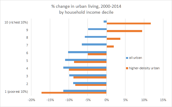
These patterns are extreme.  Just since 2000, among the bottom half of households, by income, there has been more than a 10% shift away from highly dense urban neighborhoods.  These are essentially passively imposed forced relocations.  This is the interpretation that deserves the benefit of the doubt.  To explain it any other way would be like noting how the Super Bowl (where tickets now cost thousands of dollars) is overwhelmingly attended by rich people, and concluding that there has been a shift in preferences.  For some reason, lower income fans just seem to lose interest in football after the regular season ends.  Maybe we need to do an anthropological study about why poor fans don't care about championships as much as they care about pre-season exhibitions.

income deciles
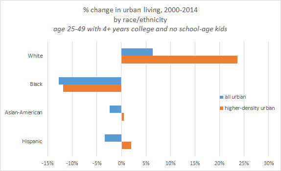
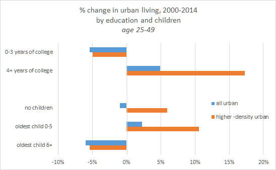
young extrasThere is a lot of discussion these days about increasing market power of corporations.  Larry Summers has an article out on this.  I think I will save a more detailed response for another post.  He concludes that increasing market power is important because all the other explanations for apparent patterns of income stagnation and inequality are mysteriously incompatible with the evidence.  But, he doesn't consider this housing issue.  It's housing that has the increased market power.  And, this power, ironically, comes mostly from "Affordable Housing" policies in the big blue cities.

young raceThe frustrating thing about discussing the economy in terms of market power, is that it sets the discussion up in a satisfying "us vs. them" framing, which is really wrong about everything.  It sets us up to look for confiscatory and obstructionist policies that we expect to level the playing field.  It leads us to spread all of the policies that have created the problem to an even broader set of agents.

We are the 100%.  The solution to all of these problems is building.  That means developers making profits on new buildings.  It means letting cities grow.  Like no other issue I have studied, this housing problem highlights the damage of "us vs. them" thinking, and the shared benefits of an open society and a free economy.

I try to avoid tribal politics, but it is really distasteful to me to see the class warfare and anti-market rhetoric that imbues so much of the anti-building activism.  Then, when those policies make refugees out of a sizeable portion of the working class households of those cities, the response is more class warfare.  The corporations have too much power!  Taxes on the rich are too low! We must be subsidizing those gauche suburbs too much!  Raise the minimum wage so corporations that have too much market power have to pay poor workers enough to pay their exorbitant rents!

"The business model of Wall Street is fraud."  And, what was "Wall Street's" big sin?  Building houses in Riverside, and Phoenix, and Atlanta for those refugees.  And we put a stop to it.  We are nearly unanimous in our support for the housing bust.  Nothing unites America these days like our agreement on this.
The policy impositions of urban activists have turned their cities into a post-modern dustbowl and the jalopies are lined up on I-10, now moving back east.  How extreme does this have to get before we can expect a little introspection?  Unfortunately, I'm afraid that love politics means never having to say you're sorry.

Monday, March 21, 2016

Housing: Part 129 - Trade, Housing, and Employment

Outsourcing manufacturing to developing economies no more leads to a trade deficit for the US than outsourcing the design of cell phones and PC software leads to a trade deficit for Australia or China.  The balance of trade is a reflection of capital flows.

The economic rents captured by real estate owners, firms, and high income workers in Closed Access cities are paying for all those imports.  There is no balance of exports we have to create to make up for those imports.

Source
If we solved our urban housing problem, the trade deficit would largely go away.  This, in and of itself, would be a bad thing for the US as a whole.  It would mean that foreigners have stopped sending us lots of goods and services in exchange for our over-valued services.

Source
But, it would also mean that we would all have more innovative goods and services at lower prices and the cost of living for all Americans would decline significantly, especially those in Closed Access cities.  The trade deficit is related to variance in incomes and a "rigged" economy, if you will.  But, not in the way it is usually described.  It has little to do with "billionaires" or "Wall Street".  The rigging is being done by planning commissions in LA, San Francisco & Silicon Valley, New York City, and Boston.

It's a shame that if we fixed this problem, the simultaneous improvement in broad real American incomes and the decline in the trade deficit would be taken as evidence that trade is harmful.

PS. Drops in manufacturing employment are clearly associated with recessions.  Yet, there is no bounce back during recoveries.  If this is, indeed, attributed to global trade patterns, shouldn't our first obvious response be to change our status as the country with the world's highest corporate income tax?

Oddly, a common response to this is that effective corporate tax rates are actually not that high, because corporations arrange for so many favorable tax breaks.  The largest supposed tax break, by far, is to move operations and revenues out of the country to literally any other place in the world.  But, for the sake of argument, let's say there are so many domestic tax breaks that corporations really do pay competitive tax rates in the US.  So, this argument basically says that US corporate tax policy is fine because as long as corporations curry favor from politicians, they can get a competitive tax treatment in the US.  This argument basically demands that corporations rig the tax system.  Because, if they don't, locating production in the US saddles them with a 10%+ disadvantage compared to the rest of the world.

In the realm of people who equate trade deficits with falling US manufacturing employment, I see two camps.  (1) those who wish to impose punitive policies on foreign producers and (2) those who wish to impose punitive policies on US corporations.

There is an argument that we need to strike a balance between stability and growth.  But, as a first step, we need to recognize where arguments against international trade are simply a subset of arguments against progress in general.  Where that is the case, proposed solutions to the dislocations caused by international trade need to be convincing in the generalized case as solutions to the dislocations caused by general progress.


PPS. If dislocations from trade are a concern, reducing the cost of dislocations seems like the primary issue.  Some of the concern over trade with, say, China seems to me like it might be measuring the decline in labor mobility that has coincided with the rise of China.  This recent paper (pdf) seems to have some interesting findings on that issue (HT: AT).  They did not find a correlation with land use regulations and declining labor mobility.  But, I can't help but notice the pattern of inter-state migration around the long term trend and the pattern of housing starts and shipments over the same period.  The movement of labor migration above trend at the height of the housing boom and the sharp drop below trend after the bust seem to support the idea that the housing boom was facilitating an escape from high cost cities.  The peculiar character of the housing supply crisis may muddy the waters a bit on this sort of topic, because the migration was away from high costs and to low costs.  It wasn't necessarily away from low employment and to high employment.  The constraints of anti-development forces have reversed the normal trends of human migration, so the footprints of this movement in the data will frequently be counterintuitive.  Low income households are being driven away from cities that generate lucrative labor opportunities.