 |
| Source |
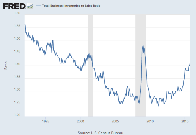
Any IW readers have an explanation for this? I'm perplexed. Keep in mind, your explanation needs to explain why the uptrend goes back to 2012 and why there was a sharp uptick in late 2014 and why the higher level has persisted for a year, with recent strength.
the early part of the uptrend was just business restocking after the recession...the past year is pretty simple; there are considerably more sales of oil and oil products than their are inventories, so when their price is cut in half, a lot of nominal sales are lost, but less so inventory, skewing the ratio...
ReplyDeleteAh. So it's an oil issue....I didn't think about that.
DeleteYou managed to explain all of the trend shifts in 3 sentences. Well done!
Thanks.
I believe there is an inventory build ex-petroleum as well. The economy is slowing...ISM<50.
ReplyDeleteThe oil explanation does fit with the 2014 uptick, though. So, I suppose it's a matter of scale. If ex-oil it would be at 1.3, and we were seeing the little uptick we do now, I don't think I would be looking at this indicator as anything very important.
Deletebusiness inventories include factory inventories, wholesale inventories and retail inventories;
Deletedetails on factory sales and inventories are here: http://www.census.gov/manufacturing/m3/prel/pdf/s-i-o.pdf
you'll see that includes a lot of processed commodities, food and petrolem products..
wholesale sales and inventories are here: http://www2.census.gov/wholesale/pdf/mwts/currentwhl.pdf
again, wholesale foods and oil products weigh heavily..
and the retail inventories are included with the overall report:
https://www.census.gov/mtis/www/data/pdf/mtis_current.pdf
all those report show the ratios by industry or product type, and there are a few where the ratio is out of line with the historical norm...but you really can't tell anything from looking at the nominal aggregate like the chart does, especially where prices of some components are going in opposite directions...
Thanks, rjs.
DeleteIf it helps narrow the field of suspects, the trend for merchant wholesalers seems to very closely track the pattern shown in the Total Business inventories to sales ratio:
ReplyDeletehttps://research.stlouisfed.org/fred2/series/WHLSLRIRSA
Getting into the detail:
http://www.census.gov/econ/currentdata/?programCode=MWTS
It's primarily metals, minerals and machinery.
Thanks
Delete