Tuesday, June 16, 2015

Looking some more at an at-risk based interest rate model.

In the previous post, I discussed the possibility of using the at-risk rate as the starting point for discount rate models instead of the risk-free rate.  This rate seems to be fairly stable over time, allowing it to be a useful benchmark.  From this we would first deduct a "fixed income" discount.  This would get us to a simple version of the Capital Asset Pricing Model, where required returns on equity are equal to the risk free rate on long term bonds plus an Equity Risk Premium (ERP).  I would treat the ERP as a discount from the at-risk rate for avoiding cash flow uncertainty, rather than a premium added to the risk-free rate for taking on uncertainty.  This is semantic, but I think it is a first step toward a more coherent framework for thinking about market values over time.

Then, there is a further discount within fixed income for maturity, which is the discount one accepts for avoiding duration risk.


Cyclical Movements in Long Term Interest Rates

Imagining discount rates in this way gives a different flavor to monetary policy, I think.  The Fed tends to focus on short term rates.  But, if we look at, say, the iShares Core Aggregate Bond Fund, a benchmark for the high quality bond market, it has a long-running average duration of around 5 years, which is between the duration of 5 year and 7 year treasuries.  This is the duration of the typical fixed income security in the US economy.  So, the movement of rates among these durations is a more accurate measure of credit markets than movement of overnight rates.

One signal of cyclical disequilibrium is the discount accepted for avoiding duration risk.  It seems like, if we are using interest rates as a measure of monetary policy, a better signal of optimal policy would be a quickly recovering short term yield, which would be reflected in compression of rates among the higher durations.

Here is a graph of several durations of treasuries.  Note that 5 and 7 year treasuries move more closely in line with long term bonds than with short term bills.  Deviations in short term rates tend to reflect steep short-term yield curves, where rates are expected to fairly quickly recover (excepting the recent zero lower bound problem).


Before 1990, 5 and 7 year rates remained very close to long term rates throughout the cycle.  And when short term rates rose, long term rates tended to rise also.  In the 1991 contraction, we began to see periods where 5-7 year rates pulled down below long term rates, reflecting an expectation of slow recovery.  A lack of any inflation recovery during this time suggests that short term interest rates were not below the natural rate.  (It is worth noting that throughout the 1980s, the yield curve was fairly steep at the very short end, and flat at the mid and longer ranges, even while inflation was plummeting and remaining low.  Rates at the very short term range don't have that much of an effect on at-risk investment.)  But, when short term rates did rise in the 1990s, long term rates compressed and the full range of durations rose with them.

Source
In the 2000s, we continued to see these extended periods where 5 to 7 year rates fall below long term rates.  And, in the 2004 recovery period as well as today, the Fed is raising short term rates while that separation remains.  And, long term rates did not rise with short term rates.  So, compression happened, not as a function of recovered long term risk perceptions, but because of Fed tightening.  By the end of 2005, after the recovery of inflation from the very low levels of the recession, much of the excess inflation was coming from this premature tightening, which cut the bottom out of new housing starts, and sent rent inflation soaring.  Core inflation (less shelter) never crossed above 2% except for a couple brief periods in 2008 and 2010.

There is an assumption that the low short term rate was funneling cheap credit into risky investments, but a steep yield curve at short durations had been the norm for 20 years in a declining inflation environment, and, if we look at this from the long-term at-risk point of view, with discounts for risk aversion, the unusual spread between 5-7 year treasuries and long term rates was signaling risk aversion among savers.

Today is even worse than in 2004, because then the brief housing recovery did reduce shelter inflation before the tightening undermined new building.  Today we are already dealing with rent inflation and a lack of building.  A bold loosening in mortgage markets could counteract monetary policy now, but while there have been some signs of that, a full recovery of mortgage growth might require several fundamental shifts in the banking sector that would give borrowers with less than perfect credit access to the market, and this portion of the market seems totally blocked out right now.

So, looking at this from a bottom-up perspective, the Fed could raise short term rates to 2%, compressing long term rates from the bottom.  And, they could be looking at 2.5% inflation that is really 1.5% after factoring in the lack of housing supply, and they would think that low long term rates are stimulative, and high inflation is a sign of overheating.  If we are using interest rates as our monetary communication device, wouldn't it be nice if the Fed announced that they wouldn't begin to tighten until 7 year rates converged toward 30 year rates?


Secular Movements in Long Term Interest Rates

I had speculated that there could also be a secular benefit to seeing rates from this perspective, and that high long term rates and a low ERP (reflecting a low fixed income discount) would change the shape of investments, pushing investments into longer-focused, more risky projects.  Qualitatively, this seems to have been the case in the late 1990s, where a very low ERP was coincident with the internet boom.

Of course, the 15 years since then have not exactly been heralded as an era of high growth.   But, if we look at real GDP / Labor Force growth, there is actually a seemingly tight relationship between stock returns and GDP/LFP growth.

My proxy here for bond returns is based on the interest rate of Moody's AAA corporate bond yields.  There is not a systematic relationship here because long-term persistent trends in inflation have had a large effect on the real returns on fixed rate nominal bonds.  Although, the return on real bonds doesn't necessarily look like it would have any more systematic relationship to GDP growth.

The lack of a bond relationship suggests that my speculation doesn't hold.  Even if the theory can be defended, it looks like future growth is overwhelmed by real and nominal shocks.  So, it is the real GDP growth that is the causal factor in the relationship between equity returns and GDP/LF growth.

GDP growth is on the right scale and stock returns are on the left scale.  Long term stock returns follow pretty closely alongside GDP/LF growth rates, but with a scale about 10 times larger.  Over time, equities gain (lose) from the proportional rise (fall) of GDP, but much of the gain in returns should be coming from related higher (lower) growth expectations, since required total returns are fairly stable.  Here is a graph of total required returns to equity, based on Damodaran's measured ERP.  There is a bit of a dip in the early 70s and a bump in the early 80s, but this is partly due to the difficulty of estimating real bond rates during volatile inflationary periods.  Inflation expectations would be somewhat backward looking, and would depend on expectations of Fed behavior.  I have simply deducted GDP inflation from bond rates, here.  Inflation expectations were probably a little lower than actual inflation in the early 70s and slightly higher than actual inflation in the early 80s.  So, there was probably a brief period of higher required returns in the early 1980s, but not as pronounced as it looks in this graph.

To the extent that there was movement in the required total return, a low discount rate in the 1970s would have called for a higher relative valuation and the high rate in the 1980s would have called for a lower relative valuation, so this was working in the opposite direction of equity price trends and growth expectations trends, at any rate.  The idea of a low ERP being a policy target that would raise future growth levels appears to be weak.  ERP levels appear to be a lagging indicator.  So, they tend to decline when business cycles have been long and shallow.  Low ERPs are less a guarantee that we will do well than a sign that we have been doing well.


Equity Risk Premiums and Capital Income

But, even though low risk aversion either doesn't improve our capital allocation decisions or doesn't overcome the uncertain noise of real shocks, in the here and now, where the future has not yet been manifest, it still has an effect.

"dlr" left some great comments on the previous post, and put some firm doubts on the idea that corporate income wasn't down as sharply in the late 1990s as the BEA suggests.  But, I believe that there is still evidence that stability and high real growth expectations are related to current high compensation levels.

I don't ascribe to the notion that transfers from capital to labor are something good, in and of themselves.  Labor income is measured in terms of time, but capital income is measured in terms of time and risk.  So, this is a sort of free lunch.  In times of low perceived risk, capital owners gain the same level of utility from less income.  Naional income has risen, even if we don't have a simple way of describing or measuring it, because the rise is coming from a change in capital's denominator (risk).  Some of that unmeasured extra income accrues to labor.

These are a couple of graphs that I have shown before, along these lines.

And, real wage growth moves pretty strongly with the unemployment rate.  Here are a couple of graphs comparing real wage growth and the unemployment rate, first in a scatterplot, then in a line graph.  Nominal stability leads to higher growth expectations, lower ERP, lower unemployment, and higher wages.  And, these are hourly wages of production workers, so confusion caused by stock options and returns to entrepreneurs in the 1990s should not have an effect on this measure.  In fact, I would argue that real wage growth has been understated since 1995, since some of the inflation is coming from the supply problem in housing.

Source: http://www.frbsf.org/economic-research/files/JEP-slides.pdf
The Beveridge Curve moved to the right in the 1970s and early 1980s and appears to have shifted back to the right again recently, due to persistent unemployment.  Job openings during these high ERP periods appear to remain at normal levels, but unemployment rises.  That suggests that job openings per unemployed worker is not as large of a factor in real wage growth as the unemployment rate is.

One common bit of wisdom that I think is mistaken is that low unemployment will lead to inflation from rising wages.  But, I think employers are too forward looking for this.  They don't tend to raise wage rates in an inflationary response to temporary labor supply factors.  There are too many frictions related to their many cost considerations for this to happen.  The lack of a wage response to job openings corroborates this idea.

Instead, real wage growth is related to unemployment levels because the growth in wages is coming from labor supply.  In a low risk environment, employees are more free to move to higher productivity positions and better matches for their skills and characters.  Real wage growth comes from better job matching and more fluid labor markets.  In a way, the unemployment rate is a proxy for labor's "ERP" - the Employee Risk Premium.  And, this ties into the idea that lower ERPs lead to higher wages.

Another way to look at this is to think of an employment contract as having an embedded interest rate swap, where the employer naturally takes on the residual cyclical risks.  When ERPs (both kinds) are low, the discount that employees must accept in their employment contracts is lower, and wages are higher.  But, again, this comes from a complex foundation of risks, so the higher wage it leads to is higher in real terms.  The employer does not need to compensate with higher revenues because they are being compensated through lower perceived risk.

Friday, June 12, 2015

Behavioral Finance is the wrong framing for equities

Here is a new paper, on VoxEU (HT: EV).  A key section of the VoxEU summary:
Various studies, beginning with Shiller (1981) have concluded that the volatility in the stock market is too great to represent forecasts of future dividends or other measures of cash flows of corporations. As memorably described by Shiller, the stock market appears to exhibit ‘excess’ volatility, namely volatility that cannot be attributed to rational factors and rather reflects (in the words of Keynes) the ‘animal spirits’ of investors. 
Rare disaster models offer an alternative way to understand excess volatility. Rather than reflecting the day-to-day whims of investors, stock market fluctuations could reflect investors' changing views of the probability of a rare disaster. An increased probability of a disaster implies that future earnings are likely to be both lower and more risky. These effects combine to lower equity prices, even if a disaster itself does not take place. Thus, stock returns, which incorporate these probabilities, can be far more volatile than dividends or consumption, which reflect (primarily) the disaster itself.

I think this is a much more helpful way of imagining equity behavior than behavioral explanations of cognitive biases, fickle moods of fear and greed, and wildly fluctuating required return expectations.  I also happened to see this at an interesting blog called Spontaneous Finance, written by Julien Noizet (the post I am excerpting is a guest post by Justin Merrill.):
The natural rate of interest is equal to the return on assets for corporations. Most economists that try to model the natural rate mistakenly do it as the risk free rate or the policy rate. This is a misreading of Wicksell since he identified the “market rate” as the rate which banks charge for loans, and the important thing was the difference between the market rate and the natural rate.

This all corroborates with my intuition - to begin with the required return on corporate assets and to discount from that to get to low risk securities, instead of starting with a risk free rate and adding risk premiums.  As the Vox paper points out, there are many separate issues going on with equity valuations through a volatile episode, but, the net result appears to create a quite stable level of required returns on corporate assets.  We can model equities based on (1) earnings, (2) growth expectations, and (3) the discount rate.  If the sorts of risks about future changes in income in the Vox paper are manifest in growth expectations, equity valuations become kind of boring.

The discount rate appears to be quite stable over a long period of time - around 6-8%, in real terms, depending on the range of corporations included.  And, there appear to be countervailing influences on growth expectations through the business cycle.  There is a natural tendency for mean reversion, because equity owners are the residual claimants on national income, they tend to experience extreme income fluctuations through business corrections, which are basically disequilibrium episodes.  If the economy does recovery, that disequilibrium will dissipate, and corporate income will return to its natural level as a portion of national income (which is also very stable over time).  But, as Jerry Tsai and Jessica Wachter argue in the Vox paper, risks about the reliability of recovery are especially high during these contractions.  These risks include the possibility of outlier events, and the ability of firms to handle them, that create a drag on probabilistic growth forecasts.  In practice, the added risks related to contractions appear to generally mitigate the expectation of mean reversion, so that growth rates also tend to remain fairly stable over time.


This leaves earnings as the primary source of volatility in equity valuations, and, helpfully, this is a variable that is widely measured, tracked, and forecasted.  As the chart above shows, corporate valuations and earnings move together most of the time.  Even the large swings in valuations since 2003 have largely been in proportion to changes in earnings.  There are two distinct periods where valuations were untethered from earnings.  These periods coincide with unusually low real growth expectations in the 1970s and unusually high growth expectations in the late 1990s.*  In other words, even in the cases where valuations fluctuated, a fluctuating natural interest rate (on corporate returns) is not the likely explanation.

Now, one could argue that this is simply a semantic distinction - that I am just taking "animal spirits" that Robert Shiller would identify as a fickle discount rate and re-categorizing them as deviations in the growth rate.  But, even to the extent that that is the case, this framing makes equity markets much more simple and conceptually manageable.  There is no need to endlessly argue about unidentifiable investor sentiments.  The vast majority of relative equity valuations simply comes down to earnings.  And, where there has been a persistent deviation from the expected valuation, there have been reasonably identifiable sources of deviating growth expectations.  If you take a tactical position, you don't need to put a mood ring on the marginal investor.  You just need to justify a different growth expectation.  You don't even need to think about Treasury Rates, Equity Yields, or Equity Risk Premiums.

Equity valuations, compared to earnings, are roughly at the level trend that, with a little noise on either side and two distinct deviations, has been in effect for 50 years, and corporate growth expectations, which include significant foreign revenues, are 5 1/2% - a bit less than long term NGDP growth.  A bearish position here based on "bubbles" seems wrong.  A bearish position needs to depend on extremely low growth rates or a contractionary shock.


* I admit that the very low valuations of the 1970s are a bit of a mystery to me.  An explanation that I don't quite trust, because it fits my political priors, is that this was the result of the pro-consumption public policy at the time.  High inflation, together with policies such as high minimum wage levels and new public transfer programs, were geared toward the sort of pro-consumption goals that are still associated with a Keynesian paradigm.  Possibly the result of those pro-consumption policies came at the expense of growth oriented investment.

But, what's interesting is that the low real growth expectations caused valuations to fall below relative earnings as much by pushing earnings up as by pulling valuations down.  When expected growth is low, corporations require a larger portion of current income to satisfy investors.  Future corporate growth expectations don't just create higher future incomes.  They create higher relative compensation today because corporate owners substitute expected future cash flows for current cash flows.

And, look at what happened when the Reagan era supply side policies replaced the demand side policies of the 1970s.  I think most people would be surprised to learn that nonfinancial corporate profits didn't top the 1979 level until 1992, after 12 years of the Reagan and Bush presidencies, during a decade when Democrats sponsored tax cuts and the New York Times was against the minimum wage.  And, these are nominal figures while inflation was still high during this period.  From 1Q 1979 to 3Q 1986, nonfinancial corporate earnings fell 60%, in real terms.

Part of this was due to the high inflation premium going to debt, and I have argued that when considering returns to corporate assets as a portion of national income, operating profits to Enterprise Value is more appropriate.  So, here is a graph that adds interest expense and debt to the data.  I have also adjusted the numbers with the GDP deflator.  And, even with high interest payments included, real income on corporate capital declined from 1979 to 1986 and was just above the 1979 level in 1992.

In terms of the main topic of this post, using operating profit and enterprise value still tends to show valuations and profits moving together over time, but here the lag in valuation persists a little longer into the 1980s than it did when we just looked at profits and equity values.

And, we see the same result in the opposite directions in the late 1990s.  There, the high growth expectations caused valuations to soar.  And, since so much of the value of equities was based on future cash flows, corporate owners did not require current income to justify their investments.  So, by any measure, profits were falling during the boom years of the late 1990s, well before the 2000 recession.

In addition to suggesting the downward influence that growth expectations have on current capital income, this also belies the cynical myth that financial markets shortsightedly chase the next quarterly earnings report at the expense of long term value.  First, there is a consistent baseline of boring valuations that simply don't change that much relative to earnings.  But, when they do deviate, they deviate in the opposite direction from this myth.  When current profits were high at the expense of long term growth, equity values plummeted, and when current profits were low while firms plowed investment into highly uncertain long-term growth, equity values soared.

This is like one of those contradictions in consensus ideas that Marc Andreessen likes to tweet.  Everyone simultaneously knows that (1) financial markets are obsessed with short term earnings and (2) financial markets push us into recessions by throwing billions of dollars at outrageous tech. businesses that have no prayer of ever making decent profits.

Housing Tax Policy, A Series: Part 39 - Housing Values and Investment

In the previous post of the housing series, I discussed the ironic source of residential fixed investment during the housing boom.  Because our major metropolitan areas have limited the expansion of housing in their cities, households have had to substitute suburban homes in less valuable locations for homes in high value, high density cities.  The lack of housing stock in the cities that causes this substitution causes real housing expenditures to decrease while at the same time it causes residential fixed investment to rise, because those households tend to build more valuable houses on less valuable lots.  They are substituting building for location.  In other words, the high level of residential fixed investment was not a result of overconsumption of housing.  It was, ironically, a result of falling consumption due to constricted supply.

This graph might give some more clues to this issue.  As a starting point, the dark red line is the year-over-year (YOY) change in market values of real estate owned by households.  To arrive at the orange line, I have subtracted the YOY change in the S&P/Case Shiller National Home Price Index.  This gives us a rough estimate of how much of the rise in the value of residential real estate was the product of real expansion and how much was price appreciation.  The real increase in household real estate was normal or slightly low during the boom.


The dark blue line is residential fixed investment minus estimated depreciation, as a percentage of real estate market values.  This should give us the same basic result that the price corrected growth of real estate did, and in fact it does give us the same basic behavior, but with less noise.  By these measures, new investment in housing has been in decline for decades, including during the so-called housing "bubble".

Now, take a look at the light blue area.  This is residential fixed investment (RFI) as a proportion of gross rent, scaled to reflect depreciation.  It also tends to follow the same trends as the other investment measures.  But, since it has rent as the denominator instead of market values, the difference between this measure and the others is mathematically simply a reflection of changing Price/Rent ratios.  So, the three periods where RFI/Rent rises above RFI/Price are the periods were Price/Rent has been high.

A high Price/Rent ratio is caused by low long term real interest rates and high rent inflation.  Relatively stable construction costs mean that the higher price accrues to the lot.  This graph shows the replacement cost of houses as a proportion of total market value, and this declined as Price/Rent rose and as rent inflation has accumulated.

During these periods, households substitute building value for lot value.  And, if we look back at the first graph, during expansions, the price adjusted growth rate in real estate values has tended to fall below the growth rate estimated by RFI when Price/Rent (and RFI/rent) has been high.  The RFI measure is a measure of investment in buildings.  The price adjusted YOY change in real estate values is a measure of all real estate - land and buildings.  During these periods, investment in buildings rose but investment in land lagged.

After the cyclical spike in 2001, growth in real housing was low.  We were building a lot of houses where location values were low.  So, homes in the problem cities were climbing in value because of supply constraints and rent inflation - no real new housing value was created there.  And, households priced out of those markets were building "McMansions" in the hinterlands for a fraction of the price on lots with much lower values.


Economic Rents and Real Value

There is a subtle issue to think about here regarding economic rents on land and real economic production.  If we released the constraints on urban building and made it feasible for urban real estate owners to expand housing to its reasonable potential where its value is high, they would earn a large windfall as economic rents on those assets.  But, those rents wouldn't so much reflect a transfer of income as they would reflect the creation of value.  The added value provided by the higher capacity of the urban land holdings would increase real household consumption and real incomes of urban households (through falling shelter rent).  The orange line in our graph above would be higher.

Here's a funding idea for city governments in the worst cities (NYC, LA, San Diego, San Francisco, and Washington DC), if they just can't stand to see their land owners reaping a windfall.  Just go around buying up underdeveloped plots in voluntary transactions, then streamline the process for developing them and sell them to developers without restrictions on rent.  They could buy properties for a few million dollars, then allow them to have a high-rise condo building, and sell them to developers for hundreds of millions of dollars.  They could probably fund the city budget that way.  And, eventually rents will fall enough that the new condo buildings will be built for middle class households, and we won't have to keep building "McMansions" in the desert.

The only parties that will be damaged by that program will be the real estate owners who don't sell their properties to the city, and see their property values fall when rents begin to fall.  But, maybe they won't be so upset if the city has eliminated property taxes because of all the new revenue.  It's not that hard to come up with a win-win scenario when your current policy is to needlessly destroy value.


My Rent Inflation Assumption

I have been using core non-shelter inflation as the baseline to estimate the rent inflation that is caused by supply constraints.  I realize this is a little sloppy.  Even lacking regulatory constraints, no two items have the same price behavior over time.

As a general point of view, the cost of replacement graph above confirms the idea that there has been significant inflation in residential land values, above the cost of building.  Here is a graph comparing shelter prices over time to household furnishings and operations and to lumber.  In both of those cases, prices have been falling relative to core CPI, while shelter prices (mostly consisting of rent) have been increasing.  I suspect that, if anything, the use of core minus shelter CPI as a benchmark understates the level of supply-based rent inflation.

Over time, there could be some non-inflationary lot appreciation.  For instance, in fast growing cities like Phoenix, Houston, or Las Vegas, homes which were purchased and then subsequently had the city grow around them, probably experienced real value gains due to the value of living near newly developed amenities.  I don't know if the BLS accounts for that sort of hedonic adjustment or not.

On the other hand, while building in high-rise areas of core cities would be expensive even without regulatory barriers, it would generally be reflected in higher price levels, not ongoing inflation.  Skyscrapers may be somewhat more expensive than McMansions, per square foot of living area, but they aren't progressively getting more expensive over time.  So, natural price levels of housing in the cities might tend to be high, but there is not a natural reason for rent inflation to be high there.

Thursday, June 11, 2015

Mortgage trends in 2015 Q1

Why can't anything be easy?  2015 1Q Flow of Funds data came out this morning.  I have been hoping for regulatory and market adjustments to allow for more expansion of mortgage expansion, which would help to push home prices back up to intrinsic values and would provide investment demand, pulling interest rates up.  The convergence of interest rates and returns to real estate would earn profit for a position short on bonds and long on housing.

But, real estate loans retained at the banks have stalled in the past month, and while mortgage levels measured by Flow of Funds had stopped declining, they have been level.  This is a little bit surprising to me compared to anecdotal information I'm seeing in the Phoenix area.  It's a sellers market, and households with decent credit seem to be able to mortgage new home purchases.  Home price growth has started to turn up again, but it seems like there is enough activity to trigger more new building and to push mortgage levels up.

In 2015 1Q, mortgage levels actually turned down again.  But, the re-acceleration of home prices, combined with the decline in mortgage levels, caused household real estate equity to jump a full point, from 54.6% to 55.6%.  Before the real estate collapse, equity levels had been ranging between 58% and 60%.  Maybe under the new regulatory and market pressures, equity levels will tend to be higher, so that there isn't anything special about hitting that range.  But, it seems like some sort of signal of healing markets, if only because it would suggest that households would be less encumbered by negative or negligible home equity levels that prevent refinancing and home selling.

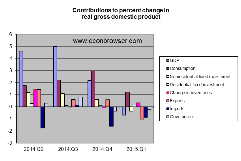
I don't have any direct evidence of a connection between foreign capital and these movements, but it does seem fitting that a large part of the decline in 2015 1Q GDP came from a larger trade deficit.  That suggests that there was a surge of foreign capital, which could be the source of price strength in housing without any domestic mortgage growth.

This complicates the housing/treasuries position.  The foreign capital will probably affect prices more than new homebuilding.  If mortgages continue to stagnate, this means that the homebuilder portion of the position will probably have a delayed reaction, and highly leveraged homebuilders like Hovnanian will need to muddle through a few more quarters before there is a positive growth surprise.  On the interest rate side, this has less clear implications than mortgage growth would have had.  New housing value grows the capital base, but I'm not sure of the effect on interest rates.  It wouldn't have as strong of an effect on the investment/savings balance as new building would.  So, I am not sure if interest rates will fall back because of the lack of mortgage growth or if they will remain fairly stable or rise slowly.  The uncertainty has pulled me out of the interest rate position, but I'm afraid that I will watch the potential profits slowly accrue to that position as I watch from the sidelines.

Wednesday, June 10, 2015

Housing Tax Policy, A Series: Part 38 - The World Record for Reasoning from a Price Change

As I was reading the 1000th account of our supposed pre-crisis over-investment in housing this morning, I realized that this whole chapter must be the most gargantuan example of reasoning from a price change, ever.  It wasn't the level of residential investment that triggered the panic about the housing market.  It was the change that we saw in prices.

I have argued that rising Price/Rent ratios were generally exogenous to the housing market - related to broader trends in interest rates and global capital flows.  Given the change in Price/Rent that we have seen, how would the reaction to the housing boom have changed if there were fewer constraints on housing expansion?  What if, instead of seeing higher rents on a more constrained housing supply we had seen falling rents on a less constrained housing supply?  Residential investment would have been higher, because there would have been more building.  Nominal price increases on homes would have been lower.  And, as a result of all of that extra residential investment, there would be much less moaning today about overinvestment in housing.  Reasoning from a price change leads everyone 180 degrees to the wrong conclusion.


Home Prices were high because Rent Inflation was high

In a previous post, I presented the case that the rise in home prices can be entirely accounted for with (1) the effect of long term discount rates on intrinsic values and (2) the full effect of rising rents on home values.  This is one of several graphs included in that post.

But, I neglected to take the next step in that analysis.  What would the counterfactual be if rent inflation had matched the inflation rate over this time of all the other non-rent elements of core CPI?

Next is a graph of home prices, nationally and in the Case Shiller 10 city index, along with a model of home prices based on long term discount rates, rent levels, and rent inflation rates.  And I have added the modeled national home price level, based on a counterfactual where rent inflation had equaled Core inflation (excluding rent).

How much concern would there have been about overinvestment in housing if home prices had only doubled in 20 years, instead of quadrupling (basically tracking inflation)?

Even the high real estate values that have persisted since the crisis would not have materialized, because the high intrinsic values now are a product of very low long term interest rates that are themselves the product of the collapse of real estate capital markets.


Rent Inflation was high because Residential Fixed Investment was Too Low

The amount of additional residential investment that would have been required in order to reduce rent inflation to levels to this counterfactual level would be a product of the elasticity of housing demand.  The next graph compares real and nominal housing expenditures.  Nominal expenditures have been level since the early 1960s.  (Homeownership rose after the Great Depression until it reached about 63% in the mid-1960s, which is roughly where it has remained since, except for the temporary push up to about 69% in the 2000s.)  Since 1995, when the latest period of rent inflation began, centered around the major coastal metro areas, real housing expenditures have fallen sharply while nominal expenditures remained level, as a proportion of personal consumption expenditures.  The long stability of nominal housing expenditures suggests a unitary elasticity of demand.  This is apparently slightly higher than the typical finding of slightly less than 1.  Households in the problem cities spend about 5% more of their incomes on housing than households in the rest of the country, which also suggests somewhat inelastic demand.  Possibly, national nominal spending on housing over this period increased slightly as a result of added tax benefits to home ownership.  This could explain why slightly inelastic demand hasn't led to a slight decline in nominal spending on housing as real housing expenditures have declined.

Long term elasticity of housing supply is generally found to be very high, which should make persistent rent inflation implausible.  This mystery fits well into the narrative that I am developing that regulatory limits to housing in the large metro areas is the driving factor in persistent rent inflation, and that rent inflation reflects the relative substitutability of real estate outside these areas for the preferred locations where building has been limited.

The average is mis-labeled.  It is for 1962-1995.
The next graph shows residential fixed investment over time.  When we eliminate the cyclical movements, I think this suggests that expenditures are very sensitive to small changes in residential fixed investment.  From 1962 to 1995, residential fixed investment (shown in the graph) averaged about 7.5% of GDP, and both nominal and real housing expenditures were at about the same level at the end of that period as they had been at the beginning.  From 1947 to 1962, nominal housing expenditures as a portion of PCE skyrocketed from about 11% to about 18%.  During this period, residential fixed investment was only about 1% above the 1962-1995 average.  And, from 1982 to 2007, when real housing expenditures fell, residential investment as a proportion of GDP averaged 7.3%, just 0.2% below the 1962 to 1995 average.  The secular variations in residential investment are smaller than the variations we see through the business cycle.

I have adjusted residential investment to create a counterfactual that would have led to stable real housing expenditures (and stable nominal expenditures, assuming unitary demand elasticity).  For instance, if real housing expenditures decline 0.25% in a given year, the counterfactural residential investment is adjusted upward by 0.25% of the value of residential real estate owned by households.  As the cyclically adjusted stability of residential investment suggest, it would appear to have taken a very small change in total residential investment to counter rent inflation.

Because this problem has been so persistent, it is easy to assume that rent inflation is a natural part of city dynamics.  The many growing metro areas that don't share this characteristic should serve as evidence against this notion.  And, if we look at rent inflation over time, we see behavior that appears to relate to the level of residential investment.  When building was allowed to expand, we did not have persistent rent inflation.  From the beginning of the core inflation series in the late 1950s until the late 1970s, shelter and core inflation generally moved together.  Shelter inflation first moved significantly above core inflation during the building contraction associated with the 1980-1982 recession.  Residential investment failed to move back above the long term average in the ensuing recovery, and so shelter inflation failed to recede back to core inflation levels.  Then, after the 1991 recession, residential fixed investment failed to even reach the long term average until 2003.  And rent inflation has been well above core inflation for most of this period.

The reason that this is even a topic of discussion is because nominal home prices rose to such heights.  Because practically everyone, from populist pundits to skilled economists, is reasoning from a price change, they associate the high home prices with high demand and high residential investment.  But, if only we could have had just a small amount of additional residential investment (focused in the large coastal metro areas, where the natural market supply response has been constrained), home prices would have been tame.  If only residential investment had been higher, nobody would be complaining that it had been too high!


The Substitution of Fixed Investment for Location Value

I made my own error in a recent post where I suggested that urban real estate owners were working against their long term interests by fighting against urban progressives who want to control the housing stock.  I was actually the one being short-sighted in my analysis.  Urban real estate owners do earn excess rents on the artificially high values of their actual properties.  But, they would clearly be better off in absolute dollar terms if they were earning normal returns on their potential properties.

In other words, they would earn much higher profits on their land by financing a 40 story condo building that earned 4% net returns than they earn on the same lot with a couple of duplexes that are currently earning 6% net returns plus 1% annual capital gains from rent inflation.  They are earning excess profit on the land they own, but that land is being prevented from providing the housing stock that it is capable of providing.  It is clearly in their self interest (and our collective interest) for them to develop that land further.

And, I think this adds a subtle twist to the picture of residential fixed investment in the 2000s.  Rent inflation moderated from 2003 to 2005, when residential fixed investment rose.  But, it was still running slightly higher than core inflation.  Why didn't this high level of investment cause rent inflation to fall below core inflation, reverting to lower levels?

The effect of limited building in the cities is that landlords are capturing higher rent for limited housing stock.  If housing wasn't limited, they would be capturing lower rents on expanded housing stock.  So, if housing was allowed to expand in the cities, capital income would be accruing to urban land owners, but it would be accruing to them for providing housing, not for owning an artificially scarce resource.

Now, high rents and limited housing in the cities is pushing households out to the suburbs and exurbs.  One effect of substituting lower value locations for the high value urban locations is that households purchase larger homes.  So, in the constrained context that we have created, fixed residential investment has been inflated.

Residential fixed investment never really rose above the historical range.  But, even the levels it did reach were inflated by our anti-housing metropolitan areas.

If urban development had expanded, households would have favored urban housing where more of their housing expenditures would go to rents on the land.  This is a scenario where capital income would have increased, but as a result of broad improvements in real living standards.  Lower rent on housing would mean that real incomes would be much higher.

Tuesday, June 9, 2015

May 2015 Employment

Last month, I wrote: "Next month will have to be an outlier for unemployment to come in above 5.2%."  So, my perfect track record remains intact.  It was apparently an outlier.  Right again!

So, what's going on?  I think it's a little bit outlier, a little bit persistence in higher unemployment numbers, and a little bit of a lull in employment growth.

Here is my graph comparing insured unemployment and total unemployment.  For 18 months after the end of 2012, there was a steady trend in the decline of very long duration unemployed workers.  Since July 2014, this decline has slowed, although it continues to have a downward trend.  Since July 2014, the red and dark blue lines show the upper and lower bounds of expected total unemployment, based on a continuation of the previous trend at the lower bound and a complete halt to the decline of very long term unemployment at the upper bound.  This month, that range was from 4.8% to 5.3%.  Total unemployment came in at 5.5%.  So, total unemployment has bumped above the range we would expect, given continued unemployment claims.  This is not a pattern we expect to see.  Here is the graph, smoothed, and going back to the 1970s.  There is a counterclockwise pattern that we see through business cycles.  The trigger for a change in trend at this point in the cycle should be a sharp increase in unemployment claims.  But, before that happens, we would expect to see unemployment insurance claims level out while total unemployment continues to fall.  So, the movement of the last few months is probably anomalous, and I would still expect to see a correction down in the unemployment rate of at least 0.2-0.3%.


This bump up in total unemployment is playing out in the shorter unemployment durations.  One reason for this may be dynamics related to Part Time Employment for Economic Reasons, which is still slightly elevated from what we might consider recovery levels.  (Note: The sharp downward shift in 1994 is a measurement change.)  Not only is total unemployment elevated compared to insured unemployment, but the number of job losers is also elevated compared to insured unemployment.  An elevated level of job losers, compared to insured unemployment, seems to have coincided with periods where there were high levels of part time workers for economic reasons.  This might have to do with less universal unemployment insurance claims by part time workers.  So, it may be continued claims that is the false signal right now.  Or, more specifically, we may be seeing temporary frictions from the normalization of the labor market.

We tend to imagine workers having hours cut and then having full time status reinstated.  But, I think we need to be careful about narrative explanations here.  Both labor supply and labor demand have strong influences on the labor market.  (Colloquially, and sometimes academically, we understate the influence of labor supply.)  There is a lot of churn among workers as these markets normalize, and it seems reasonable that some of this exchange between part time and full time could create temporary unemployment from market frictions, even if the causal factor is employment growth that is pulling workers back into the full-time labor market.  In the 1980's, this increased level of unemployment and job losers, relative to insured unemployment, appears to have persisted for several years.  That might be the case again.

JOLTS data appear to continue to show generally positive trends.  This data is a month behind, and a little noisy.  A weighted moving average gives a little faster indication of changing trends, and here Hires and Quits are beginning to show weakness, while Job Openings continues to look very strong.  But, all of these indicators were very strong in late 2014, so it is a little early to call this a problem.

A possible lull in hires might be related to some of the increase in unemployment.  I had expected to see some of the unusually high very short duration unemployment dissipate this month.  But there appears to be a hump of unusual unemployment moving through the durations in the seasonally adjusted data.  On the bright side, very short durations moved back to normal levels this month.  Maybe there has been a temporary hiring lull.

Looking at flows, there has been a decrease in net flows from Unemployed to Employed.  But, flows directly from Not in the Labor Force to Employed continue to be very strong.  In addition, the individual flows all continue to move in positive directions, even though they are at or near full recovery levels.

Any lack of flow out of unemployment into employment appears to be matched by very strong flows back into the labor force and directly into employment.

Wage growth was relatively strong in May.  I only have real wage growth through April (because I use the PCE price index to adjust for inflation).  Wage growth has recently crossed slightly below the long term trend given by the unemployment rate.  But, that should recover slightly this month, once we have inflation numbers.

In total, I think these indicators still point to a healthy labor market and to an unemployment rate that should step down a bit from current levels.  The forces that pushed it from my 5.2% call to the 5.5% print may reflect some persistent headwinds, but I think we should still expect a reversion to a trend in the unemployment rate that is lower than the last couple of months' numbers imply.

Monday, June 8, 2015

National Review Article with Scott Sumner

National Review published an article today by me and Scott Sumner.  For readers coming here from NR, if you are interested in some of the details I have been working on in the housing area, I have about 37 parts of an ongoing series in the calendar links to the right.

Here is a recent post that looks at the drag on real incomes of renting households coming out of the 5 big problem metro areas - New York, San Diego, Los Angeles, San Francisco, and Washington DC.  And here is a follow up rant to that post.

Thanks to Scott and to National Review for generously allowing me to share some of my work.

Thursday, June 4, 2015

Am I missing the boat on the Housing/Treasuries trade?

The pullback in the growth of real estate loans at commercial banks has caused me to pause on the short Eurodollar / long homebuilder position.  But other data is causing me to wonder if I am missing the early moves here.

Today, April CoreLogic data continued to point to re-acceleration of growth in home prices.

And, 1Q GDP looks like it points to a recovery in the global capital flows that draw capital into low risk American assets.  I think that net imports are mainly the result of the exchange between developing economies and US corporations, where US firms take on the risk of productive assets abroad, and developing market savers consume the benefits of trust and liquidity provided by Western economies - especially the US.  This leads to net capital inflows into the US, which are funded with net imports into the US.  We buy goods and services, and we sell liquidity and trust in capital.

About half the drop from trend in 1Q GDP growth came from the trade deficit.  We don't measure these liquidity and trust services as production.  Could this foreign capital lead to housing expansion without being reflected in mortgage expansion?  Maybe in the aggregate, at this stage, it can.  In fact, considering that US households are still holding slightly overleveraged real estate, maybe housing price growth has to come from this capital source before leveraged US households begin contributing to the housing recovery.

Wednesday, June 3, 2015

Housing Tax Policy, A Series: Part 37 - Our perpetual indignation generator

Here's a recent front page story in the Seattle times.  You see, they are proud in Seattle for leading the charge on the $15 per hour minimum wage, because rents have gotten so high that someone working full time at minimum wage levels can't afford to live in most of the apartments in Seattle.

So, demand for apartments in our major cities is high.  In cities that happen to be in "blue" states, where there are more regulatory limits to building, rents have increased.  Demand was increasing and supply was bureaucratically limited.  This meant that new housing consumption was being claimed by higher income households.

(What else could really happen?  The five cities with the lowest rent in the Seattle Times story: Birmingham, Houston, Memphis, Oklahoma City, and Phoenix.  The five hughest: Honolulu, Los Angeles, New York, San Francisco, and Seattle.)

In those high rent cities, the reaction of the locals to these new high income tenants is to put limits on supply.  So rising demand causes rents to rise, which leads these cities to lower supply, which causes rents to rise more.  And, since low income households can't afford rent any more, these cities are starting to raise the minimum wage to unprecedented levels.

The uncontroversial first order effect of these higher minimum wage levels will be a lower quantity of labor demanded.  But, some believe that there will be a mitigating increase in labor demand due to the higher spending of minimum wage workers.  So, what will these workers spend their new higher wages on?  Well, according to those proud advocates in Seattle, they will spend it on rent.

So, now we have again raised demand for housing, which, in this perpetual choose-your-own-adventure saga, takes us back to the beginning of this post.

Meanwhile, real estate owners in blue cities, the beneficiaries of these policies, collect higher rents and capital gains, while a rising cost of living hits low income households the hardest because they spend the most on rent.  And because we haven't been able to force every landlord in every blue city to rent their units for $500 after the local planning commission has managed to make them worth $1,000, this must be the fault of deregulation.  And since there are still some banks willing to issue mortgages on the market value of houses that the planning commission has managed to push from $500,000 to $1,000,000, then this must especially be the fault of banking deregulation.  Thus, the story goes, deregulated markets lead to more income inequality.

And round and round we go in the circle game.

Monday, June 1, 2015

Housing Tax Policy, A Series: Part 36 - We are the 100%, Housing Edition

As I have been working on the piece about limits to urban housing supply, I have coincidentally come across several articles and posts about the problem.

There was this New Yorker piece, with a very interesting reaction from David Glasner to a reaction from Paul Krugman.

There is also this piece at Medium.com (HT: SSC).

The New Yorker piece is about empty storefronts and old neighborhood retail shops driven out by higher rents.  Some snips (emphasis mine):
“High-rent blight” happens when rising property values, usually understood as a sign of prosperity, start to inflict damage on the city economics that Jane Jacobs wrote about...
If high-rent blight hurts New York’s municipal economy, what, if anything, might be done? Because the problem is tied almost inextricably to the value of New York real estate generally, there are no simple fixes. The #SaveNYC movement and the Small Business Congress NYC advocate the regulation of lease renewal. They support a bill written by the small-business advocate Steve Null that tries to limit rent spikes by making commercial-lease-renewal disputes subject to mandatory mediation and arbitration, like some baseball salaries. Gale Brewer, the Manhattan borough president, supports a different regulation of lease renewals, coupled with zoning rules, that encourages landlords to quit waiting for the jackpot and to start renting. Some, like Moss, want to fine landlords who leave storefronts abandoned, in the hope that they’ll then rent to smaller, quirkier companies instead of Chipotle. There may also be other original solutions to the specific problem of high-rent blight, such as, perhaps, finding ways to let pop-up stores use abandoned spaces on a seasonal basis...
Waits, the owner of the House of Cards & Curiosities, doesn’t endorse any particular solution... But, he said, the tax increases passed on by his landlord have pushed individual businesses like his to the “bursting point.” 
Comments from Krugman:
(I)t’s part of a broader story of big money moving in to desirable neighborhoods, and in the process destroying what makes them desirable...
First, when it comes to things that make urban life better or worse, there is absolutely no reason to have faith in the invisible hand of the market...
Still, we’re now arguably looking at something new, as the really wealthy — domestic malefactors of great wealth, but also oligarchs, princelings, and sheiks — buy up prime real estate and leave it vacant... 
In both of these pieces, supply is not even mentioned.  This is practically the literal definition of beating a dead horse.  Those damnable big city developers just won't make spaces available, no matter how hard we tax them and impose mandates on them.

From the Medium piece, which is by Scott Wiener, a member of the San Francisco Board of Supervisors:
Recently, five of my colleagues on the San Francisco Board of Supervisors proposed a moratorium on privately produced housing in the Mission District, as a response to the undeniable housing crisis confronting our entire city and impacting the Mission with particular intensity. Under the moratorium, no housing development of 5 units or more would be permitted. The only exception would be developments with 100% below market rate subsidized units. Even projects in which half the units are affordable to low or moderate income residents would be banned.
Wiener still supports a laundry list of urban real estate controls.  But, he gets the core problem (emphasis mine):
New residents aren’t moving to the Mission because of new development; rather, they’re moving to the Mission because of the Mission, amazing as it is. People who want to move to the Mission will move there with or without new development. And, without additional housing, they will put more and more pressure on the existing housing stock. Evictions and displacement are the inevitable result of that pressure...
(E)liminating that housing production isn’t going to help anyone, other than existing property owners whose property will become more valuable...
And, yes, in addition to the need for affordable housing, the overall supply of housing matters... Earlier this year, I authored a piece positing that the law of supply and demand applies to housing in San Francisco. While some melodramatically attacked me as channeling the ghost of Ronald Reagan for making that basic point, it really isn’t controversial... Cities that have produced significant new housing — even cities with growing populations — have seen reductions in rents

That last link in Wiener's piece suggests that New York City and Washington DC are loosening the clamps on supply.  But, the reaction from Wiener's fellow San Francisco council members doesn't bode well for San Francisco.  The irony is that the position these urban progressives are taking is basically that we can't allow market forces to dictate housing supply because the wrong sorts of people might end up moving in.  Since in today's political landscape, that's an acceptable position to have, as long as it is taken toward Krugman's "malefactors", it is spoken quite plainly - with moral fervor, even.  And, if everyone has to suffer in order to make sure those people don't move in and ruin everything, then that is what we will do.  And, in the meantime, we will try to impose controls on what market supply still remains that make sure as many of the right sorts of people remain as possible.  It's the 21st century bizarro version of white flight.  I guess that's moral progress of some sort.  The complex mesh of San Franciscan regulations are like bizarro versions of the old racist CC&R's.  You can build housing there if the tenants aren't white or if they have an income below a certain amount, or maybe exceptions can be made if the realtor can confirm that potential tenants were visibly moved while contemplating a Cristopher Wool painting.  But, somehow the uncultured rich white people keep coming anyway.

The further irony is that the surest way to be one of Krugman's "malefactors" is to own real estate in a large progressive city with strong "affordable housing" policies.  But that's just the start of the irony.  This looks like a classic Baptist and Bootlegger situation, where moralists are the public face for a policy that benefits rent-seekers.  But, that would mean that Wiener's opponents are secretly supported by real estate moguls.  I doubt that is the case.  These people all seem sincere.  They really seem to want poorer outcomes for the landlords and developers that they are inadvertently benefitting.  And, I suspect that the landlords and developers work sincerely and fervently to overturn these policies.  In their day-to-day work, they are constantly prevented from managing their properties as they see fit.  When they design new properties, they are consistently imposed upon in ways that make viable projects unviable.

So, everyone works - actively works - against their own long term interests.  Politics is how these social justice advocates work against their long term interests  (or at least their stated goal of having low cost housing).  Markets is how these capitalists would work against their long term interests as regulatory rentiers.  New supply is the only sustainable way that rents and real estate valuations will revert back down to prices that reflect their unencumbered costs.  For this to happen - really the only sustainable way for this to happen - is for new capital to compete with existing capital.  So, total capital will rise, and in absolute terms, there will be more profits.  But returns will be lower, and the "malefactors" will revert back to just investors making an honest market return.  Big city progressives won't allow this to happen because a world where their political control isn't imposed on both production and consumption is, by their definition, a moral failure.  The only way this is distinguishable from old-school social conservatism or sectarianism is that the in-groups and out-groups have been jumbled.  But the outcome demeans everyone, just the same.

Proponents of these supply constraints want exclusivity.  That is what they are calling for, explicitly.  The supply constraint is a first step in achieving that.  But, markets don't create exclusivity in a way that they can control, and exclusivity determined by money seems especially vulgar.  So, painting the households that can afford the artificially scarce housing as "malefactors" is a way to make the manifestation of exclusivity through markets seem more vulgar, giving the preferred forms of exclusivity a patina of moral superiority.  They are saving these neighborhoods.  As the San Francisco supervisor complains regarding Wiener's position, "Let me be clear - not a single affordable housing activist denies the existence of the law of supply and demand...the policies they are pushing aren't referred to by liberals as 'supply and demand' they're called 'free market development' - otherwise known as deregulation."  He understands supply and demand.  He just prefers his own exclusivity to the market's.  And, while no sane observer would include San Franciscan real estate in a list of "deregulated" markets, it must seem that way when you are trying to enforce a strict and peculiar form of exclusivity in a free society.

It's a classic case of the seen vs. the unseen.  The landlord has a building that would cost $10 million to build, and would have units that rent for $1,000 a month.  But, since the city has longstanding barriers to profitable building, it's a $40 million building with units that rent for $4,000 a month, except that the city objects to having $4,000 units, so they force the landlord to rent them for $3,000.  Of course the landlord is upset.  To him, this is clearly a $40 million building.  He might have paid that much for it himself.  And they are forcing him to charge rents below market.  Meanwhile the city is upset at all the greedy landlords who keep jacking up rents.  "That's what faith in free markets gets you," they complain.  And, only rich people can afford $4,000 rent.  The city could have a million units ranging from $1,000 to $10,000, but since they only have half a million units, they rent for at least $4,000, and so only rich people move to the city.  And the city complains, "The rich people are driving up the rents."  "But, you need to build more units," I say.  "That's trickle down economics.  We have added 10,000 units a year, and they just attract more rich people."

Calling for supply is invariably derided as "trickle down" economics.  Normally I would scoff at that.  But, in this case, there really would be a trickle down effect.  These policies have been in place for so long, with such cumulative effect, that it will probably take some time to unwind.  In the Big 5 problem cities - Washington DC, New York City, San Diego, Los Angeles, and San Francisco - cumulative tenant rent has risen by around 40% since 1995.  (Edit: this refers to excess rent inflation that is likely to be a reflection of limited supply.)  And that's for the entire metro areas.  The core cities must be much worse.  New supply wouldn't just cause rents to level off.  We would need to see significant declines for returns on existing properties to return to market levels.  (I say "market levels", but even in 1995 there were unnecessary limits to building in these cities.)

We wouldn't describe market-based housing policies in the rest of the country as "trickle down" because, for the most part, we haven't implemented these damaging supply limitations enough to mess up the market.  So there is plenty of housing of all types for everyone.  Phoenix has many decent apartments for less than $1,000/month.  The progressive housing policies of the big cities have favored rentiers at the expense of renters for decades.  We're not going to work that off immediately.  So, if supply is released, some of those rich villains will probably move in before rents become reasonable again.

These policies are a classic example of politics creating a supply problem and then trying to solve it with a demand solution.  And so - in housing, in education, in health care - we keep chasing less and less relative supply with more and more subsidized dollars, all the while complaining of "malefactors" and the "1%" who are the beneficiaries of these policies.  Time and again, this is our mania.  While this makes us all poorer, it does satisfy the sectarian progressive ambition of our time - maximizing the political dispensation of supply.  (The tide may, thankfully, be moving slowly out on that ambition in primary education.)

But where are the supply-siders that are supposedly such a powerful influence?  Most of the observers I see on the right think the problem is that we have too much money.  This is a monetary bubble we have to pop.  According to the ACS, which goes back to 2005, the median renter in San Francisco saw their nominal income rise from $43,383 to $52,212 from 2005 to 2013 - a whopping 2.5% annual rise.  But $3,600 of that higher nominal income has gone to higher rent - all rent inflation.  Real housing consumption for the median household in San Francisco has been level, or slightly down.  So, after paying for ever more scarce housing, they have seen an annual rise in nominal income of about 1.5%.

But, since the landlord sees the market value of his building rising, observers on the right claim we still are fighting a housing bubble.  We've got too much money!  And we are managing to use all that money to consume less housing every year.  In the words of Jerry Seinfeld, "That's one magic loogie!"  And the solution to this coming from the supposed keepers of the supply side is to cut that nominal income growth even more.  And, it is true, if we cut nominal income enough, property values will fall.  And if that policy "succeeds", just tell yourself you just weren't as wealthy as you thought you were, back when the median household was blowing all those 2.5% income raises on their constantly shrinking home.

There are valid complaints about rent-seeking in agriculture - corn and sugar subsidies, etc.  But, maybe this is the best we can do.  Maybe the lionized farmer has been the mythology keeping us from starving ourselves to death by insisting that for every head of cattle we raise, we have to plant an acre of northern beans for the mandated bean market.  (That's what poor families eat, so we need to make sure it's available.)  And, no, you can't plant beans there, or there, or there.  If you want to plant it there, you'll need to clear it with the planting commission.  Oh, the sandy plot at the back of your lot?  Yes, you have been cleared to plant there, but you'll need to pay a planting tax to do that.  After all, there are some farmers who own prime fields who, for some reason, have become ungodly rich, so we need to start taxing farmers that plant crops, to keep this economic inequality from getting out of hand, especially since beans are now $10 a can, and poor people can barely eat....So, I guess things could be worse.