Sunday, March 16, 2014

Another observation on home prices, rents, and homebuilders


I recently discussed the housing market.  In one post, I used this graph:

In another post I used the next graph:
Rent Inflation - core CPI (left scale), Price/Rent (right scale)

I think these graphs are helpful in showing the two influences on the housing market that I have been pondering.

Until the late 1990's, there was a fairly consistent set of cyclical behaviors in the housing market.  Cyclical factors would depress home prices, rent inflation, and housing starts.  At the same time, inventories would rise (note, the blue line in the first graph inverts the inventory of houses, in months).

Real and nominal long term interest rates were high enough throughout this period to remain a secondary factor, so a basic supply & demand framework was a coherent way through which to view these changes through time.  I will point out, though, that the one period of low real long term rates, which peaked in the late 1970's, coincides with the pre-2000 high point in real home price appreciation, and this happened during a period where a large number of new homes were being built, home inventory wasn't particularly low, and nominal mortgage payments were astronomical.

But, both graphs display the change in behavior starting in the late 1990's.  Inventories were cut to very low levels, where they remained for years.  Home price rose along with these low inventory numbers, as we might expect.  But there was no supply response, and after a brief rise, rent inflation dropped back to neutral levels.  This seems like more evidence that the home price increases during that time were a product of the changing value of homes as a security, not of supply and demand for housing.

Graph of 10-Year Treasury Constant Maturity RateFinally, in 2002-2003, as rent inflation peaked at a very high level, supply increased.  But, long term interest rates did not rebound after the 2001 recession, remaining low in both nominal and real terms.  This was not a product of a loose money policy by the Fed.  This was a product of market and demographic forces that were creating low real long-term rates, and a very long-term policy of tight money, which had been bringing down long term inflation expectations for 25 years.
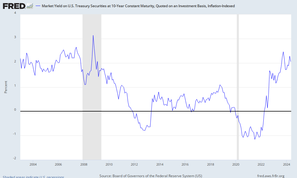
FRED GraphReal rates rose in 2005 and 2006.  By the end of 2006, home prices, relative to rents, had leveled out, and rent inflation had risen.  Housing starts began to decline along with declining home prices and increasing inventory.  But, rent inflation continued rising into early 2007.  By mid-2007, rent levels were heading south with all the other indicators.  In hindsight, it would have taken a more inflationary policy to counteract these forces in 2007, so that homes didn't contract so much in nominal terms.

Today we are seeing high home price increases and low home inventories, just like in the late 1990's and early 2000's.  But, today, this is accompanied by increasing rent inflation.  I think this is because both the real interest rate factor and supply and demand are pushing up nominal home values today.

The cash infusion of the QE's has allowed homebuyers to fund purchases from outside the banks, pushing nominal home values back toward where they should be, considering real interest rates and the alternatives for fixed income.  Now that QE is tapering, this funding will need to come from the banks again, and recent indications seems to point to increasing bank credit levels.  This should continue to increase home prices, relative to rent levels.

But, at the same time, rent levels are increasing because of the incredibly low level of housing starts.  If starts remain this low, then rents should continue to increase.  This will push the changing level of nominal home prices even higher.

Homebuilders will either respond to this with large increases in supply, or, if they don't, their home prices should increase substantially.  It looks to me like homebuilders face one of two likely scenarios: (1) continued home price increases with higher-than-expected increasing sales volume, or (2) higher-than-expected increases in home prices with moderate increases in sales volume.

Either scenario should benefit homebuilders with land holdings, options on land holdings, large quantities of available lots, and high operating and financial leverage.  It might be time to look at "low quality" firms in this industry.

Here is a recent update from Calculated Risk.  Notice that home prices aren't just rising, they are accelerating.


Institutional Investors, QE, Banks, and Home Prices

Here is a Bloomberg article (HT: calculated risk) about trends among institutional residential housing investors.  According to the article, the purchases from these investors peaked in 2013.  This has been facilitated in part by QE3, I believe.  The cash from QE3 has been funding non-bank financed investments, which have moved as a counter to bank assets.  This could be because these investors were crowding out banks in the market for asset funding, or possibly the increased interest rate levels reduced bank capital during the QEs, and these non-bank sources of funds, flush with QE cash, made up the difference.  In any case,  I am not surprised that the level of activity from these real estate investors has been coincident with QE3.  You could also see this activity as a process of capital capturing excess returns that are available in residential real estate as a result of the broken down mortgage market.

I also note that home prices are accelerating, even as these investors dial down their activity.  This is because, from a supply & demand perspective, banks have finally begun expanding real estate credit again, and from a valuation perspective, the intrinsic value of homes, relative to other similar investments is still low.


Thursday, March 13, 2014

Homebuilders going forward

Chart forSPDR S&P Homebuilders ETF (XHB)Considering homebuilders have already tripled off the 2009 lows, I'm probably late to this party.

But, with the apparent nascent turnaround happening in bank assets and consumer credit, I wonder if there is a second act left in this sector.

Here is a chart comparing months of inventory, home prices, and housing starts, over time.  The thing that is out of whack here is housing starts.  A doubling in homebuilding activity in short order would not be outrageous.  That coupled with the continued upward pressure that we should see on home prices, coming from the low interest rate environment, should provide tremendous upside for some firms in the homebuilding and real estate sector.

Wednesday, March 12, 2014

January JOLTS and February Flows

Here are updated graphs of JOLTS (January) and employment flows (February).  Watching these series from month to month is kind of like watching grass grow, but they generally continue to show tentatively positive trends.

I use weighted moving averages with the JOLTS data to cut down the noise.  Churn is slowly increasing in all the relevant measures.  In late 2012, these trends began to flatten.  They are flattening again (see graph of slopes), so this is something to watch in coming months.  If the trends start to decline, that could signal a danger as the Fed looks to tighten monetary policy.  This could be a sign that the economy can't overcome the disinflationary effects of the taper.

The Beveridge Curve continues to approach the pre-crisis trend.  This will mostly be a product of the unemployment rate declining.  The Beveridge Curve for the 45+ age group moved especially toward the old trend (the blue dot left of Dec. 2013 is the Jan. 2014 point).  This is probably related to the steep decline in long-duration unemployment in January.  Much of the long-duration unemployed are from this age group.  This might reverse in February, when long-duration unemployment moved back up.

I would hope to see hires accelerate and the Beveridge Curve shift left as we move away from extended unemployment insurance (EUI), but as of February, outcomes appear to be mixed.  Weather-related issues don't appear to be as strong in March, so next month will give us interesting information about the direction of labor markets.

The Employment Flows data is updated through February.  The trends there continue to give a positive picture of post-EUI employment.  The flow of unemployed workers out of the labor force has actually declined significantly in the last 2 months.  Relative flows out of the labor force have come from employed workers.  These are positive trends.


Monday, March 10, 2014

Housing, Interest Rates, Rents, and Inflation

I have floated the idea that housing prices during the housing boom could be explained largely by low real long-term interest rates.  Home ownership can be described as pre-paid rent - a long position in a very long-duration, inflation-protected bond.

This graph basically tells that story:


In this graph, I compare bonds, stocks, and houses all based on the same mental framework - the price of each type of asset at any point in time, expressed in proportion to a stable measure of returns.  Bonds in the secondary market are valued this way, but bonds are usually reported in terms of yield.  Homes are basically valued this way, since implied rent is a fairly stable measure of cash flow.  Stocks are basically valued this way, except that instead of a stable coupon rate, stocks represent a volatile earnings stream.

Here, I have attempted to present all of these assets in a way that can be comparable.  And, the point I have been making in my housing posts is that, when we use a standardized mental framing, we see that home prices were never out of line compared to the other asset classes.  They remained very low in the 1990's, and at the top of the housing boom, the relative value of homes in 2005 compared to the 1980's was similar to a 30 year bond.  A home is essentially a perpetuity of rent payments on real property, so price behavior similar to a 30 year + bond is hardly uncalled for.  (The equivalent rent component that I use to construct the Price-to-Rent price index only goes to 1987, but, as you can see in the graph below, PtR was high in 1978-1979, and bottomed out in 1983, along with the other asset prices shown here.)

Also, I will note here that it would be incoherent to claim that high long-duration bond prices are sign of loose money and a signal for the Fed to tighten.  Yet, this is basically how Fed watchers, and the Fed itself, have been interpreting the 2000's.  Both long term bonds and homes were "expensive", yet everyone "knows" that the Fed was too loose in the 2000's.

So, I say, home prices weren't too high in the 2000's.  Instead, a lack of access to the home market, created by the peculiar way we finance real estate investments, has frequently led to markets where home prices were not bid high enough.  The frictions dampening home demand were increasing the implied yield on home ownership, which means that these frictions have frequently kept home prices too low, making homes a very good investment for those who could qualify for the financing.  This is why conventional wisdom about buying a home usually worked.  It didn't work in the 2000's because the behavior of home prices in the 2000's was much more bond-like, did not reflect a liquidity premium, and therefore homes were not necessarily appropriate investment vehicles for many households that could qualify for them.

Price/Dividend and Price/Rent Ratios
Prices are relatively low again, because the mortgage credit market has flatlined.  Price-to-rent was surprisingly high in the late 1970's, even in the face of double-digit nominal rates, because real long term rates were very low at the time - most of the high rates were a product of a high inflation premium.  Here is a graph from this paper, which shows price-to-rent multiples farther back in time than the data I show above.  As this graph shows, home prices, relative to rent, were rising into the late 1970's until the monetary shock of the early 1980's led to a long period of high real long term rates, and declining home prices, relative to rents.


Moving into Equilibrium

If this effect is somewhat dominant, we would expect rising prices to drive up land prices, then new home supply would dampen home prices.  This would pull future house supply back in time, increasing current supply and pulling down rents.  These competing forces push in opposite directions.  This should lead to an association of low real rates with both high home prices and deflationary pressures in the equivalent rent component of the CPI.  This is why I think the complaint that the housing component of the CPI understated inflation in the 2000's is misguidedHigh home prices that are a product of low real interest rates would be associated with consumption disinflation.
P/R (red, right scale), Rent (blue, left scale)

Interest Rate series are on the right scale, which is inverted
I'm using Case-Shiller data with rent data that only goes back to 1987.  Until the late 1990's, relative implied rent inflation and the house price-to-rent ratio tended to move together, probably reflecting business cycle and demographic factors that were driving the price of homes.  Note that, while real and nominal interest rates had declined from their peaks in the early 1980's, they generally plateaued in the 1990's at levels that weren't especially low.

But, starting in 1998, home prices began to rise.  At this point, the relationship between prices and rents inverts, so that from 1998 to 2007, rising prices are associated with less inflationary rents.  Rates fell into the 2001 recession, but coming out of that recession, long term rates remained low, so that real long term rates stepped down permanently after 2000.  (Keep in mind that interest rates and prices are inversely proportional, which means that prices rise more quickly with each fall in rates.)  This period where real and nominal rates were significantly lower than any recent experience is when house prices accelerated and house prices moved in the opposite direction from rents.  This is what we would expect in an environment where low real rates were the dominant factor.

Note that from 2005 to 2007, real rates rebounded slightly, and at the same time Price-to-Rent retrenched slightly and rent inflation increased.  But, when the Fed began sucking liquidity out of the economy in 2007, both home prices and rents collapsed.


Predictions

Since 2007-2010, home prices have rebounded somewhat because of the continued low real rate environment, in spite of a hobbled banking system.  Rents have rebounded somewhat because of the lack of homebuilding since the crisis.

Real long term rates are still at least 1% below the low levels we saw in 2002-2004.  If I am on the right track here, that means that even in a rate environment with some more long term rate increases, as banks recover, we should be prepared to see home prices increase by another 40%, in real terms.  We should also expect to see home building doubling from its current levels.  And, we should expect this to be a disinflationary phenomenon.

For a start, it's probably worth taking a look at a long position on homebuilders with financial and operating leverage or other firms that are leveraged for higher homebuilding quantities and prices.

Secondarily, as I have expressed before, I am afraid that in this scenario, there will be a groundswell of public calls for the Fed to pop the housing "bubble", and we will be thrown unnecessarily into another recession, where the Fed will be tightening the money supply in an environment of low real rates and low inflation.

Friday, March 7, 2014

February 2014 Labor Report Review & Beveridge Curve notes

Well, that's just about the way it usually goes.  I predicted a positive surprise, but I thought the report was slightly disappointing.  The market, however, appears to think it was a positive surprise.

Here are updates of a few indicators I've been watching.

Durations did not move in the direction I thought they would.  Long duration unemployment actually kicked up a beat last month.  I expect this to move strongly in the other direction over the next several months.  Of course, there is some noise in this data.

Next, is my estimate of the proportion of long-term unemployed workers who exit the unemployment category (more than 15 weeks) over a 3 month period.  This indicator had moved strongly higher over the last couple of months, but this month, it pulled back.  The trend should continue to move higher, though.

Next is the year-over-year change in average wages.  This continues to show strength.  Average wages are accelerating, even as inflation remains low.  This indicator is quickly entering territory that would normally be associated with rising interest rates.


Quits, Job Openings, and Unemployment

Finally, I want to address quits, job openings, and unemployment.  Scott Sumner linked to this post by Evan Soltas.  Evan's post includes this graph, comparing quits and unemployment.

If I understand Evan correctly, he's addressing observers who believe that labor markets are in worse shape than the unemployment rate would suggest.  He's saying that since there is a pretty stable relationship between quits and the unemployment rate, the unemployment rate is probably a decent indicator of slack in the labor market.

I think Evan should take it even further.  The unemployment rate is understating tightness in the labor market.  Pro-cyclical labor policies, especially the highly extended unemployment insurance (EUI) which has recently been retracted to normal levels, temporarily and significantly raised the natural unemployment rate by adding a sort of friction into the labor market that caused unemployed workers to re-enter employment more slowly.

The addition of employable workers to the roster of the unemployed caused both the quits rate to fall and the unemployment rate to rise, relative to where they would have moved in a typical business cycle.

The more accurate indicator of economic recovery in this context is the level of job openings.  That is why the Quits to Unemployment relationship remains stable - these measures are both being affected in proportionately similar fashion.  But, the Beveridge Curve did break down.  And, also I have a graph here, comparing quits to openings.

data are weighted moving averages to reduce noise.
The unemployment level was increased by this policy, which moved the Beveridge Curve to the right.  The Quits rate was decreased by this policy, which moved the Openings-Quits curve to the left.  Both of these shifts happened coincident with the implementation of EUI and the start of the labor crisis.  The shift remained in place for 5 years as employment recovered, and both relationships have now begun to shift back to the previous proportions, coincident with the end of EUI.

Note that job openings are back to where they were in 2005 while quits and the unemployment rate remain at or worse than the cycle trough of 2003, when the unemployment rate had topped out at 6%.  Wages are increasing at a rate similar to the rate of 2005 (see chart above).  Adjusted for consumer prices, wages are as strong as they were in 2006.  So wage growth corroborates the signal we are getting from job openings.

There are jobs available, but since unemployed workers have been incentivized to re-enter employment more slowly, these jobs remain unfilled.  Employed workers can't safely quit because qualified competition is on the sidelines, and employers aren't filling the jobs with less qualified available workers because potential workers are available, even if those workers aren't being as aggressive about taking the available jobs.

For an employer, it's like the situation an oil company would face if they had access to $60 oil in a $100 market, but they knew that there were countries with closed oil markets that had $40 oil in the ground.  As long as those countries had untapped potential reserves, oil supply development would fall somewhere below the level that would be predicted by markets with $100 oil.

(Please, as always, understand, that I am speaking of this in broad terms for narrative ease, but that all of these changes result from marginal subtle changes in behavior among many diverse and reasonable workers and employers.  I am not making some boogeyman out of unemployed EUI recipients.  And, we are talking about maybe 1% of the labor force.  These changes are very subtle.)

So, with the end of EUI, we will see the Beveridge Curve and the Openings vs. Quits relationships move back toward their normal levels.  We will see unemployment decline, to more accurately reflect the strong demand in the current labor market.  And, we will see a boost in real output resulting from the return to higher efficiency in the labor market.  In the last few months, coincident with the termination of EUI, we have already seen the beginning of this movement.

History of money and gold

David Beckworth has some interesting comments on the gold standard and monetary history.

Excerpt:
 Silver actually was the dominant metallic standard for hundreds of years before gold. The main reason it was displaced by gold is not that gold was inherently better, but that important countries, including the U.K. and the U.S., introduced bimetallism—legally minting silver and gold into money—and did so at exchange rates that inadvertently led to the undervaluation of silver. This undervaluation eventually drove silver out of circulation as money. Gold became the money standard largely by accident.

Wednesday, March 5, 2014

February 2014 Employment Report

I kind of expect a positive surprise from the employment report Friday.

Initial unemployment claims are flat, but they are near the cyclical trough level.  There isn't much room left to fall.

Continued claims have stagnated, and in fact kicked up a notch in the past month.  This seems like a bad sign.  It would signal that unemployment durations are increasing again.  I suspect, however, that the end of Emergency Unemployment Insurance (EUI) has led to a renewed competition for jobs from workers with longer unemployment durations, so I think this temporary kick up in regular unemployment insurance could be, ironically, a sign of the supply-side benefits of the end of that program.

I've posted this graph before, showing the unusual improvement in unemployment in North Carolina after they ended EUI in June 2013.

In every month of the 5 months we have data for since the end of the program, the monthly change in North Carolina unemployment was significantly more than one standard deviation below the mean for the 50 states.  Most of this decrease came from employment growth.


Aug
2013
Sep
2013
Oct
2013
Nov
2013
Dec
2013
Avg. State UE % Change 0.01 -0.10 -0.06 -0.24 -0.20
Standard Deviation of State UE % Change 0.12 0.13 0.14 0.15 0.16
North Carolina UE % Change -0.20 -0.40 -0.30 -0.60 -0.50
North Carolina UE Change, # of SD -1.73 -2.37 -1.67 -2.45 -1.85

Unemployment was at 8.9% in North Carolina in July 2013, so there was a lot more room to drop, but all else being equal, I think we should expect a 0.1-0.2% drop each month for the next several months, from this effect, relative to what we might otherwise expect.

Another interesting recent development has been the recent increase in Commercial & Industrial Loans.  I had noticed a trend where this measure of credit from commercial banks has tended to flatten during QE's and recover between QE's.  I have been watching to see if the same pattern might emerge as we exit QE3.  The expansion has come much more quickly and more strongly than I expected.

In all of 2013, Commercial & Industrial Loans (red line) increased by about $110 billion.  These loans have increased by $35 billion in just the first 3 weeks of February and $50 million since the beginning of the year.  Real estate loans on commercial bank balance sheets have also shot up in the last month (blue line).

Bill McBride at calculatedrisk has a rundown of indicators.  They are oddly bearish this month.  This month's indicators seem especially mixed.

Stock/Bond Allocation (Part 5) - Modeling the Mortgage/Bond Hedge

After writing part 3, I decided to add a home & mortgage element to my historical data, to see if my intuition was correct.  So, for each 20 year portfolio, I added to option of putting a 20% down payment down on a home, at portfolio inception.

Here are the effects this had on the presumed optimal asset allocation, where the 20-year outcome variance is estimated with the historical worst case scenario, which helps to account for the non-normal distribution of outcomes in the historical data.

The lines with white diamonds are the stock/bond (red) and stock/cash (green) portfolio allocation lines from the previous analysis.  The light blue capital allocation line (CAL) identifies the optimal allocation for the stock/cash portfolio.  As I described in the earlier post, bonds do not provide effective long-term hedging against stocks, so the optimal stock/bond allocation is to 100% stocks.  Cash works a little better, so that a risk averse investor who does not want to allocate 100% to stocks can reduce risk more effectively with a cash allocation than she can with a bond allocation.

The lines with light gray diamonds and the blue CAL show the optimal allocations for a household that has purchased a house where the 20% down payment is 50% of the size of their at-risk portfolio.  This reduces the risk in all efficient portfolios, with little change in the recommended allocations.

If the household purchases a home where the down payment is equal in size to their at-risk portfolio (dark gray diamonds and purple CAL), we see several changes.  A house of this size no longer effectively improves the risk profile of the stock/cash portfolio.  Now, the stock/bond portfolio is the optimal portfolio, and now the optimal portfolio holds a 20% bond allocation.  Here, I think we are beginning to see the effective hedge between the long bond position in the at-risk portfolio and the short bond position represented by the mortgage on the home.

This becomes even more clear as the home increases so that the down payment is 150% of the at-risk portfolio.  The combined performance of the home/stock/cash portfolio continues to decline.  For the home/stock/bond portfolio, the optimal combined portfolio doesn't perform quite as well as it does with a smaller home, but the home and the stock/bond portfolio do continue to provide hedging value, providing better returns than the household that doesn't buy a home.  And, the optimal at-risk portfolio in this scenario now holds around 50% of the portfolio in bonds.

I think the effectiveness of the mortgage/bond hedge is also visible in the way that the return-risk profile looks much more smooth and normal as the home allocation increases.  In fact, at the 150% allocation to the home, the worst-case method of measuring risk actually recommends a larger bond allocation than the normal standard deviation does, suggesting that the mortgage somehow turns the persistency of bond market risks into an advantage.  (I should note that I didn't include rent savings as a benefit of home ownership in my model, which I don't think effects the shape of these relationships much, but would generally cause the graphed returns of the home-owning households to be understated.)

I'm working with a pretty simple model, and it would take a lot more work to confirm all the details here.  But, what this suggests is that a stock/cash allocation still seems most effective as an optimal long-term investing strategy.  But, for households that use home ownership as a tool in their long-term savings strategy, especially in areas where high home prices require home equity to be a large portion of the household's overall net worth, a significant bond allocation may be prudent.  This is not as a hedge against the stock allocation, however.  This is a hedge against the short bond position represented by the mortgage on the home.  And, in this regard, it may be a very effective hedge.

In fact, this helps solve the transitional problem of moving from a long term, risk-seeking portfolio to a more risk-averse retirement portfolio.  Looking at bonds as a hedge against the mortgage, a young household with a new house and a portfolio mixed between stocks and bonds would have a beginning exposure to a highly leveraged piece of real estate and a portfolio of stocks (the mortgage and bonds would roughly hedge away bond exposure).  This is probably not a bad set of exposures for a young household.  Over time, as the mortgage is paid down, the exposures would evolve, so that at the point where the mortgage is paid off, the household would have a comprehensive portfolio roughly split between unleveraged real estate, stocks, and bonds, which is probably a decent allocation for an older household.


A Caveat

This conception of the household lifecycle is dependent, though, on the behavior of real estate as a near cash asset.  That has usually been the case, in the past, since, outside the 2000's, either high inflation, high real long term interest rates, or a crippled credit market have limited entry into the homeowner's market, reducing the convexity of home values relative to long-term real interest rates.  This meant that if you could clear the hurdle to become a leveraged home owner, it would almost certainly provide you with above-market returns on capital.  If credit markets continue to recover, and we remain in a low-inflation, low-real rate environment, home values should become more convex again, leading to more pure bond-like behavior in home prices, which would mean exceptionally high home prices, again.  In that case, the highly leveraged real estate begins to mimic long-duration bonds in the household's comprehensive portfolio, and the young household that buys a home now holds a comprehensive portfolio that looks like a highly leveraged portfolio that is very heavy in bonds.  That is a recipe for disaster.


An Alternative View of the Housing Boom

The colloquial approximation of this problem would just see unusually high home prices as a "bubble", and would lead to conception of the housing market as an inefficient market where buyers should avoid buying during the "bubble".  I don't agree with that conception.  I think the high home prices of the past decade were justifiable, in and of themselves.  But, the change in character of homes in this context means that they aren't appropriate for some buyers.  Just like a retired 80 year old shouldn't put their entire portfolio into stocks - in a low rate environment with a functional credit market, a young household shouldn't buy a home on a mortgage.  Maybe there isn't much difference between the colloquial approximation and my description of the housing market, in practice.  On the other hand, if banks conceived of the housing market the way I do, they wouldn't be approving mortgages as if they were consumer credit.  It would be more appropriate to treat mortgage debt like a sort of margin credit, with standards that change with market conditions - like the Chicago Mercantile Exchange might do with margins on futures contracts.  It's understandable that they don't, since before the 2000's, the heuristics banks used for home financing erred on the conservative side, and kept the housing market inefficient, and home prices too low.  I'm afraid that the consensus views the high prices of the 2000's as a market failure, when the real failure may be the lack of sophistication in our banking conventions regarding mortgages.  This tendency for the consensus to see "bubbles" in hindsight may prevent us from learning from history, and doom us to continually repeat it.

Another comparison of what I think we've seen in housing is commodity markets.  For some time, some sophisticated institutions earned excess profits on alternative investments, like commodities.  Several new methods of portfolio construction have been proposed around their methods, claiming to boost risk-adjusted returns.  However, some observers suspect (I among them) that those extra returns were a product of the limited access investors had to those asset classes, preventing them from being efficiently included in the broadly diversified market portfolio.  As access to those asset classes is expanded, through ETF's, etc., their prices will be bid to efficient levels, and returns will be a function of their non-diversifiable risk.

The same thing might be said of housing.  Our conventional ideas about the profitability of owning a home are based on a history where access to home ownership was limited.  So, much as the Yale Endowment Fund could earn excess profits on alternative investments, a family with an income that pulled them over the hurdle of mortgage approval could earn excess profits on a leveraged home.  But, now that we have commodity ETF's and 4% fixed mortgage rates with a plethora of optional terms, entrance into these markets isn't limited, and there are no longer excess returns to be gained.

The answer to this isn't to return to inefficiency.  The answer isn't to outlaw mortgage products or to hamstring bank underwriters even while enforcing the same outdated underwriting conventions.  We just need to recognize that homes need to be assessed as investments without the old assumptions, and that they may not be the right asset for every household.

The paradigm that ignores all of this and just blames the situation on predatory banks is like an old map with "Here be monsters" scrawled across the frontier.  It might seem like a good rule of thumb for a while, but it's not a real guide to the landscape.

PS.
Below is a similar graph as the one above, using the conventional standard deviation to measure risk.  The same tendencies appear here, with the stock/bond portfolios improving as the home size increases.  The recommended bond allocation increases along with the home size.

Tuesday, March 4, 2014

Stock/Bond Asset Allocation (Part 4) - Schrödinger's cat's pension

When considering portfolios with different holding periods, as I have in recent posts, I find a paradox.  I wonder if anyone has a solution to this paradox.

Consider this graph.  This compares the outcomes of 3 portfolios over time - a stock portfolio, a long-duration bond portfolio, and a 50/50 mixed portfolio.

This seems like pretty straightforward standard analysis to me.  The longer your investment horizon, the more exposure you can withstand to temporary fluctuations, and the more risk you would want to position yourself with.

Here, we can see that, historically, the worst 20 year period for the stock portfolio was better than the worst periods for both the bond and the mixed portfolios.  So, given this binary choice, I recommend holding 100% stocks for those holding periods.  If a friend asked for my free advice, I would say, "Look, over that time frame, stocks have never done worse than these other options.  Put all your money in a low-cost stock index, and don't look at it for twenty years.  It's going to have big up years, and big down years.  You are getting paid for your lack of concern about those fluctuations."

In fact, when I invest in volatile small cap stocks, this phenomenon happens in a much shorter time frame.  A family member may invest in the small cap, and if it goes down 40%, I might get a phone call, and I say, "When you bought this, you were saying, implicitly, that the price was incorrect.  So, now the price is more incorrect.  Or, maybe the price is correct, and by the time we realize we were wrong, it will be too late to escape our losses.  So, you committed to losing all of your money the day you bought those shares.  Don't look at the price.  Just figure that money's gone.  If, by chance, a year from now, that stock is up 500% and it hits our target, we'll figure that, as best as we can tell, the price has corrected itself.  Then, we can look, and we will sell.  Until then, DON"T LOOK."

It's amazing how much our portfolios change, just as a product of us looking at them.

But, this isn't just a battle with our cognitive and emotional challenges.  As with the holding period portfolios above, our looking actually changes the portfolio.  Let's say that, having bought into my analysis above, you put all your retirement savings into a diversified set of stock funds, to be recalibrated in 20 years, when you will start to plan for eventual cash withdrawals.  This analysis depends on holding through potential volatility.

So, what happens if in 15 years, you decide to look at your portfolio to see how it's doing?  As soon as you open the file, that 20 year portfolio becomes a 5 year portfolio.  Now, you're thinking, this is too risky, I need to prepare to recalibrate this in 5 years, and if stocks take a dive, I'm going to be in big trouble.

It seems like we should plan for that transition ahead of time, but the problem is, every extra step along the life of that portfolio that we add, changes the context of the portfolio.  If we say, look, in 15 years, the portfolio is going to need to start being more safe to prepare for a recalibration, then we might say, ok, let's do all stocks for 15 years, and then see what changes we need to make to make sure we are ok in 20 years when we recalibrate.  But, now we can make the same observation about that 15 year portfolio that we did about the 20 year portfolio, and very quickly, this becomes turtles all the way down.

It doesn't take a lot of effort to start at the end point, and work our way backward, and decide that we need to be in all cash.  I don't see a hard and fast way to avoid this paradox.  Do we just create heuristics that treat portfolios as slightly shorter in duration than they really are?  Is that why we don't generally concern ourselves with the suboptimality that comes from assuming normal distributions in our stock/bond analysis?  Because the end result of that error is simply to construct portfolios with a bias toward a shorter holding period, and this solves the paradox through conservative portfolio construction policies?

If my analysis concerning the stock/bond allocation problem is correct, American households could be sorely mis-allocating their long-term investments, because this bias would not lower both risk and returns, as one might expect.  An inappropriate match between asset classes and investment horizons may be increasing risk with no benefit at all for longer-horizon portfolios.

On the other hand, my solution, which is to not look, hardly seems prudent as a systematic rule.

Follow up post.

Monday, March 3, 2014

Stock/Bond Asset Allocation (Part 3) - Short Duration with a mortgage! (Oh, you already are?)

...in which I find that two wrongs may make a right....

In my previous posts, I dug into the non-normal behavior of historical stock & bond portfolios, and decided that bonds had no place in individual long-term portfolios.  Portfolios with a cash allocation will almost always do better than portfolios with bonds that have duration risk.

Below the fold, I explore that idea some more, consider the role of home ownership in these allocations, and discuss the financial semantics that result from our peculiar treatment of real estate ownership.