Suppose we start with a basic valuation model such as:
Here, I am using the median home price for each MSA and the median rent for each MSA. (Both available from
Zillow Data.) Rent, I have reduced by 50%, to arrive at a rough estimate of net rental income estimate, after costs and depreciation.
I have estimated property tax rates from
here.
The growth rate here would be the future expected of MSA rent inflation above the general rate of inflation, which is an unknown.
And, the required rate of return is an unknown. Here I will write in terms of real yields.
I have shown that across MSAs, price appreciation has been highly
correlated with rent inflation. This is true regardless of the sensitivity of home prices to real long term interest rates (which can be used to estimate the required rate of return here). In that analysis, I used estimates of the required rate of return to solve this equation for the expected rent inflation (growth rate). That is where I find the correlation (expected rent inflation across MSAs correlates strongly with past rent inflation.)
Here, I want to go the other direction. Let's plug in various growth rates and see what sort of returns on investment that implies across MSAs at various points in time. These are 17 MSAs that we have rent inflation data for from the BLS.
Here, I am going to use 1995, 2005, and 2015.
In 1995, rent inflation had been moderate for a decade, generally, across MSAs. So, for 1995, I am assuming zero expected rent inflation in every MSA.
In 2005, the light red dots here show the required rate of return if there is no expectation of rent inflation. The dark red dots show the required rate of return if expected future inflation is equal to the excess annual rent inflation for each MSA from 1995-2005.
In 2015, the light blue dots show the required rate of return if there is no expectation of rent inflation. The dark blue dots show the required rate of return if expected future inflation is equal to the excess annual rent inflation for each MSA from 1995-2015.
In all cases, the large dots are the US median.
In 1995, this puts the US median required return at 3.5%, which is slightly less than real long term treasury yields were at the time.
In 2005, if we assume no expected rent inflation, the US median required return dropped to 2.4%. From 1995 to 2005, real long term treasury yields dropped by about 2%. Glaeser, Gottlieb, and Gyourko find that home prices
change by about 8% for each 1% decrease in yields. That is about 40% of the sensitivity of a 30 year bond.
The dark red dots reflect expected rent inflation that is 100% of recent past inflation, which is too aggressive. On the other hand, the light red dots reflect no rent expectations, and they suggest that home prices are somewhat more sensitive to long term interest rates than Glaeser, et. al. estimate. The downward slope would also suggest that the supply constrained cities are more sensitive to rates than less constrained cities.
In 2015, we find the same patterns, except that since we triggered a nationwide liquidity crisis in housing, the implied yields for housing are high, in spite of the low yields we see in treasuries.
If we just had the 2005 data to go on, we might come up with decent explanations for why home prices in constrained cities are more sensitive to long term interest rates. But, this explanation is a little harder to defend in 2015, because yields in general for housing are not low. What would cause yields in less expensive cities to rise while yields in more expensive cities decline?
If we split the difference with real yields and with rent expectations - so that home prices are somewhat sensitive to yields, but also somewhat sensitive to rent - the 2005 dots would basically settle halfway between the two versions here. That makes intuitive sense, and it suggests that prices across cities generally reflected reasonable estimates of yield and rent factors.
I think we would expect, with 20 years of established rent inflation, for rent expectations to be stronger by 2015, and with the sharp controls on mortgage markets, yields would be less influential. So, in 2015, the dark blue dots that reflect a stronger effect from rent expectations are probably a more realistic estimate of implied yields.
An easy quick way to read the graph is that, basically, the vertical difference between a light dot and a dark dot is the expected excess rent inflation. So, if a light dot is at 3%, that means that the home will provide net rental income equal to 3% of today's price. If the dark dot is at 4%, then that means the homebuyer is actually expecting to earn a 4% real return. 3% will be in the form of income and 1% will be in the form of annual capital gains as rent increases.
(Considering that mortgages can be attained, for the "haves" who have access to credit in post-crisis America, with
real interest rates of about 2%, leveraged ownership of residential real estate seems like a real bargain. That makes sense. In a context defined by credit rationing, those with credit access will earn alpha.)
In short, there is nothing about the housing markets across cities over this time that can't be explained by moderate sensitivity to broadly recognized valuation factors.
One more item we can look at here is the effect of different factors. Once we have plugged in a growth rate and solved for required return, we can adjust each factor to see what effect it has on price.
In this last graph, the blue line is the median 2015 home price for each MSA. The cities with supply problems and high prices also tend to be cities with low property taxes. This is probably no accident. The low tax base means that expanded residential housing is seen as a cost to local municipalities instead of a potential revenue source. This is quite explicit in housing debates around Silicon Valley.
Here, the red line is the hypothetical home price these cities would have if they raised their property tax rates to the same level that Dallas has. The green line is the hypothetical home price in each MSA if there was no expected future rent inflation (all else held equal). And the purple line is the hypothetical price if each city applied Dallas' property tax rates and also had no expected rent inflation. There would still be some difference between cities, because current rent levels are much higher in some cities than in others.

I think it is interesting that the shift in property taxes has as much of an effect on property values in this model as rent inflation does.
Keep in mind, though, that property taxes don't really make homeownership any more affordable. It just shifts your payment from the mortgage financier to the local government. You could think of property tax, really, as a partial public ownership, with a fixed income claim, much like a non-recourse negative-amortizing mortgage.
While property taxes only improve the illusion of affordability as a first order effect, because the public (incorrectly) treats home prices as an affordability signal, the most important effect of higher property taxes would probably be the secondary effect that it would induce municipalities to allow more generous new supply.

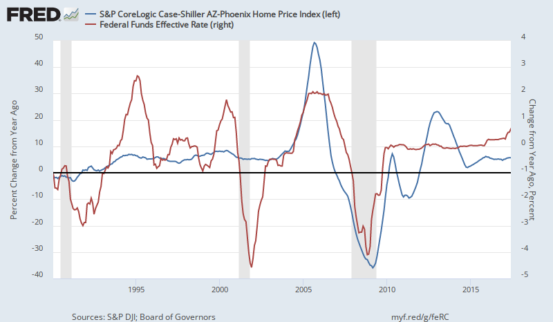
 Bob thought this third graph was the best way to look at it - with the Fed Funds level and the change in prices. When prices were accelerating in 2005, rates were rising, but they were still relatively low compared to previous cycles, so they were still capable of fueling the bubble.


