Wednesday, July 22, 2015

We will not be solving the housing supply problem.

From the June Architecture Billings Index, via CalculatedRisk.  Even as the broader index continues to improve:
“The demand for new apartments and condominiums may have crested with index scores going down each month this year and reaching the lowest point since 2011.”

Rest easy, San Francisco city supervisors, the threat of too much "market rate" housing has been thwarted.  Nationally, 400,000 multi-unit housing starts is the new American maximum.

Tuesday, July 21, 2015

Secular and Cyclical Trends in Production and Non-Supervisory Employment

Playing around with employment stats this weekend, I noticed an interesting pattern.  Non-supervisory employees tend to be laid off more cyclically than other employees.  So, the proportion of employees who are production and non-supervisory tends to be a mirror of the unemployment rate.  I think this ratio might give us a window into the business cycle.  There have, unfortunately, been few times where we have been moving ahead in a relatively calm equilibrium state.  Most of the time, we are moving through cyclical disequilibrium.


Source
This ratio suggests that we have entered a period of calm, where we have re-established economic stability.  (Corporate earnings signal this also.)  Now the question is how long we can maintain this.

I have included short and long term interest rates in the graph because we can see that cyclical declines in non-supervisory employment generally happen when the yield curve inverts.  Before the 1980s, when the Fed was biased to inflation, interest rates would tend to rise after equilibrium was reached, and the Fed Funds Rate would chase long term rates up until they went too far.  Since 1980, long term rates have tended to move sideways, but rising unemployment has continued to coincide with the inverted yield curve.  Unless we see long term rates move up sharply, I don't see any reason why we need to tempt fate here.

Source
I have also included an inverted graph of the unemployment rate, scaled to line up with the ratio of production and non-supervisory workers to total workers.  I think it is interesting that secular shifts in the unemployment rate have moved together with this shift in this ratio.  This also seems to coincide with shifts in the Beveridge Curve.

Interestingly, P&N-S workers appears to have peaked, and has moved to a higher level than the previous recovery.  This suggests that the Beveridge Curve should remain to the left and that the unemployment rate should be lower.  But, recently job openings have been very strong, which suggests that the Beveridge Curve is shifting to the right.

I would associate a lower secular unemployment rate and a leftward Beveridge Curve with less friction in the entry-level labor market.  Either my priors are being overwhelmed by other issues, or we are getting mixed signals.  I think there might be two issues here.  (1) Hysteresis in labor markets which create persistently higher unemployment after extreme corrections (like in the 1980s, where unemployment leveled out for a few years) and (2) the continued categorization of about 1/2% of the labor force, who have been unemployed for more than 2 years, as unemployed instead of marginally attached.  If these are explanations, then we may see unemployment dip below 4%, if we are willing to let it.  (It's already under 5% after adjusting for these marginally attached workers.)

Source
Could the persistent level of unemployment (which is not reflected in continued unemployment insurance claims, either today or in the mid 1980s) be a product of a cyclical correction that was deep and long enough to reach past entry level and low-skill employees?  Maybe firms have made cuts in their organizational capacity, which take longer to re-establish.  Here I have charted unemployment by education, indexed to January 1997 when unemployment was at 5.3%, as it is today.  Unemployment for "less than high school" workers has recovered, but unemployment for high school and college educated workers is still above the January 1997 level (the same goes for the "some college" category).  Again, I think that if these factors are in place, then there is a lot of room for strong top line economic growth, and, in fact, allowing this growth to happen is integral in re-establishing the foundation for future real economic expansion.

In fact, it may be dangerous to use wage growth for production and non-supervisory employees as a signal of Fed policy, because if that category is the one which has recovered, we may need to see some wage inflation there in order to complete the recovery in non-production employment.

Using these indicators, here is a graph which shows the Production Employee/Total Employment Ratio along with a measure of Yield Curve Inversion and a measure of S&P500 corrections (both real and nominal).

In terms of defensive equity tactics, this ratio may be better than the unemployment rate itself because the change in trend looks like it tends to be sharper.  (Red marks show when there is a yield curve signal, green when there is an employment signal, and purple when they both signal a correction.)  This seems like something to make note of.

On the theme of "We are the 100%.",  I think the Real S&P500 measure shown here is informative.  In real terms, from 1968 to 1982, the S&P 500 was down 60%.  High inflation during the period hides the terrible performance of productive asset valuations during the period.  This period of terrible equities performance coincides with low real wage growth and declining employment of production and non-supervisory workers.

Then, in the late 1980s and 1990s, equity values grew in both nominal and real terms and real wages and employment of production and non-supervisory workers also grew.

There is an additional adjustment that wasn't important for my trend changing signals here, but is important for long term comparisons, and that is the fact that capital returns through buybacks cause stock price indexes to rise relative to capital returns through dividends.  Buybacks have been utilized widely since the 1980s.  If I adjusted the S&P 500 both for inflation and for buybacks (so that the index price reflected the counterfactual where all capital is returned through dividends), the S&P 500 would still be about 20% below its peak.  In fact, the past 15 years has been a difficult time for equity holders.  Remember that in the 1970s, owners received upwards of 3% to 5% in dividends.  During the 2000s, that level has been more like 2% (the rest coming through share buybacks).  So, real, buyback adjusted returns on equities look much like they did from 1968 to the mid-1980s.

But, during this period, real wage growth has been fairly strong and production and non-supervisory employment has been strong.  Political rhetoric is drowning in class warfare these days, but this has nothing to do with anything that is happening in capital markets.  The story is really closer to the opposite of what our political battles are about these days.  Capital is being left behind.  Or, I should say legacy capital is being left behind.  Some of what is going on is that revolutionary changes in technology are causing much of the gains to capital to be through disruptive capital, so that existing shareholders aren't capturing the gains; Silicon Valley entrepreneurs and key employees are.

Real wage growth has been especially strong when we account for
the supply-side constraints in housing that capture some of those gains.
So, clearly, in both cyclical and secular terms, we are the 100%.  The fortunes of the lowest income workers and of corporate owners move together.  And, if anything, the fortunes of capital are the leading indicator.  That is what makes equity macro-speculation difficult.  Few indicators lead equity values.  And, this is why cynics who spit at the Fed for the "Greenspan put" and who complain about how the Fed is just keeping the stock market from having to take a loss  are so, so damaging for our economy.  There is tremendous political pressure for the Fed to avoid looking like it is just protecting Wall Street.  But, equities are a great leading indicator for what sort of damage is about to hit production and non-supervisory workers.  Equities are a great indicator for whether the Fed is doing its job well or not.

And, in the end, I think this solves a bit of an Efficient Markets Hypothesis problem.  How can the yield curve be such a seemingly good forward indicator?  And, how can equity cycles appear to have such momentum?  It's because the money supply isn't controlled by the market.  It's controlled by a committee which, even though it is somewhat insulated from year to year political upheavals, is nonetheless vulnerable to some public pressure, and that pressure is very strongly pro-cyclical.

And a lot of that pro-cyclical pressure comes from anti-capital and anti-market biases which lead people to promote wholly destructive policies when it appears as if positive policies will benefit capital.

Imagine how absurd it would sound to complain that the Fed was managing the money supply with a "Production and Non-supervisory employment put".  That would be a pretty stupid complaint.  Stable wage growth is, in fact, an ideal target that Scott Sumner mentions.  Guess what.  It's almost exactly the same policy as the "Greenspan put".  People who think we are in bubbles, who equate significant asset collapses with optimal Fed policy might as well be salting our fields.  That policy and its effect is implicitly and explicitly the same and it affects both the top and the bottom of the income scale.

These errors seem pretty mainstream these days.  Of all the anger being aimed at the Fed, little of it is aimed at the fact that they let equity and real estate values drop by shocking amounts or that they were still engaging in discretionary hawkish decisions even after unemployment had been rising for more than a year.  And the two supposedly revolutionary political figures in the current presidential race - Bernie Sanders and Rand Paul - each especially make some of the errors I have outlined here.  So, you say you want a revolution?

------------------------------------------------

Mark Andreessen linked to this graph on Twitter.

It sure looks to me like there tends to be profit from trading momentum in short term interest rates.  Will we ever be able to test this hypothesis?  I'd love to.  But I'm not sure I want to be short forward contracts if the Fed starts to raise rates and the yield curve flattens in our current environment.  I'm not sure there is much room for rates to have positive momentum before they turn back down.

In the Financial Times (the source of the graph), Gavyn Davies discusses the graph thusly:
For about three decades, it has generally paid for traders to assume that the Fed will deliver a path for short rates that is lower than that built into the forward curve for interest rates at any given time. Maybe that partly reflects the fact that a risk premium is normally priced into forward interest rate curves. But, in addition, interest rates have been on a long run downtrend, with the Fed repeatedly choosing to deliver easier monetary policy than the market has expected. “Never underestimate the dovishness of the Fed” has usually been a profitable motto for traders.
This is shocking to me.  Does he really think the Fed has been dovish for 30 years?  What does he think inflation would have done if the Fed had been hawkish?  Where does he think interest rates would be if the Fed had been hawkish?

Monday, July 20, 2015

Inflation and Housing Starts aren't encouraging

Inflation for June is a bit worrisome.  Indicators are moving back into dangerous territory, with shelter inflation moving up and "Core minus Shelter" inflation moving down.  I take this as a signal of decreasing monetary accommodation on both counts, through currency management regarding the CmS inflation and through credit constraints in the Shelter inflation (which limits housing construction).  Nominal spending is stagnant because of currency management and real consumption is stagnant because of credit constraints in housing construction.  The combined signal these give is of a moderate inflation, which looks like reasonable monetary policy if the supply problem isn't accounted for.  So, not only does this signal a monetary policy that is currently too tight, but it is likely to produce a monetary policy reaction that is even tighter.

I have been somewhat sanguine about this apparent problem because, adjusting a version of the Taylor Rule for this housing supply problem still suggests an adjusted Taylor Rule target rate of about 2%.  We have an economy that is operating at full expansion levels, with credit markets that should reflect higher interest rates - healthy industrial credit growth, recovered corporate profits, low unemployment.  So, while the extreme shortage of investment outlets in real estate holds interest rates down and the lack of credit expansion and employment in home construction (along with demographic headwinds) will probably keep a cap on real and nominal GDP growth even at the zero lower bound, it may be possible that the Fed could push interest on reserves up to 2% without affecting demand for credit substantially.  Demand for credit isn't low because of the discretion of borrowers.  It's low because of the discretion of banks and regulators.  It looks like mostly a regulation issue to me, since I would expect a market response to be through interest rate spreads instead of being being strictly through supply.  In today's real estate environment, many homebuyers would be willing to pay a higher spread if that was their only obstacle to ownership.

In any case, if the Fed begins to push rates up and that quickly triggers a drop in currency growth, growth in excess reserves, or a drop in long term interest rates, I would consider those to be negative signs.  If that does happen, I don't see the FOMC turning on a dime and quickly re-evaluating.  There seems to be significant risk there.  On the positive side, most of the recent weakness in yields has come from the movement forward in time of the expected first rate hike.  The slope of the yield curve coming after the first hike remains low, relative to previous recoveries.  But, the level of very long rates has been recovering this year.  I take this as a good sign.  If far forward Eurodollar rates remain strong as we contimplate the first rate hike, I take that as a sign that we can handle a rising short term rate.  Fortunately, it looks like we have several months to see how things develop.

Housing starts were also reported Friday.  Single family home starts continue to grow slowly, reflecting the moribund mortgage market.  Multi-unit building had looked like it was topping out, which I expect to be permanent.  I have blamed the low level of multi-unit building in the last several recoveries on the regulatory limits to building in the core metropolitan areas.  The extremely low continuing rates of new building in the major metro areas suggest that this is still the case.  But, new multi-unit building permits have surged for two months now.  Could multi-unit housing finally be poised to make up for the lack of single unit housing?  The added permits from the previous couple of months appear to have come from New York City. Unfortunately, it looks like the spike is the product of a regulatory deadline and probably won't persist.

Thursday, July 16, 2015

Housing Tax Policy, A Series: Part 44 - The explanation for rising costs which cannot be named.

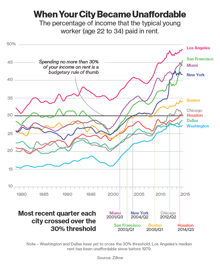
Here's a Bloomberg article about rising rents in the major metro areas.  From the article:
A couple of forces are making major cities increasingly unaffordable for millennials at the outset of their working lives. Stagnant wages in many cities have made rental and for-sale housing harder for workers to afford. 
Demand for leases has also outweighed supply in many places. In the nine cities shown on the map below, the number of renters is growing faster than the number of rental units, according to a report published in May by the Furman Center for Real Estate and Urban Policy at New York University. That trend is likely to continue if predictions for falling homeownership rates are realized. 
For many cities, the affordability gap hasn't been a growth-killer; in many, it's a consequence of their sustained popularity. People continue to flock to San Francisco for opportunities in its technology industry, despite median rents that were unaffordable to young workers for the first time in 1982. Looming rental affordability problems in Dallas and Houston are probably the result of booming local economies that have attracted workers faster than builders can erect new housing.
Not unexpectedly, the poor have suffered most from the dearth of reasonably priced housing. 

Hm.  "The demand for leases has outweighed supply."  Because falling homeownership is increasing demand for rental units.  And, remember how in the 2000s, it was increasing demand from all those new homeowners enticed by predatory lenders that was pushing up housing costs then?  And, notice that the lack of affordable housing is a result of both (1) stagnant wages  and (2) booming local economies that people flock to for their opportunities.  Those are an awful lot of hoops to jump through to avoid saying "These cities have a supply problem."

Here is a chart with earnings growth of production and non-supervisory workers and with housing starts as a proportion of population growth.

Guess what we did before 1990.  We built houses!  What a concept!  I think the 1995-2000 dip in rent affordability is a false flag.  It is a product of strong income growth, not of falling rent.  In the following two graphs, we can see that growth in real housing consumption has been falling for decades.  Until the 1990s, it was a fairly stable portion of incomes in both nominal and real terms, but since the mid-1990s, real expansion of the housing stock has been so low that households have simply been chasing a dwindling relative stock of homes with the a stable portion of their incomes.

There was a short improvement in rent affordability around 2004-2007, according to the Bloomberg chart.  You might notice that this is roughly the same period where home building briefly recovered to pre-1990 levels and earnings adjusted with rent grew as quickly as earnings before rent expenses.  Do you want to guess how our Bloomberg writer feels about the 2003-2007 housing market?  He refers to this period as "the run-up to the housing market crash of 2008", "marked by iffy tactics to wring profits out of a hot market."  (Not that he is unusual in this regard.)

And, let's talk about those stagnant wages.  You know what one of the largest factors is in adjusting wages for cost of living?  Rent!  In the graph, I include weekly earnings growth, first adjusted with Core CPI inflation (blue line), then adjusted with inflation that doesn't include rent (red line).  Real wages are stagnant because the extra earnings are going to rent.  This is based on national numbers.  The problem is worse in the major cities.  And this is the first reason given by Bloomberg for rising rents: "Stagnant wages in many cities have made rental and for-sale housing harder for workers to afford. "

I didn't want to call out this author.  His viewpoint here isn't unusual.  But, then I searched his articles, and came upon this gem of economic reasoning:
Here's the vicious circle that's sending rents spiraling higher:
  1. People paying high rents have a harder time saving for a down payment, preventing tenants from exiting the rental market.
  2. Low vacancy rates let landlords raise rents still higher.
  3. Developers who know they can command high rents (and sales prices) are spurred to spend more to acquire developable land.
  4. Higher land costs can force builders to target the higher end of the market. 
Elsewhere, he has this article with several ideas for creating affordable housing, including tax credits to developers and Wall Street firms for developing affordable rentals and vouchers for low income homebuyers.  No mention in the article about, you know, just building more houses. And this article from late 2014 complaining about a new rise in mortgage fraud, but seeming to be fine with the current level of lending standards which basically excludes households below the median.  This is the Bloomberg writer on the real estate beat.

History before 1995 does not exist in this rhetorical framework.  There are only 3 types of people in this world.  (1) Profiteers, who only prey on the middle and lower income households, but never serve them.  (2) Lower income families, who can't provide for themselves.  and (3) the advocates, who arrange for the government to pay off group 1 to serve group 2.

If my memory serves, the world that created that affordable housing before the year 1990 happened because group (1) served group (2), and group (3) was mostly engaged in facilitating that activity, not in preventing supply while subsidizing demand.  But, that 4 step vicious cycle must not have been in place yet.  Maybe developers just weren't as greedy back then.  So, you're the median family and you want to go to the bank and get a mortgage?  Like your parents and your grandparents did?  That would be predatory!  We can't let that happen.  But, enlightened folks who care about you are fighting to arrange for handouts and subsidies and corporate welfare so that we can help you move into the houses that we aren't letting developers build.


PS: While reading one of the articles titled "The Rise of the $50,000 rental" about how developers (the ones, I presume, that use his tried-and-true 4 step method for profit) are gutting middle class housing to turn it into high rent housing, a light bulb went off over my head.  I've seen a lot of articles bemoaning the fact that metropolitan developers are targeting the high end of the market, and I've always just assumed that that was an outgrowth of the housing shortage, in general.  Less available space means that higher prices will fetch households with higher incomes.  But, it occurs to me, if you're a metropolitan real estate developer, whose main source of risk is populist regulatory hassles, you would have to be demanding a higher capitalization rate on middle class housing developments.  Think about it.  Ten years down the line, if you fill that building with $2,000 apartments, what are the odds that you'll be battling some neighborhood advocacy group about raising rents?  But, you put $10,000 apartments in there, no advocacy group is going to hassle you about rent.  If you decide to do some sort of renovation in 30 years, nobody is going to be complaining about how you're ruining the neighborhood, and if they do, there will be an acrid article in the New York Times sarcastically pointing at the spoiled rich folks who are mad about losing their $10,000 apartments.  They may not say it in such stark terms, but I wouldn't be surprised if developers make risk adjustments to their expected cash flows for these problems.  They would be kidding themselves if they don't.

PPS.  The solution in San Francisco is to tax developers who have the temerity to build "market rate" housing.  (In this article, the $2 million tax on a 27 unit development amounts to $74,000 per unit.) The taxes are supposed to be used by the city to build below-market housing.  So, the city's solution to rising rents is to increase costs for builders (moves the supply curve to the left) and decrease costs for some renters (moves the demand curve to the right).  And, locals are infuriated that market rents keep rising, and demand that the policy be ratcheted up!

Wednesday, July 15, 2015

Housing Tax Policy, A Series: Part 43 - First Time Buyers and the Housing Crisis

Bill McBride points to this interesting paper from FHFA regarding first time home buyers and the housing crisis.  From the abstract:
First-time homebuyers are younger and have lower credit scores, home equity, and income than repeat home- buyers, and therefore are comparatively less likely to withstand financial stress or take advantage of financial innovations available in the market. The distributional make-up of first-time homebuyers is different than that of repeat homebuyers in terms of many borrower, loan, and property characteristics that can be determined at the time of loan origination. Once these distributional differences are accounted for in an econometric model, there is virtually no difference between the average first-time and repeat home-buyers in their probabilities of mortgage default.
One takeaway is that the high prevalence of first time buyers late in the housing boom increased the danger of subsequent defaults even if banks were not loosening credit standards, because of these distributional differences.  There are some interesting details to consider here.

First, if there was an increase in the number of first time buyers during the boom, and first time buyers have lower credit scores, then the relative strength of credit scores in general during that period means that, after adjusting for the effect of the larger number of first time buyers, banks had to be tightening credit standards even more sharply among repeat buyers for the average credit score to remain high.  This is further evidence that banks were accounting for the factors that might have been raising FICO scores of repeat homebuyers.

The paper begins:
While there are widely-perceived benefits of homeownership and overwhelming support for homeownership in the United States, the Great Recession also brought to the fore the perils of unsustainable homeownership. During the crisis, a record number of homeowners became unable to pay their mortgages and many lost their homes. According to a Core Logic report in October 2014, there were 7 million foreclosure completions in the United States since the second quarter of 2004 when the homeownership rate peaked (equivalent to 15 percent of all mortgages) and over 5 million of those foreclosure completions occurred since the financial crisis began in September 2008.
The narrative that homeownership was unsustainable is a prior here, not an interpretation of the data.  The author even points out that there were less than 500,000 foreclosures per year for the first four years after homeownership peaked, and at almost all of the foreclosures happened after September 2008 - after home values in the major cities had fallen 25% from their peaks.  A record number of homeowners didn't become unable to pay their mortgages during the crisis.  A record number of homeowners became unable to pay their mortgages after the crisis.  The fact that more than 5 million homeowners were foreclosed on after September 2008 is says little or nothing about the sustainability of homeownership in 2004.  Delinquencies and foreclosures spiked in late 2008 and 2009, but homeownership has been declining fairly linearly from 2005 to today.  There is enough of a parallel here to make these issues look like they are related, if we are primed to see them as related.

Source
If we weren't primed to make this connection, would this even be an interpretation that would seem plausible?  Since 2005, mortgage originations have remained high, then collapsed.  Home prices continued to rise, then leveled off, then collapsed, then leveled off, then recovered.  Delinquencies and foreclosures were low, then a little high, then exploded, then slowly declined.  And through all of these extreme fluctuations, homeownership rates have fallen steadily by 1/2% per year.


First Time Homebuyers, Home Values, and Interest Rates, and the Timing of Events

Here is a chart from the paper.  We can see here that repeat homebuyers peaked in 2003.  Really, it is more descriptive to say that repeat buyer originations were at a high plateau from 1998 to 2007, with a peak from 2001-2003 and decline from 2003 to 2007.  First time homebuyers peaked later, in 2007.


Source
There are several interesting things to think about.

1) Home purchases by repeat buyers peaked in 2003.  This was relatively early in the price boom and before the sharpest increases in price.  The portion of homebuyers that were existing homeowners has fallen consistently since 2003.  Consider this trend in light of the notion that the height of the boom was fueled by homeowners who were propping up their spending with real estate capital gains.  Originations by repeat buyers were about as high in 1998 and 1999 as they were in 2004-2007, even though home prices in the 1990s had been declining relative to incomes.  New home purchases were increasingly made by new buyers, who would not have had balance sheets that were artificially boosted by real estate gains.  In fact, as prices rose, these buyers would have needed to save more to increase their down payments just to keep Loan To Value levels (LTV) stable, as property values rose.

2) Entry level home sales have been low since the crisis.  This is a product of the broken mortgage market.  As I pointed out in this recent post, banks are generally only lending generously to the top quarter or so of households (by credit quality).  Entry level home buyers can't qualify for mortgages.  But, note the disconnect between entry home sales levels and the relative number of new buyers versus repeat buyers.  What we are seeing is that households that kept their homes are sitting on capital losses that have damaged their financial flexibility.  The data in this study counts households that have not owned a home in 3 years as new homebuyers, so I suspect that many of these new buyers are former homeowners who sold or defaulted on their previous homes.  In any case, there is not a lack of new homebuyers.  There are a relatively normal number of new homebuyers.  Where we are short is of households around the median financial level who can get mortgage credit in today's environment and households who have weathered the real estate bust with enough home equity to facilitate a transaction.

Source
3) The increase in first time buyers in 2004-2007 coincided with rising short term interest rates.  The yield curve inverted by mid-2006.  So, the top years for first-time homebuyers post-dated the period where ARMs would have been tempting but dangerous.  By the time first-time homebuyer originators topped out in 2007, the Fed Funds rate was already on its way back down.  By that time, ARM mortgage would have been advantageous for homebuyers.  The surge of first time homebuyers, given the timing of events, was not due to a prevalence of teaser loans, and clearly was not due to excessively loose monetary policy.

4) Here are two graphs regarding incomes of homeowners since 1992.  Homeownership rates began increasing in 1995 and peaked in 2004.  During this period, the average dollar banks lent out went to the household at about the 85% income level.  The income profile of the typical mortgage holder wasn't changing.  At the peak of the boom, from 2004 to 2007, after homeownership rates began to decline but prices were still high, the average relative income of mortgage holders increased.  During that time, the ownership rate of the top 40% of households (by income) increased and the decrease in homeownership came from the bottom 60% of households.  We might be tempted to look at the figure from the paper and assume that the jump in first-time buyers was part of a last gasp effort by the mortgage industry to rope in marginal households.  There are many anecdotes along these lines.  The data says that lower income households were net sellers during that period and that the buyers at the end of the boom were increasingly high income.

5) Remember that homeownership rates peaked in 2004.  So, the period with the sharpest rise in first-time buyers, between then and 2007, happened when there was a fall in the ownership rate.  There must have been an unusual churn in the pool of homeowners during that time.  As pointed out above, that churn, on net, was of higher income households buying and lower income households selling.

Source
6) Rent inflation was especially high during this period.  And, the problem cities (generally in the Case-Shiller 10 Index) which had especially high rent inflation, saw their steepest home price gains, relative to the rest of the country, during the 2004-2005 period.  Homeownership peaked in 2004, and housing starts collapsed at the beginning of 2006.  All of this suggests that during the final phase of the boom, the collapsing housing supply was creating pressures on rent, and that the buyers during this period tended to be high income households in large cities who had had the means to own, but had previously not purchased for other reasons.  They were purchasing a hedge against rent inflation, which, after a decade of being high, was now accelerating.  It must have been exasperating.

Since prices topped out at the end of 2005, but rents were rising sharply, this period from 2006-2007, when first-time homebuyers surged, actually had sharply falling Price-Rent ratios.

Source: calculatedriskblog.com
7) It is interesting that while mortgage originations and total mortgage levels were still growing into 2007, homeownership rates had been falling since 2004 and housing starts had collapsed precipitously starting at the beginning of 2006.  Also, note in this graph how multi-unit structures built for sale (the sort of homes one might see in the core of a large metro area) surged in 2004.  Also, note that household real estate leverage began to move up sharply at about the same time as the collapse in housing starts.

Source
This has been a mystery for me.  I have been blaming the crisis on tight monetary policy that started all the way back in early 2006, when the yield curve first inverted and monetary growth was collapsing.  But, if mortgage issuance continued to grow at a healthy pace for nearly two more years, why did housing starts collapse back at the beginning of 2006.  This new information on first time homebuyers makes the picture more clear.

The fall in homeownership and the collapse in housing starts were the first stark signs of the liquidity crisis.  By then, households weren't using home equity LOCs as ATMs; households were getting out of the real estate game - especially households with lower incomes.  Between the first-time buyer originations shown above through Fannie and Freddie, and the decline in homeownership, nearly 3 1/2 million households must have exited homeownership during the 2005-2007 period, plus however many first time buyer originations happened outside the enterprises during that period.

Source
There was still a lot of housing sales activity, but this was facilitating a huge churn out of real estate.  See in the graph of equity and mortgage levels how home prices were still the same in February 2007 as they had been in March 2006.  But, households lost nearly 10% of their home equity during that period!  You might think that this is because they were tapping their home equity LOC's.  But, that is incorrect.  Home equity lines of credit stopped growing in the summer of 2005.  They were flatlined by then.  (They did briefly rise again at the beginning of 2008, and especially after the disastrous FOMC meeting in September 2008, where LOC levels shot up as households grasped at any cash they could access.)

Source
So, the drop in real estate equity that came after the Fed pegged the Fed Funds Rate at 5.25% wasn't from irresponsible households sucking equity out of overpriced homes.  It was due to this transfer of ownership between households.  The more leveraged new first time buyers were focused on the large, supply-constrained metro areas and had higher incomes than the sellers.  The new buyers were reacting to the supply problem, which as of the beginning of 2006, had turned from chronic to acute.  The liquidity crunch was partially being played out in a collapse of home equity.

(As a side note, I wonder if the liquidation of home equity that came from this transfer of ownership was one factor that buoyed the stock market until late 2007.)


Characteristics of First Time Buyers

There are a lot of graphs in the paper showing characteristics of first-time and repeat buyers.  Some can fit the conventional narrative.  There was a positive skew in Payment-to-Income and Debt-to-Income ratios that raised the average PTI and DTI during the boom for both first-time and repeat buyers.  At the risk of seeming stubborn, I will point out that:
(1) In the aggregate during this period, households were adjusting to rent inflation by maintaining nominal housing expenditures, thus lowering real housing expenditures.  But, rent inflation, especially in the supply-constrained large metro areas, has been creating cost pressures for both renters and buyers.  In other words, the positive skew here was coming from the higher cost of housing, centered in supply-constrained metro areas, not necessarily from a higher cost of owning relative to renting.
(2) Counterintuitively, payments should increase in a low real interest rate environment.  Also, an environment where rent inflation is persistently higher than non-rent inflation is mathematically similar to having even lower real interest rates, and mortgage payments should be relatively higher at the inception of the mortgage, since the advantage of ownership comes from lower payments in future years.

There are several characteristics which don't fit the standard narrative, and which point to the constricted mortgage markets that have been in effect since the crisis.  Incomes for both first-time and repeat buyers were stable through the boom, confirming the data I have previously referenced from the Survey of Consumer Finances.  In the later boom years, incomes of repeat buyers appears to have risen at least as strongly as first-timers, and in the constrained post-bust market, incomes of all buyers have had to be very high.  Data from several sources (survey data, conventional loans, and subprime loans) now fails to back up the idea that homeownership and home prices were inflated through systematic predatory lending to lower income households.

FICO scores increased throughout the boom for both first-time and repeat buyers.  In 2006 and 2007, when there was a surge of first-time buyers, their average FICO scores did fall back to the average FICO levels of the 1990s.  Since this same cohort had rising incomes, this may reflect the influx of households with higher incomes, but some other characteristic that created obstacles to mortgage credit, who were willing to take non-prime terms in order to escape rent inflation exposure.  Since the crisis, FICO scores for both types of buyers have risen to above previous norms, mostly because only about 10%-15% of mortgages are going to FICO scores under 700 points, which was close to the average FICO score for new mortgages in the mid-1990s.

Average Loan-to-Value (LTV) was stable until 2004.  From 2004-2006 LTVs decreased for both first-time and repeat buyers.  LTVs then increased to a level above the previous norm for first-time buyers for one year, 2007, before falling to levels below the previous norm since then for both types of buyers.  By 2013, LTV had climbed back to the previous norm.

As with other reports I have looked at, delinquencies appear to be overwhelmingly a product of capital losses beginning in 2007.  First-time buyers have a naturally higher default rate, because of the difference in their characteristics, but considering that the most significant difference is probably a higher LTV for first-timers, it is surprising that there weren't more defaults among that group as prices dropped.  It looks like many homeowners have decided to ride out the crisis with negative equity.


Tuesday, July 14, 2015

Housing Tax Policy, A Series: Part 42 - A quick note on new housing units

I was doing my housing schtick at marginalrevolution and a commenter mentioned that building in Austin, TX was going strong.  I pulled together some numbers, for comparison, and figured I'd post them here for future reference.  If only the Case-Shiller 10 cities could be like Austin:

City-------——–Population—2015 1Q Housing Permits--Units/Thousand pop
Austin——————2 million———5,364---——————2.7
San Fran-Oakland–6 million———2,411-----——————0.4
NYC,NorthNJ,LongIs–20 million—-10,580----—————-0.9
San Diego————-3 million———2,251----—————–0.8
LA————————13 million——-9,816--—————–0.8
Washington DC——–6 million——-4,861----—————–0.8
Boston——————-4.5 million——3,094---—————-0.7
Chicago——————9.5 million——3,124---—————0.3

And, there is no lack of demand for housing in these metro areas. Does that rate of new units even make up for loss of old units? Except for Chicago and Austin, rental vacancy rates in all these cities are 4.6% or below and rent inflation is running high.

I frequently hear people say that there was an unsustainable boom in housing because the baby boomers reached a life cycle peak in home ownership and household size was falling but will now stabilize.

What I find fascinating about the housing situation is that there are dozens of just-so stories to explain the conventional story, which all would make theoretical sense, and which come with countless anecdotes and facts that we all agree are true.  The problem is that they don't match the data.

The problem is, since there are so many palpable anecdotes and since the conventional idea about what happened is held up by so many pillars of evidence, even someone who is 80% confident that there was an unusual level of building in the 1990s and 2000s looks at this graph and says, ok, maybe I'm only 40% confident, they will follow up with, "But, there are 12 other things that I'm 80% confident about."

I've become that person, except in defense of a contrarian reading.  I've looked at so much data in this series that doesn't back up the conventional story that if I see some detail that doesn't quite fit my story, I think, "Well, I need to adjust my narrative a little bit, but there are 12 other things that I'm 80% confident about."  I know how they feel.

Here is a national measure of housing unit permits / population, both in terms of population level and population growth.  We need to build.  Yet the only period over the past 25 years that even reached historically typical building levels is widely derided as a bubble.  Public policy is explicit and nearly unanimously supported.  The one thing we can't do is have that happen again.  And, meanwhile there is marching in the streets against the 1% ownership class - marches in cities like New York, San Francisco, and Washington - marches against financiers and developers and bubbles.

Note: The table above is based on the number of 1Q permits.
This graph is based on Seasonally Adjusted Annual Rate.
So, on the left scale, Austin corresponds to a rate of about 11 per thousand.
The other cities correspond to about 3 1/2 or less.


Seen on Twitter:

Here's the story, which is, line for line, a lesson plan on how to create a dysfunctional urban housing market.  The MissionLocal website appears to be full of one story after another of activists in San Francisco harassing developers with gems of economic logic like this: “There’s just too much market-rate development, and its cumulative effect is making the neighborhood unaffordable.”

Monday, July 13, 2015

Housing Tax Policy, A Series: Part 41 - A Free Housing Market vs. a Constrained Housing Market

Tyler Cowen links to these population density maps of New York, day and night:


This is the difference between a market that is allowed to clear and one that isn’t.

No activist has ever marched on City Hall to get rent control for investment bankers’ offices in the 60th floor of a skyscraper. No activist has ever complained that the new skyscrapers being built to house new offices will ruin the neighborhood where the other offices are. No activist has ever marched to stop the new commercial landlord from raising rents on the importer-exporter, forcing them out to be replaced by a commodities broker.

Those daytime population densities reflect the density that happens in a functional market where supply is unencumbered. The nighttime densities reflect a sick semi-market where potential suppliers are harassed and micromanaged.

There is a status quo bias about these things. We assume that this is just the natural way that cities develop. But, it’s not. It’s the result of a long buildup of peculiar policies. There are trillions of dollars worth of untapped resources hundreds of feet in the air in our major core cities which we have strangled ourselves into leaving unused. One reason productivity and real growth have been low is that instead of building housing that consists of $100,000 of building materials and $400,000 of intrinsic location value in our core cities, households substitute housing outside the cities that consists of $300,000 of building materials and $100,000 of intrinsic location value. Those core city homes simply aren’t available and the housing stock that is there gets bid up and up and up.

The elusive rate hike

We are now firmly 7 months into a projected rate hike that moves pretty linearly ahead in time, so that we are always 6 months away from the first hike.  This has happened with the end of each phase of QE.  Notice that the slope of the yield curve also appears to be declining over time as the elusive rate hike date keeps pushing into the future.  I believe that this reflects the fear that we will not leave the zero lower bound, or will return quickly to it.

It is worth keeping in mind that, from a pure expectations point of view, the zero lower bound will cause the yield curve spread to be inflated because there is a lower limit on the range of forward expectations.  If short term rates were at 5% and the yield curve flattened, this would reflect a range of rate expectations, some falling and some rising.  At the ZLB, there is no space for falling expectations, and there will always be some segment of the market that expects rising rates.  I don't think there is a way to measure the scale of this effect, but a rate market that is equivalent to a flat or inverted yield curve will still have a positive slope in this context.

This effect will diminish as we leave the ZLB.  So, if the Fed does eventually push rates up prematurely, the yield curve should flatten sharply as short term rates leave the ZLB.  So, with no rate hikes, the yield curve signal is difficult to read.  But, if there is a rate hike, it should be more clear.

Source
Mortgage levels remain subdued.  Recent attempts to loosen up mortgage lending appear to have stalled.  It looks to me like the market for households with very good credit is strong, but mortgages are practically non-existent for FICO scores below a fairly high level.  We are still burdened by an over-reaction to a phantom phenomenon.

You'll have to squint really hard to see an unprecedented expansion of housing credit in the 2000s here.  I never cease to be amazed at the absurdity of so many today looking at home prices as if they are getting "bubbly" again, as if we have a demand-side problem.  QE, at this point, is all sitting in excess reserves.  The only way for that cash to inflate home prices at this point is through bank credit expansion, and that hasn't happened in residential mortgages for 5 years.  Note that commercial mortgages, which aren't saddled with the demands of our public financial asceticism, are expanding at modest recovery rates, along with Commercial and Industrial Loans.

This is typical of the impenetrable wall built around the consensus view of the housing problem.  When I report that FICO scores and incomes of average homebuyers were actually rising during the 2000s, the response is usually that this is a distortion.  The FICO scores were deceptively high because households were living off of the capital gains of their rapidly appreciating homes.  Once the "bubble" burst, the tide went out and those homeowners couldn't use their home equity ATMs any more, and their true credit risk was exposed.
Today, with even the slightest loosening of mortgage credit standards, there are snorts of "Here we go again."  "Did you hear, they're starting it up again with the 3% down loans?  Gotta keep that bubble economy going."  If banks began approving mortgages for FICO scores that were the norm in any previous market, there would be outrage.  In a way, you can't blame the regulators.  Public opinion is sharply against having a functional, accessible mortgage market.


Source
But, here's the thing.  If anything, current FICO scores are skewed lower.  Households have just made it through the toughest recession in at least 35 years.  Many were unemployed.  Homes lost huge portions of their value.  If FICO scores were inflated in the 2000s, they are deflated now.

So, if we want to retain the "predatory lending" cause of the crisis by dismissing the high FICO scores of the 2000s, then we can't also justify such stringent standards in today's credit market.

I'm a voice in the wilderness, and this state of affairs isn't about to change.  But there are two implications:

1) This will continue to create frictions in the housing market, which create supply-side inflation in housing consumption, low interest rates because of the lack of housing investment, and demand-side disinflation because of the lack of credit growth.  None of this bodes well for catching our perpetual future rate hike.

2) Note in the Federal Reserve slide above, originations for FICO scores above 770 are still near boom levels.  All FICO scores lower than that are below 2001 levels.  I think it is especially interesting that originations for FICO scores above 800 shot up in 2004 and 2005, and have remained near that level to today, even through the deepest part of the housing bust.  In effect, the misplaced fear of predatory lenders has created a housing market where the top quarter of households are buying up houses at significant discounts to intrinsic value and households below the median are stuck renting homes with ever increasing rents.  The idea that homes are selling significantly below intrinsic value is not popular.  But, it sure looks like households with FICO scores above 770 agree with me.  They have been on a buying spree that has been unabated since 2005.

This isn't even a Baptist and Bootlegger problem.  We are living in the naïve rentier economy.  I don't think the top quarter of households are lobbying Congress to maintain credible threats toward the banks so a hobbled mortgage market keeps homes cheap for the lucky few.  I suspect that many of them are complaining about the "bubble economy" even as they sign off on their new homes.

Saturday, July 11, 2015

Residual Claimants, part 2

Following up on yesterday's post, we can see how there would be a threshold below which production capital wouldn't form.  Here is an expanded version of the table from that post.


Required returns and asset efficiency generally move together.  An economy with less secure asset usage (proxied here by "Asset Lifespan") will tend to have higher required returns.  Here is a table from Aswath Damodaran at NYU with estimated equity premiums, by nation.  Generally, developing economies, like Pacific Rim countries, China, Eastern Europe, Mexico, the better Latin American countries, etc., have required returns (equity premiums plus risk free rate) that are just a few points above developed countries' - in the 8% to 10% range.  In my simple model above, this level of returns would correspond to the 50%-60% labor share of income that we see in those countries.

There are many countries, though, that have required returns well above 10%.  There is some threshold where low asset utilization and high required returns would simply be too high to justify productive investments.  Looking at it through this framework, we can see how these nations would tend toward banana republic status or toward extractive industries.  The assets in both of those contexts are land or minerals, which have value based on their endowments instead of based on cost.  A factory will tend to have a relative fixed cost, which cash flows (discounted at required return rates) would have to cover.  But, the price of land and minerals can fall until the relative returns are high enough to justify investment and labor usage.

But, in those countries, total capital inflows will be very low and labor compensation will also be relatively very low.  In the North, Wallis, and Weingast framework of limited access, the high returns in these extremely low wage economies may be enforced through barriers to entry even while existing capital is protected.  So, while we might say that institutions that create safety for capital are the key to higher production and higher labor compensation, there is an important distinction to be made.  The safe context required for capital is specifically not for existing capital.  The safe context applies to new capital.

This can be confusing, though.  That safe context must include a credible promise of safety that applies to new capital even when it becomes existing capital.  So, the only functional and sustainable model for high labor incomes is a model that offers universal protections to both new and existing capital.  There is always a political tendency to favor existing capital.  (This is usually imagined as back-room deals with lobbyists and industrialists, but pleas like "saving good jobs" reflect the same error with a populist veneer.)  This is the subtle difference between "business friendly" and "market friendly", and even though "market friendly" policies are the path to prosperity, they always have a rhetorical disadvantage against the limited-access pleas of both pro-business and pro-labor factions.

Friday, July 10, 2015

The residual claimant is equity (cyclically) and labor (secularly)

Someone recently described to me a tech. manufacturing firm's decisions regarding the movement of some production to China.  She claimed that the firm felt like they were giving up a lot of fundamentals, like protection of trade secrets, but that they were making so much money on the move that it was worth it.

This is the sort of story that feeds very nicely into the narrative that production moves to places with low wages, but I think if we think about this carefully, we see that that narrative is incorrect.  We need to distinguish between changes over time and comparisons at a point in time.  We also need to distinguish between corporate returns on a given project and perpetual returns on reinvested capital.


Changing Geography of Production

I have made this point before.  It is not true that production moves to places with low wages.  This should be obvious in many ways.  Production happens overwhelmingly in high wage economies.  If we ordered nations from highest wages to lowest, most of the bottom of the list would be nations that are not attracting capital.  In fact, expanding production is not related to low wages.  The Congo, in its current form, could have low wages for the next 50 years, and we will not be importing semiconductors from them.  The only future scenario where we would be importing semiconductors from them, would be a scenario with higher Congolese wages.  Expanding production is related to rising wages.  It only looks like production moves to countries with low wages because the surest way to have rapidly rising wages is to begin with very low wages.  Low wages are readily noticeable, so that is what we notice, and we establish a false sense of causation.

The causation comes, more precisely, from improving institutions, which cause both the inflow of capital and the rise in wages.  So, places such as Taiwan and South Korea are high wage nations today even though it seemed as though they had attracted capital by being low wage nations.  As growing nations expand production, they naturally develop competitive advantages in a wider array of productive areas.  This happens most strikingly in nations playing catch-up, so at any moment in time, production appears to be moving from high wage to low wage nations.

This misidentification comes also from the tendency of developing economies to expand into established productive areas while developed economies expand into productive frontiers.  So, assembly lines move to China, but Apple and Google headquarters locate in the US.  The transfer of existing production is more palpable to us than if Chinese expansion had simply grown on the frontier because of the visible dislocations that it causes.  But the flows we see are probably inevitable since activities on the technological and productive frontier will come from the most developed and secure economic areas.

If a genie offered me wishes, one would be for economists, especially ones that should know better, to refer to these movements of capital in these terms - as production moving to places with rising wages, not as production moving to places with low wages.  At a shallow level, this is counterintuitive, so using the incorrect colloquial terminology is easy, but the truth of the matter is obvious, and I think, after all, not controversial.  And its proper identification is important.

Improving institutions (liberal capital and labor regulation, property rights, legal universality, etc.) lead to rising production and rising wages.  And, countries with better institutions and higher per capita GDP have higher labor compensation as a share of GDP.  This is because, first, the inflow of capital and the improvement in local institutions increase local productivity, which leads to higher GDP.  But, a secondary effect is that more economic stability means that corporations require lower returns to achieve the same risk-adjusted rate of return, and it is the relative risk-adjusted rate of return that influences capital flows.  Less capital risk means higher labor compensation as a share of GDP.  I think we even see this over time in the US.  (Here is a new paper from Robert Lawrence, making the case that higher compensation share comes from increased capital investment because capital & labor are complements. [HT:MR])


Changing Incomes During Business Cycles

Another source of misidentification here is that corporate owners overwhelmingly bear the burden of cyclical volatility.  So, we identify changes in economic activity with corporate profits.

Source
The first graph here shows shares of domestic income over time from profit, interest, and compensation.  Cyclical shifts are larger than secular shifts.  In fact, if we adjust for income data issues related to housing, there is very little secular movement in compensation over time.  Almost all of these shifts are cyclical.*  (Note how the Rental Income - which is imputed owner-occupier income - is a mirror image of the secular shifts in compensation share.)

Source
If we look at these changes in dollar terms, we see that, cyclically, compensation tends to be very stable, so that almost all of the cyclical shifts in compensation share are the result of the changing denominator (GDI).  Further, interest income tends to move contra profit, further creating extreme cyclical movements in corporate profits.  Since these cyclical flows are what we see, we associate expansion with corporate profit.

But, these are movements in and out of disequilibrium.  The movement of production to developing economies is not a cyclical movement.  There may be a component that looks cyclical, if there is a lag between capital inflows and rising wages.  But, the enduring effect is to increase the rate of income gains for all of the income categories.

Source
(An aside: Has anyone noticed that domestic profits have been declining for two years now, and that this is a leading indicator for recessions?  Declining profits + hawkish Fed = Uh Oh.  I hope the FOMC is prepared to totally back off their rate hike plans if bearish indicators continue to appear.  Normally, falling profits before a recession are associated with rising interest, but that isn't the case now.  Here is an additional graph, highlighting nonfinancial corporate interest expense and personal interest expense.  Falling profits are not the result of corporate leverage or cyclical interest rate increases.  We are in fairly dangerous territory here, regarding monetary policy.)


Perpetual Corporate Profits vs. Project Profits

I think there are two things happening when a firm moves production to a rising wage economy.  (I first typed "low wage".  Even I am not immune.)  First, because of the higher risk to capital in an economy that has not fully developed trust, corporations will require a higher return on assets.  This is the factor that leads to a lower labor compensation share in developing economies.  Some of these risks are political, and some of them play out as excessive cyclical risks, such as what we see today in China.  To an extent the low institutional trust feeds excess cyclical volatility, as Tyler Cowen touched on recently regarding China.  So, there are some excess returns that reflect long-tail risks, and some that are conventional returns on excess volatility.

In developing markets that are functional, these risks amount to just a few percentage points of net returns, which I think could explain the roughly 10% difference in compensation share between developed and developing economies.  (If a 7% real return on corporate assets amounts to a 35% income share in developed markets, the 45% share in developing markets would be associated with required real returns of around 9%.)

But, there is a subtle issue of appearances here, too.  The lack of safety in developing markets shortens the expected life span of intangible assets.  Thinking of the comment that began this post, the firm is making a tradeoff, which is really imbedded in this trust issue.  So, we might think of this in terms of project-level cash flows.  If a project includes a billion dollars of assets with a 20 year lifespan, and we think of a simple required payout model, then a 7% required return would need $94 million in annual cash flows.  A 9% required return would need $109 million in annual cash flows.  Not that different.  But, what if the lifespan of the assets is reduced to 10 years because of the vicissitudes of operating in a developing economy.  Now the required cash flows for a 9% return are $156 million.  This makes a huge difference.

Higher depreciation appears to be a factor in low productivity economies.  Is this a significant source of the high capital consumption that could be at the root of declining global labor shares?  Could the global footprint of US corporations mean that some of this is seeping into inputs of US capital incomes?  This seems likely.  We might think of this era of globalization as having some of the characteristics of the fashion industry.  Innovators must constantly re-invest to stay ahead of the copycats.  Maybe much of the intangible value in Apple, Google, etc., is not that different from the intangible value of, say Gucci.  The emergence of a not-yet-fully-developed global economy makes the present context inevitable.

But, for my purposes here, this has a significant effect on the appearance of profitability of operations in low wage economies.  These shortened capital lifespans mean that more reinvestment is expected.  So, higher depreciation means that the cash flows of a single project would be much higher, but the cash flows of a firm operating in perpetuity would still simply reflect a 9% return on capital.  Yet, if we are only looking at the cash flows of a specific project, it would appear (in this scenario) that a firm that offshores their operations is increasing cash flows by 60% by moving to a low wage economy.  This is an exaggeration of the profitability of continuing operations, though, even after factoring in the higher required return.  As I noted above, the difference in capital incomes between the developing world and the developed world can be accounted for by a relatively small increase in required returns.

Depending on how these risks are accounted for (much of this may be related to off-balance-sheet intangibles), accounting profits may look high initially after a move.  At the same time, relative wage levels in developing economies are even lower than the total compensation share, because of lower productivity among the workers.  These lower individual wages are not reflected in lower total labor expenses, so they are unrelated to the firm's investment prospects.  But, the simultaneous association of those low wages and high current cash flows for the firm to new developing economy production might also create an inflated sense of a profit/wage transfer.


Labor is the Residual Claimant

Given all of this, let's think about the factors involved in offshoring an operation.  For simplicity, let's think about this in a zero growth, zero inflation context.

An operation in a developed economy, with 7% required returns:
For total gross annual production of $250 million.
$1 billion asset value with 20 year lifespan

$50 million annual reinvestment for capital consumption
$70 million annual net operating profit
$120 million annual cash flows
$130 million annual labor compensation (based on 65/35 labor/capital split)
$250 million annual gross production

Now, using this simple model, I can estimate the labor/capital split for a set amount of production, given a required return and a depreciation rate.  Let's assume the extreme example above, where asset lifespans are only 10 years - half the developed economy lifespan.  What if required returns were 10%.

$100 million annual reinvestment for capital consumption
$100 million annual net operating profit
$200 million annual cash flows
$50 million annual labor compensation (= 33/67 labor/capital split)
$250 million annual gross production

This is the capital split of some of the least developed economies.  Here is a table of estimated labor shares from this extremely simple model.  Conceptually, we should expect lower labor shares from both higher required returns and lower asset lifespans.


The relative level of wages per capita is much lower in developing markets than the relative total labor compensation level.  That reflects labor productivity issues beyond the scope of my analysis here.  Although, the fact that the very low individual wages are not a product of low national labor compensation share also points to the fact that low individual wages are not the result of a transfer to corporate profits.  This point, itself, separate from my analysis above, belies the notion that firms gain profits from moving to low wage economies.  In fact, considering the huge difference between incomes in a country like China and a country like the US, the lower productivity of individual workers in low wage countries must be a much larger explanation of their low wages than the low productivity of capital or the higher required return on that capital.  As an explanation for low wages, my analysis here of the capital decision must be a relatively small part.

But, regarding the main point, it should be clear that the lifespan of assets within an economy and the expected revenues from an operation are fixed from the perspective of a firm making a location decision.  And, the target, risk-adjusted required return is also exogenous.  In any individual investment, a firm will aim for positive net present value (NPV), but over time unless the location of operations has erected barriers to entry, aggregate returns will be bid down to the required return level.  (And, in the paradigm we are using here, limits to entry are themselves an example of poor institutions.)  So, the secular residual claimant to revenues from production is labor.

If institutions of a given economy improve, this will be reflected either in lower required returns or better asset utilization.  Capital will be attracted to that economy until wages rise to the new equilibrium.  Wage levels are a direct result of these interactions.  From the perspective of a firm, the only variable here that isn't fixed is the wage level.

As we saw in the second graph above, cyclically, equity is the residual claimant.  In other words, when there is a cyclical shock, profits are what changes.  They are the only class of income that can change cyclically.  But, at the secular scale, when there is a permanent change in the perceived risk of investment, labor is the residual claimant.  In other words, when there is a secular change in context, labor compensation is what changes.  It is the only class of income that can change secularly.


* I should note that while higher wage nations tend to have higher compensation share of income, there has been an international decline in compensation share over the past 50 years or so (pdf, pages 41-44) in both high and low wage countries.  This is generally blamed on the new labor pools in developing economies bidding down global wages.  I think this explanation captures too much support because of the framing of global incomes I described in this post.  Labor is the residual claimant over the long term.  Wages are the effect, not the cause.  So, I think this is more of a mystery than it is generally seen to be.  The housing issue may solve some of the mystery of what is happening here.  Since capital gains are generally not included in BEA income accounts, the marginal shift of a household from renting to owning creates complex shifts in reported income.  Homeowners tend to have larger housing expenditures which are recorded as income to financial enterprises, because a nominal mortgage includes an inflation premium.  The interest payments created by that inflation premium are counted as capital interest income, but the capital gains of the home are not counted as household income.  The marginal shift of a household from renting to owning is usually associated with a larger cash expense, because much of the mortgage payment is really a saving vehicle which is manifest through rising home values over time, due mostly to inflation in the long run.  An owner-occupier household will generally have higher cash expenses than a renting household, at least at the outset, when there is a significant mortgage.  So, there is a large transfer, in the data, from rental income share to interest income share (because the inflation premium is subtracted from rental income), and also a small transfer from compensation share to interest or profit share (because a leveraged owner-occupier has higher cash outlays than a renter does, since much of the benefit to a homeowner comes from expected capital gains).  Globally, as national economies develop, homeownership tends to rise, and nominal expenditures on housing tend to rise in general.  These trends would tend to increase this bias in income reporting.  Additionally, this inflation premium was very high in the late 1970s and 1980s, which is when much of the downward shift in labor share occurred (especially in developing economies).  Homeownership rates in the US are actually relatively low, so this effect is global.

This is only a hunch - I haven't done the difficult work of digging deeply into global income data.  If global trends match US trends, the increase in homeownership has also come with higher mortgage leverage levels, especially as populations in developing economies become more urban and move from basic rural homes to professionally built homes.  In the US compensation shares graph shown above, the high Rental Income share (which is to owner-occupiers) before the mid-1960s was during a time when homes were less leveraged, so these distortions weren't as pronounced before the inflationary period.  As I have argued in my housing series, imputed rental returns are currently very high relative to mortgage rates, so homes are very deleveraged now compared to their intrinsic values.  This is why rental income is rising again.  One can argue either that this is a product of a disequilibrium or that homeowners are earning a higher return (on a lower intrinsic value) because homes now have a higher perceived risk of volatility.  Whichever framing one chooses, we can see visually in the graph of compensation shares above how secular changes in compensation share are related to relative returns to homeowners and landlords.  Total corporate profit, interest, and proprietor returns have not moved out of their long term flat range.

Source
This is a global pattern.  I have been blaming much of this on US housing policies.  The fact that US labor compensation share trends have been typical of developed economies challenges my domestic bias here.  My defense is that there appear to be similar housing supply constraints in many developed economies (London, Sydney, etc.) so that maybe some of the policy trends mirror the income trends.  And, labor share in developing economies dropped in the 1970s and 1980s, but has been relatively level since.

Source
I think that "financialization", which is frequently blamed for income inequality and wage stagnation, is, in part, a misidentification of this issue.  First, because of the issues I have described here.  And, probably even more so, because low real interest rates that would, themselves, presage a slowing growth rate, would be related to rising nominal real estate values.  The low real interest rates would foretell falling growth rates, and would also lead to both higher investment in safe assets and higher nominal valuations of safe assets (especially real estate), relative to current incomes.  This is simply a mathematical relationship.  The cause is being misidentified as "financialization", when "financialization" is itself a product of lowered expectations.