Friday, April 4, 2014

The QE Taper, Bank Assets, and Economic Growth

I've been trying to get a grasp on how NGDP and interest rates will proceed as we exit QE3.

Here is a graph of the expected date of the first rise in short term interest rates since the beginning of QE3.  After moving inexorably into the future since the beginning of the crisis, the expected date of rising interest rates finally found a static trend since the beginning of QE3, and has actually moved back in time as the taper has been implemented.  With the termination of previous rounds of QE, interest rate expectations continued their march into the future.  One big current question is, "Will we see that happen again?"  My hope is that banks are healthy enough now to counter any disinflationary effects of the end of QE3.

On the other hand, inflation is as weak as it has been since the beginning of the crisis.  The graph to the right is of the PCEPI and the core CPI - two forms of inflation measurement.  The graph on the left is of 5 year implied inflation expectations from the TIPS spread.


Bank Balance Sheets

Here is a history of total loans & leases, real estate loans, and commercial & industrial loans, expressed as a percentage of bank assets.  I have also shown each series as a percentage of bank assets, net of cash, to show the effect of QE related excess reserves since 2008.

Two things I would note: (1) for total loans & leases and for C&I Loans, the behavior since 2008 looks like normal recovery behavior if we look at them as a percentage of total assets, net of cash. (2) Real estate loans have taken an increasing proportion of bank balance sheets over the past few decades, but they have not begun to recover since the crisis.

The next graph, which shows bank assets as a % of GDP, clarifies these changes some more.  C&I Loans have remained fairly stable as a percentage of GDP, while real estate loans have grown.  Bank assets have grown to accommodate the growing level of real estate values, so the growth of real estate debt doesn't appear to have crowded out C&I Loans over time.  I have added the background relative valuation indicator in order to show how the bank balance sheet expansion was related to low interest rates.  (I speculate that the spike in the late 1970's didn't lead to more real estate expansion because of the exceedingly high nominal interest rates at the time.)

Here is a graph of the nominal level of bank assets since 1973.  They never strayed far from the trend of 7.3% (log) growth over the period.  The next graph shows the nominal level of bank assets in the more recent period, both gross and net of cash.  Since the beginning of QE3, total bank assets have been growing at the long term trend rate.  They aren't catching back up to the previous trend level, but at least they are growing at a typical rate.  But, as can be seen by the level of bank assets net of cash, until recently, all of this growth was due to excess reserves accumulated as a result of QE3.  In fact, since the crisis, bank assets net of cash have barely grown at all.

The next graph compares cumulative changes in commercial bank asset and deposit levels since the beginning of 2008.  I find it interesting that bank asset levels have moved in a contrary direction to QE.  The level of cash built up during each QE period.  And, we can see here that during those times, bank credit tended to flatline.

Between QE2 and QE3, bank assets were growing.  Gross bank assets weren't growing as quickly as they had during QE2, but they were growing.  QE3 caused gross bank assets to grow at a faster pace again, but once again, this growth appears to have come at the expense of bank credit.


The graph after that shows a recent view of C&I Loans as a percentage of bank assets, both gross and net of cash.  It is interesting that when viewed net of cash, the recovery of C&I Loans is very linear and normal looking, and has even surpassed the pre-crisis high.

But, the graph of real estate loans shows a different picture.  There has not been any recovery.  At least, the relative decline in credit leveled off during QE3, as a proportion of assets net of cash.  Very recent weekly H.8 releases from the Fed are showing signs of recovery here, too, but it is still too early to tell.


QE is a shadow bank

I think the best way to interpret this is that the banks were constrained mostly by capital and possibly also by a lack of investment demand.  The Fed used QE to create bank assets without capital.  The commercial banks are operating as they were before the crisis, but with diminished capital.  In addition to them, we now have a "bank of the Fed".  This bank's balance sheet doesn't show up as part of the H.8 report on Commercial Banks, except that the commercial banks hold its deposits, which appear on their balance sheets as "Deposits" which are held by the Fed as excess reserves.  But, the Asset side of the balance sheet for this bank is completely obscured.  Officially the "bank of the Fed" holds treasuries and MBS.  But, the credit created by this bank takes a mysterious path through the stock market, private equity, real estate, and consumption before it ends up at the Commercial Banks as deposits.  Clearly some of this cash ended up in consumption, as inflation tended to move up with each QE.  Clearly it also funded billions of dollars in all-cash real estate purchases, some equity investments, and even some forms of private corporate loans.  But, those details are lost out in the ether.

What Happens Now that the "bank of the Fed" is closing down?

The good news is that the commercial banks are picking up the slack so far.  During the period between QE2 and QE3, they could almost keep total assets growing apace.  Since the beginning of the taper of QE3, total assets has even accelerated a bit.  Growth in C&I Loans is straight as an arrow.  The question is whether the incipient resurgence of real estate loans can gain traction.

If we look at the QE cash and the "bank of the Fed" as a sort of separate entity from the commercial banks, with the banks holding these deposits as a sort of inert middle-man, and we view the constraining factor in credit markets, not as reserves and liquidity, but as bank capital, profitable investment demand, and regulatory and debt overhang issues in real estate, then asset growth among the commercial banks will need to grow to counter the lack of new credit coming from QE.  But, the existence of these reserves should have only a small effect on inflation.  Interest rates could move regardless of what happens with the excess reserves, but not because of some sort of hyperinflation resulting from the mass expansion of these reserves into new credit.

In this view, the main effect of a rise in interest on reserves may be through mark-to-market losses caused by the higher rates.  But, the deposits making up excess cash reserves were never really loanable funds anyway, if the banks were constrained by other factors.  The Fed could choose to unwind them, which would be deflationary, but I don't see any reason why short term interest rates couldn't move up by several percentage points during that process, and I doubt that there will be inflationary pressures if the cash reserves remain in the banks for a while.

The high number of moving parts in this context makes thinking about interest rates through this period difficult.  They can raise the Fed Funds rate, raised interest on reserves, or sell securities, and all of these actions will have different effects on interest rates and the money supply.  I'm fairly confident that at some point the Fed will create another liquidity crisis as real estate tries to reach its higher justified price level again, but I'm losing faith in my ability to figure out interest rates in the 2016-2017 time frame.

Wednesday, April 2, 2014

Economic growth was not fueled by unsustainable consumer debt.

There appears to be widespread belief in the story that for the past 30 years, economic growth was unsustainable because it was fueled by unsustainable debt accumulated by a squeezed middle class.  Here is a graph of the type that usually accompanies this story:

That story is wrong.  The real story is exactly the opposite, in fact.  This isn't a story of the American middle class mortgaging their future in order to consume today.  This is the story of the American middle class attempting to pay for tomorrow's consumption today.

I believe that this is another case of a sort of money illusion that arises from changing real interest rates and the typical methods though which Americans buy homes.  Even before getting into the details, the commonly believed story is suspect, because, (1) marginalized or economically stagnating populations tend to deleverage and (2) it would be very strange if most of the households in an economy were experiencing stagnation and the most pronounced result of that stagnation was a sharp and sustained bidding war for housing.  In fact, these developments point to a strong and aspirational middle class.

I think that digging into the details makes it clear that this is all about housing.  Here is a graph of mortgage debt, other consumer debt, and home equity, all as a percentage of GDP.  Non-mortgage debt is insignificant compared to mortgage debt, and follows a fairly linear, slightly increasing, trend that goes back at least 60 years.  The issue comes down to housing.  Here, we can see that mortgage debt grew slowly until the 1990's, then leveled off for a decade, then skyrocketed for a decade along with home prices and equity, then collapsed.  Below, these series are shown in nominal dollars, along with GDP.  In both graphs, it is clear that mortgages and home market values were rising together.  It was only with the collapse in home prices that the level of mortgages became out of line with the level of home equity.
 Here is a graph of debt service levels.  Note that while home equity and mortgage levels started rising in 1998, mortgage debt service didn't start rising until 2005.  2005 was when real interest rates bumped up slightly after bottoming out in 2002-2004.  Until 2005, regardless of the nominal price of homes, homebuyers were not committing to any more cash outflows, relative to rent, than they had before.  In 2005 and 2006, rents were increasing at more than the general rate of inflation (in fact throughout the 2000's rents were generally increasing) and home prices had begun to drop slightly, so even during this period, cash outflows of homebuyers relative to renters were not excessive.


So, what's my point, exactly?

My point is that, in terms of lifetime household consumption, the equilibrating variables will be the cash flows of owning versus renting.  Rent levels aren't going to react strongly to interest rate levels.  They will roughly move along with income levels.  So, the monthly cost of buying a home is also going to roughly move along with income and rent levels.

Think of home ownership as basically a security whose coupon is the rent payment (net of estimated repairs, maintenance, taxes, etc.) on the home, with a maturity value equal to the future sale price of the home.  That future sale price will itself be a function of subsequent future rent payments.  So, assuming that home values and rents will increase at the general rate of inflation (which is to say, assuming no speculative motive on the part of the buyer), the maximum current value of a home is the net rental payments over the functional life of the home, discounted by the real interest rate of the given duration.
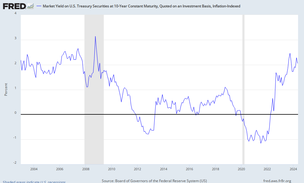
Here is a rough estimate of real 30 year treasury rates over the past 35 years.  It's a rough approximation, but it tracks pretty well with TIPS rates during the time when TIPS have been available.  The actual duration of a 30 year bond is usually less than 20 years, because of the coupon payments, and long term interest rates tend to be more stable than short term interest rates.  On the other hand, the change in real rates on 30 year treasuries understates the change of rates at a given duration, because as rates decline, the duration of a bond increases.  So, the rates in 1990 reflect a bond with a duration of about 12 years, while the rates in the 2000's reflect a bond with a duration of about 16 years.

In any case, zero coupon rates beyond 10 years tend to co-move.  It is not hard to see that real rates of very long duration securities like a home have fallen significantly.

If we estimate a home value based on a 50 year functional life (with no residual value, for simplicity)and a net rental value of $1,000 per month in current dollars, at a real discount rate of 5%, the home is worth $220,000.  At a real discount rate of 3%, the home is worth $310,000 - a 41% increase in nominal value.  As we push the functional life of the home into the future, the nominal current value of the home increases more with each incremental decline in the discount rate.  One can quibble about the functional life and the proper interest rate to use at that duration, but the end result is clear - very long duration real interest rates plunged in the last 35 years, and home values should have been very sensitive to this change.

My point is that, in the analysis of aggregate households in the face of changing interest rates, this nominal home value is meaningless.  What matters to households and to aggregate measures of cost of living, etc. is that net monthly rental cost of $1,000.  The nominal price of the home is a transfer between two households.  And as long as the housing market is liquid and the real net rental expense remains $1,000, the market value of the home and the size of the mortgage are a mirage.  They could amount to 10% or 1,000% of GDP, and the meaningful amount of debt held by the public would still be a reflection of their ability to live in homes that cost $1,000 per month - and this value did not change significantly over this time period.

Further, in the face of falling real and nominal interest rates, there were ONLY two feasible outcomes - (1) continued unremarkable behavior in the implied rent expense of homes together with significant nominal increases in home values and mortgage levels, or (2) a breakdown in the housing market which would block most potential home buyers from the market and present remaining buyers with very high returns on investment.

We had #1 until the Fed engineered #2.

I say, forget about all the other theories about the unsustainably indebted middle class.  To have expected Americans to keep their aggregate real estate values below 70% of GDP, you might have well asked them to stop breathing.  In the aggregate, it couldn't have been done - the outcome we saw was the only functional possible outcome, and it had nothing to do with debt-fueled consumption.


Side Note

If I was a homebuilder, and I believed that the period up to 2006 was reasonable, and that it was 2007-2008 where the housing market was broken, and if I had options on developable land, I would not be in any hurry to develop those plots.  If the Fed can keep itself from torpedoing the money supply again (a big if in today's hawkish environment), those lots should see a 30-40% appreciation over the next couple of years as long as the banks rediscover real estate loans coming out of QE3.

Friday, March 28, 2014

North Carolina Employment Update

This is an update of some of my previous posts on the North Carolina employment trends since they prematurely terminated Emergency Unemployment Insurance.  We finally have numbers through February, and there have been extensive revisions.

Here are some graphs:

The revisions have lowered the North Carolina Unemployment Rate from the summer of 2013 by more than 1/2 a percentage point.  The net result is that, even with the revisions, NC still shows very strong declines in unemployment.  But, the revisions remove most of the relative improvements in NC employment since last summer, suggesting that more of the net result of ending EUI has been a movement from unemployment to not-in-the-labor-force instead of to employment.

These large revisions show just how noisy this data is, so that there is always some question about the validity of the statistical evidence.  Evan Soltas has more on that here.

I expected to see more of a transition from unemployment to employment, as opposed to leaving the labor force, and I would have hoped for that.  In either case, if a similar trend ensues from the end of EUI at the national level, we should be left with an unemployment rate well under 6%.  It would be one thing if, in a worse case scenario, a million workers left the labor force and the unemployment rate was at 9%.  But, the tenor of this potential outcome is different when the resulting labor market is near levels we associate with full employment.

This is a place where the mistaken pessimism about labor force participation muddies the picture, because the response I see to this is that unemployment would be much higher than 6% if not for the flight of workers from the labor force.  Once we account for secular trends, the labor force, while somewhat depressed, is within the historical range.  Below, I have included a graph of LFP for the 3 male age groups with long-term linear trends.  The 25-34 age group is the only age group that is significantly below the 60 year linear trend, and even that group is only 1.2% below the trend.  On the whole, the LFPs compared to the trends are similar to where they were in 1994 and 1995, coming out of the 1991 recession.  The unemployment rate in January 1994 was 6.6% and it was 5.5% in December 1994.  EUI was terminated in the first few months of 1994, and had been much less generous than the recent version of EUI.  One caveat is that the LFP's might decline more as we exit EUI, so we might see some more deviation from trend.  I believe that EUI beneficiaries trend older, so I would expect the 25-34 group to continue to recover relative to trend, and for dips in LFP over the next few months to come in the 45-54 year old group.

The end of the program should be disinflationary, which should add to the challenge of where inflation will be over the next year, in the face of the end of QE.  On the one hand, more monetary stimulus might help move former EUI recipients back into the labor force.  On the other hand, to the extent that a number of the long-term unemployed might have marginal quantities of savings, and associated fixed incomes, unexpected inflation would reduce their real incomes.  If this is the mechanism that pulls them more aggressively back into the labor force, it might be beneficial for national production, but not necessarily beneficial for the households in question.


Thursday, March 27, 2014

A Regime Shift in Interest Rates and Stocks

I thought I would do an update on a pattern I initially mentioned last summer.

10 Year Treasury Rate (green, left scale)
real S&P 500 Level (blue, right scale)
There seem to be two regimes, regarding the relationship between equity returns and interest rates.  (I am using 10 year treasury rates.)

From about 1968 to 1995, inflation remained above 3%.  During this time, interest rates were negatively correlated with equity prices.  When interest rates went up, equity prices usually went down.

10 Year Treasury Rate (green, left scale)
real S&P 500 Level (blue, right scale)
From 1997 to the present, when inflation has generally been below 2.5%, interest rates and equity prices have been positively correlated.  Rates and equities have moved up & down together.

I wonder if this is because during the earlier period, the Fed was erring on the side of being too loose, so higher rates reflected a risk of suboptimally high inflation; but during the recent period, the Fed has been too tight, so that low rates reflect a risk of deflation and low real rates associated with economic decline.

Simple regressions for both periods produce an r-squared value of about .2 (data is monthly).  In the earlier period, a 1% YOY increase in 10 year treasury yields was associated with a 4% YOY loss in the real S&P500 level.  In the current period, a 1% interest rate increase is associated with an 11% increase in the real level of the S&P500.

This relates, I think, to my recent posts on asset allocation.  It is only in the current, low inflation regime where bonds provide strong asset class diversification.  In this regime, equities have declined when interest rates have fallen (long-duration bonds gain when rates fall).  But, this negative beta may only be in effect when interest rates are very low, when there is a dual drag on bonds - both from limited income and limited potential for capital gains.

One issue to watch if we move back to a high inflation regime would be TIPS.  It might be possible that inflation protected bonds will provide very low or negative beta with equities in both regimes.

PS.  I forgot about this post from last year on this topic.  I guess it took less than a year to start repeating myself.

Wednesday, March 26, 2014

Housing & Inflation Update

Here are updates with the January 2014 Case-Shiller housing data.

I have speculated that when rents and home prices rise or fall together, this might be cyclical behavior; but when rents and home prices are moving in opposite directions, this might be behavior related to the effect of low real and nominal interest rates on home prices.

I am using annualized monthly changes of weighted moving averages in order to retain the ability to see recent changes while minimizing the monthly noise in these series.  Home prices and rent are both continuing to increase.  However, home prices have stopped accelerating since mid-2013, roughly coincident with rising interest rates.

Current behavior suggests cyclical recovery, although the lack of acceleration in home prices suggests that the recovery phase may be maturing.

I expect both the continued low interest rate environment and the low level of housing starts to continue to push both of these levels up.  This is partly dependent on expansion of bank balance sheets as the Fed winds down QE3.  As the bottom graph shows, this expansion appears to be tentatively gaining traction.

Tuesday, March 25, 2014

Interest Rates in 2008

Here are a few more graphs from 2008.  I will leave most of the exposition to anyone else who would like to chime in.  A few patterns I see:

1) The Fed Funds rate was especially high, compared to short term treasury rates, from December 2007 to June 2008.

2) There appears to be a distinct pattern in October & November 2008, around the implementation of interest on reserves.  It doesn't seem to affect short term rates much, but as you move out on the yield curve, rates were declining; they would bottom the day of the IOR increase, rise for a few days, then begin to decline again; then bottom and begin rising again the day IOR were increased again.

3) Rates across the curve collapsed in November and December 2008.  The 10 year rate was 4% at the end of October, 3% on November 26, after QE1 was announced, and bottom at 2.1% on December 18, soon after the Fed Funds Rate was pushed to near 0% and QE1 was formally started.

 4)  The 3 year rate declined, uninterrupted, from July 2008 until the implementation of QE1 in mid-December.  Longer term bonds had similar declines, but with a hump, where long term (7 year and longer) rates jumped, coincident with IOR announcements, before eventually falling again.  The entire curve shifted down about 2% from July to December, in this fashion.  The IOR increases seem to have had no effect on the very short end of the yield curve.

(Added: One other interesting thing about the 2007-8 period that appears to be the case, in reference to the top graph, is that in past cycles, the slope of the yield curve at the shorter durations has fluctuated with higher frequency and amplitude than the longer-duration yield curve.  But, in 2007 & 2008, the slope of the yield curve under 3 years remained suppressed while the yield curve in the longer durations moved up.  This is evident in the second graph, where the 3 year treasury yield (red) tracks with the 1 year treasury yield through 2007 until March 2008.  So, while traditional yield curve indicators would have shown steepening in early 2008 because of the higher 10 year yields, the yield curve at the time was flat at durations 3 years and under.  This was before we hit the zero lower bound.  Short term rates were at 2% and above during this period.)

Friday, March 21, 2014

Wage Growth, Inflation, and Interest Rates

I think the topic of wage growth and inflation is one of those topics that is muddled by what I call the "Wizard of Oz" theory of the Fed.  Or, maybe a better name would be the "Pet Rock" Fed.  This is the notion that interest rates are primarily set by the Fed, so that if we move from .25% to, say, 3% short term rates over the next few years, that reflects intentions of the Fed regarding inflation control.  I would say that most of that movement is determined, essentially, by the market, and that, if the Fed is lucky, they keep their target near the market rate as we move along.

The Fed is like a gas station.  In the literal sense, they can go out to the curb each day to set the price.  But, in another sense, they are guessing at what the right price is, and tweaking it one direction or another.  If they get outside a given range for too long, bad stuff is going to happen.

Here is a graph showing wage growth, short term rates, and inflation.

Next is a graph estimating wage growth and short term interest rates, net of inflation.  Generally there is a relationship between wages and interest rates, both nominally and in real terms.

But, I think, instead of thinking of wage growth as a cause of inflation, which, in turn, causes Fed tightening through rising interest rates, I think it makes more sense to simply think of wages and interest rates as two symptoms of a thriving investment market.  Firms with a high demand for investment are bidding up both the price of capital and of labor.

Inflation may reflect Fed policy, but real interest rates and wages tend to rise and fall together in both high and low inflationary periods.  Wage growth might signal interest rate increases, but not necessarily because the Fed plans it that way.

On the other hand, during the 1980's, wages did tend to move pretty tightly with inflation, while debt retained a high real premium.  Perhaps the secular downward pressures on real interest rates are so strong that we will see the reverse over the next decade or two, with growing wages while interest rates remain pinned near inflation.

Could it be that when the baby boomers were young, healthy, and poor, capital was more scarce than labor, but now that baby boomers are old, retiring, and flush with capital, labor is becoming more scarce than capital?

Wednesday, March 19, 2014

Fed Forecasts

Just for kicks, here are the FOMC projections since 2007.  They are all based on 4th quarter numbers (4Q over 4Q for rates of change).  NGDP is implied from the RGDP and the PCE inflation projections.

NGDP saw a negative shock in 2009, but 2010 & 2011 came in about where the Fed wanted.  2012 & 2013 were below the Fed's original expectations.  This might be cause for some doubt about Scott Sumner's position on monetary offset, although I would generally subscribe to that view.

Unemployment came in around expectations in 2010 & 2011.  In 2012 & 2013, unemployment improved at roughly twice the pace the Fed had expected, and 2014 looks to be on track for similar results.


Tuesday, March 18, 2014

The Fed in 2008

There have been some good reviews of the Fed in 2008, since the transcripts have been published.  Matthew O'Brien at the Atlantic has a very good review of the transcripts of the meetings over the summer & fall.

Marcus Nunes builds on that here.  From his post:
Plosner (July 22): Keeping policy too accommodative for too long worsens our inflation problem. Inflation is already too high and inconsistent with our goal of — and responsibility to ensure — price stability. We will need to reverse course — the exact timing depends on how the economy evolves, but I anticipate the reversal will need to be started sooner rather than later. And I believe it will likely need to begin before either the labor market or the financial markets have completely turned around.
Hoenig (July 16): “While the comparison to the ´70s can be useful(!), the present economic situation is also different…
However, like the 1970s, monetary policy is currently accommodative(!)…In this environment there is a significant risk that inflation and inflation expectations could move higher in coming months.
Thus, it will be important for the Federal Reserve to monitor inflation developments and inflation expectations closely, and to move to a less accommodative stance in a timely fashion”.
Scott Sumner has some posts, including this one.  There have been many others.

I don't have much to add, but I tried to pull details and dates out of these posts and the sources they link to, to construct a timeline of late summer 2008.  Normally, a pithy narrative develops as I put these things together.  That hasn't come to me yet, but I thought some of you might find the chart I put together useful.


Notes:
1) It is amazing how well markets held up in mid-September 2008, considering the sheer number of catastrophic economic events that happened in succession.  And this was after nearly a year of financial disruptions.  The Ted Spread exploded in the days after the quick succession of financial crises, but the S&P 500 and inflation expectations held up pretty well for another couple of weeks.

2) 129 mentions of inflation and 4 mentions of systemic risk at the September 16 meeting?  I don't have words.  For nearly a year, the Fed balance sheet had been accumulating unconventional assets.  And, the day before the meeting, Lehman had failed.  The 2 days after the meeting, AIG & the Reserve Primary Fund need capital and Bernanke tells Congress "we may not have an economy Monday".

3) The market expected inflation to average 1% for the next 5 years as they sat in that meeting discussing inflation 129 times.  Between then and Nov. 5, the Fed decided it would be a good time to institute a new policy to pay banks to hold excess cash reserves.  By the end of November, expected 5 year inflation was -2%.  During this period, they did lower the federal funds target rate, however their treasury holdings declined during this period.  There is no sign that the targeted rates were accommodative.

4) They held the Federal Funds rate target at 2% at the September meeting, and signaled that rate increases were around the corner!  The effective Federal Funds rate went haywire until the October 8 meeting, when they lowered the Fed Funds target while initiating interest on excess reserves.  At that meeting Timothy Geitner scolded members who dared to take responsibility for an erosion of confidence!

5) It looks to me like the Fed had been sterilizing unconventional asset
accumulation by selling treasuries, since late 2007.  During this time the monetary base was flatlining.  And, again, while QE1 was purportedly an injection of liquidity into the economy, the Fed balance sheet did not expand from the level it stood when QE1 was announced.  At best, QE1 was reinjecting liquidity into the economy as the Fed unwound other unconventional assets.  While inflation expectations did increase from their deflationary levels of late 2008, they remained below the 2% level throughout QE1.

While the EMH is generally a good starting point for looking at financial markets, our money supply is not the product of a market.  The Fed seems to be operating with the understanding that their actions in 2007 and 2008 were reasonable.  They also seem to continue to have excessive fear of inflation, and they associate this fear with increasing real estate prices.  As long as this is the perspective they hold, going forward, carefully taking prospective positions that would capture extraordinary gains during disruptive deflationary episodes is probably warranted, for either speculative or hedging purposes.

PS.  ....From the September 16, 2008 FOMC meeting.
Mr. Dudley, Manager, System Open Market Account (pg. 26-28 of transcript):

If I could add a few thoughts on market expectations about this meeting—I think it looks as though easing is priced in for two reasons. One, dealers do expect the federal funds rate to trade soft as we add excess reserves, so I would not take the softness in the September federal funds futures contract as indicative of necessarily expecting an easing. Two, I think it is important to recognize that the rates embodied in those fed fund futures contracts are means not modes. So I would characterize the market expectation as either that things get very, very bad and the FOMC cuts rates significantly or that the FOMC does nothing.
I think that actually a 25 basis point cut is probably the least likely outcome that the market anticipates. As evidence of this, a couple of dealers yesterday did change their forecast to a 50 basis point rate cut. I’m not aware of anybody who has changed to 25. Probably people like that are out there. I know that my colleagues at Goldman Sachs, where I used to work, are saying that they think the FOMC is going to keep rates unchanged today but, if they were to move, it would be 50.

That gives you a sense that it’s really a bimodal kind of view and that putting different probabilities on 50 and zero gives you some easing priced into the federal funds rate futures market. So I think the consensus view still in the marketplace is that the Fed probably will not cut rates today. That would be a disappointment to a degree because there’s some probability placed on the idea that the Fed might do 50, but that’s how I would interpret what’s priced into the markets today....
....I think on Friday the mood was basically that the funds rate was going to be flat for a long time. Probabilities placed on either easing or tightening were quite low, and since then the probability of easing has gone up fairly significantly. But I think it’s hard to interpret because it’s really not about 25 versus zero. It’s really about zero versus 50 or maybe even 100 as you look out longer term. Either the financial system is going to implode in a major way, which will lead to a significant further easing, or it is not.


Here is a good example of the content of the meeting.  This is from Sandra Pianalto, head of the Cleveland Federal Reserve Bank:

I am hearing that credit is harder to come by for many borrowers who in the recent past would not have thought twice about their creditworthiness.....One of my directors, who heads a very large regional banking organization, reported at our board meeting last week that many banks are shedding assets and that in some cases they are walking away from longstanding customer relationships in order to do so. He said that investors are very skeptical about putting new equity into banking deals and that those who have done so in the past vow not to be burned twice, let alone a third time.  
Of course, inflation remains an important issue as well....most of my contacts agree that the commodity price environment has stabilized considerably, making me more confident that core inflation will gradually slow over the next couple of years. (Even so, she favored leaving the Fed Funds Rate at 2% and waiting some more to see how the economy performed.) 


I don't blame the committee members.  Having a committee manage a monopoly in cash is ludicrous.  They are bound to fail.

The failure of the committee itself isn't even the most damning aspect of this system.  The most damning thing is that the Lehman Bros. collapse was the product of poor Fed policy leading up to September 2008, and the Fed just kept moving along with the same policy.  The Fed was taking a billy club to the shins of the financial sector without even knowing it.  Even after the banks absorbed a 25% decline in home prices over nearly two years, the Fed plunged us into deflation.  And, in the aftermath, the standard story is that the heroic Fed saved us from falling off the economic precipice, but that we're all supposed to be a little upset because they "bailed out" the banks - the banks that were sitting on balance sheets loaded with receivables backed by collateral measured in nominal values based on the one and only thing the Fed is supposed to produce - those lucky, lucky banks.  This is mass insanity.

Sunday, March 16, 2014

Another observation on home prices, rents, and homebuilders


I recently discussed the housing market.  In one post, I used this graph:

In another post I used the next graph:
Rent Inflation - core CPI (left scale), Price/Rent (right scale)

I think these graphs are helpful in showing the two influences on the housing market that I have been pondering.

Until the late 1990's, there was a fairly consistent set of cyclical behaviors in the housing market.  Cyclical factors would depress home prices, rent inflation, and housing starts.  At the same time, inventories would rise (note, the blue line in the first graph inverts the inventory of houses, in months).

Real and nominal long term interest rates were high enough throughout this period to remain a secondary factor, so a basic supply & demand framework was a coherent way through which to view these changes through time.  I will point out, though, that the one period of low real long term rates, which peaked in the late 1970's, coincides with the pre-2000 high point in real home price appreciation, and this happened during a period where a large number of new homes were being built, home inventory wasn't particularly low, and nominal mortgage payments were astronomical.

But, both graphs display the change in behavior starting in the late 1990's.  Inventories were cut to very low levels, where they remained for years.  Home price rose along with these low inventory numbers, as we might expect.  But there was no supply response, and after a brief rise, rent inflation dropped back to neutral levels.  This seems like more evidence that the home price increases during that time were a product of the changing value of homes as a security, not of supply and demand for housing.

Graph of 10-Year Treasury Constant Maturity RateFinally, in 2002-2003, as rent inflation peaked at a very high level, supply increased.  But, long term interest rates did not rebound after the 2001 recession, remaining low in both nominal and real terms.  This was not a product of a loose money policy by the Fed.  This was a product of market and demographic forces that were creating low real long-term rates, and a very long-term policy of tight money, which had been bringing down long term inflation expectations for 25 years.

FRED GraphReal rates rose in 2005 and 2006.  By the end of 2006, home prices, relative to rents, had leveled out, and rent inflation had risen.  Housing starts began to decline along with declining home prices and increasing inventory.  But, rent inflation continued rising into early 2007.  By mid-2007, rent levels were heading south with all the other indicators.  In hindsight, it would have taken a more inflationary policy to counteract these forces in 2007, so that homes didn't contract so much in nominal terms.

Today we are seeing high home price increases and low home inventories, just like in the late 1990's and early 2000's.  But, today, this is accompanied by increasing rent inflation.  I think this is because both the real interest rate factor and supply and demand are pushing up nominal home values today.

The cash infusion of the QE's has allowed homebuyers to fund purchases from outside the banks, pushing nominal home values back toward where they should be, considering real interest rates and the alternatives for fixed income.  Now that QE is tapering, this funding will need to come from the banks again, and recent indications seems to point to increasing bank credit levels.  This should continue to increase home prices, relative to rent levels.

But, at the same time, rent levels are increasing because of the incredibly low level of housing starts.  If starts remain this low, then rents should continue to increase.  This will push the changing level of nominal home prices even higher.

Homebuilders will either respond to this with large increases in supply, or, if they don't, their home prices should increase substantially.  It looks to me like homebuilders face one of two likely scenarios: (1) continued home price increases with higher-than-expected increasing sales volume, or (2) higher-than-expected increases in home prices with moderate increases in sales volume.

Either scenario should benefit homebuilders with land holdings, options on land holdings, large quantities of available lots, and high operating and financial leverage.  It might be time to look at "low quality" firms in this industry.

Here is a recent update from Calculated Risk.  Notice that home prices aren't just rising, they are accelerating.


Institutional Investors, QE, Banks, and Home Prices

Here is a Bloomberg article (HT: calculated risk) about trends among institutional residential housing investors.  According to the article, the purchases from these investors peaked in 2013.  This has been facilitated in part by QE3, I believe.  The cash from QE3 has been funding non-bank financed investments, which have moved as a counter to bank assets.  This could be because these investors were crowding out banks in the market for asset funding, or possibly the increased interest rate levels reduced bank capital during the QEs, and these non-bank sources of funds, flush with QE cash, made up the difference.  In any case,  I am not surprised that the level of activity from these real estate investors has been coincident with QE3.  You could also see this activity as a process of capital capturing excess returns that are available in residential real estate as a result of the broken down mortgage market.

I also note that home prices are accelerating, even as these investors dial down their activity.  This is because, from a supply & demand perspective, banks have finally begun expanding real estate credit again, and from a valuation perspective, the intrinsic value of homes, relative to other similar investments is still low.