Tuesday, December 10, 2013

Minimum Wage, Demographics, Emergency Unemployment Insurance, and Unemployment from 2007-2011

So, after reviewing the historical evidence on increases in the national minimum wage, I have some method for estimating each of these factors on employment in the latest downturn.

Edit:  After looking some more at the relationship between the MW and the proportion of workers at or below MW, I noticed a non-linearity at the low end of the range, where MW levels were in 2007.  The first hike in 2007 hardly budged the proportion of workers at MW.  This was likely because the legislated MW had fallen below the typical voluntary MW.  I have updated the graphs and numbers below to reflect that deviation from the trend.

Minimum Wage:
This is based on the forecast described in the previous few posts, based on the relationship between the change in the minimum wage as a proportion of average wages, and the change in employment, during episodes of minimum wage increases from 1956 to 2004.  For total employment, during two-year periods following an initial MW hike, the null is rejected at the 10% level.  For follow-up MW hikes in episodes with more than one increase, the null is rejected at the .001% level if we include all periods of time, and is rejected at the 10% level for the 1956-2004 period.
The null hypothesis could not be rejected when tested in terms of unemployment instead of employment for the period ending in 2004.  But, the employment forecast gives us the more important number, in terms of expected jobs lost.  The unemployment forecast simply helps parse that out between workers who leave the labor force and workers who are categorized as unemployed.  With that caveat, I have used the forecast from those tests for the estimated unemployment due to MW hikes.

Demographics:
This estimate is based on a pattern I touched on here.  Unemployment duration tends to grow with age, and education.  I think this tendency can basically be thought of as labor market friction.  Older workers may have greater skill specialization, which creates searching costs.  They may also have more back-up resources, and a greater ability for consumption smoothing.  All of these factors may lead to greater cyclicality in the unemployment rate during times when there are more older workers.  This estimate is based on simple relative average unemployment durations for each age group, with unemployment increasing in proportion to average duration.
This is one of the earliest effects of the baby boomer aging process.  This effect is already diminishing because as older workers enter the oldest age categories, their labor force participation and general level of unemployment decline enough to counteract this effect on unemployment.

Emergency Unemployment Insurance:
I touched on this issue in this post.  Here is a graph of the relationship between unemployment durations of less than 26 weeks and durations of 26 weeks or more, going back to 1960.  Short term unemployment durations and long term unemployment durations moved with some uniformity through many different business cycles over that time, until the implementation of 99 week EUI.  David Grubb from the OECD explains how the level of EUI support was vastly longer than in any previous period.

My estimate for how much this policy affected the unemployment level treats this, much as in the demographic effect, as a labor market friction.  I compared the proportional level of durations over 26 weeks to the typical level we have seen in business cycles over the past 3 decades, and attributed that difference to the EUI policy.  One might be able to argue that there are some other factors involved here, but decades-long pattern of this relationship suggests that those other factors have been dwarfed.  Further, my measure ignores any influence EUI might have had in increasing the average unemployment duration of workers unemployed for less than 26 weeks.  This is clearly a conservative assumption.  On net, until I figure out how to sensibly estimate EUI influence on durations under 26 weeks, this estimate will probably be somewhat conservative.

Here are the unemployment estimates:

graph before update

This chart covers the time period until July 2011.  This is the period where I have a monthly model for minimum wage related employment changes.  These estimates suggest that if we did not have these demographic and policy issues, this would have been a typical unemployment cycle.  (The pale blue line is where I estimate we would be without these policies.)

Here is the graph extended to June 2013.  We are getting far enough away from the MW hikes that the recovery in low-wage employment is mostly dependent on broader economic recovery, Fed policy, etc..  As the earlier posts on MW showed, MW episodes that were small enough would eventually see catch-up employment growth as the economy naturally outgrew the wage-price floor.


graph before update
We may be near a normal labor market, if not for these issues.  These issues might continue to inflate the unemployment rate for a few years, but they shouldn't be permanent.  The Fed hasn't been too loose up to this point, but if they start to err on the side of being stimulative in the face of an unemployment rate that stays stubbornly above 6%, the hidden core of the labor market which may already be back to recovery levels, might create unexpected inflation.  The scale of the recent MW hikes was large enough that there may be low wage workers who continue to be priced out of the market if we don't experience some inflationary adjustments.  There may also be some frictions for long-term unemployed who want to go back to work.  So, unemployment declines might slow down at a higher range than has been the recent experience.  But, it is possible that if federal policies allow these issues to decrease in importance, that could help to reaccelerate the decline in unemployment.

Next up, Labor Force Participation.

Saturday, December 7, 2013

Minimum Wages in the 2008 Recession

Before I bring all of the issues together from the previous posts, regarding the 2008 recession, I want to look at the minimum wage, alone.  The BLS publishes annual surveys of minimum wage worker characteristics.  So, I can compare the number of minimum wage workers from the BLS reports to the number of workers affected by the minimum wage increase, which I have estimated by using the correlations from past MW episodes.

All of these graphs are additive (the lines are stacked).

Edit:  After looking some more at the relationship between the MW and the proportion of workers at or below MW, I noticed a non-linearity at the low end of the range, where MW levels were in 2007.  The first hike in 2007 hardly budged the proportion of workers at MW.  This was likely because the legislated MW had fallen below the typical voluntary MW.  This finding led me to discount the disemployment effects of the most recent episode, with changes large enough that I have edited the numbers here, and replaced the graphs with updated graphs.

Total Employment

This first graph is for the entire labor force, expressed as a percentage of the labor force.  What we see is that as the minimum wage was increased from $5.15 to $7.25, the number of workers at or below minimum wage increased from 1.2% to a peak of 2.8%, falling to 2.4% by the end of 2011.

If the forecast from past MW episodes is accurate, then, over that time, we should expect that 1.4% 0.9% of workers have become unemployed as a result of the MW hike and an additional 2%  1.6% have left the labor force.

I don't find this surprising, considering the latest string of MW hikes lifted the nominal wage price floor by 40%.

Old Graph

2.4% Employed at wages up to 40% higher
3.4% Exit employment coincident with MW hikes
2.5% Exit employment coincident with MW hikes

If this is accurate, then, not only are there tremendous deadweight losses, but, for every dollar gained in wages nearly $5 about $3.50 in wages have been lost by the job losers.


Young Workers

Since about half of minimum wage workers are under 25 years old, my intuition was that this would mean that age group would really get dinged.  But, I think the result is kind of interesting.

For 16-24 year olds, the proportion of workers at or below minimum wage starts out at 3.8%, rises to 10.3%, and then falls to 8.8% by the end of 2011.

On the other hand, I estimate that by March 2011, 2.4% 1.9% had become unemployed and 2.7% 0.2% had come into the labor force.

So, at first glance, this seems worse than for the population as a whole, because 5.1% of young workers are losing their jobs versus 3.4% of older workers.
old graph


But, since so many young workers earn minimum wage, this is a much smaller percentage of the number of workers affected.  In addition, according to the historical regressions, young workers recover earlier in the episode, so that, by the end of 2011, only 4.1% 0.7% of young workers are unemployed or out of the work force, coincident with the MW hike.

8.8% Employed at wages up to 40% higher
4.1% Exit employment coincident with MW hikes
0.7% Exit employment coincident with MW hikes

For this age group, for each dollar of higher wages earned, only about $0.27 was estimated lost.  This still seems like a bad deal, but it's not nearly as bad as for the rest of the labor force.  Possibly this episode of MW hikes benefitted young workers.

Additionally, since there appears to be a substitution effect between 16-19 year olds and 20-24 year olds, I suspect that 20-24 year olds are actually gaining here at the expense of 16-19 year olds and everyone else.  Although, I have to admit, looking at the raw labor force participation rates and unemployment rates for the 16-19 and 20-24 year olds, they both seem to have the same trends through the recent period of time.  My lack of success in finding anything to back this up is causing me to doubt the notion that I have developed about the substitution between these ages.


Workers 25 and Older

If we subtract the younger workers from the data, the data for workers 25 and older looks like this.  This is shown in thousands of workers instead of percentages:
Here, by the end of 2011:

1.8 million Employed at wages up to 40% higher
4.3 3.6 million Exit Employment

Here, $6.60 is lost for every $1 in higher wages.

old graph
I had expected to see most of the pain borne by the younger age group, so this has been a surprising finding to me.  This leads to the question, if the outcomes are worse for older workers, does the higher minimum wage especially hurt the older, poor, full-time workers that MW proponents intend to help?  (There are very, very few workers in this category among MW workers, according to the BLS, incidentally.)  Or, since MW jobs tend to be marginal and part-time, does this exodus from the job market among older minimum wage workers simply reflect life-style jobs people have for non-pecuniary reasons, which they leave when the higher wage floor requires a heightened work environment?  The mix of jobs in the BLS surveys appears to be remarkably stable throughout the period of rate hikes.  I haven't found any clues to answer this question.

Of course, there is also the possibility that my forecast model is simply mis-calibrated, but I think these graphs are helpful, because they help to create a visual comparison of the costs and benefits.  Even if net wages were unchanged as a result of a MW hike, the dislocations caused by the law would create a net harm.  But, even to justify it on those grounds, the total number of jobs lost would need to be a small fraction of the jobs retained.  My model claims that over 5 nearly 4 million workers lost their jobs in the last wave of MW hikes.  That number would have to be in the low hundreds of thousands for the law to deserve any deference.

In any case, I hope now to use these more definitive numbers to try to quantify the effects of MW, Emergency Unemployment Insurance, and Demographics on recent labor statistics.

Thursday, December 5, 2013

A Digression on Labor Force Participation

This is the next post in a continuing series.  In order to look at the effects of the minimum wage in the most recent recession, we are going to need to look at trends in Labor Force Participation (LFP) again.  The demographic trends are too strong to leave out of any labor force analysis.

Here is a graph of the actual LFP to the LFP trend:

This trend isn't just a naïve moving average.  I created this trend by tracking population changes within age groups, and applying relatively stable, long-term trends to each age group.  This trend is not effected by any reasonable inflation of the individual trends, because the overwhelming cause of the aggregate trend is the movement of workers into the 55+ and 65+ age groups that have much lower LFP.

Female labor participation peaked in the mid-90's, so that now all of the 25-55 age categories are following long-established, slowly declining trends.  Here are the 20 year trends that I used to formulate the LFP trend line.  The other graph shows the trends in the male-only series, which are similar and quite linear for at least 50 years.

I don't know why so many people refuse to believe that the stasis LFP rate is declining this steeply, but it should be clear as day that there is nothing unusual going on with the age-specific labor force participation trends that I have used to make the trend.  (I have an upcoming post on LFP trend forecasts that the BLS made in 2007).

Following is a graph of the LFP going way back to 1954, compared to a smooth trend.  Now, it is fortunate that all of the trends back to 1993 are so linear, so that it is so easy to see what's happening with the current trend.

But, this isn't the case before 1993.  There are lots of moving parts in the earlier periods involving women, older workers, younger workers, etc.  So, for the earlier period, I did just fit a smooth curve to the actual data.  This isn't important for my purposes here.  My aim for the longer series is to show the typical scale of movements above and below trend.  So, if my trend is not precise at any given point, the trend-adjusted level of the LFP might be off, but the scale of the movement over the course of a business cycle will be basically accurate.

The next graph shows the LFP deviation from trend (the red line, with the left scale).  The blue line (right scale) is the inverted unemployment rate.  The green shadows are periods of initial minimum wage (MW) hikes.  (The combination of high inflation and a series of small MW hikes in the late 1970's makes that period difficult to analyze, so I have not included MW hikes from that period.)

The takeaway here is that LFP tends to move up and down with unemployment, and the scale at which it is moving in the current cycle is not that unusual.

I have found a correlation between minimum wage hikes and drops in LFP.  It isn't easy to see it visually in the graph of aggregate LFP.  But, most of the effect of MW is on young workers.

So, this last graph shows the long term LFP of 16-24 year olds (not de-trended).  And, the correlation between MW hikes and drops in LFP from the trend is more clear here.  The experience of previous MW hikes predicts the large fall in LFP in 2007-2009, focused mainly on young workers.  Next, I expect to show that, once the expected effects of the MW hikes are accounted for, the cyclical LFP declines that remain will be even less sharp.

But, before you look at the next post, go back to the start of this post and look at that chart again, and the trends that feed it.  Anyone that tries to tell you there is some policy-fix or cyclical recovery that is going to pull LFP back up to 65% or higher is simply wrong.  And anyone who says that unemployment would be 11% if not for a cyclical exodus of workers from the labor force is spouting nonsense.  This is very straightforward.

PS.  Here is a closer view of the 20 year trends of the main working ages:

As mentioned above, these slopes are similar to very long term male trends, and all three series follow the pattern of being above trend when the unemployment rate is around 5% or less and being below trend during recessionary periods.


Next: Minimum Wages, 2007-2009 and my estimate of their employment effects.

Minimum Wage and Unemployment

Following up on this post, a signature of minimum wage induced declines in employment is that they are mostly reflected in reduced labor force participation and employment declines among the youngest age group.  I have taken the same data that I used in the last post and the earlier post on minimum wages and run it again using the Employment Rate as the dependent variable instead of Total Employment.  Here are some comparisons:

Employment Changes per typical episode

Total Employment, expressed as 6 month relative change

Employment Rate, expressed as 6 month relative change


For total employment, in non-MW periods (Group 1), about 70% of net changes in employment are transfers with unemployment (.13/.18).  About 30% of net changes in employment are transfers into and out of the labor force.  After initial MW hikes, about 60% of net changes in employment are transfers with unemployment (.28/.46), so, on net, 40% of the job losers leave the labor force instead of appearing as unemployed.  After subsequent hikes (Group 3), there is a slight increase, on average, in employment (.06% per 6 months) and a slightly larger increase in the Employment Rate (.08% per 6 months), suggesting that workers are still leaving the labor force, even as the Employment Rate is recovering.

The difference in age groups are interesting.  As I have found in the previous posts, there appears to be a strong substitution effect between 16-19 year olds and 20-24 year olds.  When MW increases, some of the damage is mitigated in the 20-24 age group as employers trade up from lower-wage teens, so 20-24 year olds have unusually good employment trends during MW periods and poor trends in non-MW periods.  We see the same phenomenon in this comparison.  After the initial MW hike, all age groups show less of a drop in the Employment Rate (ER) than they do in total Employment, suggesting a drop in Labor Force Participation.  But, 20-24 year olds have a higher drop in the ER, suggesting that even though employment is dropping for all age groups during these periods, some 20-24 year olds are being drawn into the labor force.

After follow-up MW hikes, this phenomenon expands to all of the 20-44 year old groups.  They experience some employment increases during these periods, but only some of these increases are reflected in the ER, suggesting an inflow into the labor force.  Some of this would be catch up growth.  For 16-19 year olds, total employment continues to fall, but the ER improves, on average, suggesting that for the youngest age group, an exodus from the labor force continues through the entire series of rate hikes.

Employment Changes compared to the size of the MW increase


ER and total employment have the same general trends here.  Even though the serial nature of month-to-month data creates a large amount of residual error when plotted by the month, in both cases, the trend line indicates a relationship between the size of the MW hike and the loss of employment.  (Edit: I ran regressions with distinct 6 month periods, including 4 periods from each episode, from 6 months before the initial MW hike to 18 months after.  Trends are similar to the regressions for the rolling periods. The slope coefficients for Employment of 20-24 year olds and total employment show significance at 5%.  16-24 year olds are significant at 10%.  Regressions on the ER do not exhibit statistical significance of 10% or less.)

This comparison suggests that when the size of the MW hike is factored in, less than 40% of the lost employment shows up in a reduced ER.  (A slope of -.039 compared to -.104.)

This is especially pronounced in the youngest age groups.  The comparison of 16-24 year olds suggests that after an initial transfer from employed to unemployed, nearly 90% of subsequent lost employment among young adults, due to steeper MW hikes transfers, leads to an exit out of the labor force.

The other age groups exhibit the same pattern - an intercept near the origin with a downward slope - but the difference between the total employment slopes and the ER slopes are less extreme than they are in the 16-24 age group.

Employment Forecasts from Lagged MW/AW changes

Because the loss of employment from MW hikes is more weighted to labor force exits, the forecast of MW effects over the period of 2007 - 2011 is much stronger when stated in terms of total employment than it is when stated in terms of Employment Rate (which is the corollary to the Unemployment Rate).

Whereas the forecast from MW hikes explained 4.24% out of the 8.23% drop in total employment from trend, the forecast of the Employment Rate only forecast 1.08% out of 4.05% of the drop in the ER.

Adding the recent recession to the regression specification (bottom graph) would increase the forecast to a 1.75% drop in the ER.  Interestingly, adding the recent recession to the specification for the total employment forecast created little change to the forecast results.  So the recent recession has produced an unusual coincidence of unemployment with a MW hike, but it hasn't produced an unusual coincidence of employment decline with a MW hike.

In the next post, I will look at how the minimum wage might have affected the labor force participation and unemployment rates in the recent recession.  (But, first a digression on LFP.)

Wednesday, December 4, 2013

Minimum Wage and Labor Crises

I dug some more into historical national minimum wage data, and I'm shocked at what I have found.  This will be the first of several posts, tying into the recent conversation about Labor Force Participation and Unemployment.

Here is my post on relationships between historical employment levels and minimum wage hikes.

In that post, I divided each month from 1954 to 2013 into 3 categories:
  1. Months that are not within 2 years after a MW hike.
  2. Months within 2 years after any MW hike that occurs at least 2 years after any previous hikes.
  3. Months within 2 years after any MW hike that occurs within 2 years of a previous hike.
In that post, I found evidence that minimum wage hikes were a significant factor in historical labor shocks, and I outlined an episodic pattern of employment loss after MW hikes.  For this post, I have regressed changes in employment against lagged 6 month changes in MW as a proportion of average wages.  For Group 2 & 3 months (months within 2 years of an initial MW hike and within 2 years of follow-up hikes), the relationship looks like this:

The relationship during Group 1 periods (no MW hikes) is not coherent, since there are no shocks to the MW/(Avg. Wages) measure during those times.  In the Group 2 and 3 periods, the independent variable jumps when MW hikes are implemented, and then recedes in proportion to the growth of average wages.  So, this relationship measures both the effect of the shock (the MW hike) and the mitigating effect of nominal wage increases as the MW remains at the new level.

If the MW is increased by an amount equal to 10% of average wages, it is associated with about a 2% drop in employment in the preceding 6 months and the following 4 six-month periods.  Among the most affected group, 16-19 year olds, the drop in employment is about 5% in each of the periods before and after the hike, with the effect diminishing over the next few periods.

Most MW hikes are implemented as a series, and the Group 3 graph shows the relationship during those follow-up hikes.  The relationship is even stronger here.  This is because follow-up hikes tend to have an increasing effect on MW employment because they tend to push the MW level up to a higher proportion of the average wage, and therefore affect a larger number of workers (the price floor enters a fatter part of the income distribution as the MW/(Avg. Wage) ratio increases).  This stronger relationship also reflects the ability for high inflation or strong real wage growth to push the price floor back to the narrow end of the income distribution, which allows for some catch-up employment growth, especially among the most vulnerable groups, like teenagers.

So, we can construct a forecast of employment trends by using these lagged relationships to MW hikes.  The following graphs compare these forecasts to the actual changes in employment.  The 1976-1982 period is not included in my analysis, because there were a number of MW hikes that roughly matched inflation, so there is no clear pattern of price floor shocks with which to establish a relationship.  For Group 1 (non-MW) periods, the forecast reflects naïve mean values for those periods.  For Group 2 and 3 periods, the forecast reflects the lagged correlations with changes in MW/AW:

Original graph, based on Establishment Survey
Edit:  After I posted this, I made several adjustments to the data.  One was to reduce the effect of the 2007-2009 episode, because in this post I saw evidence of a lesser influence of the MW at the pre-2008 levels.  In addition, after originally using establishment survey data, I had switched to household survey data, in order to have more consistent data between total employment and age-specific employment.  I just realized, while reviewing my spreadsheets, that in the household data, a drop in total employment shows up in 1996, which means that every MW hike is associated with a statistical drop in employment. (Although, one could debate the episodes in the 1960's, where the employment data doesn't seem to convey coherent cyclical trends).


There are 7 MW hike episodes, and 6  all of them are associated with labor shocks or downward changes in trends.  Outside the 1976-1982 period, there are only 3 labor shocks that are not coincident with MW hikes.  The one MW hike not associated with a labor crisis is the 1996 hike, which was a fairly small hike during the hottest labor market of the last half century.  While no negative effect on total employment is visible in that episode, the teen employment level does appear to show a dip followed by a recovery, which is a typical pattern.

We can also see here how MW episodes where nominal wage growth is strong relative to the follow-up hikes can actually be associated with a rebound in employment as employment catches back up to trend.

The minimum wage forecast explains almost all of the teen employment loss of the last crisis, and a surprising amount of the total employment loss.

Here is a graph of detrended changes in total employment in the 2008 crisis, compared to a forecast that is specified by the historical correlations (the 2008 crisis is out of sample):

From July 2007 to June 2011, when the Group 2 & 3 forecasts are active, the forecasted detrended employment decline is -4.24%.  The actual decline in that time period was -8.23%.

Half of the employment loss of the crisis was related to the minimum wage hikes?  Surely not.  This is hard to believe, but there it is.

One caveat is that the measure I use, MW/AW (minimum wage as a proportion of average wages), creates a circular argument, because in the absence of a MW hike, stagnant average wages will cause these forecasts to also forecast lower employment growth.  I believe that this effect is limited, however.  Two points to this effect:

1) During Group 2 & 3 periods, there will be at least one period with a hike in MW.  In the recent episode, these hikes were all in the range of a 3% - 3.5% increase in MW/AW.  During 6 month periods without a MW hike, the ratio has declined by .3% - .6%.  So the effect of the shock period on the forecast is much larger than the effect of the non-shock periods.  This is clear in the forecast graph, where the forecast steps up and down, depending on how many rate hikes were implemented in the preceding 2 years.  Other movements beside these shock movements, related to changes in average wages, are much smaller.

2) A decent portion of the change in nominal average wages is a product of inflation.  In the periods after a MW hike, inflation policy can be correctly considered part of the appropriate policy response to MW hikes.  To the extent that lower wage inflation after a MW hike prevents labor markets from recovering, this is part of the MW policy.  So, to the extent that this effect changes the forecast, it is an effect that is entangled with MW policy in a way that would be difficult to separate.

Addendum:  I messed around with the regressions of Employment growth from MW/AW changes by adding nominal wage growth, real wage growth, and inflation as independent variables.  Nothing made much of a change in the coefficients or significance of the MW/AW variables.  In Group 2 periods, the addition of nominal wage growth does improve the strength of the regression, but, interestingly, inflation seems to have a negative impact on employment growth while real wages have a positive impact.  Neither is statistically significant.  And the addition of these variables causes the coefficients and the significance of the MW/AW variables to increase.  In general, within this context, there is not a clear relationship between inflation or real wage growth and employment growth, but I think I can say that the presence of Average Wages in the denominator of the MW/AW variables is not causing a non-MW factor to falsely inflate the significance of the MW/AW variables.

In the following posts I will look at the effect of MW hikes on labor force participation.  The decline in LFP has been a major concern during this crisis.  Interestingly, given the above finding, my preliminary analysis on the MW shows that most MW employment loss comes from workers leaving the labor force, not from unemployment.  So, in this way also, the signature of the recent crisis has reflected what one would expect from a MW-induced labor shock.

Tuesday, November 26, 2013

Labor Share of Income

Tyler Cowen links to new research on labor share of income from Elsby, Hobijn, and Șahin.  It's an interesting paper.  Much of the findings demonstrate the difficulty of using these statistics in a precise way.  For instance, they find that in stock options are accounted for when they are exercised, and they tend to be exercised at market high points.  So, recently, there has been a pro-cyclical quality to labor income.  There are periods of underreporting, which miss deferred income in the form of options.  Then, when the options are exercised, they create an overreporting of labor income.  They do not find evidence that reduced unionization is related to lower labor share of income.  But, they also find that the data do not support several neo-classical predictions about relationships between labor and capital, and they also find that more than 3% of the decline in labor share is due to offshoring.

Looking at this post I did on this basic topic, I should have included this graph:
 
This is compensation as a portion of GDI.  My feeling is that this is still within a fairly tight long term range, but the research noted by Tyler is basically looking at the decline since the 1970s.  (The proportions I use are from table 1.11 of the BEA interactive data tables for National Income and Product Accounts.  Levels can differ, depending on the denominator used, etc., but the trends tend to be the same.)

I tend to have a queasy feeling about the implied moral notions that discussions about these things tend to carry.  There is usually a sense that declining labor share is a problem to be solved.  But, who is to say that labor share hasn't been too high?

I am going to eat some sugar plums tonight, then go to bed and dream of a world where the social convention is to wonder how we can increase capital's share of GDI.  Does that make me a bad person?  If you think so, then I encourage you to visit a place where 100% of compensation goes to labor.  They exist.  Floors tend to be made of dirt there.  You might find that you want to take the first available flight back home from there...except they won't have planes, because planes require capital.  Many places like that are now seeing vast improvements in the conditions of the typical household.  The places that are doing that are doing it by encouraging the profitable allocation of private capital.

My point is that it is very hard to determine the optimal proportion of income that should go to labor.  A mental model that induces concern for decreasing Labor Share but never induces concern for decreasing Capital Share is not a coherent model.  It's a very effective, and widely utilized, model for social posturing, but it would be practically useless as an informational tool.
If we imagine the range of possible outcomes for Labor Share of Income, a society where 100% of income goes to labor is generally going to be a subsistence society.  These societies are usually characterized by a universal lack of individual property rights, so that legal or cultural norms impose a negative rate of return on individual saving, and thus, there is little accumulation of wealth or capital.
 
A limited access society, where property rights are monopolized by a small set of owners and the mass of the population works for subsistence wages and has a limited ability for accumulation or savings, would have a very low Labor Share of Income.
 
Developed, free societies with universal property rights populate the area around the tip of the hump.  These societies generally allow for an emergent equilibrium level of Labor Share of Income that moves dynamically around some range.
 
The level of potential income, optimal labor share, and actual labor share, are constantly moving due to changing cultural, technological, and legal contexts.  If this relationship is smooth and continuous, then we would expect Labor Share of Income to decrease as a result of non-universal capital-related policies or policies that prevent entry into specific markets (these policies include ethanol mandates, health insurance mandates, regulated monopolies, the FDA, non-competitive government procurement, zoning restrictions, etc.).  Universal restrictions of capital would tend to increase labor share (high taxes on capital, pro-labor contract regulations, high levels of public employment, etc.).
 
To the extent that there are forces pulling in both of these directions, the level of potential income (the height of the hump) is reduced.  If labor share is to the left of the hump, and our reaction is to implement confiscatory capital policies, we won't be climbing the hump.  We will just be lowering the hump as we pull labor share back up.  If we are truly to the left of the hump, the appropriate policy reaction would be to decrease some of these non-universal capital policies.
 
Even though the list of policies above is long, the US has been better than most at avoiding non-universal capital policies, and it also has a higher labor share than other economies.
 
But, how can we know if we are to the left of the hump?
 
The Gross Domestic Income that is not taken by labor is, for the most part, taken by capital.  But this is divided between Consumption of Fixed Capital, which is a measure of deterioration and obsolescence of capital assets, and Net Operating Surplus, which is the remaining income to capital, in the form of profit, interest, and rent.  What we can see here is that, over time, there has been a large decrease in the relative income to capital.  We would expect this to coincide with an increasing Labor Share of Income.
 
But, as we can see here, this has been a product of an increasing capital base.  An increasing amount of capital has been put to work in the American economy.  Decreasing marginal returns have led to a lower proportional income to capital, but the absolute return to capital has remained within a relatively narrow band.  So, the lower labor income has come at the hand of higher capital deployment, and not from higher capital income.
 
This is understandable.  As we continue to become wealthier, we should have more capital to deploy.  The net effect of this on Labor Share of Income is not clear.  Long term cultural and technological developments could lead to higher, lower, or stable income shares.
 
In the end, I propose some basic ideas to guide discussion on this issue:
1) Any discussion prefaced on a naïve notion that decreases in Labor Share of Income are bad, ipso facto, will be unlikely to lead to a productive outcome.
 
2) This does not make a good proxy for income inequality issues, since high incomes can be a part of both labor and capital.  CEO's and high status athletes earn mostly labor income.  Elsby, Hobijn, and Șahin note that while labor income variance has increased, the increased variance of incomes among proprietors dwarfs that of payroll labor.  The sources of inequality are complex, and I wonder if labor markets mitigate these variances as often as they promote them.
 
3) A discussion framed in terms of shares of income is framed to miss the most important factor - the height of the hump.  This chart shows the actual Compensation of Employees, over time, compared to the range of compensation share over the past 65 years.  The slope of these trends is, far and away, the most effective way to improve the lot of the average laborer.
If we are considering a policy that is meant to correct the level of Labor Share of Income, which has an ever-moving and unknowable optimum, and if that policy will arguably lower the rate of growth for the economy as a whole, then that policy needs to have a very high bar to top in terms of effectiveness and coherence of purpose.

On the one hand, the research of Elsby, Hobijn, and Șahin suggests that my idealized model certainly won't be supported by all of the data.  But, I think we tend to have an aesthetic response to these issues that leads us astray.  If we see a shrinking labor share of income, we think of the poor worker, putting in long days and barely making ends meet.  We don't have a comparable image when capital's share of income shrinks.  (Why don't we think of our widowed grandmother, trying to extend her nest egg in the face of negative real interest rates?)  But, the tip of the hump in my model is not utopia.  It's a place where there will still be, for now, working poor families.  This is unrelated or tangentially related to labor share of income.  We shouldn't be led by the realities of our current distribution of scarcity away from the most effective means to improve it.  Some of those solutions may be redistributional, but it might be worthwhile to aim for policies that reduce the drag on universal returns to capital as opposed to policies intended to increase that drag, in some sort of misplaced attempt at fairness.
 
 
PS:  "Negation of Ideology" comments at themoneyillusion.com.  Here is the beginning and end of the comment:
"People confuse the distributional issue with the labor/capital split. The ideal obviously is for Capital to receive 100% of national income and labor to receive 0%, and the ownership of Capital to be very widespread...............If a farmer that owns his own farm gets a tractor that cuts his workload in half is he angry?"
His comment is profound.  But, it gets at the difficulty of achieving utopia.  Capital is risk.  Accumulation is risk.  Whereas information asymmetries probably mitigate inequality in the labor context, in the capital context outcomes multiply upon themselves, whether those outcomes are skill-based or simply from bad luck.  Could the 100% capital-utopia be stable?

The conundrum is that, clearly, a capital-heavy society is better than a labor-heavy society.  But, a capital-heavy society is probably inevitably less stable with more diverse individual economic outcomes.

Monday, November 25, 2013

Employment and the Economy

A couple months ago, I was a little worried about trends in the JOLTS data.  Here is a graph of the monthly change in the 12 month moving average of Quits, Job Openings, and Hires.

These indicators tend to move up and down together, and since a decline of labor churn is one of the symptoms of a recession, these indicators might prove to be a useful leading indicator for economic headwinds.  In June, all three indicators were testing declines that they had been flirting with for a few months.  Most other indicators seemed to still be signaling a recovering economy, but JOLTS might be an early signal.  Since then, the JOLTS indicators appear to have recovered, and are again growing from month to month.  This suggests that there could be tailwinds in the coming labor market.

Unemployment has been peculiar in this cycle.  This graph shows the total unemployment rate (blue), which has been declining at a pretty linear rate of about 0.8% per year since early 2010.  But, the green line is the unemployment rate after subtracting workers on Emergency Unemployment Insurance (EUI).  It has been basically flat for 4 years.  All of the reduction in unemployment is coming from EUI.  There are only about 1.3 million workers still on EUI, and its rolls are still dropping by nearly a million workers a year, so it appears that, regardless of whether Congress renews it in 2014, it will be a less relevant part of the picture.  Nonetheless, nonrenewal would probably help to bring down the unemployment rate a little more quickly.

Among the other 6.4% of unemployed workers, about 4.6% have been unemployed for less than 26 weeks.  About 1.8% have been unemployed for more than 26 weeks.  Both of these levels have been relatively stable for several years.  In a healthy economy, where the UE rate might dip below 5%, the short duration unemployment rate would be between 3.5-4.5%, plus about 0.75% of workers unemployed for more than 26 weeks.  So, the excess unemployment is mostly related to the long-duration unemployed.

I would blame much of the excess unemployment duration on EUI and demographics.  Older, more educated workers tend to have longer unemployment duration.  The EUI problem will work itself out as the recovery continues, but I expect the demographic factor to buoy the unemployment rate well into the recovery phase, for another decade, at least.  (Here is a link to some of my previous posts on the topic.)
This graph is the long-term level of initial and continued unemployment insurance claims, as a percentage of the labor force.  Three notable pieces of information from this graph are:
1) new claims are at a level historically associated with full employment (UER of 5% or less).

2) In terms of initial claims, the 2009 labor market was roughly as bad as the 1991 labor market.  All of the additional labor market problems were related to unemployment duration.

3) the effect of demographics on unemployment duration are evidenced by the relative growth of continued claims in the last 15 years, as baby boomers have entered to the older age groups.  The currently high relative level of continued claims might also result from the EUI policy.  This measure does not include EUI recipients, but EUI appears to also increase the unemployment duration of those unemployment for less than 26 weeks.

This graph reinforces the idea that normal employment levels are basically recovered.  Short duration unemployment is probably near a long term bottom, which with a typical level of long duration unemployment would put us at an UER of about 5.3%.  Depending on the behavior of the workers currently listed as long term unemployed, this could lead to inflationary pressures even when unemployment is somewhat above 5%.

This graph compares the unemployment rate to continued unemployment insurance claims.  Here, we can especially see the significant amount of unemployment that is due to the long duration unemployed, since the UER is much higher relative to standard UEI recipients than it has been in the past.  The labor recovery over the next couple of years will be a process of bringing that green line down to the level of the red line.  The question is, how quickly will it happen.

The number of long term unemployed once reached 6.7 million, and is now down to 4 million.  That leaves about 3 million additional workers who would need to leave the rolls of the long-term unemployed to bring us back to a normal labor market.  Workers have been leaving the ranks of the long term unemployed at a much higher sustained rate than one might have guessed, with an exit rate staying strong at about 2 million a quarter.  This is in spite of the fact that the total number of workers in this group has declined by about 40% from the peak and in spite of the fact that a normalized short-duration labor market has meant that we are seeing fewer new long-term unemployed.  Reasons for this include:
1) The proportion of long-term unemployed workers covered by EUI has been shrinking, so it has had a decreasing effect on durations over time.
2) A large number of the long term unemployed are marginally attached to the labor force - for instance many are in the older age groups, where they may be near retirement or may have the flexibility to wait for a more robust job market.  So, there are an unusually high amount of transfers between workers classified as unemployed versus not in the labor force.  Some of this reflects the arbitrary status of some workers, especially among the older age groups, which makes trends in the unemployment rate difficult to predict.  (Here is an earlier post about why the decreasing labor force is generally demographic in nature.)

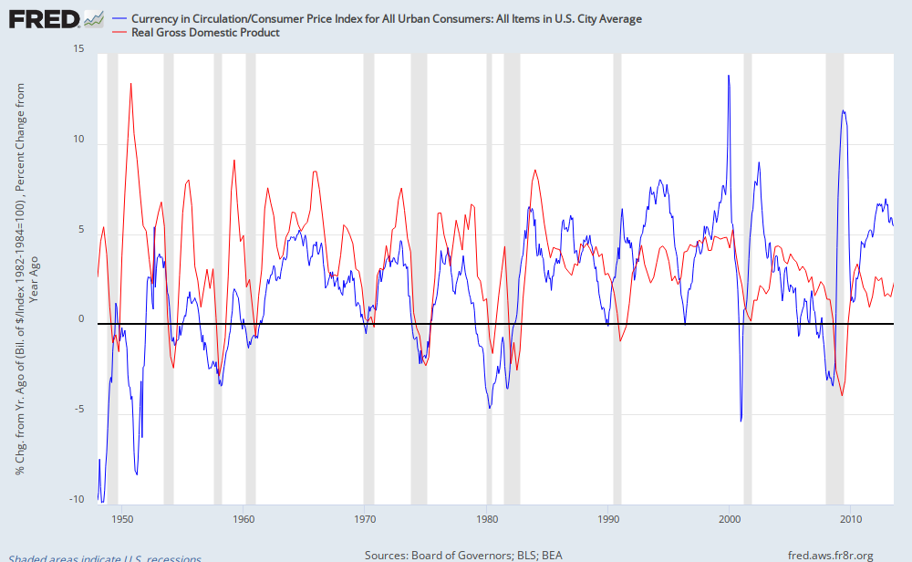
FRED GraphIf the linear rate of unemployment reduction continues, we could hit 6.0% unemployment by the summer of 2015, and labor markets may become inflationary earlier than normal because of structural and demographic issues.  This graph suggests that we are a long way from worrying about any inflationary problems, though.

The blue line is the annual change in the CPI adjusted amount of currency in circulation and the red line is real GDP.  Drops in inflation adjusted currency seem to pre-date drops in real GDP.  The current high rate of increase in currency suggests that current increases in currency are not inflationary and that a negative shock in real GDP is not imminent.

PS. I'm not sure what this last chart is really measuring.  Could this be a product of the Fed's inflation targeting policy?  When inflation adjusted currency growth stops, that means that any real GDP growth has to be related to increased velocity.  We would expect that to happen if real interest rates are rising as part of an accelerating economy, so this wouldn't necessarily make that indicator a leading indicator of a decline in real GDP.

Do these drops in inflation adjusted currency signal times when a relatively larger portion of NGDP growth is coming through inflation?  If that is the case, and the Fed reacts to that development by pulling back currency growth even more, then could the inflation targeting policy be creating a causal retationship between momentarily higher inflation and subsequent recessions?  If that is the case, this would be an example of how inflation targeting causes unnecessary economic contractions that could be avoided with NGDP targeting.

There are a lot of moving parts here.  Please comment if you have insight into this relationship.  Especially comment if you know of some technical error I am making or if the graph is useless in some way I don't understand.

Friday, November 22, 2013

Speculation about movements in 2013 Interest Rate Futures

Interest rates have made several broad moves through 2013.  Here is a graph of Eurodollar futures at four turning points during the year:

The following graph is of deconstructed versions of the Eurodollar forward rates, reflecting the expected date of the first short term rate increase and the rate of the increases that follow.

May 1 was roughly the low point in forward rate expectations.  At that point, the first rate increase was expected at the end of 2015, with a slope of only about 20bp per quarter after that.  I have speculated that this low slope was actually a reflection of inflation uncertainty.  Market expectations of a steeper slope might have been tempered by uncertainty about the Fed's balance sheet, which could have lowered bond yields across the yield curve.

From May 1 to June 14, unexpected improvements in the economy caused the expected date of the first rate increase to move forward, but Fed uncertainty kept the subsequent slope fairly flat.

In June, the Fed clarified its intentions for ending QE3 and eventually planning rate increases.  Bernanke announced an intention to continue pushing rates down.  Rates went up immediately, which was widely attributed to expected tightening, but I believe that the main cause was a reduction in the probability of outlier outcomes in the Fed's balance sheet management, which caused the slope of the yield curve to more accurately reflect market expectations.(1) (2)  As the August 1 snapshot demonstrates, in the weeks following the announcement, the expected date of the first rate increase did not move, but the slope of the yield curve increased.

Since then, we have had the government shutdown and the Obamacare debacle.  In the meantime, economic news has still been fairly stable, and Janet Yellen has become the presumed replacement for Ben Bernanke.  Most observers expect Yellen to be more aggressive with monetary stimulus, which is taken to mean, among other things, that she will wait longer before raising rates.  In addition, there are whispers of the Fed moving its unemployment rate threshold target for raising rates from 6.5% to 6.0%.  That brings us to the current curve (Nov. 20 in the graph), where the rate rise has moved back to the end of 2015, but the slope is now over 30bp per quarter, which reflects a market very confident about a typical interest rate recovery coming out of the zero lower bound.

This gets complicated, because the Fed's stated policy stance and the effect of its stance on interest rates are self-contradictory in their nature.  If the market really does expect the Fed to be more accommodative and to delay a reversal of its Open Market Operations (OMO), then the subsequent boost in economic activity should actually push inflation and real economic growth up, so that the rate increase actually happens sooner.

So, the current expected rate increase seems to be a conservative, naïve (by which I mean unbiased) reflection of the Fed's implied policy stance.  I think both inflation and unemployment are more likely to skew this to a sooner date than to a later date, but I don't think we can expect the slope of the yield curve to get much steeper than this.  So, I think we are still looking at rates in the 2016-2017 time frame coming in roughly in the range they have been dancing around for the past few months, with the current rates being the bottom of the range.

Here is a graph of the slope of the Treasuries yield curve over the past 30 years or so.  The slope is understated at the current time because the zero lower bound makes the slope in the unadjusted treasury curve slightly less steep than pure expectations would normally make at the short end of the curve:

The blue line is the difference between the 1 year treasury rate and the implied 2nd year rate from bootstrapping 1 and 2 year treasuries.  The shadow columns are the actual changes in the forward 1 year rate compared to the immediate 1 year rate.  There are several items of note:

1) Coming out of an interest rate collapse, it is very common for the yield curve slope to top out at about 50bp per quarter, or slightly less.  I think this more or less caps the top end of forward rates that one would need to be prepared for.

2) Well-known research has shown that an inverted or flat yield curve is a very reliable predictor of coming recessions.  But, as reliable as it has been, the 1-2 year forward yield curve has massively underestimated the level of rate reductions that have happened during those recessions.

3) Even outside recessions, the forward yield curve has overstated the actual rise in rates.  During this time, the yield curve overestimated the actual rise in rates in the 1 to 2 year time period by an average of more than 1%!  I realize that there is some maturity premium, but not 1%  within the first 2 years.  On the one hand, I am currently arguing for a short position in forward bonds, so this worries me.  On the other hand, this is at least partly a reaction to the volatile inflation of the 1970's, and may eventually disappear or reverse, especially since interest rates don't really have anywhere to go but up or sideways.

4) The bond market sure looks like it wanted a more aggressive Fed.  Coming out of 2009 in the midst of QE1, forward rates were ready for a standard rate recovery.  Then the Fed cut QE off, and forward rates died.  They picked up again with QE2, and then died again as it also was cut off too early.  They are picking up again.  I hope the natural recovery strength of the economy and the new expectations from Janet Yellen will pull us the rest of the way out as we exit QE3.

Thursday, November 21, 2013

Family Structure and Income Statistics

Russ Roberts linked to a nice paper he did laying out some of the problems with statistical income trends.

Here is a table from page 18 of the paper:

This is a classic Simpson's Paradox situation, which shows up again and again in these income time series.  Poverty rates within each family structure have fallen tremendously.  But over the same period of time, Americans have chosen increasingly to populate the most vulnerable family structures, so the aggregate poverty rate has not dropped very much.

Why does this paradox show up so much in these statistics?  I think it is inevitable.  It's because people have agency, and the statistical aggregation is confused by that agency.  It's similar to the effect of safety mechanisms in cars, where drivers adjust their driving to be more aggressive when they feel safer, so that the new mechanisms tend to reduce injuries, but by a lower amount than what one would have predicted.  Helmets on football players are another example of this issue.

It doesn't matter which way the causation goes.  These statistics are a refutation of the standard haves-and-have-nots, stagnation and bifurcation story that seems to be conventional these days.  That narrative would cause one to expect households to move into structures associated with more social support and lower poverty.  We would see higher poverty levels within each structure, and more households in the married couples with children category, staying together for economic reasons.

If the causation is that fewer married households and more children with single parents leads to higher poverty levels, then this supports the conservative moralistic narrative.  If the causation is that more wealth and income leads to families that are more willing to make trade-offs which result in more vulnerable family structures associated with lower incomes, then this supports an optimistic narrative that broad-based improvements in standards of living have increased the choices available to households.

In any case, the large changes in family structure and the tremendous reductions of poverty levels within each family type point to a society that continues to offer greater opportunity over time to its households.  Just as drivers demonstrate the existence of a variety of priorities when they choose to trade new standards of safety for savings of time, etc., households demonstrate a variety of priorities in addition to household income.  This includes households who have income levels some of us would consider unacceptable or marginal. (I don't intend to paint a portrait of households making coldly rational decisions.  I am sure that many of the priorities and trade-offs that households consider are vastly different than the ones I would consider, and I am sure that many of these choices are demonstrably detrimental.  I don't wish to judge the choices.  I'm just pointing out that they must exist to a much greater extent than they did previously.)

The single women with children category presents a good example.  In 1967, 3.2% of households were poor families in this category (6.2% * 51.2%).  In 2003, 4.4% of households were poor families in this category (11.9% * 37.3%).  So, the net change over 36 years is an addition of 1.4% of poor single mother households.  But this 4.4% can be divided into 2.3% (6.2% * 37.3%) which would have been the total number of poor single mother households if the proportion of household types had been stable, and 2.1% (4.4% - 2.3%) of households who have been induced into this vulnerable household type.

3.2%     Percent of Total Households in 1967 who were poor, headed by single mother
-.9%      Reduction in poverty for existing single mother households from 1967-2003
+2.1%   Additional poor families due to increase in single mother households from 1967-2003
4.4%     Percent of households in 2003 who were poor, headed by single mother

So, a skeptic or moralist might say that this shows how all the social support programs and broad improvements in economic opportunity are fruitless when there are groups of people hurting their own chances for success.  A progressive might look at the aggregate poverty measure and say that this shows how the economy has not provided any improvements for the most vulnerable families.

Those reactions are both short-sighted.  Some of those 1967 households had income problems and some other set of larger problems.  In 2003, those families had fewer income problems and more manageable trade-offs for their other problems, so they addressed those other problems in ways that required a change in family structure and a reduction in income.  We can infer that even though those families show up as poor single mother families, this is a preference over being a non-poor married family.

Some of this growth in vulnerable household types is clearly a reaction to some of the perverse incentives created by public poor relief policies.  This is inevitable in coercive public programs.  It is very difficult to ensure an honest accounting regarding the effects of these policies.  Some of these problems were addressed in the Clinton/Gingrich welfare reforms, and it is disappointing to see some of the current progressive movements against social support programs for the working poor.

All of this suggests that in the battle between agency and structure, agency pulls its share of weight.  We should conclude, then, that the labor market, even at low income levels, is influenced by the demands of laborers.  Pessimism about labor income distribution is overstated, and policies premised on monopsonist low-wage employers are based on inaccurate presumptions.

Of course, there are many improvements to make.  The point isn't to deny the existence of suffering or poverty.  The point is to make sure that we understand what we are dealing with and to use the right tools to create progress.  Further, if seemingly marginalized families do retain influence over their quality of life, then public policy that is premised on a lack of agency will not only be damaging, but it will also deny dignity to the very families that it is meant to support.

The solution isn't to remove choices so that vulnerable women are again forced into unpalatable marriages for economic reasons.  But the solution also isn't to remove choices for the working poor because their choice set is unpalatable to us.  Minimum wage laws, occupational licensing rules, and other limits on freedom in employment contracts reduce the choice set.  Support for some of these laws presumes a lack of choices for poor laborers, so that, in the name of that inaccurate presumption, we limit the choice set even further.