Saturday, August 31, 2013

There was no housing bubble, seriously....no, I'm serious.

As a follow-up to the previous post, I've been trying to reconcile this graph from an earlier post

 
with this graph from calculatedriskblog.com
 

So, was there a sustained period of overbuilding, or wasn't there?......There wasn't!  As outlined in the previous post, there are several parallels between the 1970's and the 2000's.  One of them is an overabundance of 45-65 year olds, who are earning the highest incomes of their lifetimes, whose savings is peaking to its high point before they transition into retirement where they will start dissaving, and who are beginning to transition their savings into low risk fixed income.

One of the outcomes of this demographic context is that the prices of single family housing units is bid up, partly because that demographic can afford it and can use it, and partly because for them it is a superior investment to other low risk investments.   The peculiar dual role of housing as consumption and investment gives it an especially superior profile as a pragmatically low risk investment.

We can see in the 2nd graph that in the 1970's, starts for single family homes hit all-time highs.  This is especially striking, considering the very high nominal rates of the time.  As I speculated in the previous post, the high inflation at the time probably served to mitigate the trend of single family homebuilding that likely would have surged otherwise.  The 2000's saw low inflation and low nominal rates, so that when the baby boomers hit that age range, there were fewer constraints on homebuying.  The number of houses built skyrocketed to new highs, along with prices.  But, as can be seen in the 2nd graph, this came at the expense of multi-unit building.

So, while the investment preferences of baby boomers did lead to a boom in housing, the total housing stock remained level.  We didn't overbuild housing; we just accommodated the baby boomer preference for single family homes......both graphs are true!

Real Interest Rates and the Housing Boom

The housing boom of the 2000's was not a bubble.  The bust of 2007-2009 was a Fed-imposed liquidity crisis, with the banks its victims.  Hear me out.
(Here is a brief follow-up.)

Long Term Housing, Equity, and Interest Rate Comovement with Demographic Foundations

Here are a couple of articles from the Minneapolis Fed that discuss a series of papers on the similarities of the 2000's and the 1970's, which got me thinking more about aging population and long term macro cycles.

This paper from Piazzesi and Schneider argues that a combination of demographic and cyclical issues caused a decline in real interest rates and a transfer of wealth from equities to housing in the 1970's:
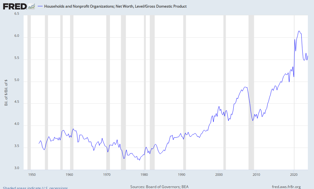
In the 1970s, U.S. asset markets witnessed (i) a 25% dip in the ratio of aggregate household wealth relative to GDP and (ii) negative comovement of house and stock prices that drove a 20% portfolio shift out of equity into real estate.
FRED GraphHere is a Fred graph that extends a basic version of their ratio into the 2000's.  We can see a similar dip in net worth that comes from a decline in equities in 2000-2002.  But in the 2000's, the housing boom was much more extreme, so there is the huge bump in net worth from 2003 to 2007, which breaks down in the financial crisis.

Piazzesi and Schneider argue that high inflation was integral in the shift from equities to housing.  So, the mystery is, why did we see this effect explode in the 2000's in a low inflation environment?

Here is a graph from P & S, showing Home Price to Rent ratios in a range from 20 to 25, peaking in the 50s, 70s and 2000s (roughly coincident with low real interest rate environments and similar population distributions, with population bulges in late middle age).

In addition, here is an updated Price to Rent graph from Calculatedriskblog that puts the subsequent peak of Home Price to Rents in the mid 30s.


Trying to get at the mystery, I put together a model to find the break-even price of owning a home versus renting, with the following variables:

Expected change in home values
Expected change in rental rates
Real long term risk free rate of interest
Down Payment %
Tax Rate
Home Price, expressed as Price to Rent

I had expected to find large consequences from housing's preferential tax treatment and from low down payments leading to the treatment of home ownership as a call option.  I was surprised to find very little effect from these factors.  In fact, the benefit of ownership increases with higher down payments.  And, in line with P & S, home ownership becomes more profitable with high inflation, ceteris paribus.

So, how could home prices have exploded in the 2000s?

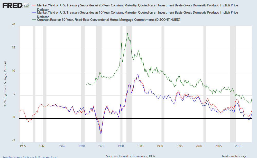
The overwhelming factor justifying a higher Home Price to Rent (PTR) is the real interest rate.  That is because much of the value of owning, versus renting, is as a hedge against future nominal increases in rent.  And, the present value of those relative gains is very sensitive to real rates.  Here is a graph of interest rates:
FRED Graph


The green line is the 30 year mortgage rate.  The blue and red lines are rough proxies for real 10 and 20 year rates (nominal rates minus the inflation rate).  The mortgage spread is pretty stable over time, so most of the difference between the mortgage rate and the real rates is a reflection of the inflation premium.

Using my model, I found that, as an alternative to risk free fixed income, assuming no qualification constraints, the following PTR ratios could be justified simply from changing the level of real rates:

These justified prices assume a reversion to a long term PTR of 24.  In other words, the buyer of a house with a PTR of 28.69 can expect the house to lose 17% of it's value in real terms over 30 years, and the 28.69 PTR is still justified.

With naïve price expectations (expected home price growth and expected rent price growth equal to the inflation premium), PTR would range from 17.5 at a 5% real risk free rate to 32.6 at a 1% real risk free rate.

So, we could expect prices very similar to what we saw in the 2000's with little or no bubble behavior.

So why doesn't this show up in the 1970s?

The model justifying the prices of the 2000's has one big assumption - no qualification constraints.  No qualification is required on fixed income investments that are alternatives to homes.  But, to invest in the home you live in, you have to commit to purchase the entire house.  And, the method the bank uses to affirm your investment has nothing to do with a comparison between a long term bond investment and your home.  The bank simply compares nominal interest rates to your annual income.  So, even though the return on a home investment is higher in a high inflation environment, making nominal payments from your income becomes the constraining factor.

But, even as late as 1979, when mortgage rates were above 10% and rising, PTR was still rising at 25.  It was only the advent of higher real rates that sent home prices back down.

Low inflation in the 2000's meant that this constraint was minimal, so the prices that could have been justified in the 1970's in terms of return on investment could now be bid.

How does this change the interpretation of the 2000's?

From this point of view, the home prices of the 2000's were rational.  The apparent bubble activity that seems excessive (no doc loans, low down payments, interest only loans, etc.) now can simply be described as methods used to further remove constraints which were keeping investors from making a reasonable real estate investment.  Since low inflation caused monthly nominal payments to be low, buyers could reduce capital constraints by using methods that reduced other constraints, such as a down payment, with the cost of increasing the monthly payment.  Trends, such as lower down payments, also served to increase the option value of the mortgage, lowering the required return of the real estate. (There might still have been a bubble for AAA rated securitizations at the banks, but if my interpretation of events is plausible, then I don't think the CMO market would have more than a small effect, as long as nominal rates were low enough to reduce the qualification constraint.)

These methods would not have been useful in the 1970's, because the constraint then was in making the monthly payment.  A larger, unamortized mortgage principal would have only increased the constraint.

Also, note that before the financial crisis, real rates rose by about 1% from 2005 to 2007.  And, coincidentally, PTR peaked in 2005 and fell by about 4 points by the end of 2007.  This is exactly the behavior we would expect from a reasonably priced housing market that is constrained by expected returns instead of qualification constraints.

All of those mortgages were basically put options on homes, held short by the banks.  And, the Fed caused a deflationary liquidity crisis, starting at the end of 2007, which meant that many of those options were exercised.  The image of the Fed as a fat cat stuffing $100's into the tuxedos of its favored friends may be less accurate than the image of a waiter bringing out a free dessert after the chef burnt the entrée.

How does this change our expectations?

We can already see a rebound in the housing market, post-crisis, which is reportedly very heavy in all-cash purchases from sophisticated investors.  We don't have an overheated CMO market and we don't even have a generous real estate credit market.  What we do have are low real rates and low inflation.  I expect that there will be much gnashing of teeth as credit markets loosen up and homeowners take on a larger portion of home purchases as prices rise once again, with stories built around smart money and dumb money.  But, it is possible that this will be reasonable behavior.  I would expect real rates to rise somewhat as the economy continues to recover, and at some point, as in 1980 and 2006, this will become the constraint for home prices.  But, I suspect that we will see PTR at 25 or more before that happens.

And, the really interesting thing to watch will be if the Fed continues to be hawkish on inflation, and real rates fall again within the next decade, while baby boomers are still holding their peak level of low risk savings.  It could be possible that even under a conservative regime of mortgage qualification rules, PTR could head well into the 30's again in that environment.

The investment landscape and possible policy reactions, which could be misplaced, in that context, would bear consideration.

This is yet another reason why an inflation rate of 4 or 5% might not be so bad.  In addition to preventing sticky wages when inflation in non-cash earnings is high, it would help bond markets clear at rates safely above zero while real rates remain low or negative, and it might just help to stabilize home prices.

Wednesday, August 28, 2013

Tuesday, August 27, 2013

Could JFK have ended poverty with today's government?

He probably would have thought so.

Here is a graph of GDP and government spending per capita, in 2009 dollars:


Government at all levels today spends the equivalent of the entire US economy of 1961.

Monday, August 26, 2013

Minimum Wages and the Business Cycle

I'm still working on an update of the minimum wage and employment.  One problem with analysis of the national minimum wage is that there are really only 7 episodes of isolated minimum wage increases, so even if it has very poor employment effects, it would be hard to find statistically significant results.  Five of the seven episodes just happen to coincide with significant downturns in the labor market.  Here is a graph of part time employment since 1987:

It seems like there are correlations within the broad national data that point to a large disemployment effect, yet, as can be seen in this graph, interpretation can be difficult.  Here we have 2 episodes where a drop in age 16-19 part time employment drops and age 20-24 part time employment climbs, which could result from a substitution effect, and these both coincide with broad recessionary labor markets.  Then, a third episode seems to have no effect on employment at all.  And, a fourth notable event is another recession that has the same signature of the recessions that coincided with MW hikes.

Political Calculations points out that the 2001 episode coincides with a large MW hike above the federal level in California, but I'm not convinced that the timing and scale of the labor market declines fit that story.

And, the 1994 episode happened to come during what was possibly the strongest labor market in the last 80 years, where the labor demand was strong enough to create a bulge in the greater-than-full-time labor force unprecedented for this period.

I think I've got some ways to get some indications through the fog of data, but it's a funny situation, where MW hikes have an unlikely and uncanny coincidence with poor labor markets, yet there is enough noise to cast doubts on using the broad national data to confirm anything definitive.  Maybe it's not worth my time, as this has been a frequently studied topic, but there are interesting things to learn from the data along the way.

PS.  One other thing this graph makes clear, again, is that the reports of a labor market that is only strong among part time workers because of Obamacare seem to be based on specious measurements.  There is a surge in part time employment and a plateau in full time work over the past few months, but these are noisy indicators, and the same thing could have been said at some point each year since the recession ended, so significant confirmation would be required to be able to say that.  The lack of any trend in the year over year part time employment data in the chart here suggests that a confirmation is unlikely.

More on Unemployment Duration and Emergency Unemployment Insurance

Average unemployment duration always increases with age. In the previous post, I found that this recession caused an unusual amount of extra unemployment duration among the older age groups.  I thought that I might be able to further estimate the effect of EUI on unemployment by using the ratio of Duration/UNRATE.  Basically, this is a rough measure of how much variance there is among the durations of unemployed workers. If most workers get a new job within a few weeks, this number will be low.  But, if some workers get a job in a few weeks while others take months, then this ratio will be higher.

The results are somewhat inconclusive.  First, as an explanation, this ratio has a somewhat funny behavior, because when unemployment first kicks up, the ratio decreases, since many newly unemployed workers bring down the average duration.  After unemployment peaks, the ratio grows, as the number of newly unemployed workers declines relative to the existing pool of unemployed workers.

This recession does show very high variance of duration behavior in every age group.  But, I don't think this would count as evidence of EUI effects because, (1) it is difficult to compare the ratio over time on an absolute scale because many factors, such as structural impediments to reemployment, the amount of churn in the labor market and the rate of change in the unemployment rate will effect the dynamics of it; and (2) if EUI were a factor in the recent recession, I would have expected the effect to be more pronounced in the older age groups, since they naturally start with a higher average duration, and would be relatively more affected by insurance over 26 weeks.

But, I can imagine other interpretations.

I will point out that for economists who argue that unemployment is mainly an aggregate demand problem, I would think that the EUI would have to be a prime suspect for the high unemployment durations.

Saturday, August 24, 2013

Uneasy Money on the Great Depression

http://uneasymoney.com/2013/08/21/why-hawtrey-and-cassel-trump-friedman-and-schwartz/

http://uneasymoney.com/2013/08/16/friedmans-dictum/

Naive market maker strategy in forward interest rates

There is a profit to be made over the next year in forward interest rate markets as a sort of naïve market maker, which I touched on here and here.  This is basically a leveraged asset rebalancing approach.  Everyone should do some unleveraged rebalancing.  You can goose the returns to rebalancing by leveraging up the adjustment.  For instance, if you're 50/50 stocks and bonds, and after a year, you find that you are now 40/60, then you might expect stocks to rebound, so you could rebalance to 60/40.  As with any leveraged strategy, this can get you in trouble in proportion to the leverage you take.  With enough leverage, it becomes a classic hidden fat-tail risk situation.  You make excessive gains like clockwork, but most of the time you are carrying some unrealized losses, as you buy into weakness.  Then the day comes that the markets go against you one too many days in a row, and those unrealized losses become realized losses, and you can't rebalance any more.

But, if you can draw a boundary around the potential volatility you can expect to handle, you can make sure your leverage is low enough to prevent a meltdown.

This graph represents the potential payouts of this kind of strategy.  It books profits over time, but as the price moves away from the midpoint, the losses can become catastrophic quickly.

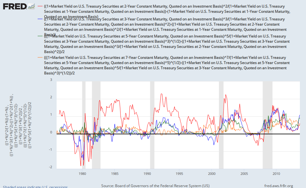
We have an unusual situation in forward interest rate markets, where short term rates are certain not to budge, and at some point around the end of 2014, we can expect short term rates to follow a path, managed by the Fed, up to some higher level.  The first rate increase is very likely to come between September 2014 and March 2015.  In the meantime, there is a lot of volatility in the middle part of the yield curve, around 2016-2018.  So, the question is, if we want to earn profits by mitigating that volatility, where would we set our boundaries?

FRED Graph

This is a graph roughly measuring the slope of the yield curve along several segments, over time.  There appears to be a typical slope in the short end of the yield curve that reaches about 2%/year at the point in time where the Fed is expected to raise Fed Funds rate for the first time.  In other words, if the 1 year interest rate is 3% when the Fed starts to raise rates, forward markets will price the rates one year ahead at about 5%, 2% above the beginning rate.  The yield curve levels off to a slope of 1%/year or less after that.

This should put a cap of about 4% on contracts that are about 3 years out from the initial interest rate increase.  So, while short term rates are near zero, the bullish boundary would put September 2017 contracts at about 4.25%.  I estimate that a bearish scenario of a rise in March 2015, with a slower rate of expected Fed Funds increases would give an expected value for the September 2017 contracts of about 2.75%.

Daily volatility is fairly high, as investors second guess Fed stances and daily economic indicators.  But, I expect there to be a very strong mean reversion behavior within these boundaries, until the rate increases commence.  As the date of the rate increase approaches, the planned range of the strategy can be occasionally adjusted to reflect new information on the health of the economy, if necessary, although this can create some costs, depending on where prices are at the time of the adjustment.

The low rate environment limits the ability of the expanded money supply to goose investment and spending, so I expect the eventual path of short term rates to be slower than 2% per year.  But, by the time the actual spot rates start moving, it will probably be time to put this strategy away for a while.

Friday, August 23, 2013

More on Duration, Demographics, and Emergency Unemployment Insurance.

I've been looking some more at unemployment duration data, to see if we can make any broad estimates of what is going on.  I realize that my back of the envelope estimates aren't academically rigorous, but I hope this provides plausible food for thought, and some grist for speculative decision making.

Postscript: Upon further reflection, I think the approx. .75% of age-related unemployment, anomalous to the recent recession, which I found in the demographics section, is probably closely related to the .7% excess unemployment that I found in the later section on EUI related to excess unemployment duration above 26 weeks.  So, in total, of the approx. 5% in cyclical unemployment that we saw at the peak, I am attributing approx. .5% to age demographics and at least .75% to EUI.  This leaves 3.75% attributable to other factors, although EUI would likely be responsible for some of the remaining 3.75% in ways that I haven't been able to isolate here.

Under the fold.....

Tuesday, August 20, 2013

Predictable Variations in Economic Growth

Along the lines of the demographic issues I've been thinking about recently, I wonder how we can make the appropriate adjustments to our standard measures of economic activity.

In 1995, 12.5% of the population was above 65 years old.  In 2015, it will be up to 14.4%, and by 2035, it will be up to 20.7%.  Compared to the boom times of the 1990's, an additional 8% of the population will be of retirement age.  Whether we measure the effect of this change on the economy through consumption or production, there will be a tremendous drag on the standard measures of economic growth.

But, the point I would make is that this will be a purely statistical drag.  For those 60 million retirees, this will be a perfectly predictable part of their life plan.  They worked harder and saved when they were younger so that they could enjoy a long life of retirement.  The coming reductions in GDP growth will be a reflection of success, a product of an incredible time in history where we can expect to spend much of our lives being economically unproductive.

It seems like there should be some adjustment for that, similar to an adjustment we would make for inflation:  "Real GDP grew at a rate of 1.5% this quarter.  Nominal GDP grew at 2.5%.  And, lifecycle adjusted GDP grew at 3.5%."

I am afraid that we are looking at a 20 year period where there will be a constant clamoring for poor solutions to problems that only exist in the minds of lazy or opportunistic consumers of statistics.